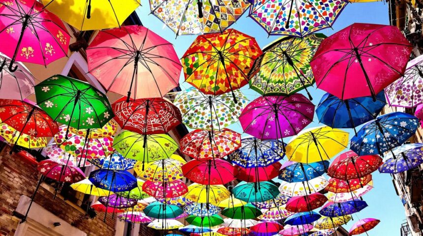
Unity and variety in art are like the perfect mix of a matching team uniform and a group of wild sneakers. Artists use repetition to make things feel like they belong together—think of repeating shapes, lines, or colors. But they also throw in contrast, like bold colors or different textures, to keep people interested. Too much sameness? Boring. Too much difference? Chaotic. Finding that sweet spot keeps art exciting and organized, with some famous artists showing how it’s done—stick around to find out how!
Key Takeaways
- Repeating shapes or colors throughout an artwork creates unity, while introducing contrasting elements generates visual interest and excitement.
- Van Gogh’s swirling brushstrokes offer unity through repetition, while bold color contrasts add variety and energy.
- Grouping similar motifs together fosters cohesion, while varying their size, color, or texture maintains viewer engagement.
- Kandinsky balances unity with repeated geometric shapes, then disrupts expectations using contrasting lines and colors for variety.
- Harmonious color palettes unify artworks, while occasional bold accent hues prevent monotony and draw attention to focal points.
Understanding Unity and Variety in Art
When looking at a painting or a sculpture, it’s easy to get caught up in the colors and shapes, but there’s something deeper going on—artists are actually playing a clever balancing game between unity and variety.
Unity is what makes all the different elements—like color, shape, and texture—feel like they belong together, almost like a team that knows exactly how to win.
Unity is the secret sauce that makes colors, shapes, and textures work together like a perfectly synchronized team.
But if everything looks too similar, things get boring fast! That’s where variety steps in, shaking things up with contrasting elements so our eyes don’t fall asleep.
Artists use unity to make art feel whole, but they sneak in variety to keep us interested.
Think of Van Gogh’s swirling brushstrokes or Kandinsky’s wild shapes—both show this amazing balancing act.
Techniques for Achieving Unity Through Repetition
When artists want their work to feel like it truly belongs together, they often use repetition in some clever ways—think patterns that pop up again and again, or a favorite shape that keeps showing up like a familiar face in a crowd.
Sometimes, the way things are placed close together in a composition, or the use of the same little detail, can make the whole piece feel unified, almost like all the parts are secretly chatting with each other.
Whether it’s through patterns, repeated motifs, or just smart arrangement, repetition has a way of pulling everything into one big, happy family—no awkward family reunions here.
Pattern Creation Techniques
Patterns might seem simple at first glance, but in art, they’re like secret codes that tie everything together.
Pattern creation techniques let artists repeat certain shapes, colors, or lines, building unity while still keeping things lively. Even though the same element gets used over and over, artists can tweak things—change a color here, stretch a line there—to make sure it doesn’t get boring.
Plus, when repeated elements are spaced just right, it feels like the artwork is dancing! Here’s how artists pull it off:
- Repeat shapes, colors, or lines to build a strong, unified look.
- Use tessellation so patterns fit together perfectly, like a puzzle.
- Adjust spacing and alignment to create rhythm and movement.
- Add small changes in size or color for extra visual interest.
Consistent Motif Usage
Even though a painting might look wild and full of surprises, there’s usually a secret trick holding it all together: the clever use of motifs. Motif usage means repeating shapes, colors, or patterns to create unity, so everything feels connected, almost like a secret handshake between different parts of the artwork. Artists rely on repetition to bring a sense of order, whether it’s a certain swirling line or a splash of red popping up again and again. Take a look at how these elements can play out:
| Motif Element | Unity Effect |
|---|---|
| Repeated dots | Guides the viewer’s eye |
| Color palette | Ties diverse pieces |
| Pattern lines | Creates visual rhythm |
| Shape echoes | Connects composition |
| Themed symbols | Builds emotional impact |
Without repetition, things get chaotic—motif usage is the glue!
Proximity in Composition
Not every artwork shouts for attention with wild colors or crazy shapes; sometimes, the real magic comes from how things are grouped together.
Proximity is like the secret handshake of art—put things close, and suddenly, they’re best friends. When artists use repetition, like repeating shapes or colors, and pair it with proximity, they create unity that feels natural, almost like the artwork just “clicks.”
Want to know how artists pull off this trick? Check out these moves:
- Arrange repeated elements in clusters to connect them visually.
- Use negative space to give breathing room, making groups stand out.
- Try tessellation to fit shapes together like puzzle pieces for seamless unity.
- Guide the viewer’s eye with patterns and rhythm, making the artwork flow.
That’s proximity and repetition, working their magic!
Creating Visual Interest With Variety and Contrast
Imagine walking into an art gallery and spotting a painting that just pops—your eyes can’t help but bounce from one corner to the next, trying to take it all in.
That’s the magic of variety and contrast working together to create visual interest. Artists like Wassily Kandinsky knew how to keep things exciting by mixing straight and curvy lines or pairing bold colors with softer ones.
Contrast makes certain shapes or colors stand out, almost like they’re shouting, “Hey, look at me!” at a party. This keeps you from getting bored, guiding your eyes around the canvas with a kind of visual rhythm.
The Role of Harmony in Cohesive Artworks
Harmony in art is like a secret handshake that brings everything together, making different parts of a picture feel connected.
When artists use similar shapes or stick with a certain color palette, it’s almost like the artwork is wearing a matching outfit, and that just feels right to our eyes.
This sense of togetherness can make a painting feel extra powerful, as if every piece is rooting for the same team.
Similar Elements Foster Togetherness
Every great piece of art has a secret recipe, and a big part of that recipe is how artists use similar elements to pull everything together.
When artists repeat things like shapes, lines, or textures, it creates harmony—kind of like everyone at a party wearing matching hats. This repetition helps the artwork feel like one big, happy family, not a bunch of strangers in a room.
Unity grows when similar elements echo through the piece, making it feel intentional and well-planned. Still, it’s not just about making everything look the same!
Check out how artists use harmony and repetition to foster togetherness:
- Consistent shapes and lines create visual flow
- Repeated textures tie areas together
- Recurring motifs build a theme
- Unified arrangement boosts overall impact
Color Palettes Enhance Cohesion
Lots of artworks feel like they just “click” together, and a big reason for that is the colors the artist chooses. When an artist picks a color palette and sticks to it, everything just feels like it belongs—even if there’s a wild repetitive pattern or lots of different shapes. Using similar colors, like blue and green, can create harmony and unity without making the artwork boring. Sometimes, an artist repeats a certain color all over the piece, almost like sprinkling magic dust, and suddenly all the parts seem to work together. Check out how different color palettes affect unity:
| Color Palette Type | Effect on Artwork |
|---|---|
| Limited Palette | Strong harmony |
| Analogous Colors | Subtle unity and variety |
| Dominant Color | Cohesive focal points |
Color choices really do the heavy lifting!
Practical Examples of Unity and Variety in Famous Art
Picture walking through an art museum, where each painting seems to have its own secret recipe for grabbing attention. The magic behind these masterpieces often lies in how artists balance unity in art with a dash of variety, using the elements of art like color, shape, and line to cook up harmony and variety.
For example, Van Gogh’s “Starry Night” swirls together colors and shapes, but throws in a bold cypress tree for a surprise. Kandinsky, Kusama, Klimt, and Monet each use their own tricks, too. Here’s how:
- Repeated patterns and colors create unity, making art feel whole.
- Unexpected shapes or contrasting colors introduce variety, keeping things interesting.
- Consistent textures or themes tie everything together.
- Surprising details make viewers want to look closer.
Tips for Balancing Repetition and Contrast in Your Own Work
Sometimes, making art can feel like trying to solve a tricky puzzle—how do you make everything look like it belongs together, but still keep it exciting? Artists often use unity, repetition, and contrast to tackle this challenge. For example, they might stick with a consistent color palette for unity, but then toss in a pop of contrasting color to grab attention. Repeating shapes or patterns can tie things together, but changing their size or color keeps things from getting boring. Mixing up line weights and textures adds another layer of contrast. Grouping similar items helps the oddballs stand out. Regular check-ins on the overall balance are key. Here’s a quick cheat sheet:
| Trick | Unity Factor | Contrast Boost |
|---|---|---|
| Color Palette | Consistent colors | Bold accent color |
| Pattern | Repeated shapes | Varied sizes |
| Line Work | Similar weight | Unexpected thickness |
| Texture | Smooth areas | Rough patches |
| Grouping | Close proximity | Stand-alone element |
Frequently Asked Questions
What Is an Example of Unity and Variety in Art?
An example of unity and variety in art can be seen when an artist employs color harmony for thematic cohesion, while introducing texture contrast within the composition, ensuring the artwork feels balanced yet visually engaging through its diverse elements.
What Is an Example of Unity Through Repetition in Art?
Unity through repetition in art appears in patterned textiles, where consistent repeated motifs create visual harmony. Similarly, rhythmic brushwork in paintings establishes cohesiveness, as seen when artists use uniform marks to unify the overall composition and aesthetic experience.
What Are the 7 Principles of Art Design?
The 7 principles of art design are balance, emphasis, movement, pattern, rhythm, contrast, and unity. Balance importance and visual hierarchy are established through contrast techniques, guiding the viewer’s attention while creating visually harmonious and engaging compositions.
What Are the 7 Elements of Art and Explain Each?
The seven elements of art include line, shape significance, form, color theory, value, space, and texture exploration. Each element contributes uniquely, influencing composition, depth, mood, and tactile qualities, forming the essential building blocks of visual expression.
Conclusion
In the end, finding the sweet spot between unity and variety is a bit like making the perfect playlist—too much of the same gets boring, but total chaos is just noise. Artists mix repetition and contrast to keep eyes moving, brains thinking, and hearts feeling. Whether in a painting, sculpture, or even a doodle, balancing these elements makes art pop. So, next time you create, remember: a little unity, a little variety, and a whole lot of you!


Leave a Reply