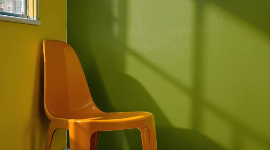
Some colors just freak people out! Shades like mustard yellow, sickly green, or the famously “ugly” Pantone 448 C push our buttons because they remind us of gross things like mold, rust, and even bodily fluids. It’s not just imagination—psychologists say our brains link these colors to danger, sickness, or decay. Even different cultures mostly agree about the yuck factor. Ever wonder why companies pick these colors for warning labels? There’s more gross-out science behind it.
Key Takeaways
- Certain colors trigger psychological responses of disgust or discomfort, often linked to associations with decay, sickness, or pollution.
- Cultural context shapes perceptions, making some colors unpleasant in some societies but neutral or positive in others.
- Colors like Pantone 448 C, mustard yellow, and murky green are widely disliked due to negative emotional and physical associations.
- Unappealing color names, such as “Goose Turd Green” or “Puke,” reinforce negative perceptions and add to their unpopularity.
- Some universally disliked colors are used intentionally, such as in cigarette packaging, to reduce product appeal and influence behavior.
What Defines an Ugly Color?
Disgust—it’s a powerful feeling, and when it comes to colors, it shapes what people call “ugly.”
Some shades just make people wrinkle their noses or want to look away, but why do certain colors get such a bad reputation?
Certain colors instantly trigger a reaction—sometimes all it takes is a glance to make us cringe or turn away.
It turns out, the ugliest color isn’t just about what we see—it’s about what we feel. Negative associations play a huge role; if a color reminds people of something gross, like mustard yellow or pickle green, it quickly lands in the ugly zone.
But here’s the twist: it’s all in the eye of the beholder. One person’s hideous muddy shades might be another’s trendy vibe.
Even Pantone 448 C, famous for being unpleasant, shows how context and culture twist our feelings about color.
The World’s Most Unpopular Colors
When it comes to the world’s most unpopular colors, Pantone 448C takes the crown, so infamous that it’s used on cigarette packs just to make them less tempting.
Some colors just seem to get a bad rap everywhere—whether it’s mustard yellow making people squirm, or dark gray bringing everyone’s mood down, these shades pop up in “least favorite” lists all over the globe.
It’s almost like some colors are born to be disliked, no matter where you go!
Pantone 448C’s Global Impact
Although most people don’t spend much time thinking about ugly colors, Pantone 448C is so famously disliked that it actually changed the world. Known as the “ugliest” color, Pantone 448C was chosen to make cigarette packaging less attractive and reduce smoking.
Its muddy, greenish-brown shade was picked after heaps of research showed it had almost zero positive associations. People described it as “dirty” and compared it to smokers’ lungs—definitely not something you’d want to show off.
Here’s how Pantone 448C made a global splash:
- Australia was the first to use it on cigarette packaging in 2012.
- Other countries like the UK, France, and Canada followed.
- Smoking rates dropped in places where it was used.
- It proved ugly colors can actually help save lives!
Culturally Disliked Color Trends
Ever wonder why some colors just make people cringe? Around the world, certain shades have earned a reputation for being truly ugly colors.
Pantone 448 C, for example, is so disliked that it was picked for cigarette packaging simply to make smoking less cool. Talk about a color trend nobody wants to follow!
Mustard yellow isn’t winning any popularity contests either—it’s often linked to gross things like bile.
Pickle green gets a bad rap, too, thanks to its muddy vibe reminding people of infections.
Dark gray can make people feel gloomy or even depressed, while beige is seen as super boring and dull.
These culturally disliked colors show how powerful color trends can be, shaping what we wear, buy, and even how we feel.
Pantone 448 C: The Science Behind the Ugliest Shade
Pantone 448 C isn’t just any ugly color—it messes with people’s minds, making them feel weird or even grossed out, which is exactly what health officials wanted.
This strange greenish-brown shade was so off-putting, it became the go-to color for cigarette packages in Australia and inspired other countries to follow suit.
Turns out, a color that makes people wrinkle their noses can actually help save lives—who knew ugly could be so powerful?
Psychological Triggers and Associations
When a color is so ugly that it makes people want to put down a cigarette, you know there’s some serious science going on behind the scenes. Pantone 448 C, that murky brown shade, wasn’t chosen at random. It triggers strong psychological reactions, making people wrinkle their noses and think of things they’d rather avoid—like decay or dirt.
In public health campaigns, using unappealing colors can work wonders by connecting products with negative associations. Here’s how Pantone 448 C works its magic:
- It taps into deep psychological triggers, sparking disgust.
- It’s linked to negative associations, like dirty lungs or pollution.
- It’s so unappealing, it makes cigarettes less attractive to buyers.
- It’s a secret weapon for public health campaigns aiming to change behavior.
Global Influence on Packaging
Nobody would expect a weird, muddy color to change the world, but that’s exactly what happened with Pantone 448 C. This shade isn’t just ugly—it’s legendary for being chosen as the ultimate “no thanks” color.
When Australia put Pantone 448 C on plain packaging for tobacco products, it sent smokers running. The color was so unappealing, people didn’t even want to touch the packs. Soon, smoking rates dropped, making Australia one of the leaders in kicking the habit.
The global influence was huge. Other countries like New Zealand, the UK, and France saw the results and quickly followed suit, slapping Pantone 448 C on their own cigarette packages.
Who knew an ugly color could do so much good around the world?
Color Psychology: Why Certain Hues Evoke Disgust
Color can be a real troublemaker; it messes with our heads way more than we think.
In the wild world of color psychology, certain colors just seem to get a bad rap, no matter where you go. Some shades, like Pantone 448 C (dubbed the “ugliest colour”), instantly make people wrinkle their noses.
It’s not just about looks—it’s about wild associations that stick in our brains. Check out these cringe-worthy connections:
- Murky browns and greens—remind people of decay or sickness.
- Mustard yellow—sometimes fun, but often linked to bodily fluids (yikes).
- Dark gray—can feel heavy, like a rainy Monday.
- Rust—brings up thoughts of old, corroded metal or infections.
No wonder some colors just give everyone the creeps!
The Role of Culture in Color Preferences
Honestly, isn’t it wild how a color that’s loved in one country can be totally hated in another? Color preferences aren’t just about what looks good; they’re shaped by cultural symbolism and history. For example, white means “pure” in the U.S., but in China, it’s tied to mourning. These differences change how people feel—emotional responses—to the same color. Check out the table below to see just how much color meanings can vary:
| Color | Western Symbolism | Eastern Symbolism |
|---|---|---|
| White | Purity, peace | Mourning, loss |
| Red | Danger, love | Luck, celebration |
| Black | Mourning, power | Wealth, health |
Global color trends, tracked by the Pantone Color Institute, prove how local events and traditions keep shaking up what’s “in” or “out.”
How Ugly Colors Influence Branding and Marketing
Even though everyone has their own favorite colors, some shades just seem to get a bad rap, especially when it comes to branding and marketing. The ugliest color in the world, Pantone 448 C, is actually famous for being so unappealing that it’s used on cigarette packages to turn people away!
Brands definitely don’t want to chase off customers, so they’re super careful with their color picks. Here’s why color matters:
- 85% of consumer decisions are based on color alone—wow!
- Branding strategies usually dodge colors with negative vibes, like brown and mustard yellow.
- The right color can boost brand recognition by up to 80%.
- Some brands, like Coca-Cola, use bold colors to spark excitement and energy.
Clearly, color isn’t just decoration—it’s a marketing powerhouse!
Strange and Unusual Names for Unappealing Colors
Nobody wants their brand to remind people of something gross, but sometimes, the names given to certain colors are just as off-putting as the shades themselves.
Take “Goose Turd Green”—yes, that’s a real color name from the Elizabethan era! It’s not a pretty olive, but a yucky green shade that even sounds like it smells bad.
Then there’s “Puke,” an olive-brown color name straight from Shakespeare’s play “As You Like It.” Imagine painting your room with “Puke.” Not exactly inviting!
“Humorous Green” might sound funny, but it’s a weird mustard yellow that most people find pretty ugly.
And don’t forget “Ox Blood,” a deep red that brings to mind ancient rituals, not cozy sweaters.
Sometimes, the color name can be just as cringe as the color itself!
Frequently Asked Questions
What Is the Most Unflattering Color?
The most unflattering color is often identified as Pantone 448 C, according to color psychology, cultural perceptions, fashion trends, and personal preferences, as its muddy brown hue is widely associated with negative emotions and is rarely favored in design.
Why Do We Hate Certain Colors?
Dislike for certain colors stems from color psychology, cultural influences, personal preferences, and historical context. Negative emotional associations, societal symbolism, and individual experiences collectively shape aversions, making some hues widely disliked while others are celebrated in different contexts.
What Is the Most Unliked Colour in the World?
The most unliked colour in the world is often identified as a brownish green resembling Pantone 448 C. Other widely disliked shades include neon yellow, muddy beige, and dull gray, all associated with negative emotional reactions and aversions.
Conclusion
Ugly colors aren’t just random shades that make people wrinkle their noses—they have science, psychology, and even culture behind them. Whether it’s the infamous Pantone 448 C or a weirdly named puke green, these colors actually shape how we feel and what we buy. So, while everyone has their own least favorite hue, there’s a reason some shades are just almost universally disliked. Who knew something as simple as color could cause so much drama and laughter?


Leave a Reply