
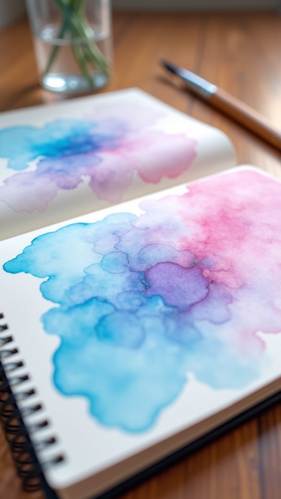
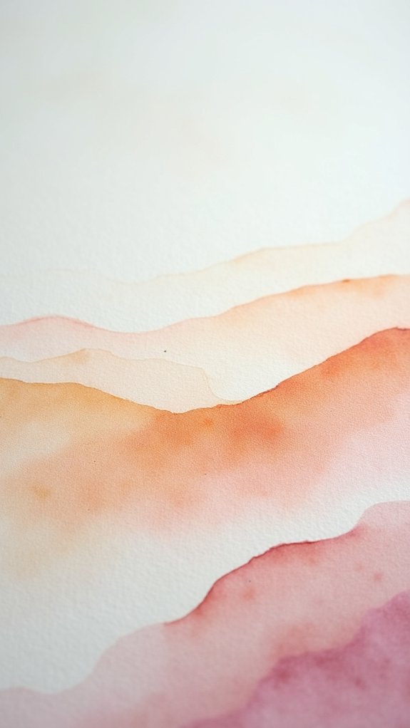
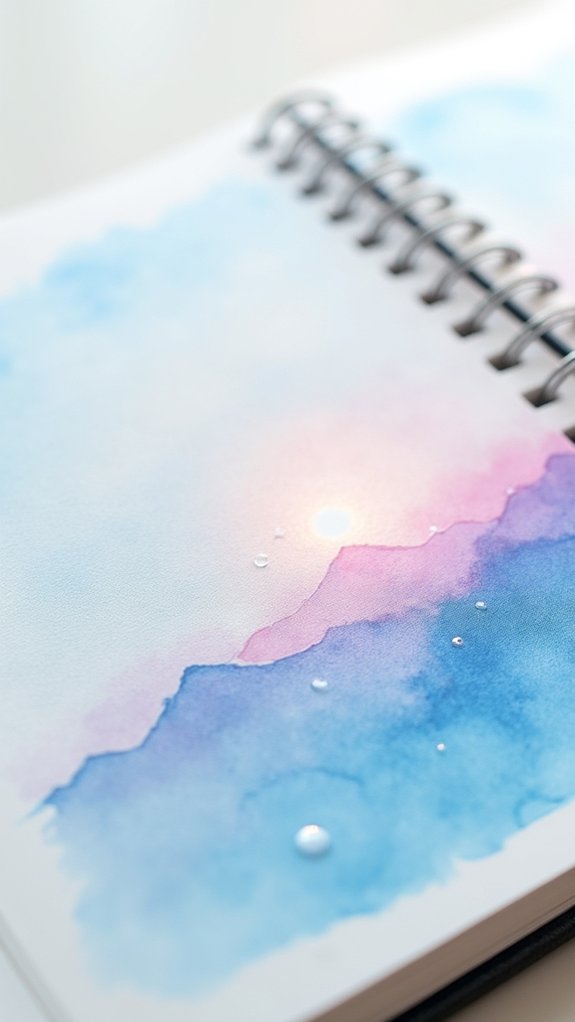
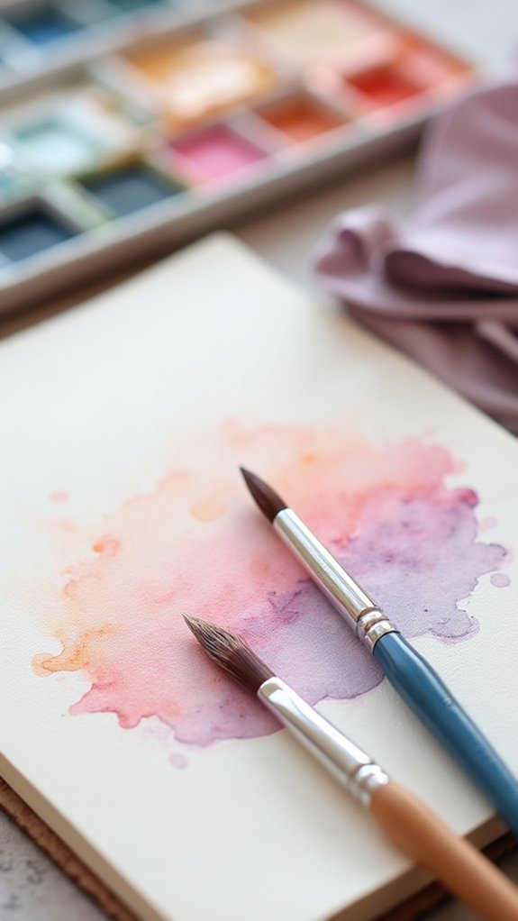
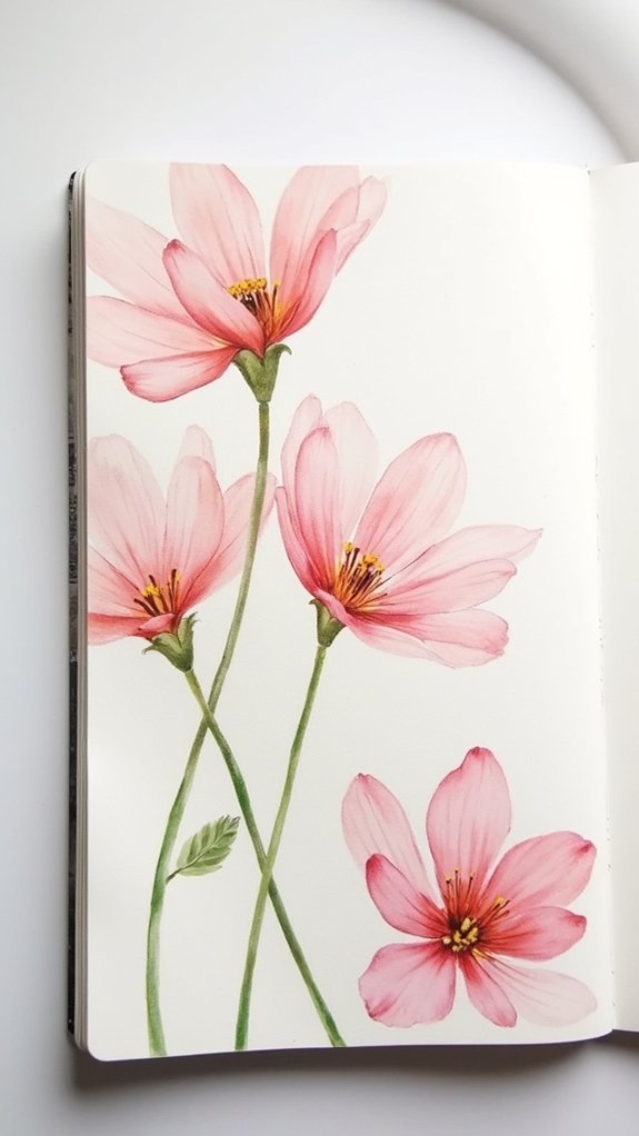
Watercolor artists can create super soft, dreamy effects in sketchbooks by playing with special stuff like cotton paper, lots of water, and layering thin washes—imagine puddle magic! Techniques like wet-on-wet painting, misting, and gently lifting color with a damp brush help colors melt together for glowing edges and misty blends. Adding salt or tilting the sketchbook makes surprising patterns while blues and purples swirl. If you’re curious, there’s a whole kaleidoscope of tricks just waiting to be unraveled.
Key Takeaways
- Pre-wet paper with clean water to achieve soft, dreamy watercolor blends and natural edge diffusion.
- Use soft, round brushes and gentle brushwork to blend and soften color transitions seamlessly.
- Gradually layer transparent washes, allowing each layer to dry for luminous and vibrant soft effects.
- Lift color with a damp brush or sponge to create subtle highlights and glowing soft spots.
- Apply mist or a fine water spray to dampen edges, encouraging organic flows and soft, diffused textures.
Choosing the Right Sketchbook Paper

Choosing the perfect sketchbook paper can feel like picking out the right pair of shoes—get it wrong, and every step (or brushstroke) feels off.
Paper makes a huge difference when trying to create dreamy, soft watercolor edges or wild mixed media effects. Not all sketchbook paper is created equal.
The Stillman & Birn Beta sketchbook is nice and smooth, great for illustration, but it doesn’t always shine with bold wet-on-wet techniques.
The Pentalic Aqua Journal is like that perfect sneaker—super versatile, handling ink, watercolor, and whatever else you want to throw at it.
Meanwhile, the Etchr Sketchbook goes all-in with its 100% cotton cold-pressed paper, making it a top pick for mixed media and for those rich, flowing wet-on-wet watercolor effects that artists dream of.
Mastering Wet-on-Wet Application
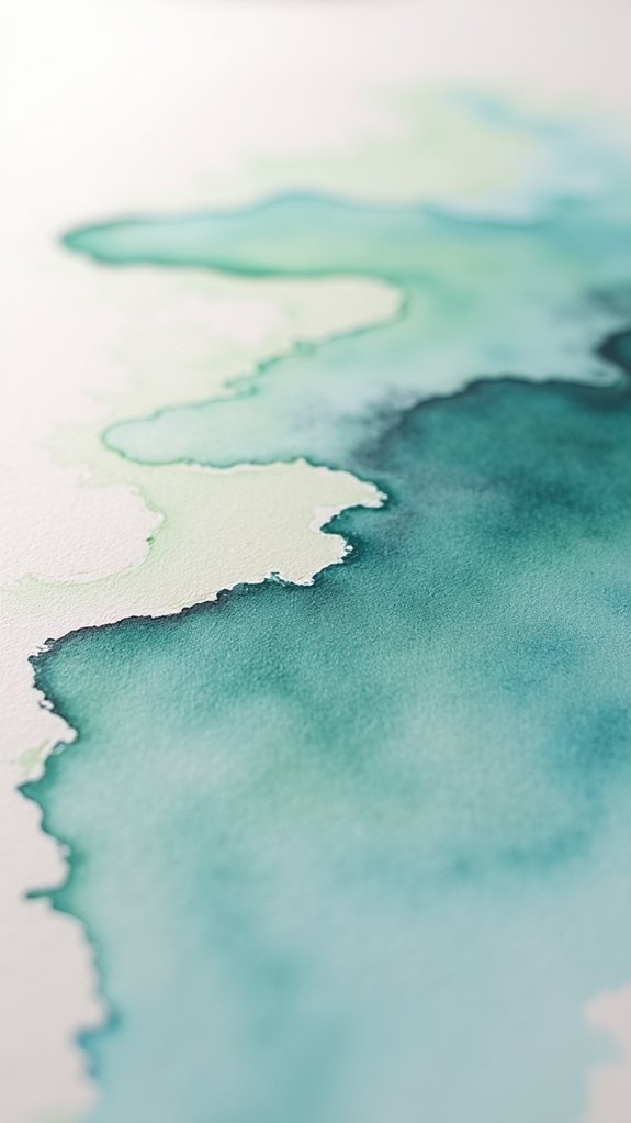
Wet-on-wet painting is where the magic of watercolor happens—colors meet on a wet surface, swirling together for the most amazing soft edges and dreamy blends.
Getting those fluid color shifts is a bit like coaxing cats—they go where you want if you know a few tricks, like watching how the paint spreads and giving the paper just the right tilt.
With a little practice, it’s honestly thrilling to take charge and watch the colors mix and move right before your eyes!
Creating Fluid Color Transitions
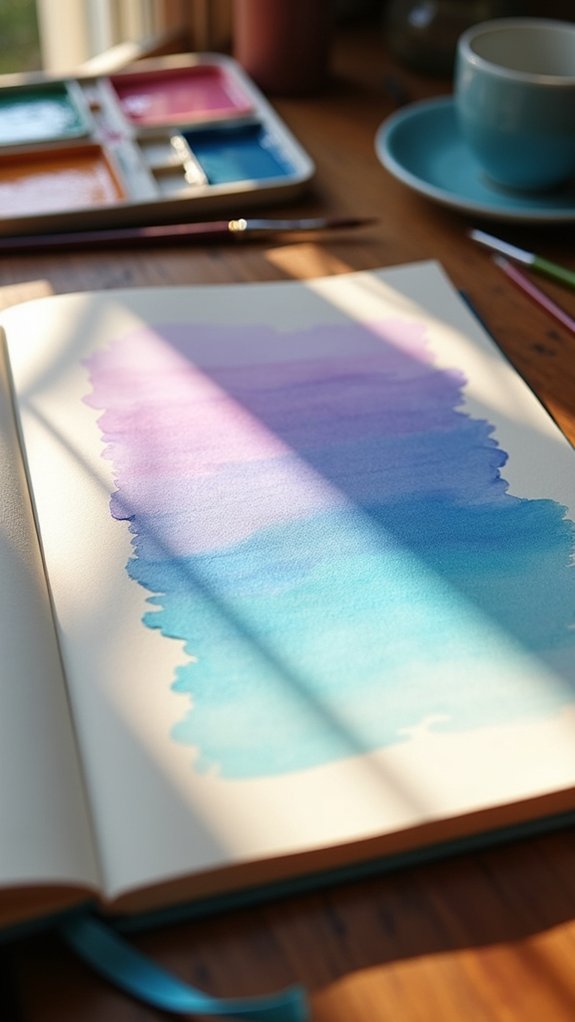
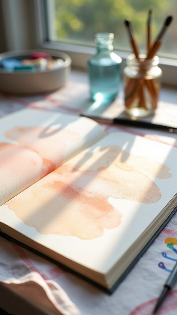
Even though watercolor painting might seem tricky at first, creating soft, dreamy color changes isn’t as mysterious as it looks—in fact, it all starts when the paper gets that magical touch of water.
In this blog post, readers learn that by pre-wetting their page, especially if using a trusty Etchr Sketchbook, they enable smooth shifts and gentle blends.
Acid-free, 100% cotton cold pressed paper is super absorbent, letting colors flow and mingle like old friends at a party—no harsh lines, just good vibes.
Dab water onto your brush first and experiment by tilting the paper for even more movement and exciting effects.
A gentle mist from a water sprayer can set the stage for those soft, glowing edges that make watercolor painting truly magical.
Controlling Paint Spread
Once those beautiful watery backgrounds start to take shape, it’s time to level up and get serious about actually steering the paint—rather than just hoping for a happy accident!
Water control techniques are the secret to this magic. Pre-wetting the paper helps control how much the paint spreads, so you can actually decide where it goes, instead of letting it run wild like a river.
Mist your page with a spray bottle for extra fine moisture management strategies, perfect for blending but not drowning your design. Tilt the sketchbook and watch the paint dance—gravity’s suddenly on your team!
Play with paint consistency variations by adjusting water on your brush: more water = softer edges, less water = crisper marks. Artist-grade paints like Daniel Smith really kick up the smoothness.
Layering Transparent Washes

Layering transparent washes is all about sneaking up on big, bold color one soft step at a time—you start light, keep things gentle, and before you know it, your painting glows like it’s lit from within.
Each layer acts a bit like sunglasses for your page, letting you shape depth and drama without losing that bright, clear look underneath.
Glazing this way takes patience, but hey, the reward is pure magic—who knew waiting for paint to dry could be so exciting?
Building Depth Gradually
Imagine a painting that seems to glow from within, each color quietly building on top of the last to create a picture you could almost step into. That’s the magic behind building depth gradually with watercolor techniques.
By starting with light washes and slowly layering darker colors, artists create soft, dreamy scenes. Think of it like making a sandwich, but with color!
Good brush selection is key—use a soft, round brush for smooth blends. Always let each transparent wash dry before adding another to keep your colors bright and fresh.
Color theory matters here too; stacking blues on yellows, for example, creates rich greens.
- Begin with light colors and thin washes
- Allow layers to dry for crisp edges
- Add darker shades for depth
- Use sturdy sketchbook paper for smooth results
Glazing for Subtlety
Every watercolor artist chasing that soft, glowing look will probably bump into glazing sooner or later—it’s like a secret ingredient for subtlety.
Glaze techniques are all about layering transparent washes of color over already dried paint. This isn’t just tossing on more color—it’s real-deal magic. Each transparent wash lets the colors below peek through, giving amazing depth without wiping out details.
But here’s the twist: you have to wait until your layer is bone-dry. Jump the gun, and it’s muddy city.
Artist-grade transparent watercolors work best—think of them as the superheroes of color layering, packing a punch with minimum effort.
And don’t forget good paper, like cold or hot pressed, because that’s your stage for smooth, glowing glazes.
Try mixing up those layers for wild, beautiful results!
Preserving Luminosity Layers
Light is the real superstar when it comes to making watercolor paintings look brilliantly alive.
Preserving luminosity layers isn’t just a fancy term—it’s one of those layer transparency techniques that can make your artwork glow like it’s been sprinkled with a little magic.
When stacking thin, see-through washes, each layer lets light bounce off the paper below, helping you achieve luminous effects and maintaining color vibrancy.
But patience is key, or your masterpiece might turn into a mud puddle!
For some superhero-level tips, check these out:
- Wait for each transparent wash to dry—no shortcuts!
- Start super light, then go darker each layer.
- Pick high-quality paints like M Graham or Daniel Smith for maximum glow.
- Choose sturdy sketchbook paper (Etchr’s a winner) to avoid buckling.
Creating Graduated Color Transitions
Although blending colors might sound like magic, creating smooth, graduated color shifts in watercolor is actually all about smart technique—and a little patience.
First, the right blending techniques matter: pre-wet the area (Method #2), so your paint glides without sharp lines. Using cold pressed paper, like in the Etchr Sketchbook, gives you more time for gentle mixes.
Brush selection isn’t just about style—choose a soft, round brush for better control over edges. According to color theory, placing harmonizing hues side by side helps you avoid muddy mixes.
Add water gradually (Method #1), diluting pigment as you move to the lighter side for that seamless fade. Don’t shy away from tilting your paper or misting with a water sprayer—both tricks can supercharge your shifts!
Softening Edges With a Clean Damp Brush
Sometimes, the magic of watercolor isn’t in what’s painted—but in what’s gently blurred away. Softening edges with a clean damp brush lets artists make colors dance into each other, like fog rolling over hills. It’s a cool trick!
Just grab a brush, dab it on a paper towel until it’s only damp, and gently swipe along the edge of wet paint. This watercolor softness strategy helps blend colors, avoiding harsh lines.
Want to nail this brush technique tip? Remember: too much water can make things messy! For killer results, experiment on sketchbooks like the Etchr, perfect for smooth edge blending methods. Try it on different surfaces—a little bravery goes a long way.
- Moisten brush—never soaking!
- Lightly touch edge
- Blend gently
- Practice, laugh, repeat
Lifting Color for Gentle Highlights
A lot of watercolor magic happens when artists learn the secret of lifting color to create gentle highlights. It almost feels like uncovering hidden light in their paintings!
Lifting techniques involve using a damp brush or even a clean sponge to gently swipe away a bit of paint. The goal? To reveal brighter, softer spots—like the glint on a shiny apple or the tip of a petal.
But, don’t just attack the paper; highlight placement really matters. Work on slightly damp paint for best results, and always pick your brush selection with care. Soft round brushes make nice, subtle highlights, while fan brushes can add texture.
Practice on good, sturdy watercolor paper, and remember: start small, so you don’t overdo it and erase your masterpiece!
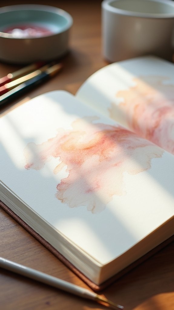
Using Natural Drying Time for Blended Effects
After brightening up highlights by lifting color, there’s another kind of magic in watercolor: letting time itself do some of the work. Instead of forcing pigment to blend, artists can use natural blending techniques by paying attention to drying time effects.
Watching wet paint slowly merge is almost hypnotic, and small changes in humidity or temperature make big differences. Color diffusion strategies come alive when the paper is damp—one swipe of paint meets another, and suddenly there’s a smooth, dreamy edge.
Want to give it a try? Here are a few handy tips:
- Watch how colors flow and blend while the surface is still wet.
- Apply new colors when the paint is damp, not dry.
- Experiment with humidity; it changes everything!
- Take notes on your favorite drying time effects.
Controlling Water Flow for Subtle Movement
Getting those soft, dreamy watercolor looks isn’t just about luck—it’s about smart moves, like tilting your paper to guide the flow and paying attention to how much water is in your brush (trust me, a puddle on the page is never the plan).
Picking the right paint matters too, because some just blend like magic, making those gentle color shifts way easier to pull off.
With a bit of practice, anyone can control where colors wander, turning watery chaos into controlled, subtle movement.
Adjusting Paper Angle
Ever wondered why those brilliant watercolor artists keep their boards at funky angles, like they’re preparing for takeoff?
It’s not just a wild stylistic choice—it’s all about controlling those sneaky watercolor flow dynamics! Adjusting the paper angle lets artists pull off soft blends or sharp edges, depending on what magic they’re after.
A steep tilt lets paint cascade gently, creating dreamy, soft shifts. Think of it as skateboarding for paint; gravity is in charge!
Here’s how adjusting the paper angle creates awesome soft effects:
- Steep angles make paint flow fast, great for wide, blended areas.
- Low angles increase paper stability techniques and help with precision in tight spots.
- Angle experimentation benefits—discover unexpected pooling or blending.
- Directing paint—tilting aims color exactly where you want softness.
Managing Brush Wetness
Water is the secret sauce of watercolor painting—seriously, it decides if your colors will blur softly into each other or stop in their tracks.
Managing brush wetness is all about striking the right water balance, tweaking your brush control techniques, and matching your paint consistency to the effect you want.
Want gentle color shifts? Use a wet brush and watch those colors slide around like they’re at a party.
Need defined edges? Dab off some water—less is more for crisp results.
For big, swoopy areas, loading up your brush with water first works wonders, but smaller details ask for a pre-dampened brush and a little patience.
Artists who experiment with brush wetness really get to dial in those dreamy, soft edges, no magic required.
Selecting Paint Quality
Some watercolor paints just seem to have a mind of their own, gliding across paper like they’re on a quest for soft, dreamy edges—while others barely budge, no matter how much water you throw at them.
That’s really the magic (or the madness!) of choosing between premium versus student watercolor paints. Premium paints—think M Graham or Daniel Smith—move and blend super smoothly, thanks to higher pigment and lower paint viscosity effects, making them perfect for soft effects.
Student-grade paints? Well, they tend to “park” themselves, staying put on the page.
Here’s how paint quality changes everything:
- Premium paints flow more, making subtle edges easier.
- Student paints have lower color saturation levels, so blends look dull.
- Viscosity effects impact softness—thin paints drift beautifully.
- Different brands create unique blending surprises!
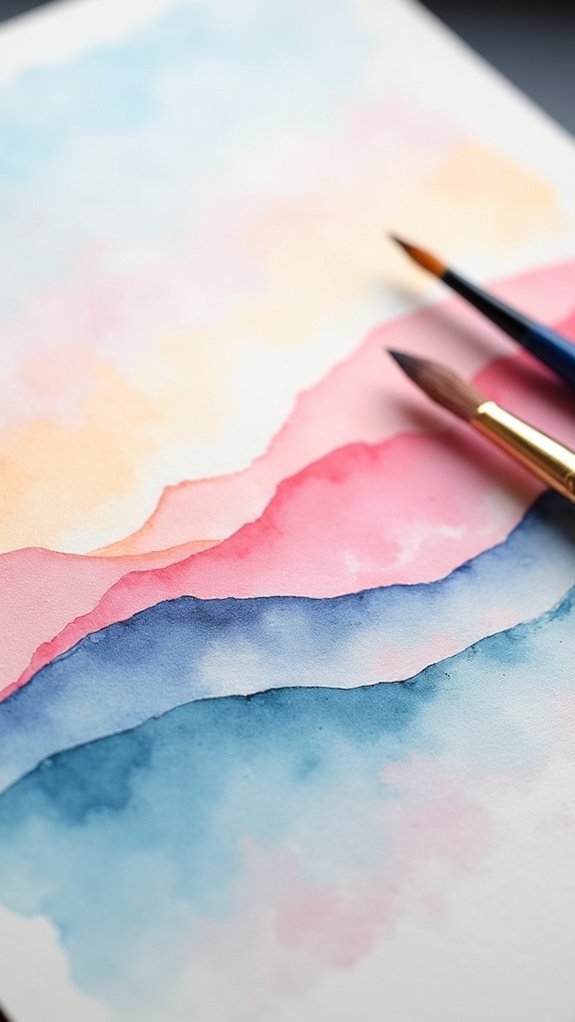
Mixing Colors Directly on the Page
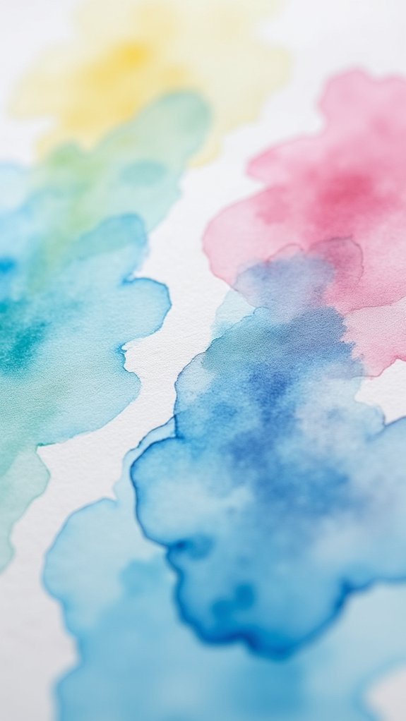
Splashing different colors right onto the page is where the magic of watercolor really comes alive. When artists mix colors directly on the sketchbook, they witness color harmony unfold right before their eyes. It’s almost like watching science and art have a dance-off—different pigments interact, swirl, and blend as you play with water and a wet brush. Using high-quality materials, like artist-grade paints and thick paper, helps keep those soft, dreamy edges. Tilting the paper? That’s the secret move for gravity-powered blending, letting colors glide into one another instead of making a muddy mess. Take a peek at some handy tips:
| Tip | Effect on Mixing |
|---|---|
| Use a wet brush | Softer shifts |
| Tilt your sketchbook | Gravity aids blending |
| Pre-wet your paper | Smoother pigment flow |
| Try quality paints | Vibrant color harmony |
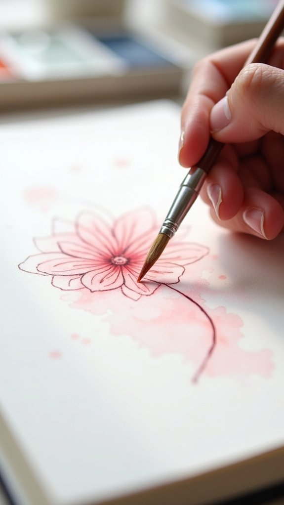
Dropping in Color to Enhance Softness
Quite a few artists would agree—dropping in color is where watercolor starts to feel a bit like magic.
Imagine a brush loaded with deep blue or vibrant red, hovering over a glistening puddle on the page. The instant that color touches the wet surface, it blooms, drifting and mixing, making softer shapes than you could ever brush alone.
Dropping in color is more than luck, though—it’s understanding color theory, playing with brush techniques, and recognizing the pigment properties at play.
Here are some quick pointers:
- Load your brush with concentrated color and dab it into already-wet paper.
- Use artist-grade paints for the best flow and brightness.
- Adjust water carefully; too much or too little changes the effect.
- Experiment with color combos for surprising soft blends!
Pre-Wetting for Controlled Blending
Dip a clean brush into water and you’ll release one of watercolor’s best tricks: pre-wetting. It’s like setting the stage for color to dance, but only where you want it!
The key pre-wetting benefit is controlled blending—when you add paint to a pre-wetted patch in your sketchbook, colors slide together in a soft, dreamy way without running wild. This really shines in small spaces, making shifts buttery-smooth.
Now, not all pre-wetting techniques are created equal. Too much water, and your colors might bolt for freedom. Too little, and blending just fizzles.
Top tip: high-quality watercolor paper, like in an Etchr Sketchbook, helps a ton. Pre-wetting challenges? Yep, the water amount is tricky, but mastering it totally pays off.
Spraying Water for Organic Textures
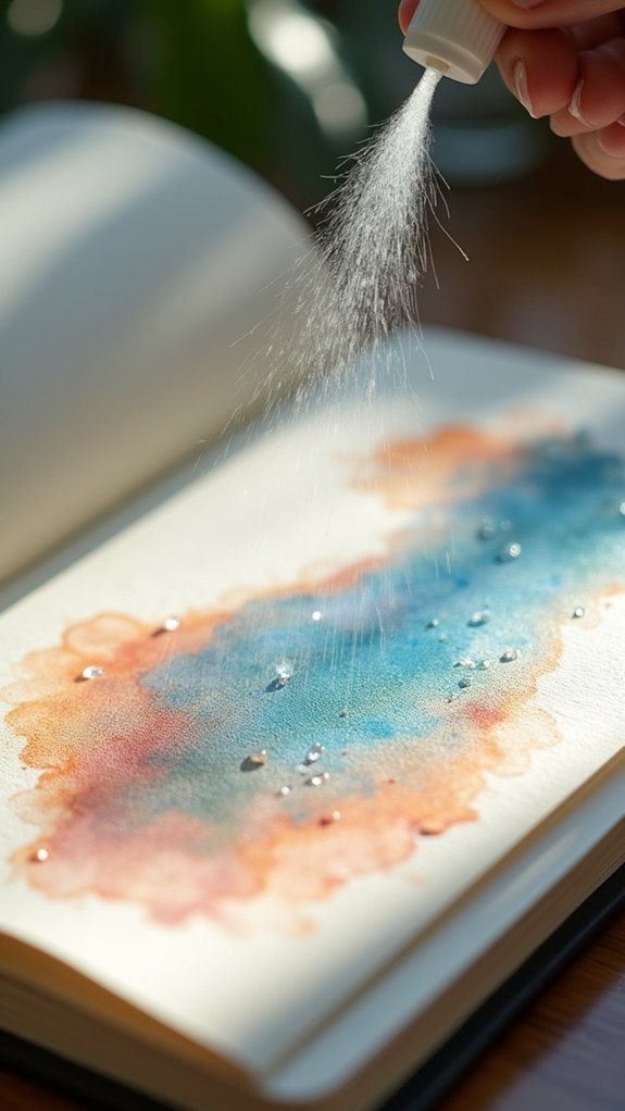
Imagine the satisfying whoosh of a water sprayer—suddenly, painting feels more like playing.
Sprayer techniques give artists a ton of control over moisture, revealing endless ways to create organic textures. Just a gentle mist can help paint move and blend all on its own, making those magical soft-edge effects. It’s fantastic for capturing wild mist, dreamy clouds, or natural-looking backgrounds.
Want to try it? Here’s how sprayer techniques bring surprises:
- Spritz water before painting for smooth swirls and texture enhancement.
- Spray onto fresh paint for cool, unpredictable color flows.
- Use a fine mist for moisture control—helpful for changing conditions, especially outside.
- Boost texture enhancement in both open washes and tiny, detailed spots.
With a water sprayer, every splash feels new.
Minimizing Brush Marks for Seamless Areas
Nothing ruins a dreamy watercolor wash faster than those pesky brush marks—like uninvited guests at a pool party. For artists who crave seamless areas, there are some clever tricks to keep those streaks at bay.
First, start with a color palette selection that includes high-quality, artist-grade paints; these flow smoother and blend better. Next, give the paper a quick pre-wet—think of it as rolling out a red carpet for your paint. This helps the colors glide smoothly.
Try using a wet brush before loading it with paint, which softens brush techniques and blending styles, making everything look more unified. Mist lightly with a spray bottle if you need even softer edges.
And remember, the right paper, such as the Etchr Sketchbook, makes all the difference!
Blotting With Tissue for Subtle Transitions
With the streaks tamed and the paint flowing smoother, artists sometimes bump into another watercolor hurdle—those spots where two colors meet and the edge just looks, well, kind of awkward.
Blotting techniques can rescue those changes, using a tissue like a magic wand to soften harsh lines. This blending method is all about timing and gentleness. A quick dab—never a wipe—keeps the paper texture safe and doesn’t overwork the paint.
But don’t just grab any tissue! Tissue selection matters. Lint-free types leave fewer fuzzies and keep your art looking sharp, not fuzzy. Act fast while the paint is wet for the best results.
- Dab, don’t wipe, for soft edges
- Blot immediately after painting
- Use lint-free tissue for best results
- Lift excess paint for gentle changes
Incorporating Salt for Delicate Soft Patterns
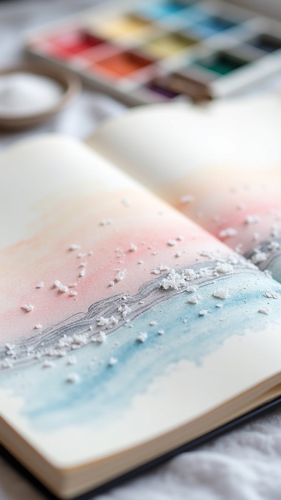
Choosing the right kind of salt turns this watercolor trick from “meh” to magical, with big flakes like sea salt leaving bold, spotty marks and table salt creating finer, softer speckles.
The real secret, though, is timing—add salt while the paint is still damp but not puddly, or things could get messy in a hurry.
Figuring out just the right moment and salt for your masterpiece feels a bit like wizardry (and yes, you get to be the wizard).
Choosing the Right Salt
A pinch of salt might seem like just something you sprinkle on your fries, but in watercolor art, it’s a total game changer.
When it comes to choosing the right salt, salt types comparison is pretty important! Coarse kosher salt drops bold, patchy clouds, soaking up pigment and leaving wild, dramatic marks. Fine table salt, though? It’s sneakier—giving you soft, intricate patterns that look almost magical.
Don’t grab just any salt, though. Each type gives a different twist, and salt application techniques vary, so try a few out and see what works! With a little experimenting textures, you’ll find your favorite.
- Coarse kosher salt: Bold, textured patterns.
- Fine table salt: Delicate, subtle effects.
- Salt size: Influences the softness and spread.
- Experiment: Mix types and placements for unique art.
Timing for Optimal Texture
Ever wonder why timing is so important when you’re tossing salt onto wet watercolor? It’s all about catching that perfect moment—when the paint is damp, but not puddled, salt absorption techniques work their magic.
Drop the salt too soon, and it sinks into the color soup, barely making a splash. Wait too long, and the paint’s already said goodbye to moisture, leaving salt sitting there feeling awkward.
Timing application strategies make or break those delicate, soft patterns by letting the salt draw out just the right amount of pigment and water. Using different salt sizes and testing out texture variation methods on cold-pressed paper can totally change the effect.
Don’t forget to let it dry, then brush off the salty leftovers—ta-da, instant watercolor wow!
Glazing Layers for Additional Depth
While some folks think watercolor is all about happy accidents, glazing is one technique that puts artists totally in control.
Glazing techniques let you stack super thin washes of color, one over another, to boost color transparency and build awesome layering effects. Each glazed layer adds something special—a new glow, a hint of shadow, or a pop of unexpected color.
But here’s the big tip: if you get impatient and layer too soon, you end up with a wild, muddy mess instead of luminous depth. So, trust the process and let each layer dry completely!
- Always use transparent watercolor for glazing techniques.
- Wait until each layer is dry to keep colors crisp and clear.
- Play with different color combinations to explore layering effects.
- Test on different sketchbooks for best results with color transparency.
Softening Details With a Misty Overlay

When artists want to make a painting look soft and hazy, layering gentle color washes can work like magic, almost as if clouds are drifting right over the details.
Sometimes, even after adding soft washes, certain edges might look a little too sharp—no problem, because lifting edges with a wet brush or extra water can blur those lines in an instant.
It’s a bit like erasing part of a chalk drawing with your finger—messy in a fun way, and always surprising!
Layering Gentle Color Washes
Although it might sound fancy, layering gentle color washes is just a clever way to make watercolor paintings look dreamy and soft, like a scene in a hazy memory.
Artists start with color theory basics—using light, watery paint to build up soft hues step by step. Different brushes change the washes dramatically; flat brushes sweep over a wide area, while round brushes help blend small sections, so a brush types comparison helps a lot!
Layering techniques analysis shows that letting each layer dry a bit keeps things subtle, not streaky. Cold-pressed sketchbooks, like the Etchr, are awesome for this because they soak up the paint just right.
To break it down:
- Pre-wet paper for smooth blends
- Apply transparent color washes
- Mist lightly for longer blending
- Let layers dry slightly between applications
Lifting Edges With Water
A lot of watercolor artists love the look of soft, dreamy edges, and lifting edges with water is like waving a magic wand to make that happen.
With clever water brush techniques, artists gently mist painted areas, then swoop in with a soft brush to lift up some color. This edge manipulation method means shapes don’t have to look stiff—colors blend into each other, swirling together in a misty overlay that’s honestly pretty magical.
Controlling how much water you use is key; too much and you’ll have paint puddles on the loose, but too little and stubborn edges stay put.
Watercolor blending effects also depend on your paper—cold-pressed brings more texture, while hot-pressed keeps things smooth.
Experiment, and watch edges melt like morning fog!
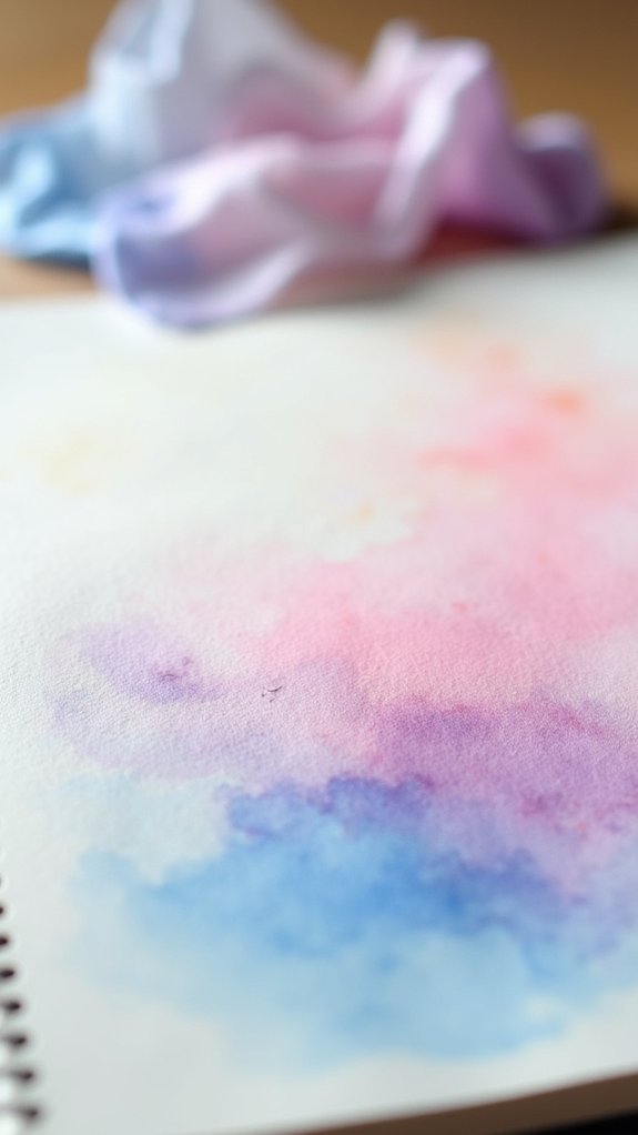
Using Gravity for Natural Color Movement
Envision this: tilting a sketchbook ever so slightly and watching watery bursts of color gently slide across the page, like a rainbow going down a waterslide—except you’re in control of the ride.
That’s gravity effects in watercolor, and it totally changes the paint flow. By letting gravity do its thing, artists create soft blends and wild, dreamy gradients, all just by tipping the paper.
Cold pressed cotton paper, like the Etchr Sketchbook, soaks up water perfectly, letting the colors blend and move without making puddles. Pre-wetting the area is the secret for smooth color blending and softer edges—no harsh lines allowed!
- Start with wet paper for easy color movement.
- Tilt the sketchbook for directional paint flow.
- Layer colors for smooth shifts.
- Try different angles for unique gravity effects.
Frequently Asked Questions
How Do You Make Watercolor Look Soft?
To make watercolor appear soft, an artist often uses watercolor layering, soft brushwork, and gentle color blending. Pre-wetting the paper and angling the surface enhance flow, while artist-grade paints and misting techniques further refine soft shifts.
Is a Sketchbook Good for Watercolor?
A sketchbook can be suitable for watercolor if it uses proper watercolor paper, offers adequate sketchbook weight, and absorbs paint well. Paint consistency also matters; lighter washes may work better on some sketchbook papers than heavy applications.
How Can You Create Textured Effects With Watercolours?
To create textured effects with watercolours, one might use the wet on wet technique for organic blends, sprinkle salt for unique salt texture, and achieve depth by layering colors. Tools such as sponges and textured paper enhance results.
How to Get Smooth Watercolor?
Achieving smooth watercolor involves using the wet on wet technique for seamless color blending, careful brush selection for clean, controlled strokes, and pre-wetting paper to allow pigments to flow naturally, resulting in soft shifts and even washes.
Conclusion
Watercolor is like magic in a sketchbook—soft edges, dreamy colors, and endless ways to experiment. Practice these 18 techniques, and soon, your pages will feel like secret treasure maps, shimmering with soft effects and hidden details. Remember, it’s okay to get a little messy or have colors run wild—sometimes, that’s when your best art happens! So grab your brushes, splash some water, and let your imagination do the rest. Every sketchbook is a brand-new adventure.
Leave a Reply