
Sketchbook wallpaper backgrounds can totally level up art pages, whether you’re into vintage paper, messy ink splatters, or bold comic book halftones. Mix it up with watercolor washes, soft pastel smudges, geometric patterns, or even weathered concrete for serious texture. Try adding torn collage edges, cool handwritten script, or delicate botanical lines for extra flair. These backgrounds make art pop and keep sketchbook spreads from ever feeling boring. Stick around to find even more wild ideas to try!
Key Takeaways
- Vintage paper textures and weathered concrete surfaces add nostalgic or urban vibes as versatile, neutral backdrops for layered art.
- Abstract color gradients and layered color variations infuse energy, emotion, and depth without distracting from main sketches or paintings.
- Geometric patterns and retro comic book halftones introduce visual interest and cohesion while spotlighting central artwork.
- Botanical line illustrations and soft pastel smudges offer organic, gentle backgrounds that frame art without overpowering composition.
- Dynamic techniques like ink splatters, controlled chaos layering, and playful texture experiments create engaging, textured foundations that unify or accentuate sketchbook spreads.
Watercolor Wash Background

Watercolor wash backgrounds are like a magical mood-setter for any sketchbook page, giving art that cool, dreamy vibe everyone loves. Imagine starting with a soft blue or peachy swirl—suddenly, the page isn’t empty; it’s alive!
These backgrounds use neat techniques like wet-on-wet or dry brush, letting you get creative with how colors bleed and blend (sometimes it’s wild, but that’s the fun part).
In digital art tools such as Sketchbook Pro, messing around with a watercolor wash background gets even cooler. By adding washes to a layer with an alpha channel, artists can keep things transparent, letting main sketches pop.
Geometric Patterned Layers
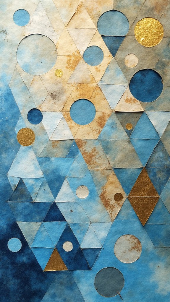
Triangles, circles, and squares become way more exciting when they team up to make geometric patterned layers. In a sketchbook, this kind of background layer really sets the stage for your main art, kind of like the coolest opening band ever. These patterns, whether bold and bright or soft and subtle, can pull eyes right toward the heart of your masterpiece. Want to make things pop? Use contrasting colors and play around with varying opacities. Creating an alpha channel lets artists tweak transparency, making their geometric patterns blend in smoother or stand out stronger. It’s all about experimenting until you find a vibe that fits your style. Check out this table for inspiration:
| Tips for Geometric Layers | Cool Effects |
|---|---|
| Mix shape sizes | Adds dynamic movement |
| Repeat patterns | Creates unity in the background |
| Adjust opacity (alpha) | Makes layering seamless |
Abstract Color Gradients

A splash of color can totally change the vibe of a sketchbook page, and abstract color gradients are like the secret superpower for dreamy backgrounds. With a smooth blend of colors, these gradients create an awesome sense of movement and energy, making any Art Sketchbook instantly more interesting.
When used as a background layer, gradients give depth without stealing the spotlight—kind of like the really cool backup dancer for your main sketch. Artists can create these gradients digitally or with hands-on materials like watercolor or pastels—either way, experimenting is half the fun.
Adjusting the layer’s opacity helps the art stay center stage, but still lets those wow-worthy colors peek through. Try out styles like linear, radial, or even weird, wild angles for something truly unique!
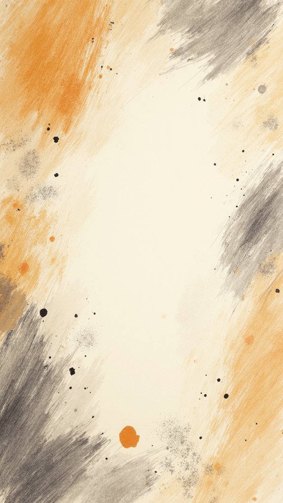
Vintage Paper Texture
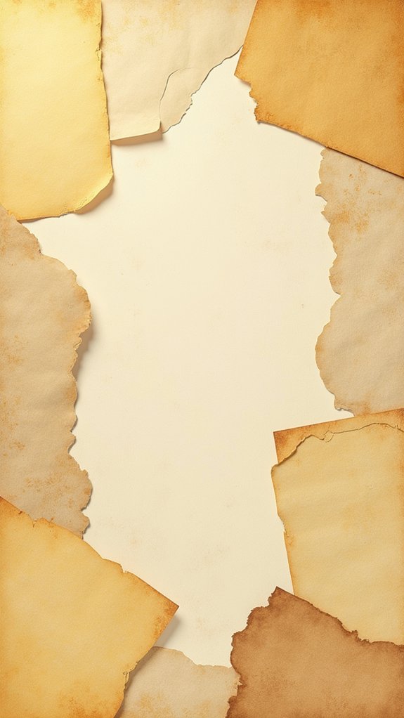
Vintage paper textures are like a time machine for your sketchbook, letting you create that cool, aged-paper effect without raiding your grandma’s attic.
They can totally boost collage projects, making scraps and drawings pop against a background that looks straight out of an old treasure map.
Plus, when you use these textures in digital art, you can easily mix, match, and tweak them until your piece feels just right—no coffee stains required!
Creating Aged Paper Effects
If you’ve ever wanted your sketchbook wallpaper to look like it came straight out of an old library—or a secret wizard’s journal—you’re in for a treat.
Creating aged paper effects is all about setting a background that whispers stories from long ago. Start by dropping a textured brush layer at the bottom of the layer stack, giving you that crunchy vintage paper look.
Adjust the alpha (opacity) so your main art still shines through, but everything feels old-school. Toss on a little yellow or brown overlay, dialing the opacity way down, and your page is suddenly centuries old.
Wanna go next level? Add noise or a touch of grain, then swipe a gentle Gaussian Blur for soft, worn edges—poof, wizard cred released!
Enhancing Collage Aesthetics
Stacks of old paper, each with its own crinkle and faded edge, have a special way of making collage backgrounds feel like secret treasure maps or pages out of a detective’s notebook.
When artists choose a vintage paper texture as the base layer in their Sketch Book, something almost magical happens—the artwork takes on this cool, old-school vibe that makes anything layered on top pop.
Mixing different shades, or tucking in patterned scraps, adds just the right amount of chaos to keep things interesting.
With a Layer Editor, creators get to play with opacity, perfect for sneaking in extra details or fading things out where needed.
Every choice, from texture to transparency, makes the story richer—like adding new suspects to a case.
Digital Texture Application
Drag and drop a scanned paper into your art app and—boom—suddenly your digital sketchbook looks like it has a hundred years of secret history.
That’s the magic of digital texture application, especially when you use vintage paper textures. Artists love these weathered backgrounds because they totally change the vibe of a page, making any doodle or sketch seem legendary.
If you’re curious about digital texture techniques, here’s a quick breakdown:
- Scan or download high-res vintage paper for those unique fibers and stains.
- Use clever layering strategies—place the paper texture beneath your art layers.
- Play with texture blending by adjusting the opacity and trying different blending modes.
- Combine multiple textures to invent your own “ancient” look.
Basically, it’s creative time-travel—with pixels.
Botanical Line Illustrations
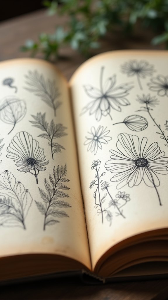
Botanical line illustrations are like secret messages from nature, hidden in the twists of a pen. These drawings use delicate linework techniques to capture the smallest details—think wispy leaves, petals, and vines. When used as sketchbook wallpaper backgrounds, they invite the viewer into a quiet world where plants tell their stories without saying a word. Artists dive deep into botanical symbolism exploration, finding meanings in every stem and bloom. Layering organic shapes makes each page come alive, as though a garden is tucked behind your sketches. They’re perfect for adding depth, yet gentle enough so your main art takes center stage. Check out how artists use these ideas:
| Linework Style | Symbolism Explored | Organic Shape Use |
|---|---|---|
| Thin, precise | Growth, renewal | Layered leaves |
| Flowing vines | Simplicity, harmony | Overlapping petals |
| Shaded stems | Strength, resilience | Curved branch lines |
Subtle Grid Overlays
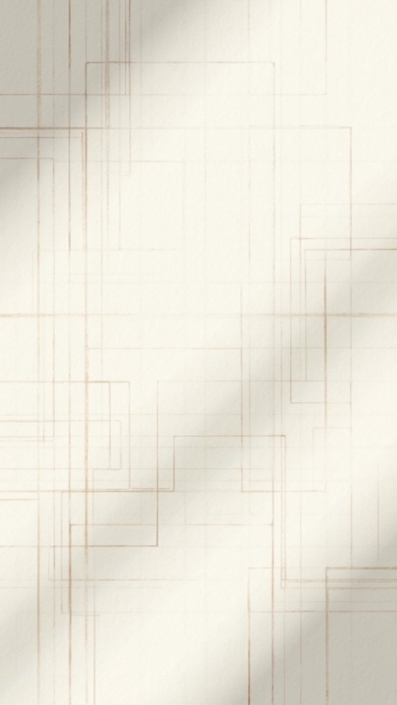
While leafy linework brings wild nature into a sketchbook, sometimes a little order makes the whole page shine. Subtle grid overlays totally change the game!
With grid alignment techniques, even the wildest ideas can snap into place perfectly—no more lopsided castles or slouchy robots.
Artists are loving:
- Boosted Precision: Grids help nail down proportions and keep lines steady, making perspective way less scary.
- Creative Control: With digital customization options, artists tweak grid color, size, or transparency for just the right look.
- Style Flexibility: From classic Cartesian grids to trendy isometric ones, there’s a grid for every project vibe.
- Layering Magic: These overlays offer artistic layering benefits, letting the main art shine while the grid quietly does the heavy lifting.
Try laying a grid and watch your art come alive!
Bold Brushstroke Motifs
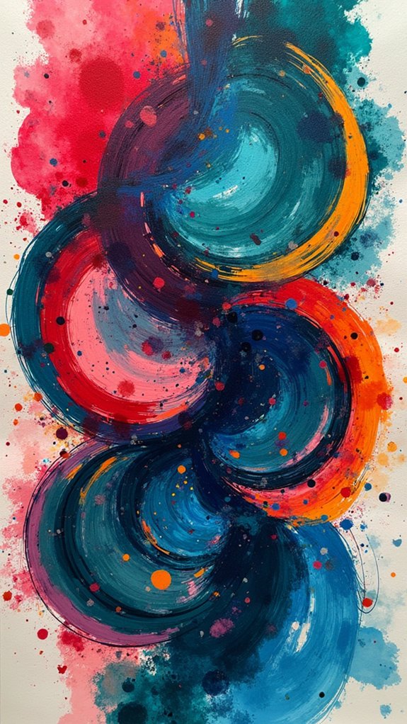
There’s just something electric about bold brushstroke motifs blasting across a sketchbook page. They’re all about bold color exploration, splashing reds, blues, or crazy neons wherever your imagination wants to wander.
These backgrounds don’t just sit quietly—they add serious drama with energetic, sweeping lines and wild brushstroke techniques. Each swipe can create awesome textures, making plain pages look dynamic and full of life.
Layering art on top of these wild backgrounds is like placing a hero in an action movie—the main event pops out, but the energy behind them is impossible to ignore. Plus, these motifs are great for showing emotional expression, whether you need a stormy mood or a burst of excitement.
No two pages will ever look quite the same!
Pointillism Dot Fields
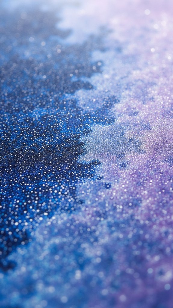
Pointillism dot fields are like magic, turning basic backgrounds into something totally eye-catching just by arranging hundreds of tiny dots.
Playing around with different colors, mixing close shades or bold contrasts, can make the flat page look surprisingly deep or almost 3D—no special glasses required!
Creating Dot Pattern Textures
Plunge into and discover how a bunch of tiny dots can totally transform your sketchbook backgrounds. Seriously, it’s wild how those little specks can bring a page to life!
With pointillism, artists play around with dot density variations, color mixing techniques, and clever layering strategies to create crazy cool textures and effects. If you want your dot patterns to stand out, check this out:
- Adjust dot size and spacing for wild or subtle texture—packed dots vs. breezy gaps.
- Grab a brush that lets you experiment with color mixing techniques for eye-popping gradients.
- Try layering strategies, stacking some dots over others for depth (no, it isn’t cheating).
- Use a grid overlay so your dots don’t go totally rogue or off the rails.
Dots—simple but brilliant!
Layering With Color Variations
After messing around with tiny dots and seeing how they can totally jazz up a page, it’s time to take things further with color.
Imagine building a background that’s more than just specks—it’s a whole mood! By switching up the colors in pointillism dot fields, artists launch into a journey of color psychology exploration. Hot pinks might spark excitement, while blues chill things out, all thanks to emotional resonance techniques.
Plus, using vibrant contrast applications can make everything pop, turning plain dots into fireworks for your eyes. Even better, adjusting dot size and spacing loads the background with energy and keeps things interesting.
With transparent alpha channels, these lively color fields blend perfectly under any art, adding richness and making viewers want to look closer.
Enhancing Depth Using Dots
While some people might think that doodling with dots is just a way to pass the time, using fields of tiny, colored circles can actually give a flat sketchbook page a surprising amount of depth.
Pointillism isn’t just for fancy art museums—it’s a trick you can use in your own sketchbook, right now. By playing with pointillism color blending, adjusting dot density manipulation, and messing around with light shadow interplay, artists can totally change how the background looks and feels.
Here are four cool ways you can use pointillism dot fields to amp up the depth:
- Layer bright and dark dots for shading effects.
- Mix colors for cool gradients.
- Pack dots closer for shadowy areas.
- Space out dots for highlights and shine.
Torn Collage Edges
Torn collage edges are like the rebels of the art world—messy, dramatic, and totally awesome for giving sketchbook backgrounds that extra bit of flair.
Instead of perfectly trimmed lines, torn paper creates textured layers that make everything look bolder and more exciting. Collage techniques like this bring a cool clash between jagged and smooth, which makes the artwork pop.
When artists tear paper—anything from magazine clippings to textured scraps or even bits of fabric—the wild edges stand out against the rest, drawing eyes deeper into the page.
Using techniques like layering and blending with an alpha channel, artists can keep those edges crisp and transparent, so every layer shines through.
Torn collage edges? Pure chaos that seriously upgrades any background.
Soft Pastel Smudges
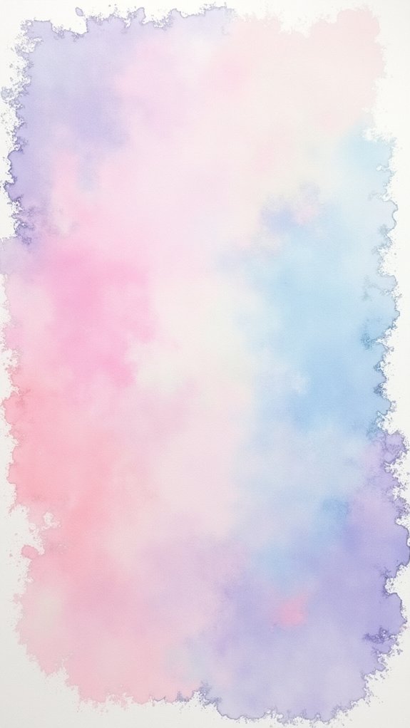
Soft pastel smudges are kind of magical—they let you blend colors super smoothly, almost like mixing frosting, to make backgrounds that feel soft and dreamy.
With a few clever moves, like layering light shades and gently blending with your fingers, it’s possible to craft gentle gradients that look like they just melted together.
Want your main drawing to really pop? These pastel tricks are definitely worth a try (plus, they’re a total mess, but in a fun way).
Blending Techniques for Pastels
Diving into the world of pastels feels a bit like having a colorful cloud at your fingertips—especially when it comes to blending and smudging those soft pigments.
With just a few easy pastel blending techniques, anyone can jazz up sketchbook wallpaper backgrounds, helping colors melt into each other or pop with dreamy edges. Think smudgy skies, hazy fields, or even cool gradients that look almost good enough to eat.
To master these texture enhancement methods and smooth color shift strategies, artists usually reach for handy tools:
- Fingers—quick and super satisfying for wide, soft blends.
- Blending stumps—nifty for detailed smudging in small spaces.
- Soft cloths—perfect for gentle sweeps across big areas.
- Textured paper—super important so those pigments grip and blend just right!
Keep it fun—and keep those backgrounds vibrant!
Color Layering Strategies
Plenty of amazing effects come to life when artists start layering colors using soft pastel smudges—think of it as building a tasty, colorful sandwich, but with way less mess.
Using color blending techniques, artists can smudge pastels in circular motions with their fingers or a blending tool, making colors melt into each other smoothly. Soft texture applications really shine when you layer colors strategically.
Start with lighter shades as a base, adding hints of darker tones for cool pastel layering effects. Feeling bold? Grab some complementary colors and watch your background make the main artwork pop!
Play around with the opacity of each layer; a thin, wispy smudge can give your background a dreamy, almost magical look—perfect for making your art stand out.
Creating Gentle Gradients
Even though gentle gradients might look like digital magic at first glance, anyone can create them with soft pastel smudges—no wizard hat required.
With just a few strokes and the right pastel techniques, smooth background magic is within reach. To make these dreamy gradient applications pop, all it takes is a bit of planning and a pinch of color blending know-how.
Here’s a simple way to get started:
- Pick a soft brush and lightly swipe on pastel colors over your paper—think less is more at first.
- Layer more translucent strokes, letting the hues blend together like sleepy clouds.
- Use the smudge tool to soften any harsh lines for a seamless gradient.
- Play with opacity for each layer, keeping the vibe gentle and mysterious.
Marbleized Swirl Effects

Magic happens when colors start to blend and swirl together, creating marbleized effects that look like something from an art wizard’s dream. Imagine blobs of teal and raspberry spinning in slow motion across your page—a feast for the eyes and a treat for anyone exploring color blending techniques.
These designs rely on fluid art applications, where artists pour or swirl acrylics, inks, or even digital colors, letting them meet and twist into wild, unpredictable patterns.
The best part? Vibrant contrast exploration means no two backgrounds are ever alike. Deep blue rivers can snake through lemonade yellow, or fiery orange might splash against snow-white.
These playful layers give your sketchbook wallpaper backgrounds amazing depth and character, drawing you in without ever stealing the spotlight from your main masterpiece.
Ink Splatters and Spills
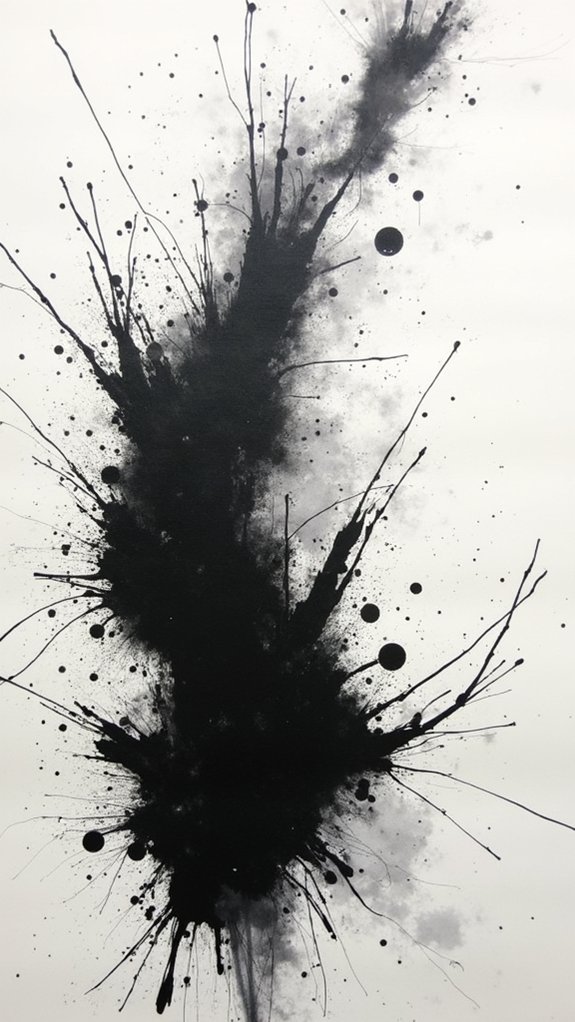
Ink splatters and spills explode onto the page with energy, making backgrounds that look like a controlled mess—a sort of art chaos that’s actually on purpose.
Playing around with ink washes can create wild effects, from soft transparent clouds to sharp, inky bursts, and layering them just adds to the drama.
It’s almost like a game of creative accidents, where texture experiments can spark surprising ideas and even tie a whole sketchbook spread together, sometimes with a few unintentional ink fingerprints for good measure.
Dynamic Ink Wash Effects
Splashes and spills bring a wild energy to any sketchbook page, turning plain backgrounds into something bold and full of life.
Dynamic ink wash effects let artists play with unpredictability, as ink flows and bleeds across the paper in exciting, unexpected ways. It’s like a science experiment—not always tidy, but always interesting!
For those looking to start, here’s what to try:
- Use ink dilution techniques for cool layering effects—just add water to get different shades.
- Experiment with organic shape exploration, letting the ink roam and form shapes that aren’t planned.
- Notice fluid movement dynamics by tilting or blowing on wet ink to create wild, wavy lines.
- Switch up your tools; droppers, brushes, even sticks can invent fun marks.
Go mess around—there’s no wrong way!
Layering Controlled Chaos
For artists who love the wild and unpredictable look of ink washes, there’s a next step that cranks up the excitement even more—layering controlled chaos with ink splatters and spills.
Using ink splatter techniques isn’t just about making a mess; it’s about weaving chaos into your composition with purpose. By playing with chaotic layering strategies, like mixing random splatters with careful placement, backgrounds can pulse with energy.
Some artists use alpha channels for transparency, letting colors and shapes beneath peek through like secrets. Dynamic texture integration also happens when you mix up the opacity and color of each splatter—suddenly, your wallpaper feels alive!
Tweak brush settings or blending modes, and you’ll discover endless ways to balance that wild energy without overwhelming your main artwork.
Playful Texture Experiments
Sometimes, when an artist wants their sketchbook background to really burst with personality, playful texture experiments are the secret sauce. Ink splatters and spills have a way of taking a basic page and supercharging it with energy and movement.
Mixing up different ink types, like watercolor and acrylic, means there’s no limit to the textures you can dream up. It’s like doodling meets mad science—just with less chance of stains on your shirt.
Want your art to really stand out? Try:
- Using ink blending techniques for surprising color combos.
- Practicing splatter control methods—some mess is good, but let’s not redecorate your walls.
- Building depth with clever texture layering strategies.
- Getting digital by using alpha channels for smooth, seamless background merges.
Repeating Textile Prints
Patterns have a way of taking something plain and turning it into a total masterpiece, and that’s exactly what repeating textile prints are all about.
Think about it—layering a seamless string of shapes or florals under your art can totally transform a boring page into a showstopper.
When choosing designs, motif selection guidelines suggest picking shapes that won’t steal the spotlight but still bring flavor.
Print scaling techniques let you go bold with big, brave patterns or soft with tiny, sneaky ones.
Want your art to pop? Color contrast strategies are your best friend. Use light on dark, or dark on light, but keep it eye-catching (not eye-burning).
Thanks to cool digital tools, customizing these patterns is easier than ever!
Graffiti Texture Layers
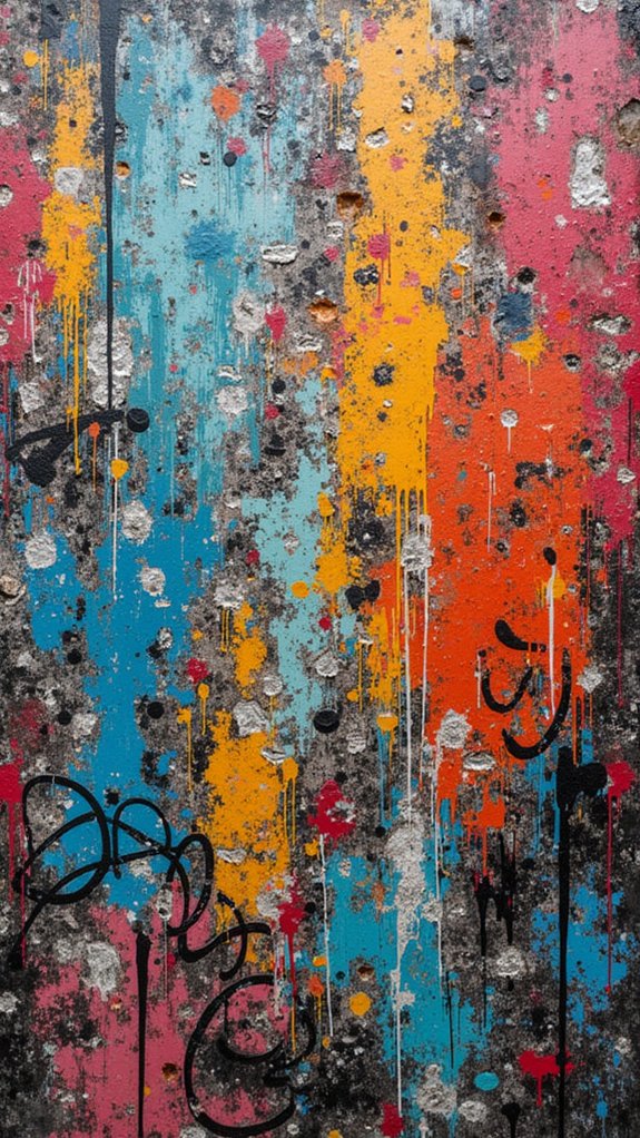
Graffiti texture layers kick things up a notch with bursts of urban color spray effects, adding attitude right behind your main artwork.
Layering these wild textures not only gives your backgrounds serious depth, but also floods the scene with graffiti tag motifs that feel bold and expressive—almost like someone snuck in with a spray can after midnight.
With the right blend, your wallpaper background can go from basic to straight-up street masterpiece, no permission slip required.
Urban Color Spray Effects
Even though digital sketchbooks come packed with all kinds of backgrounds, nothing quite matches the wild, energetic vibe of urban color spray effects.
These wild bursts of color channel serious street-art attitude, turning any drawing into something that feels fresh from the city walls. Graffiti layering techniques let artists layer unique spray paint effects—think drips, splatters, and crazy bright patterns—right behind their main sketches.
Urban texture blending isn’t just about chaos, though; it can be totally controlled using software tricks. For those just starting, here’s what makes these backgrounds stand out:
- Spray paint effects offer wild patterns and colors.
- Graffiti layering techniques bring an urban vibe.
- Urban texture blending gives smooth shifts.
- Custom brushes and alpha channels make each background totally original!
Layering for Depth
Out on the digital canvas, wild color sprays might steal the show at first, but there’s a whole new level of magic waiting when artists start stacking graffiti textures in layers.
Suddenly, the artwork doesn’t just pop—it leaps out with textured contrasts and deep shadows, almost like peeking down a paint-splattered alley.
Thanks to clever layering techniques, artists can blend different graffiti influences, like stencils or abstract shapes, through shifting opacities and fancy alpha channels. This helps the graffiti boost the art, not boss it around.
Positioning these layers at funky angles or spinning them around shakes up each background. It’s like giving every project its own secret graffiti code, making the finished piece look wild, dynamic, and totally unique—never boring, always bold.
Expressive Tag Motifs
Bold lettering and splashes of color—there’s something about expressive tag motifs that just grabs attention right away.
These graffiti texture layers burst with energy, making them awesome backgrounds for any sketchbook art. By digging into graffiti symbolism exploration, artists can find wild ways to tell stories or share feelings.
Urban art techniques like spray painting, stenciling, or even digital tricks really change up how these backgrounds look. Plus, cultural expression analysis helps people notice the bigger meaning behind each tag or swirl.
Here’s how to get started:
- Experiment with layering tag motifs in bright, funky colors.
- Try urban art techniques like stencils or sprayers for different effects.
- Adjust opacity and blending for cool texture blends.
- Explore what those graffiti shapes and words really mean!
Minimalist Monochrome Grounds
Simplicity can be surprisingly powerful, especially when it comes to sketchbook wallpaper backgrounds. Minimalist monochrome grounds aren’t boring, they’re like grabbing one superpower instead of juggling ten. By focusing on monochrome texture exploration, artists get to test patterns—think grainy grays or soft cloudy whites—without stealing the spotlight from their real creations. Emotional color selection can be dramatic: one bold shade says “Look at me!” while soft tones whisper in the background.
Here’s a quick peek at how minimalist monochrome styles can be explored:
| Technique | Benefit |
|---|---|
| Layering techniques comparison | Find your favorite style |
| Opacity adjustments | Add depth easily |
| Bold or subtle shades | Choose the mood |
| Textured or smooth finishes | Set the vibe |
| Flexible for all art styles | Works with everything |
It’s minimal, but totally magical.
Retro Comic Book Halftones
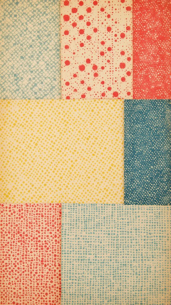
Comic book energy practically jumps off the page when retro halftone backgrounds come into play.
Those classic dots you see in old comics? That’s halftone magic—a mix of art and science that takes vintage color palettes and spins them into pure nostalgic graphic styles.
Artists today use these dots in all sorts of ways, and it’s a blast for sketchbooks.
Check out how you can use halftones:
- Adjust dot density variations to play with contrast—big dots pop, tiny dots smooth things out.
- Stick with vintage color palettes for a fun, throwback look.
- Layer halftones under your art for a boost of drama and energy.
- Try digital tools to make perfect halftones—no ink stains required.
Ready to make your sketchbook pages feel retro and full of life?
Weathered Concrete Surface
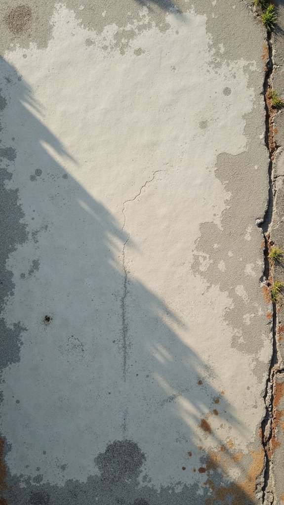
Cracks, stains, and rough patches—there’s just something about a weathered concrete surface that brings instant attitude to a sketchbook page.
It’s like the wall behind a cool street mural or the sidewalk where adventures start. This background offers true weathered charm, packing real texture and subtle color changes that make art pop.
Concrete aesthetics are all about those gritty details, the perfect match for anyone looking for urban inspiration.
Want your drawing to stand out? A concrete surface is a strong, neutral base that lets the main image shine but keeps things interesting underneath.
Layer some transparent paint or markers, and you’ll notice soft edges and a unique blend of vibes that’s super hard to fake.
Concrete—totally tough, right?
Handwritten Script Underlays
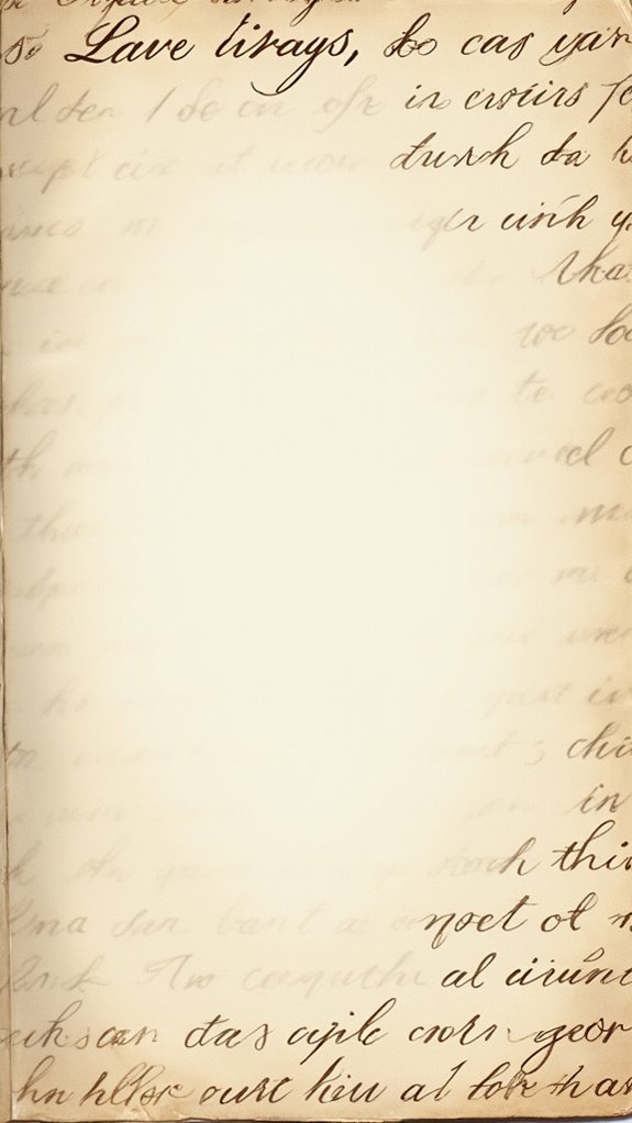
Lots of artists know there’s nothing quite like a splash of handwritten script underneath their art to totally change the vibe.
Handwritten script underlays aren’t just for journaling—they’re epic for adding depth, texture, and a hint of mystery to any piece.
From artsy scribbles that look like ancient codes to famous quotes, the script can play a huge part in how the whole artwork feels.
Here’s how these underlays take things up a notch:
- Experiment with script layering techniques—layer cursive writing below the artwork for instant texture.
- Play with contrasting font styles, mixing bubbly handwriting with sharp block letters for drama.
- Try thematic text integration by picking words or lines that match your art’s subject.
- Mess with opacity to let background colors peek through, creating cool, dreamy vibes.
Frequently Asked Questions
How to Do Layering in Sketchbook?
When approaching layering techniques in Sketchbook, one accesses the Layer Editor to add, arrange, and adjust layers. These sketchbook tips enable digital art creators to separate elements, manage transparency, blend effects, and refine artwork non-destructively.
How to Put Background in Sketchbook?
When exploring background options in Sketchbook, users should access the Layer Editor, add a new layer beneath the artwork, and experiment with solid colors or images. These sketchbook tips support creative layering and enhance overall visual compositions.
How Do I Add a Photo Layer in Sketchbook?
In Sketchbook, users employ photo editing features to enhance digital art by adding a photo layer through the Layer Editor. This creative technique allows positioning, resizing, and blending imported images, ultimately enriching complex compositions with versatile visual elements.
How Do You Overlap Pictures in Sketchbook?
To overlap pictures in Sketchbook, one utilizes photo manipulation techniques through the sketchbook app features, such as layers and opacity adjustments. Digital art tips also suggest repositioning, locking, and blending layers for ideal multi-image compositions.
Conclusion
With all these awesome sketchbook wallpaper backgrounds, every page can feel like its own adventure. Whether it’s bold comic dots, soft watercolor, or weird concrete, there’s something for every mood and every masterpiece. It’s kind of like giving your art a really cool stage to perform on—maybe even with a few dramatic spotlights. So go wild, layer up, and let your creativity out. You never know what amazing ideas will take center stage next!
Leave a Reply