
Aesthetic sketchbook spreads can be anything but boring. Imagine jaw-dropping city skylines in black ink, wild splashes of gouache colors, or inky floral designs as fancy as a tattoo. Fashion sketches strut across pages, while funny animal portraits and collage-style travel notes keep things lively. There’s room for quirky doodles, illustrated quotes, and even paintsplosion rainbow palettes that pop right off the page. Want to pick up fresh sketchbook ideas and some seriously fun art tricks? Keep going!
Key Takeaways
- Combine monochrome urban sketches with striking inky techniques and comic-style layouts for a visually cohesive and dynamic spread.
- Layer vibrant gouache or watercolor cityscapes to create bold, eye-catching spreads with dramatic contrasts and glowing effects.
- Arrange botanical illustrations and timelines in neat grids, using harmonious colors and varied shapes for clarity and visual interest.
- Mix character and fashion illustration, highlighting personality and movement with expressive poses, dynamic colors, and creative media.
- Enhance spreads with hand-lettered quotes, playful doodles, or abstract marker art to add whimsical flair and tactile texture.
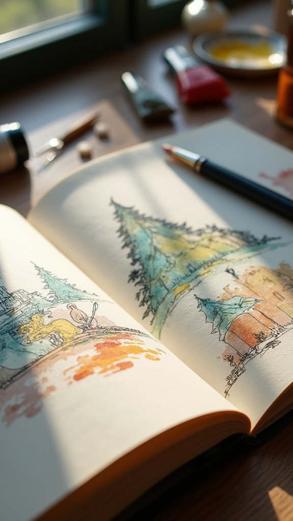
Monochrome Urban Sketch Adventures

Even though city life can feel a little wild and messy, monochrome urban sketch adventures have a magical way of turning that chaos into something totally cool and eye-catching.
There’s something super satisfying about flipping through sketchbook spreads filled with bold lines, inky shadows, and just one main color tying everything together.
Artists love using techniques like hatching and cross-hatching to add texture and make buildings almost pop right off the page.
When you create a series of monochrome urban sketches, it’s like building your own comic book of city life—each page tells its own interesting story.
Experimenting with different pens, ink, and brush sizes helps artists find their unique style, but honestly, the real fun is letting everything look a little wild.
Gouache Dreams: Vibrant Color Scapes
Gouache really brings out the wow factor when artists start mixing and layering colors, turning a plain page into a color-packed adventure.
There’s something almost magical about the way bold blues can meet zesty oranges or how soft pastels can sneak up behind punchy reds, all playing together in wild harmony.
With each thick or whisper-thin layer, these spreads don’t just look cool—they practically sing.
Playful Blend of Hues
There’s something magical about mixing colors until they practically buzz on the page, and that’s exactly what happens in a “gouache dream.”
With this paint, sketchbook artists can turn plain spreads into wild color islands, bursting with bright pinks, punchy blues, and every shade in between.
By exploring color theory—stuff like complementary and analogous color schemes—anyone can make a portrait or sketch practically jump off the page.
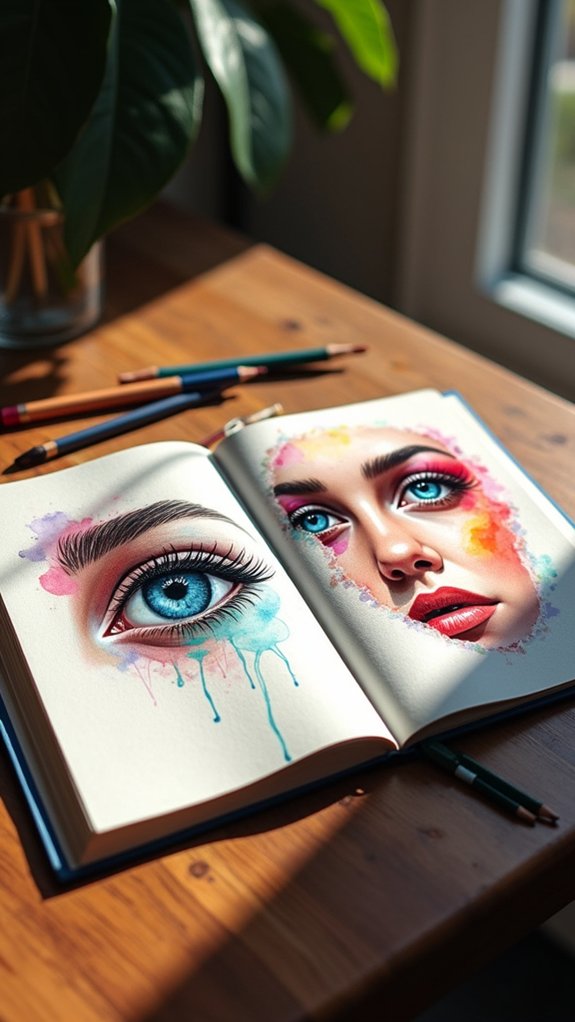
Sometimes, they throw in colored pencils to add sharp details or funky textures, especially when drawing portraits with those big, sparkly eyes.
It isn’t just about picking a favorite color; it’s about seeing how colors play, clash, or team up to make even the silliest doodle look like a masterpiece you want to post everywhere.
Layering for Visual Impact
A splash of color stacked on top of another is where the real magic of gouache painting kicks in. Layering in gouache painting isn’t just about adding more paint—it’s about creating depth that practically makes your sketchbook spread pop off the page.
When you build up transparent layers, you get these amazing, glowing effects, almost like your colors are whispering secrets to each other beneath the surface. Playing around with brushstrokes can add soft backgrounds, crisp lines, or funky textures—seriously, the possibilities are endless.
Want to grab someone’s attention? Add some contrast colors into your layers for instant drama and visual impact. Keep things looking put together by sticking with a limited palette, and you’ll have a sketchbook spread that looks both wild and totally cohesive.
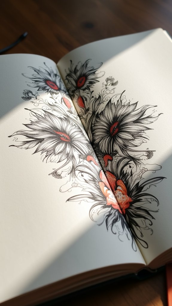
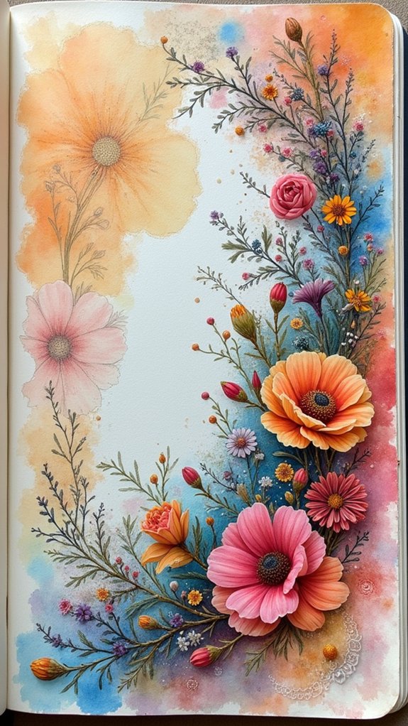
Inked Florals in Black and White
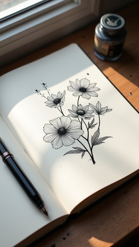
Mystery and drama fill the page when black ink meets paper in the form of florals. Inked florals turn any ordinary sketchbook spread into something extraordinary, almost like a comic-book garden.
Without color to distract, these black and white designs let the fine lines do all the talking—every petal and leaf pops with its own fancy, dramatic flair. Some artists started with a pencil sketch, then went wild with ink, switching up line thickness to give flowers some major attitude.
Others played with stippling or cross-hatching, adding shadow and texture that practically leaps off the paper. Inked florals are like the little black dress of the art world—stylish, versatile, and easy to pair or layer with other ideas whenever inspiration strikes.
Collage-Style Travel Diaries
Collage-style travel diaries feel like a scrapbook explosion in the best way, mixing sketches, photos, and even that random pizza receipt you kept for no good reason.
By layering tickets, postcards, and doodles, these pages turn into wild timelines that actually capture what the trip felt like.
Every scrap and scribble tells its own mini story, throwing your memories together in a way that’s messy, personal, and way more fun than just words on a page.
Mixed Media Memories
Sometimes, all it takes is a handful of ticket stubs and a few messy sketches to bring a whole adventure to life. That’s the magic behind mixed media memories in sketchbooks—each page becomes an explosion of color, scraps, and doodles, like a party for your travel tales.
By using all sorts of art supplies, from watercolor to random fabric and ink, artists can explore different ways to make their memories pop. There’s no single rule; every spread is a wild mix of photos, handwritten notes, and souvenirs that shout, “Remember this awesome place?”
Design tricks like repeating elements or changing the size of objects help make everything look cool (rather than chaotic). It’s a creative way to revisit every adventure—messy, meaningful, and totally unique.
Dynamic Visual Timelines
Even though a single sketch can tell a cool story, there’s something extra exciting about packing an entire day—or even a full trip—into one action-packed spread.
Dynamic visual timelines do just that, letting artists turn their sketchbooks into a kind of graphic adventure. Collage-style travel diaries pack drawings, handwritten notes, and all kinds of little doodles onto the page, creating a wild mashup of memories and emotions.
Experimenting with different layouts, from simple timelines to comic book panels, keeps each spread interesting. It’s less about perfect art, more about capturing that “you had to be there!” feeling.
- Mix sketches and notes to show the whole journey
- Use the rule of thirds for a balanced page
- Try comic panel layouts to tell a story
- Group themes for extra impact
Storytelling Through Ephemera
Nostalgia practically explodes off the page when artists shove old train tickets, postcards, and scraps of maps next to their sketches. Collage-style travel diaries, like those inspired by Mary Clare Montgomery, take storytelling through ephemera to another level. Each page mixes scraps and sketches, creating a scrapbook feel that’s both messy and magical. The different layers—textures from torn wrappers, colors from stickers, loops of cursive—invite viewers to peek into the artist’s journey. Handwritten notes squeezed beside watercolors make everything more real and personal. By using design tricks like the rule of thirds and repeating colors, these diaries aren’t just memories; they’re visual adventures. Here’s a quick look at what you might find:
| Ephemera | Sketch Element | Personal Note |
|---|---|---|
| Train ticket | City skyline | “Rushed in London” |
| Postcard | Coffee cup | “Best espresso!” |
| Map scrap | River detail | “Walked for hours” |
| Sticker | Cafe scene | “Rainy, cozy day” |
Fashion Illustration Fantasy

How does fashion illustration fantasy make something as simple as drawing clothes feel like stepping into a whole other world? For some, it’s about taking fashion illustration and adding an extra dash of imagination—almost like making style dreams real on paper.
Using mixed media—think watercolor, ink, or even bits of magazine collage—artists can layer wild colors and textures, creating designs that seem to jump right off the page. Looking at artists like Ignasi Monreal opens up a whole new universe of new ideas, with every brushstroke bringing clothing to life in unexpected ways.
- Mix and match media for cool effects
- Experiment with bold, playful proportions
- Draw inspiration from haute couture or streetwear
- Let the clothing look as wild or dreamy as you want
Anatomy Studies for Artists
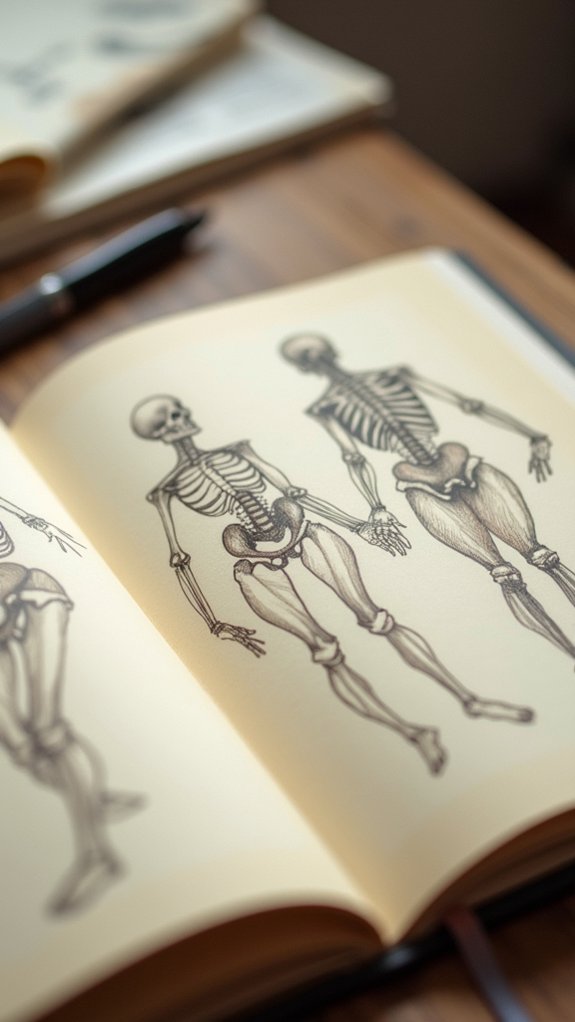
Getting the hang of anatomy starts with breaking down facial structure—think of it like building a head out of LEGO bricks, but with cheekbones and jawlines instead.
Then come hands and feet, which are basically the boss level for most artists (why do fingers bend so many ways?).
After that, exploring dynamic poses can make figures leap right off the page, turning awkward stick people into action heroes full of energy and attitude.
Breaking Down Facial Structure
Faces are like puzzles—full of shapes, lines, and a whole lot of personality crammed into a pretty small space. Breaking down facial structure starts with understanding how bones, muscles, and proportions work together.
For artists, learning to really see these details isn’t just useful—it’s super satisfying! Use your sketchbook for quick studies or go all-in with detailed portraits. When you’re stuck, check out my FREE short course for tips and tricks. It’s all about observation and practice.
- Divide faces into thirds: hairline to brows, brows to nose, nose to chin
- Focus on landmarks—brow ridges, cheekbones, and jawlines make faces unique
- Expressions change everything, so capture those too!
- Mix in colored pencils for cool shadows and texture—try it, it’s fun!
Hands and Feet Practice
Even though they might seem like a total nightmare to draw, hands and feet are where all the action is when it comes to showing movement and personality in a figure.
Seriously, with 27 crazy bones in each hand and 26 packed into every foot, it’s a wonder we can even scribble them at all!
But nailing their shape is worth it. A Sketchbook Tour that skips hands and feet would miss some of the coolest details in anatomy studies.
By practicing these tricky parts, artists learn structure and proportion, but also get better at catching all those tiny gestures and poses.
Plus, filling sketchbook spreads with hands and feet is a fun way to document progress.
Who knows, maybe next time they’ll finally look right!
Dynamic Poses Exploration
Energy bursts off the page when artists immerse themselves in dynamic poses—these are the stances where characters leap, twist, or strike a dramatic angle, and anatomy studies become an absolute must.
Mastering dynamic poses means understanding how muscle group dynamics make a figure look believable even when defying gravity. Gesture drawing techniques swoop in, helping artists capture energy and movement fast, like sketching a superhero mid-air.
Pose stability analysis is kind of like figuring out if someone can actually stand like that—or if they’d fall on their face! For those aiming to make sketchbook spreads cool enough to snap a pic for social media, it’s essential to keep these in mind:
- Draw from live models or photos
- Study muscle and bone movement
- Experiment with wild, active gestures
- Practice pose stability analysis
Self-Portraits in Mixed Media
When artists tackle self-portraits in mixed media, things can get wild in the best possible way. There’s no set rule—one moment you’re splashing watercolors for dreamy backgrounds, then switching to inky outlines that crackle with energy.
By adding colored pencils for texture, or even pieces of collage, artists let their personal identity exploration take center stage. Sometimes, it gets emotional—bold colors, wild brush strokes, and layered text let feelings shine.
Emotional expression techniques like these turn simple faces into powerful stories. Those looking for mixed media inspiration can check out how legendary artists did it and tweak their own style.
Throw in some personal reflections or process photos, and the sketchbook becomes a kind of visual diary—unique, messy, and totally worth showing off.
Sculptural Forms: Inspired By Classics
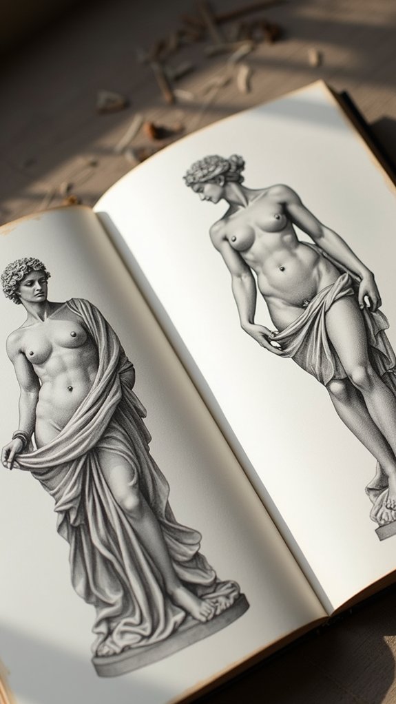
After all the messy, heartfelt self-portraits, some artists turn their sketchbook pages toward something a bit more stoic—sculptural forms inspired by the classics.
Suddenly, things get all statuesque, like a crash course in ancient beauty with a modern twist. That means careful attention to classical drapery techniques, dramatic shadows, and those really intense marble stares that could win any staring contest.
But it’s not all serious—they mix in modern anatomical interpretations and start exploring mythological themes, making old-school statues feel brand new again.
- Study the light and shadow on classical sculptures to nail down depth and dimension.
- Practice draping fabric over figures—think togas, but cooler.
- Try drawing dynamic statue poses for better figure drawing skills.
- Reimagine classic myths with updated, creative details.
Everyday Doodles With Whimsical Flair
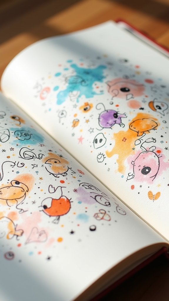
Everyday doodles get way more exciting when artists take plain objects—a coffee mug or a pencil, for example—and add goofy faces, tiny wings, or silly shoes, creating scenes that instantly grab attention.
With bold inky lines and pops of color from pencils or markers, these unlikely characters practically dance off the page.
Playful transformations like these turn simple sketches into crowd-pleasers, making anyone who sees them want to smile (or maybe grab a pen and join in).
Playful Everyday Object Transformations
How does a slice of toast suddenly grow legs and race across a page, or a boring coffee mug become a superhero with a cape? That’s the magic of playful transformations in sketchbooks!
Everyday objects, when given quirky features or brought to life with whimsical interpretations, can totally change the vibe of a spread. These simple things take on personalities, sparking laughter and surprise.
Artists layer on everyday charm by exaggerating shapes, adding funny faces, or mashing up ideas. Trying mixed media—like pairing watercolor with ink—brings even more energy.
Sketchbook fans often borrow ideas from artists known for their playful styles. With imagination, even socks and spoons can be hilarious.
- Exaggerate shapes for comedic effect
- Add quirky character traits
- Mix art tools for extra flair
- Use humor to boost everyday charm
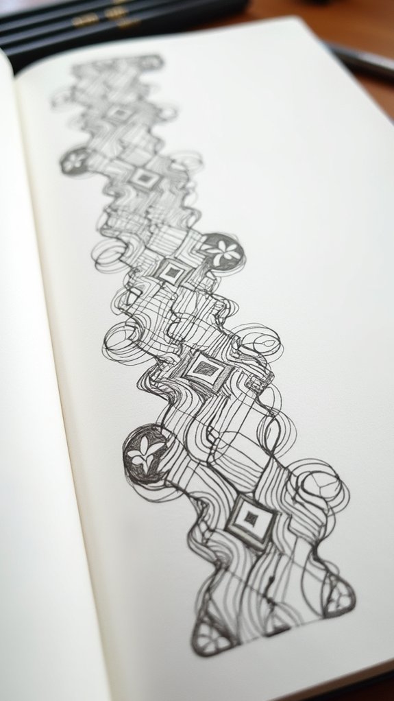
Imaginative Linework and Color
A wiggly line here, a splash of wild color there—suddenly, a regular old doodle feels like it’s bursting off the page with personality. With imaginative linework, even the humblest sketches turn remarkable, showing off expressive strokes that zigzag or loop in unexpected ways. By experimenting with different line thicknesses, artists can layer depth and discover completely new looks. Throw in playful contrasts—think fiery red beside cool blue, or bold ink outlines mixed with watercolor swirls—and the effect is eye-popping. Whimsical patterns and spontaneous ideas often pop up when doodlers let go and have fun, leading to tiny masterpieces that beg to be shared. Just imagine this scene:
| Dotted Clouds | Splashy Flowers | Spiraled Suns |
|---|---|---|
| Wavy Borders | Mixed Media | Zigzag Rays |
| Playful Hues | Bold Outlines | Blended Blues |
Character Design: Miles and Gwen
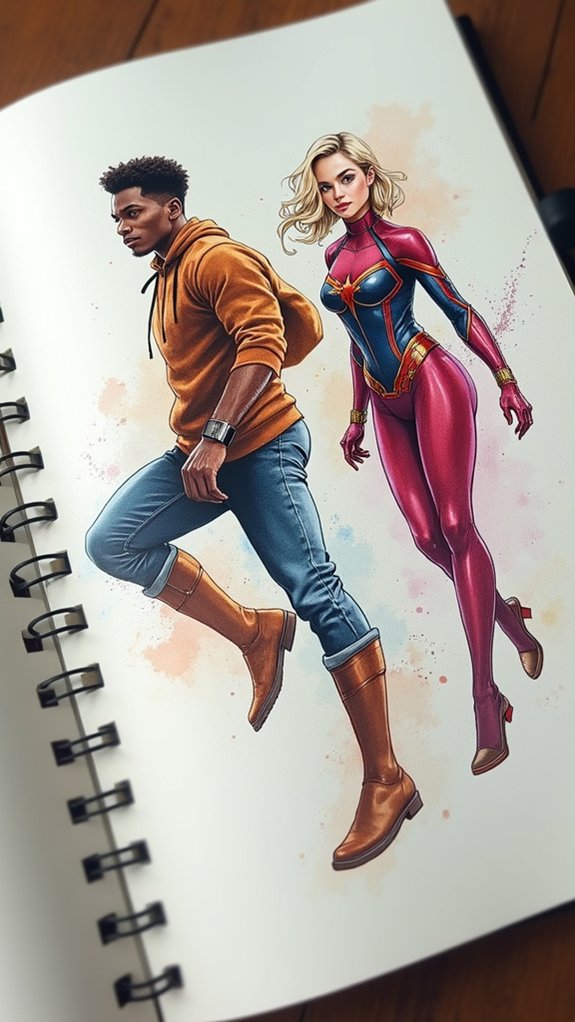
Jump right into a sketchbook spread with Miles and Gwen, and suddenly, the page comes alive with bold contrasts and electric energy. Their character interactions practically dance across the paper—Miles’ sleek black and red suit is a striking foil for Gwen’s hoodie and sweet pastel palette.
It’s not just the colors; their poses and expressions explode with personality highlights. Miles sometimes looks serious, a little mysterious, while Gwen might swing across the page with a playful grin.
Trying out different art mediums for these two amps up the fun and brings out new design contrasts every time.
- Play with color to show off their unique styles
- Focus on how the characters interact together
- Show personality through dynamic poses
- Try switching art tools for creative effects
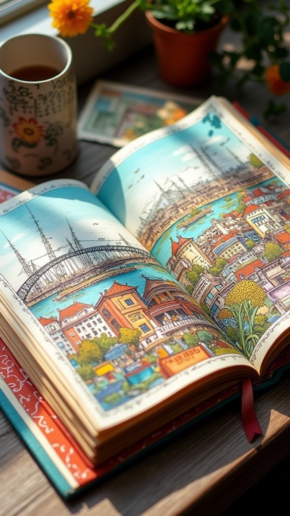
Watercolor Cityscapes at Golden Hour
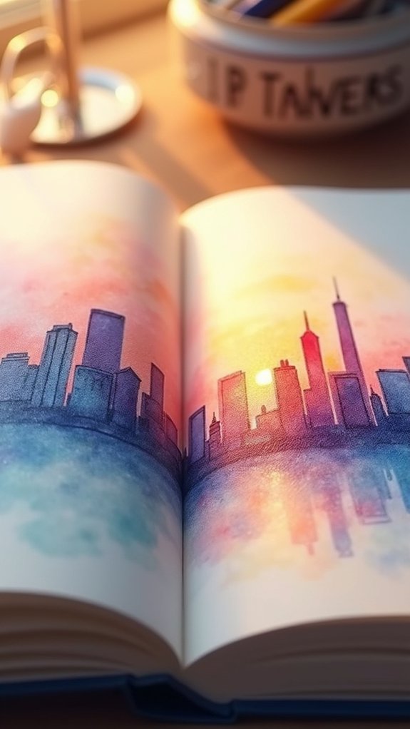
Watercolor cityscapes at golden hour look almost magical, glowing with warm colors that make everything seem alive.
Artists chase this moment when the light changes fast, using layers of yellow, orange, and purple to show reflections and depth that make you want to jump right into the scene.
Capturing Warm Atmospheric Light
Right when the city is bathed in that golden hour glow, everything starts to look a little bit magical—like the buildings are showing off and the sky just got a paint upgrade.
Artists chase that warm, buttery light to capture the city’s atmospheric reflections and those long, dramatic urban silhouettes. With watercolors, this moment isn’t just about painting what you see; it’s about catching that feeling of warmth and wonder.
To really nail it, artists use soft washes, let colors bleed a little, and pay close attention to how shadows stretch across city blocks. Sketching at this time makes you realize how quickly the light shifts, keeping you on your creative toes.
- Observe golden hour in real life for true color inspiration
- Use wet-on-wet watercolor technique for glowy effects
- Highlight shadows for drama and depth
- Focus on atmospheric reflections for mood
Layering for Vibrant Depth
Blending bright washes of color—or stacking them like transparent pancakes—is where the magic happens in golden hour cityscapes.
Layer after layer, artists splash on watercolor to build depth creation methods that make buildings almost jump off the page. It starts simple: lay down a super light wash to catch that sunset glow.
Then, slowly add darker shades, always letting things dry—patience is secretly a color layering technique! Want those city windows to pop? Toss in some opposite colors for real urban scenery contrasts.
Try a wet-on-wet technique for fuzzy edges or go with wet-on-dry for those crisp city lines. And, for the final wow factor, a dash of ink or colored pencil crisply outlines details.
Instant city magic—worthy of any sketchbook post.
Abstract Exploration With Markers
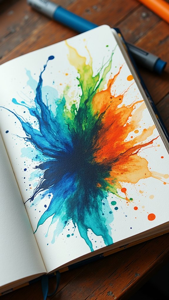
There’s something super exciting about diving into abstract exploration with markers—it’s like your sketchbook becomes this wild playground where colors and shapes can run totally free.
With all the different marker techniques out there, you can really let loose: layer wild streaks, blend bold hues, and watch your page turn into a riot of fun. Mixing alcohol-based, water-based, and brush tip markers brings in a mix of textures that are honestly kind of magical.
Deliberately using abstract layering lets you discover surprising color blends and eye-popping contrasts. Throw in some sharp line work or geometric shapes to keep things from spiraling into total chaos.
Here’s what makes marker-based abstract art so eye-catching:
- Quick-drying layers build vibrant depth
- Color blending sparks unexpected effects
- Different markers create unique textures
- Geometric shapes anchor the wildness
Cozy Interiors in Colored Pencil
Colored pencils are perfect for showing off the cozy glow of warm sunlight spilling onto fluffy blankets and squishy armchairs, making rooms look inviting enough to nap in.
By layering different textures and patterns, like cheery rugs and chunky knits, artists can bring out the snug vibes, almost letting you “feel” the softness on the page—no socks required.
And when a sketchbook spread highlights a favorite reading nook or a spot by the window with a beloved plant, it practically begs you to grab a mug of cocoa and move right in.
Capturing Warm Lighting
Even on the dullest days, sketching cozy interiors can make anyone feel like they’re basking in a golden sunset, and colored pencils are totally up for the challenge.
To capture warm lighting in your sketchbook spread, color layering techniques become your best secret. Stacking soft yellows, oranges, even gentle browns creates those dreamy, warm color palettes that make any living room look abnormally snuggly.
But don’t forget about light direction effects! Notice how the glow from a lamp splashes across a couch, or how sunlight bounces by the window, and use those cues to shape shadows and highlights.
- Layer warm hues for a rich, glowing atmosphere.
- Focus on light direction for realistic scenes.
- Boost highlights near lamps or windows.
- Leave negative space for balance.
Layering Textures and Patterns
Textures and patterns might just be the secret ingredients that crank up the coziness in any interior sketch—and colored pencils totally bring them to life.
When building a cozy ambiance, artists often start with a soft base layer, outlining furniture and décor using gentle strokes. Pattern play comes into action next: stripes on a rug, florals on pillows, and geometric wallpaper all dance together to form visual interest.
Layering darker tones builds shadows, while highlights add pop to the textures. It’s all about textural harmony—blending between the plush softness of a sofa and the smooth hardness of a tabletop makes spaces feel real.
For a playful twist, leaving patches of negative space around favorite patterns draws attention, giving the sketch that irresistible, homey vibe.
Showcasing Favorite Corners
There’s something magical about picking just one or two favorite corners from a room and turning them into cozy wonderlands inside a sketchbook.
With cozy color palettes and colored pencils, anyone can make armchairs glow and little desks feel alive—because yes, even pencils can make a mug of cocoa look warm!
Artists who add personal object sketches, like a quirky lamp or a beloved paperback, create a story layered with narrative corner details. These details show off personality, making every drawing feel like someone’s secret hideout.
- Use layering and burnishing to blend rich, cozy color palettes
- Sketch small, personal objects to make the corner personal
- Add light sources to create inviting, glowing scenes
- Leave negative space to make cozy details pop
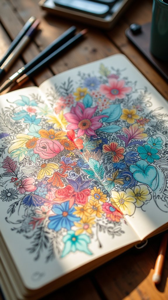
Botanical Collections in Grid Layouts
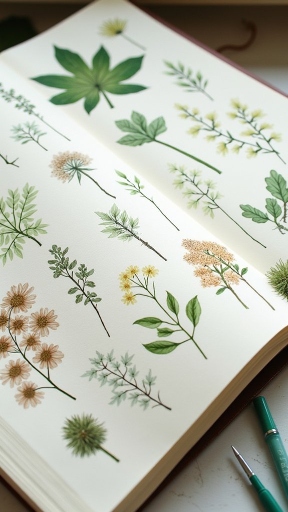
Botanical collections arranged in grid layouts can turn a simple sketchbook page into an eye-catching display, almost like a personal plant museum—except without the risk of forgetting to water anything.
Using grid organization techniques, artists line up leaves, flowers, or even seed pods in tidy squares or rectangles. This setup isn’t just neat—it makes comparing plant varieties much easier.
Playing with botanical color harmonies, like matching deep greens with pops of pink or gold, instantly boosts the visual appeal and brings the page to life.
When sketching plant varieties, experimenting with size and shape in each grid box adds excitement and motion. Crisp white space around every sketch keeps things fresh, letting every little detail breathe.
It’s systematic, satisfying, and seriously fun.
Timeline: A Day in Miniature
When the clock starts ticking, a sketchbook spread can quickly turn into the ultimate highlight reel of a day. Timeline techniques let artists freeze the coolest moments—just like the play-by-play clips from a championship game, but for your Tuesday.
By lining up tiny sketches in event sequencing, anyone can capture the vibe of waking up to a loud alarm, that wild lunch with friends, or even the accidental nap that lasts way too long. These daily highlights get extra flair when arrows, labels, or color codes jump into the mix. It keeps everything clear and way more fun to look at.
- Tiny sketches document key moments from morning to night
- Arrows and labels guide viewers through the story
- Color coding links activities with mood or theme
- Varying perspectives make each highlight pop
Repetition and Rhythm Studies
Patterns, beats, and echoes—repetition and rhythm turn an ordinary sketchbook spread into a visual dance floor. By using repetition techniques like repeating colors, doodling similar shapes, or drawing snappy patterns, artists create visual harmony that really pops.
But it’s not just copy-paste; rhythm variations shake things up! Maybe the elements get bigger and smaller, or leapfrog across the page. This keeps the viewer’s eyes bouncing around, adding excitement, sometimes even making the art feel like it’s dancing.
It’s a sneaky way to give sketches a strong theme or mini-story—repetition keeps things together, while rhythm makes sure the spread never gets boring. When an artist experiments with mixing shapes and switching up colors, every page becomes an energetic, fun adventure.
Symmetry Vs. Asymmetry Experiment
Although sketchbook spreads often fall somewhere between neat and wild, playing with symmetry versus asymmetry is like having a superhero showdown right on the page.
Symmetrical balance swoops in, keeping everything orderly and pleasing—think of it as the superhero who always has a perfectly straight cape. Asymmetry charges in with bold moves, tossing things around just enough to create dynamic tension, making viewers stop and stare.
The rule of thirds? That’s like their universal sidekick, helping both heroes create awesome layouts. Creative freedom ramps up when artists break away from the usual patterns, especially with asymmetrical designs.
Want art that pops? Here’s what helps:
- Use symmetrical balance for calm vibes
- Try asymmetry for extra energy
- Mix both styles for intrigue
- Let creative freedom guide bold choices
Negative Space: Minimalist Designs
Even the emptiest spaces in a sketchbook spread have a job to do—negative space is like the quiet kid at a loud party, but somehow they’re the one everyone notices. Through negative space techniques, artists practice minimalist composition strategies that let just a few details really shine. Sometimes, less is so much more. Negative space isn’t just emptiness—it’s like giving your art room to breathe. Using blank areas in smart ways helps in enhancing visual balance, pulling your eye right to the good stuff. And with clever use of the rule of thirds, minimalist spreads get even more interesting.
| Feeling | Visual Impact | Negative Space Vibe |
|---|---|---|
| Calm | Super focused | Breathe deep |
| Mystery | Undeniably cool | Curious emptiness |
| Clean | Sharp edges | Less, but stronger |
| Thoughtful | Well-placed bits | Quiet confidence |
| Restful | Eye gets a break | Silent star |
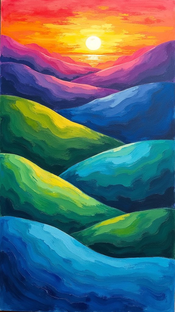
Color Splash: Rainbow Palettes
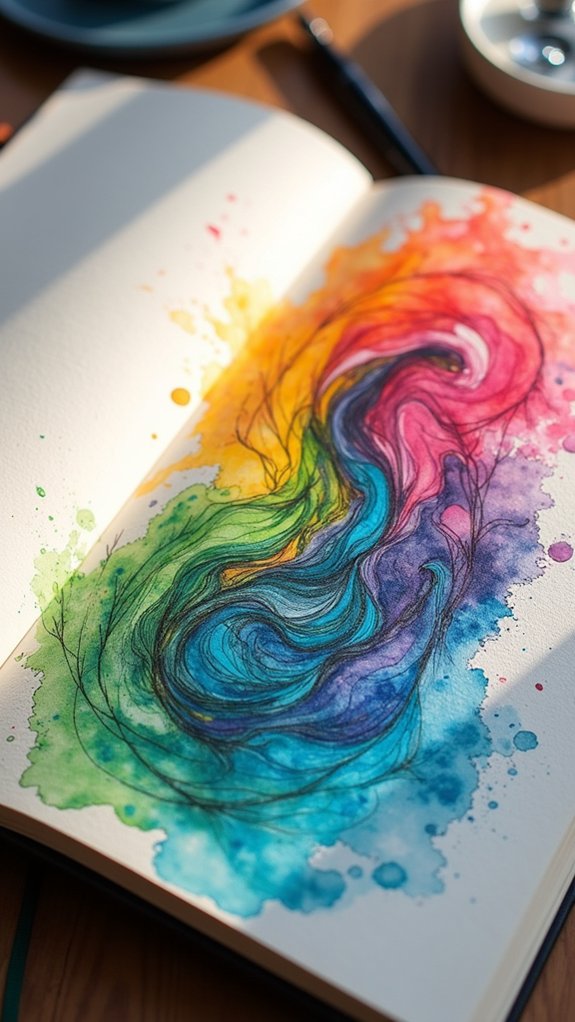
Who says a sketchbook spread has to stick to just one or two colors? Why not try a color splash and let every hue imaginable burst across the page!
Rainbow palettes aren’t just pretty—they’re powerful. By exploring color psychology, artists can evoke moods and grab attention. Mixing in gradient blending methods creates lively shifts, transforming a simple sketch into a masterpiece that moves and breathes.
And don’t forget about contrasting color techniques. Use them to make certain shapes or details pop, turning ordinary doodles into spotlight-stealers.
- Color psychology exploration brings meaning to every shade
- Contrasting color techniques add excitement and energy
- Gradient blending methods give artwork depth and life
- Color splashes guide the eye, creating focal points and storylines
Turns out, rainbows aren’t just for the sky!
Illustrated Quotes and Hand Lettering
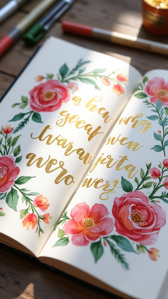
If there’s magic in how a rainbow dances across a page, then illustrated quotes and hand lettering are the secret spells of a sketchbook spread. Mixing bold hand lettering techniques with splashy color theory applications, artists can turn ordinary words into powerful visual storytelling elements.
Maybe a quote about bravery pops with fiery reds, or kind words shimmer in soft pastels—color choices create emotion! Want extra wow? Add doodles, cute borders, or tiny icons.
Layering textures using ink, markers, or watercolors gives the text a look you want to reach out and touch. The coolest part? Every artist’s style is unique, so every quote feels personal.
Illustrated quotes don’t just deliver messages—they shout them, laugh them, and make everyone stop scrolling.
Animal Portraits in Stylized Forms
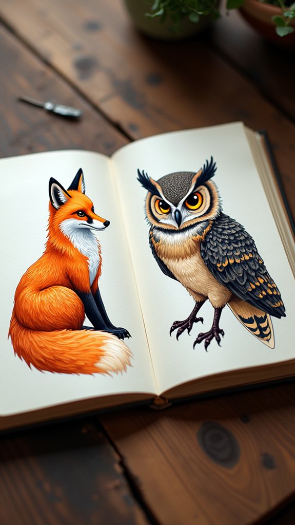
Animal portraits can be way more than just realistic brown eyes and fluffy fur—stylized forms let artists get wild with creativity.
With exaggerated features, an elephant might get even bigger ears, or a fox could have a tail shaped like a lightning bolt. Artists mix all sorts of media—like watercolor, colored pencils, and ink—to make funky textures and punchy colors pop.
Want a polka-dotted penguin or a neon tiger roaring? Go for it! Animal expressions get cranked up, too: happy sloths, surprised owls, or grumpy cats, each with a ton of personality.
Adding backgrounds or patterns helps tell a story and gives each page extra flair.
Here’s what makes stylized animal portraits stand out:
- Exaggerated features
- Mixed media layers
- Expressive animal emotions
- Creative, story-rich backgrounds
Collaborative Spread With Artist Friends
After experimenting with wild animal portraits, some artists like to pass the sketchbook to a friend and see what magic happens.
Collaboration techniques might mean each friend adds a sketch or doodle in their own style, or maybe someone starts with a background, and others build on top. These mashups make the spread look dynamic and keep things exciting.
Visual storytelling comes alive because every page tells a story shaped by different imaginations. It’s all about shared inspiration—the fun multiplies as each person’s ideas spark new ones.
Sometimes, artists add little notes or funny comments right in the margins, making the whole process feel like an art party on paper.
Posting these team efforts online can spark tons of feedback and make the group want to create even more.
Moodboard Madness: Texture and Pattern
When it comes to creating a sketchbook spread that really pops, nothing brings it to life like a whirlwind of textures and patterns.
Texture exploration makes things feel lively—think crinkly washi tape or a little splash of watercolor meeting a strong ink outline. Layering techniques are the secret sauce; stack patterned papers, sketch over fabric scraps, and suddenly your page feels almost 3D.
Pattern inspiration can come from the wildest places—tile floors, leafy parks, or even grandma’s old curtains. But beware: too much action and your page could look like a sock drawer exploded. Smart artists balance the busy bits with smooth, empty space.
- Mix different materials for juicy texture
- Try pattern inspiration from daily life
- Use layering techniques for visual depth
- Balance patterns with negative space
Frequently Asked Questions
How to Make a Sketchbook More Aesthetic?
To make a sketchbook more aesthetic, one should thoughtfully select harmonious color palettes, experiment with dynamic layout designs, and utilize texture layering through mixed media. Strategic use of white space and thematic organization further enhance visual appeal and coherence.
How to Make a Good Sketchbook Spread?
Creating a good sketchbook spread involves thoughtful color combination tips, innovative layout design ideas, and diverse theme inspiration sources. Balancing visual interest with intentional negative space, mixed mediums, and rhythmic repetition helps unify the page while maintaining an engaging composition.
Is It Okay to Not Finish a Sketchbook?
Choosing not to finish a sketchbook reflects sketchbook freedom and allows artists to prioritize personal expression over completion. This approach emphasizes that an artistic journey is about exploration, growth, and creativity, rather than finishing every page.
Do Sketchbooks Have to Be Perfect?
Sketchbooks do not have to be perfect; embracing sketchbook imperfections allows for authentic creative expression and the development of personal style. Their true value lies in their role as a space for experimentation, growth, and self-discovery.
Conclusion
In all, these 23 sketchbook spreads prove there’s no single way to be creative—or to show it off online. Some pages burst with wild color, while others vibe with simple black lines or quirky collages. Honestly, mistakes and doodles just make them more unique. Anyone can grab a pencil or paint and try. Who knows? The next viral sketchbook spread could be yours. Go ahead, fill those pages and share your art with the world!
Leave a Reply