
Looking for sketchbook inspiration? Try stacking rectangles for a bold layout, let sketches burst from a central map, or leave empty space for dramatic effect. Mix ink, watercolor, and collage to keep pages lively. Tuck in ticket stubs and doodle arrows that guide the eye. Combine building plans with real-life sketches for a cool twist, or plan a color explosion across your spread. Want more wild and clever layout tricks? There’s plenty more creativity right ahead!
Key Takeaways
- Experiment with rectangles within rectangles to compartmentalize sketches, notes, and doodles, ensuring a dynamic and organized page layout.
- Integrate text creatively by layering handwritten notes, quotes, or captions over and around drawings for engaging, narrative-rich pages.
- Incorporate collage techniques using mixed media—such as fabric, paper scraps, or ephemera—for added texture and visual intrigue.
- Use negative space intentionally to highlight focal sketches and provide visual breathing room within busy layouts.
- Employ a unified color palette across each page to create cohesion, guide the viewer’s eye, and accentuate key elements.
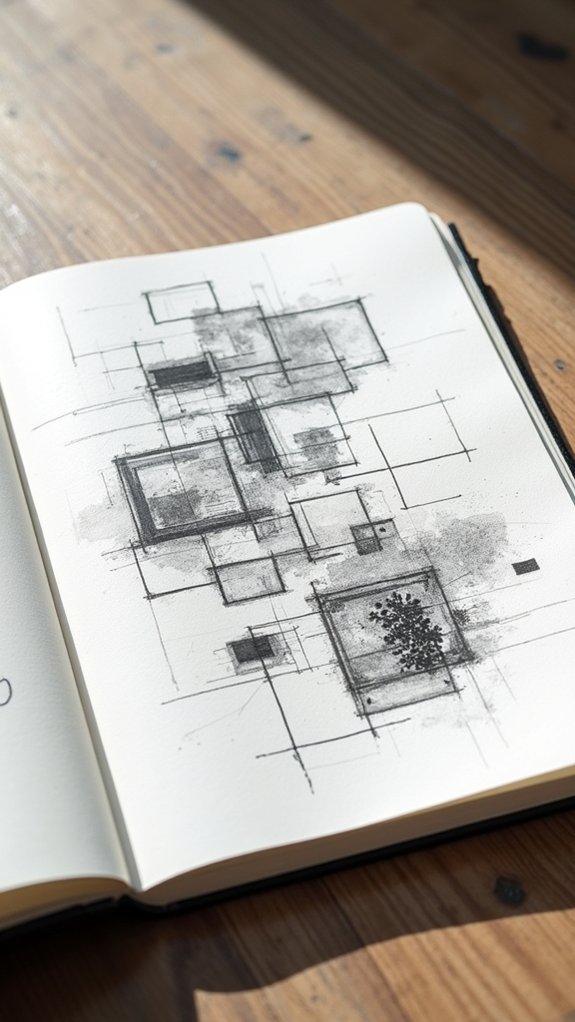
Dynamic Rectangles Within Rectangles

Imagine this: a sketchbook page where rectangles live inside other rectangles, kind of like a set of nesting dolls, but way more artistic.
It’s not just for show—using these rectangles is a clever trick for coming up with layout ideas when filling your pages. Each box can hold something different: maybe a wild splash of watercolors here, a goofy doodle there, and even some handwritten notes sandwiched in between.
Dividing a design sketchbook this way makes everything neat and eye-catching, but it also lets creativity run wild. Whether rectangles are big, tiny, or somewhere in the middle, mixing up their sizes adds instant energy.
Sketching tiny layout thumbnails first is like your secret superpower, making sure every section pops and the entire page just works.
Arranging Sketches Around a Centerpiece
Even before a pencil touches the page, there’s something kind of magical about planning a sketchbook spread where everything revolves around one seriously cool centerpiece.
Putting a main drawing—like a detailed map or awesome observational drawing—right in the middle of a page layout gives any art journal major wow factor.
Then, it’s like building a tiny universe around it! Surrounding sketches play off the centerpiece, telling their own stories while staying connected.
Want more action? Draw arrows, dashed lines, or little symbols to show relationships and connections—it’s like doodle GPS!
Here are three ways to totally rock centerpiece-focused sketchbook page layouts:
- Anchor pages with a bold centerpiece to guide the eye.
- Experiment with different sizes and orientations of side sketches.
- Use lines or arrows for instant, eye-catching connections.
The Power of Negative Space

Sometimes, the space you leave blank on a sketchbook page is just as powerful as the drawings themselves—those empty zones help important parts really stand out, almost like putting a spotlight on your best ideas.
When things start to get a little too wild or messy, adding gaps can calm things down and make the whole page feel easier to look at.
It’s all about finding the right balance, like knowing when to shout and when to whisper with your art.
Enhancing Focus With Gaps
While some might think a page packed with drawings is the way to grab attention, there’s actually a secret weapon every sketchbook artist should know: negative space.
Letting bits of your page breathe can totally transform your visual composition! Leaving gaps isn’t just about being lazy or running out of ideas (though, hey, we’ve all been there), but rather about using space to highlight the coolest parts of your sketches.
Imagine your art getting the VIP treatment, with all eyes drawn right where you want them.
Try these sketchbook ideas:
- Leave intentional gaps to draw attention to your most important drawings.
- Use empty areas to balance out busy parts of the page.
- Guide the viewer’s eye by making your sketches pop against the calm of negative space.
Balancing Busy and Calm
Although filling every inch of a sketchbook page might sound exciting at first, there’s actually magic in letting some areas stay blank. Negative space is like that chill friend who knows not to interrupt when the action gets intense. When observational drawings get a little too busy, using negative space creates calm—it’s almost like your page is taking a deep breath. The empty spots highlight the important details and give viewers a place to rest their eyes. Check out the table below for ways to mix it up:
| Busy Elements | Negative Space | Effect on Page |
|---|---|---|
| Dense doodles | Wide margins | Balanced look |
| Layered sketches | Blank corners | Clarity pops |
| Overlapping lines | Isolated objects | Focal point shines |
| Text clusters | Open background | Calming contrast |
| Packed patterns | Empty borders | Breathing room |
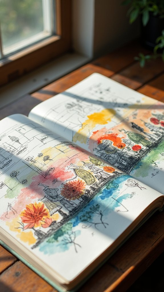
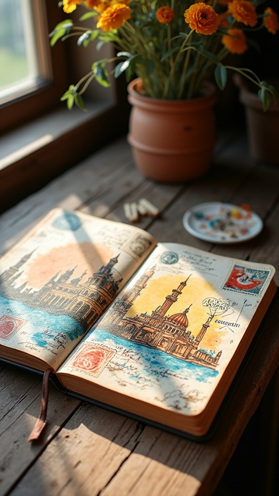
Integrating Maps as Visual Anchors

Putting a map right in the center of your sketchbook page can work like magic—it grabs attention and sets the mood for everything around it.
Centerpiece Map Placement
Sometimes, a sketchbook page just begs for something that pulls everything together, and that’s where a centerpiece map totally shines. Plopping a map right in the middle of a page? Genius move.
It acts like the sun, with observational drawings orbiting around it, instantly creating a cohesive layout that looks intentional and super cool. People get a boost of story and direction, not just random sketches all over the place.
Maps don’t have to be boring, either—try a wobbly hand-drawn one or a printed piece ripped right out of a brochure.
To make that centerpiece really work its magic:
- Group related sketches around the map for clarity.
- Use arrows or lines to connect each drawing to its spot.
- Mix map styles for added personality.
Linking Locations Visually
If someone wants their sketchbook to really pop, integrating maps as visual anchors is an awesome move. Maps aren’t just for finding where you’re lost—they pull everything together and make each page feel like a journey.
Imagine sketching a street vendor and then drawing a little arrow that points to their spot on your cool street map. This trick connects observational drawings straight to real places, instantly giving a “whoa, check that out!” vibe.
You can play around with different map styles, like classic street layouts or artsy topographic maps, for even more flair. Don’t be afraid to doodle notes or memories beside your sketches.
When maps and art work together in a sketchbook, the whole travel story feels super interactive—almost like a treasure hunt!
Enhancing Narrative Flow
Maps already make things pop, but they do so much more when it comes to telling the story across sketchbook pages.
A map placed among sketches acts like a secret decoder ring for your whole narrative—it helps viewers connect the dots, literally! When maps are the center of a spread and sketches orbit around them, the whole page just feels like it’s telling one big adventure.
Want to make the journey clearer? Toss in arrows to point out where things happen, and suddenly the map and sketches work as a team.
Here are three ways to enhance narrative flow with maps:
- Place maps in the center to anchor surrounding sketches.
- Use arrows for storytelling clarity.
- Try hand-drawn, printed, or collage map styles for variety.
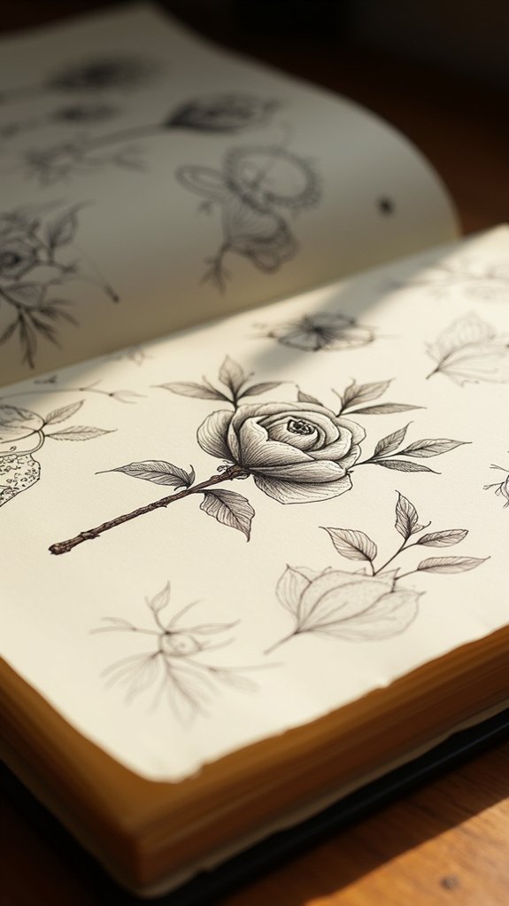
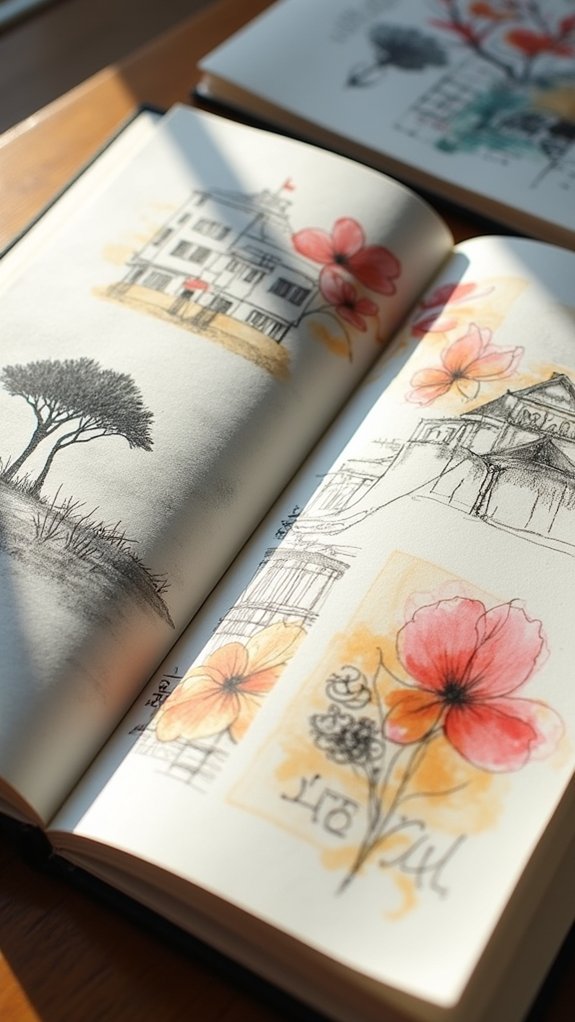
Mixing Media: Ink, Watercolor, and Collage
One amazing way to level up any sketchbook page is by mixing ink, watercolor, and collage together—it’s like throwing the ultimate art party where everyone brings something cool.
Ink can outline and give structure, with slick black lines, while watercolor swoops in with all its vibrant, dreamy shades. The result? Contrast, depth, and drama—think of superhero sidekicks balancing each other out!
When it comes to collage, that’s where the sparks really fly. Toss in photos, maps, or wild scraps of textured paper to make the story on your page jump out. Each piece adds a new layer and a fresh angle, so no two spreads look the same.
Experimenting with different ink types and collage materials keeps things surprising and always reflects a bit of your own style.
Combining Drawings and Handwritten Notes
When sketches and handwritten notes team up on a page, something magical happens—the story behind the art gets clearer, almost like the drawing is talking right to you.
With scribbled thoughts and arrows weaving between doodles, information jumps off the paper, making each page feel alive and packed with personality.
Balancing the space between text and pictures isn’t just about neatness; it’s how artists keep the whole page rocking together, not fighting for attention like hungry cats at breakfast.
Integrating Text With Images
Blending text with images in a sketchbook is a bit like giving your drawings their own voice—suddenly, sketches start telling stories instead of just sitting on the page.
Integrating text with art makes observational drawings come alive, letting artists sneak little notes and doodles around the edges—or right through the center!
Whether it’s a funny quote, a bit of background info, or a timeline, the mix creates pages that are bursting with personality.
Mastering this is all about balance: you don’t want your words drowning out your pictures (or vice versa).
Here are three ways to rock this combo:
- Fill empty spaces with captions or thoughts for better flow.
- Pair sketches with bold, creative fonts for big themes or emotions.
- Arrange sketches and text in sequences for awesome visual storytelling.
Enhancing Narratives Visually
Stories jump off the page when handwritten notes and quick sketches start hanging out together. Seriously, a simple doodle paired with a quick sentence about what’s happening—or how you feel about it—turns an ordinary sketchbook page into a mini adventure.
Observational drawings gain a whole new personality when surrounded by personal response notes, whether it’s an “Oh wow, look at that crooked streetlamp!” or a bold, “This pond totally freaked me out.” Arranging text around the drawings guides the eye, giving everything visual appeal and helping the story flow.
Want even more style? Mix up fonts or handwriting, and use negative space so things don’t get squished together. Grouping similar ideas just makes the page easier to follow—and totally fun to explore!
Balancing Notes and Sketches
Some sketchbook pages look like a wild jumble of doodles and scribbles, but—get this—they actually work way better when drawings and handwritten notes team up.
It’s like peanut butter and jelly for your brain! Balancing notes with observational drawings gives your page a Fine Art vibe, but with extra info for anyone flipping through.
Here’s how artists pull it off:
- Context magic: Handwritten notes around sketches add stories or fun facts, making the page way more interesting.
- Strategic space-filling: Notes tucked into empty spots help balance everything out, stopping the “random chaos” look.
- Direction power: Placing notes next to sketches in a cool flow (like a map and legend) guides your eyes and brain together.
Balancing notes with observational drawings makes every sketchbook extra memorable!
Diagonal Layouts for Dramatic Impact
Shoot your sketches across the page like lightning—diagonal layouts instantly boost the excitement level in any sketchbook.
Forget boring boxes and straight rows; with Level Art sketchbook pages, using diagonal layouts makes everything feel like it’s leaping off the page! Diagonal lines guide your eye on a wild ride from corner to corner, making even simple observational drawings look dramatic and full of energy.
Artists love mixing up sketches, notes, and shapes along these slanted paths. It keeps things balanced and stops the page from looking lopsided or, worse, flat-out dull.
Diagonal layouts let creative sparks fly, helping you break away from the usual grid pattern. So why settle for the straight and narrow when you can zig, zag, and wow?
Using Color to Unify Page Elements
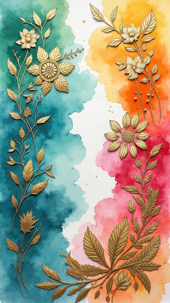
Color—the secret sauce that can turn any sketchbook page from “meh” to mesmerizing in seconds. Every high school artist knows the difference a pop of color can make.
Color isn’t just about looking pretty; it’s about creating unity and tying sketches together when your page risks looking chaotic. Instead of letting the eye get lost, using a consistent palette helps everything feel like it belongs.
Wanna make sure your favorite doodle stands out? Brighten it up, while keeping everything else more chill. And don’t forget, arranging bits of color in a circle can whisk the viewer’s gaze all around your glorious page.
Try these ideas:
- Stick to just three to five harmonious colors.
- Color only important sketches for epic focus.
- Save color choices until sketches are done!
Grouping Elements With Boxes and Lines
Even when a sketchbook page feels like a wild party of doodles and notes, boxes and lines can step in as the ultimate peacekeepers. They help with grouping elements, turning chaos into clear visual unity. Use boxes to organize sketches with the same theme, so your page layout pops with purpose. Lines act as little highways, connecting different ideas or dividing sections so viewers don’t get lost at the party. Mixing up box styles or line thickness? That’s like adding party decorations—it keeps things interesting. Planning where elements go in quick thumbnails before starting the final layout really helps. Check out the ideas below:
| Element | Purpose | Fun Tip |
|---|---|---|
| Boxes | Group related items | Try rounded corners! |
| Lines | Guide the viewer’s eye | Vary line weight |
| Thumbnail | Plan layout | Use sticky notes |
Creating Visual Narratives Through Sequencing
If a sketchbook page is like a comic strip, sequencing is what turns random doodles into an epic story. Sequencing links observational drawings together, so each sketch feels like a step in a journey—think of it as giving your page a cool, movie-style montage.
Visual narrative isn’t just about cool art, it’s about guiding the viewer’s eye and making each moment count. To do this, artists can:
- Use thumbnail sketches to plan out the arrangement and story flow.
- Group sketches with similar themes to create visual unity and strengthen connections.
- Add arrows or lines between drawings to show direction, turning the page into an engaging, almost cinematic experience.
With clever sequencing, even the wildest sketches become a story worth following!
Balancing Big Views With Small Details
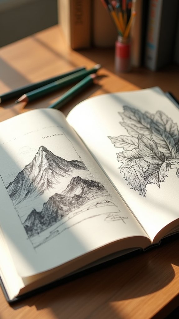
Why does a sketchbook page instantly feel more exciting when it combines sweeping scenes with tiny, detailed drawings? It’s all about balance!
Big views, like a mountain range or a bustling city, set the stage and instantly grab attention. But then—bam!—you spot those small details. Observational drawings of a single leaf, a sneaker print, or even a scribbled note bring your eyes zooming in, like playing a game of hide-and-seek right on the page.
By mixing large vistas with little sketches or annotations, artists build a lively mix of focus and context. Experimenting with different placements and using diverse media, such as watercolors for big views and ink for small details, adds depth.
This clever combo makes every page a mini adventure!
Timeline Spreads to Tell a Story
A sketchbook can become so much more than a collection of random doodles when artists try out timeline spreads. Instead of flipping through scattered sketches, friends can watch a whole adventure unfold—almost like reading a comic, but more personal!
By drawing moments in order and linking them with arrows or lines, a timeline turns a messy memory into clear visual storytelling. Small touches, like scribbled dates and quick notes, help everyone know when awesome things happened. Want it to really pop? Mixing in photos with the sketches makes each page buzz with life.
Here are three awesome ways to create a timeline spread:
- Draw a horizontal or vertical line and add sketches at each milestone.
- Connect moments using arrows for flow.
- Sprinkle in photos or notes for extra detail.
Layering Text Over Images
Sometimes, a page just begs for something extra to help tie everything together, and that’s where layering text over images can totally level up a sketchbook. When you stack bits of handwriting or bold titles right on top of your observational drawings, suddenly everything feels deeper and more connected. If you use color and pick contrasting shades, the words pop on the page, making key details or funny notes stand out like highlighters at a dance party.
Here’s a cheat-sheet for mastering layering text over images:
| Technique | Result |
|---|---|
| Use color + contrast | Text grabs attention |
| Fill negative space | Easy to read, looks balanced |
| Combine with sketches | Observational drawings shine |
| Mix font sizes/styles | Pages feel energetic, unique |
Calligraphy or messy notes—both add personality and spark!
Experimenting With Vertical and Horizontal Formats
Mixing vertical and horizontal sketches on the same page is like throwing a fun party where every angle gets an invitation—it makes the whole layout pop and keeps things interesting.
When artists balance all that space and shift between tall buildings and wide-open fields, the page almost guides your eyes on a little journey.
Figuring out which scene fits better in each orientation can be a challenge, but it’s also where a lot of the creativity (and a few “oops” moments) can happen.
Mixing Orientations for Impact
Every artist knows that a sketchbook page can become way more exciting when playing around with both vertical and horizontal layouts. Flipping between formats isn’t just about shaking things up—it invites new ideas, keeps observational drawings fresh, and turns every sketch into a tiny adventure.
Think about it: a tall building sketched next to a sprawling view instantly feels more alive! Mixing orientations makes your pages pop and keeps viewers guessing what’s next.
Here are some fun ways to try this out:
- Storytelling—Pair vertical portraits with horizontal scenes to add drama.
- Organization—Group related sketches by orientation for easy browsing (and a happy brain).
- Energy—Alternate drawing directions for a sense of movement, like your art is bursting off the page!
Balancing Space and Flow
If an artist wants their sketchbook pages to feel alive and never boring, balancing space and flow is where the magic really happens.
By switching between vertical and horizontal formats, even a collection of observational drawings can feel like a wild rollercoaster for the eyes—no boring straight lines here!
Using rectangles inside rectangles, an artist can cleverly balance space, giving each sketch or doodle enough room to breathe without turning the page into a crowded bus.
Planning with thumbnail sketches helps connect ideas and keep the flow strong, but leaving room for flexibility in arrangement keeps things playful.
Maybe a tall building sketch next to a wide vista? Why not!
This approach guarantees pages that look thoughtful but never stiff or stuck in a rut.
Adapting Scenes to Format
Sometimes a sketchbook page just needs a little twist, and switching between vertical and horizontal formats can totally change the vibe.
Seriously, just turning your page can make a simple observational drawing look way more dramatic or chill. For example, vertical formats are awesome for drawing tall buildings or zooming in on crazy details, while horizontal formats give you all that space to sprawl out a huge vista or panorama.
Mixing both in your sketchbook keeps things interesting—and if you use thumbnails to plan it out, you can make your layouts totally pop!
Here are three ways to play with your scene’s format:
- Use vertical formats for towering objects or close-ups.
- Stretch out horizontal formats for wide scenes.
- Try combining both on one page for maximum wow!
Fan-Shaped and Circular Arrangements
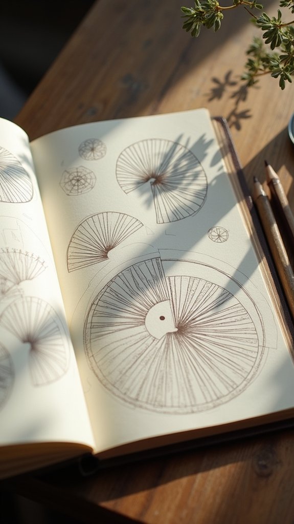
Imagine this: instead of lining up your sketches in stiff rows, you whip them into fun, fan-shaped bursts or swirl them around in a confident circle.
Fan-shaped arrangements explode outward from a central spot, instantly adding drama and movement—kind of like a firework on your sketchbook page. It’s perfect for showing off observational drawings from different angles, and it totally grabs attention.
Circular arrangements, meanwhile, keep everything connected. Your eye travels around, soaking in each detail, no awkward corners or lonely sketches left out. If you pop a cool centerpiece in the middle—maybe your boldest drawing or a mini map—it anchors the whole design.
Varying sketch sizes and playing with the spacing makes the page feel fresh, balanced, and completely unique to you.
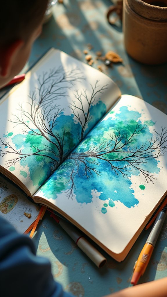
Capturing Emotion in Sketchbook Pages
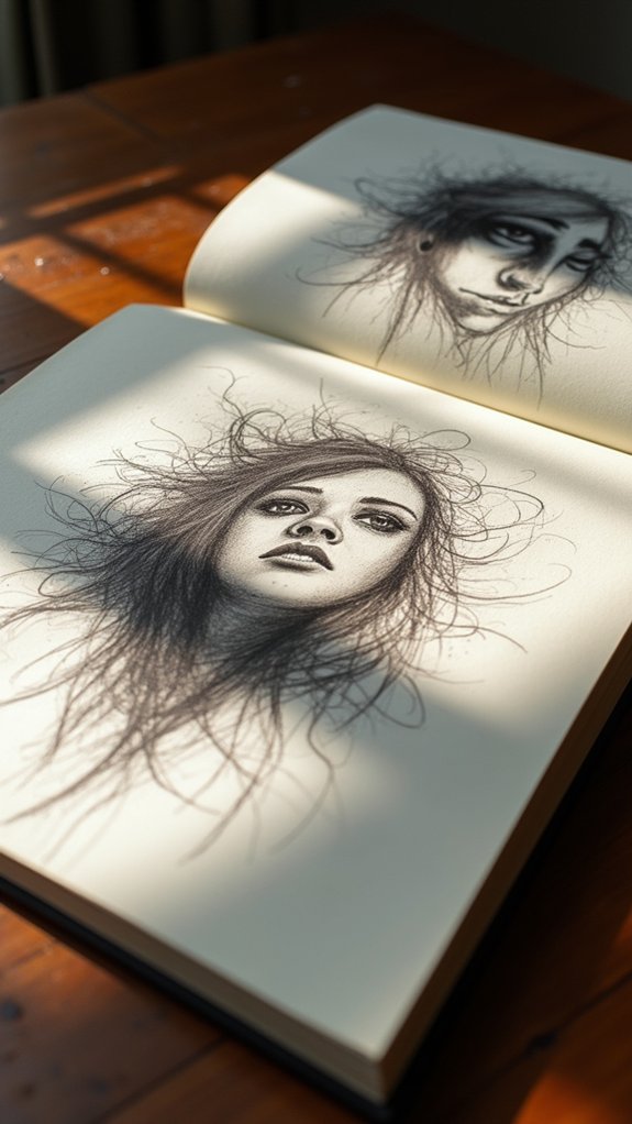
Expressive color and bold lines can almost shout how an artist is feeling right onto the page, whether it’s stormy midnight blue for sadness or fiery orange when excitement just can’t be contained.
Mood isn’t just something you talk about—it bursts out through every swipe of a brush or scratch of a pencil, changing the whole vibe of a sketchbook page in seconds.
Even a goofy, bright yellow doodle can quickly flip a bad day around, making art a secret code for sharing big feelings without saying a word.
Expressive Color and Line
Bright color and lively lines can totally change the mood of any sketchbook page, turning a boring doodle into something that almost jumps out at you.
When artists work with observational drawings and add expressive color, they can tell a story or make you feel something just by how wild or gentle their lines look. It’s like their pencil has a secret emotional life!
Dynamic linework makes sketches look super energetic, and using bold colors in just the right spots grabs your attention fast.
Here’s how you can boost your own pages:
- Pick a focal object from your observational drawings and highlight it with expressive color.
- Mix energetic, dynamic linework with calm areas for balance.
- Experiment with markers or watercolor to add awesome texture and depth.
Conveying Mood Visually
Even though doodling might seem like just a way to pass the time, sketchbook pages can become powerful mood machines when artists pay attention to how they use color, words, and placement. Selective splashes of color, especially arranged in circles, can actually guide a viewer’s eye and even set the emotional tone—think a burst of yellow for joy, or a swirl of blue for calm. Mixing short notes or quotes with observational drawings gives those sketches a story, making the whole page feel richer and more personal. Nature journaling, in particular, can work like therapy—each leaf or bug drawn helps sort out feelings. Here’s a quick look at expressive elements:
| Color Choice | Sketch Type | Emotional Impact |
|---|---|---|
| Cool Blues | Nature journaling | Calm and peaceful |
| Bright Yellows | Observational drawings | Joyful and energetic |
| Muted Browns | Personal reflection | Nostalgic, thoughtful |
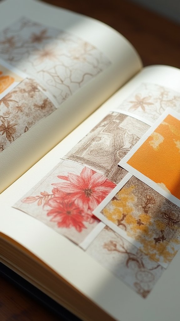
Collage Techniques for Textural Contrast
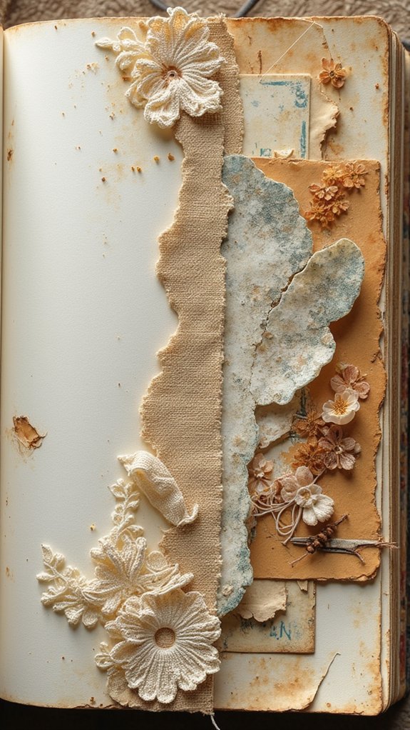
When it comes to making sketchbook pages pop, collage techniques are like a secret weapon for artists who want to play with texture and surprise. Instead of just drawing what you see, adding stuff like scraps of fabric or patterned paper gives sketches extra life.
Observational drawings can look totally new once layers, textures, and even funny bits of handwritten notes are mixed in. Suddenly, your plain old artwork feels exciting—almost like it wants to jump off the page!
Here are three ways to use collage techniques for bold textural contrast:
- Layer unexpected materials (think newspaper, cloth, or cool wrappers) for real depth.
- Blend watercolors with thicker collage elements for dramatic light-versus-solid effects.
- Sneak in quotes or doodles on top for fun, surprising context.
Using Arrow Motifs to Guide the Eye
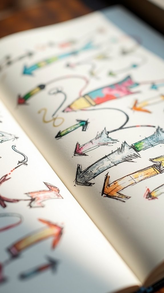
Because sketchbook pages can sometimes feel a little wild or all over the place, using arrow motifs is like having a secret map that guides your eye exactly where it should go. Arrows easily connect your observational drawings or notes, especially when your pages include a lot of details and start to look a little busy. Want to show how two sketches are related? Draw a fun, curvy arrow between them—bam! Instant connection. Use arrows of different styles—bold, skinny, swoopy—for extra personality and movement. Colorful arrows make certain things pop while keeping your layout neat. Even when your page looks chaotic, the arrows lead the way! Here are a few ideas:
| Arrow Style | Placement Ideas | Extra Touch |
|---|---|---|
| Hand-drawn sketchy | Between sketches | Color pop |
| Chunky graphic | Border details | Shadow effect |
| Swirly playful | Linking notes | Pattern fill |
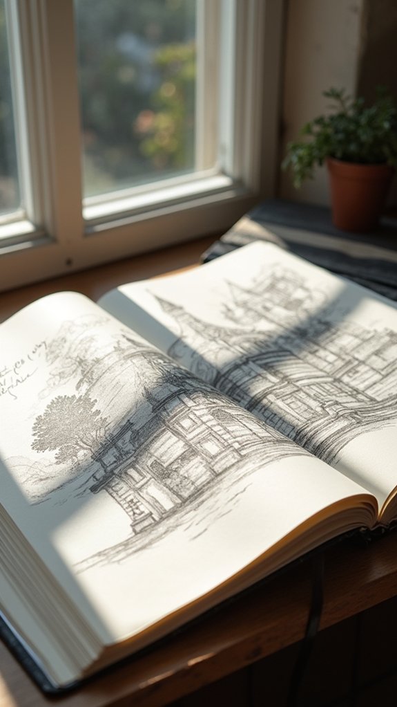
Mixing Architectural Plans and Observational Drawing
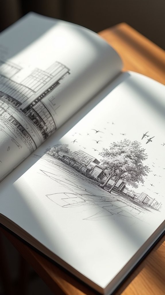
Mash-ups make the most exciting sketchbook pages, and mixing architectural plans with observational drawing is like giving your art double superpowers.
Imagine spending two years sketching city streets and then layering those observational drawings next to floor plans—it creates a story that’s as cool as any comic book adventure!
When students blend precise ink lines for the technical parts with loose, splashy watercolors for observation, things really start to pop. It’s not just about pretty pictures; it’s also about showing off your brainpower and creativity at the same time.
Here’s a quick breakdown:
- Pair floor plans and building sketches to show both structure and personality.
- Play with scale to highlight details or the big picture.
- Annotate your work for extra wow-factor and context.
Arranging Travel Ephemera for Added Depth
Even with just a handful of ticket stubs, postcards, and wrinkled maps, a sketchbook page can transform from “meh” to totally memorable. It’s all about mastering ephemeral storytelling and using visual layering techniques, like stacking a museum pass over a faded train ticket, or tucking a mini-map behind a photo. This makes each page feel like a puzzle you get to solve—color, theme, and texture all play together. When arranging travel memorabilia, playing with thematic color exploration keeps everything harmonious and appealing. Experimenting with layout isn’t just fun; it gives the page real depth.
Here’s a quick table of ideas:
| Travel Ephemera | Layering or Theme Tip |
|---|---|
| Ticket stubs | Overlap with colored paper |
| Postcards | Use as a page background |
| Wrinkled maps | Tuck behind sketches |
| Metro passes | Create color-themed clusters |
| Stickers | Frame important memories |
Spontaneous vs. Planned Layouts

If a sketchbook ever seemed to have a life of its own, it’s probably because of the wild contrast between spontaneous and planned layouts. One page might burst with wild, spontaneous creativity—maybe a splash of coffee becomes a mountain, or the artist doodles right over yesterday’s to-do list.
On another page, planned precision takes over, as thumbnail sketches and careful rectangles within rectangles line everything up just right. Both have their magic! Plus, blending images and handwritten notes makes each story pop. Artists are never boxed in—they’re always up for layout experimentation.
Here are three ways artists play with layouts:
- Scribbling and sketching on the fly for unexpected results.
- Using thumbnail plans to organize every detail.
- Mixing both approaches for the ultimate creative freedom!
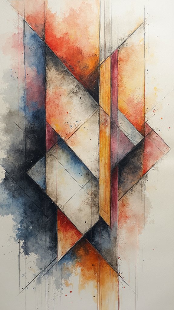
Showcasing Color Studies on the Page
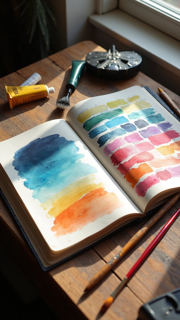
A splash of color on a sketchbook page can change everything. Suddenly, the page feels alive, grabbing attention in ways plain pencil sketches just can’t compete with.
By using color harmony techniques, artists can make sure everything looks good together—no clashing colors here, thank you very much! With smart color arrangement strategies, like arranging swatches in a circle or creating color trails, the viewer’s eye moves across the page exactly how the artist wants.
Don’t forget emotional color expression; colors set the mood, from bright yellows that scream excitement to moody blues that whisper calm. Mixing media, like watercolors and colored pencils, makes each page rich and interesting.
Best part? Color studies keep things fresh and build a sketchbook that’s never boring.
Frequently Asked Questions
What Paper Types Work Best for Mixed Media in Sketchbooks?
When selecting paper types for mixed media in sketchbooks, artists often prefer heavy weight sheets, such as watercolor paper, as these provide durable, textured surfaces that accommodate various wet and dry media without warping or bleed-through issues.
How Do I Overcome Creative Block When Starting a New Page?
When facing creative block at the start of a new page, one might utilize brainstorming techniques, engage with visual prompts, or participate in thematic challenges. These strategies help stimulate ideas and reduce the pressure of producing immediate perfection.
Which Pens and Paints Won’T Bleed Through Most Sketchbook Papers?
When considering which pens and paints won’t bleed through most sketchbook papers, artists often choose watercolor pens, gel ink, and specifically labeled bleed proof markers. These options typically provide vibrant color without saturating or damaging the paper’s surface.
How Can I Store and Protect Thick or Bulky Sketchbook Pages?
To address storing and protecting thick or bulky sketchbook pages, individuals may use page protection methods like interleaving sheets, consider bulky storage solutions such as archival boxes, and explore sketchbook cover options like custom hardcovers or portfolios for added durability.
What’S a Good Way to Organize Finished Sketchbook Pages for Later Reference?
To efficiently organize finished sketchbook pages for later reference, one should consider digital organization tools, categorize themes, and employ sketchbook indexing techniques. These methods streamline retrieval, support creative workflows, and preserve an accessible record of artistic progression.
Conclusion
With all these sketchbook page ideas, anyone can turn a boring sketchbook into a playground for creativity. It’s not about being perfect—it’s about having fun, experimenting, and letting each page surprise you. Mistakes? Totally part of the adventure! Whether you mix maps and watercolors or just doodle wild shapes, your sketchbook can be as unique as you are. So, grab those pens and plunge in—your next masterpiece might start with a messy scribble!
Leave a Reply