
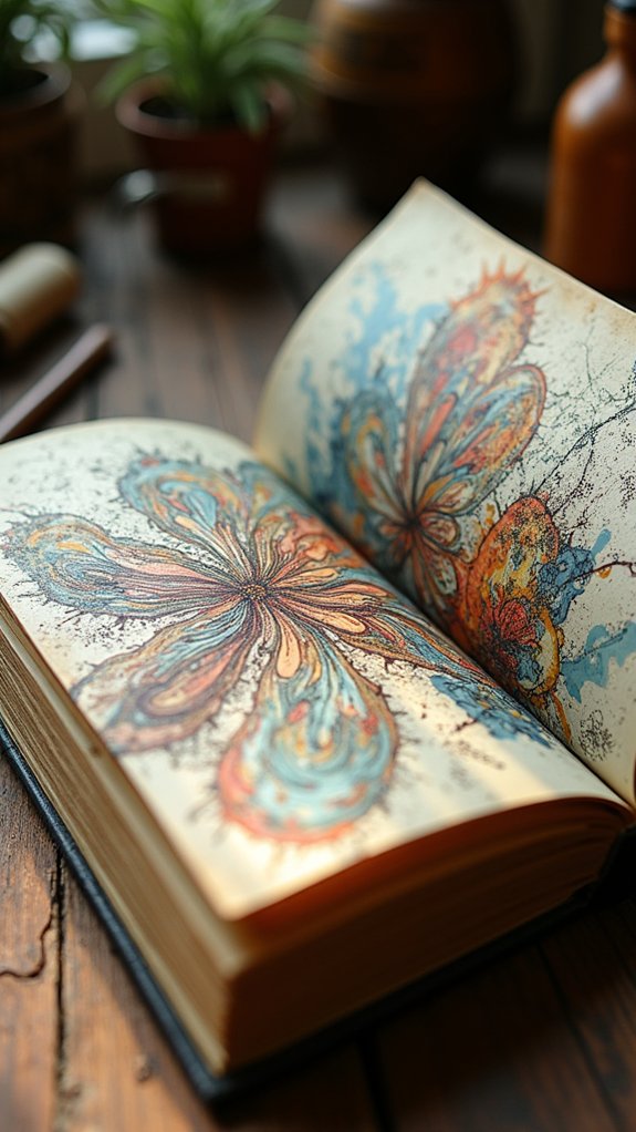
Aesthetic sketchbook pages are all about mixing color, texture, and flair in wild, fun ways. Think bold botanical bursts, playful hand-lettering, or wild cityscape sketches done on the go—each page bubbling with personality. There are vintage collages stained with real coffee, dramatic geometric shapes, nature patterns that feel alive, and even textured mashups with glued-on treasures or funky stencils. Some pages practically shout, “Share me!”—and there are plenty of tricks for making your own pages look just as cool.
Key Takeaways
- Incorporate vibrant botanical illustrations with watercolor and ink for depth and visual interest.
- Use playful typography and brush pen calligraphy to make expressive, eye-catching lettering pages.
- Layer found objects, textures, and mixed media for unique, tactile sketchbook spreads.
- Create personal map illustrations or expressive self-portraits to share your story and personality visually.
- Explore urban sketching and bold geometric patterns for dynamic, share-worthy compositions.
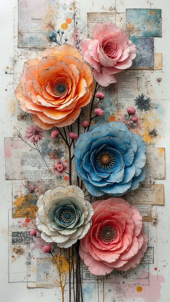
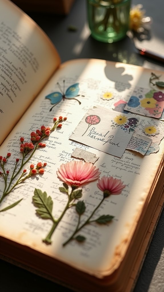
The Botanical Burst Spread

Imagine opening a sketchbook and seeing a page bursting with color—plants of all shapes and sizes tangled together in a big, beautiful mess. That’s the magic of the Botanical Burst Spread.
It’s like someone let a wild garden loose using only botanical illustrations, watercolor techniques, and a pinch of creativity. The mix of curly vines, spiky leaves, and petal-packed flowers jumps out, thanks to bold pen outlines and layers of watercolor.
These layers don’t just sit flat; they build up, creating real depth—like you could reach in and pick a leaf. Colors clash and blend, making certain plants pop right off the page.
This spread isn’t just eye-catching, it’s an invitation for artists to try wild things in their own sketchbooks.
Playful Typography Exploration
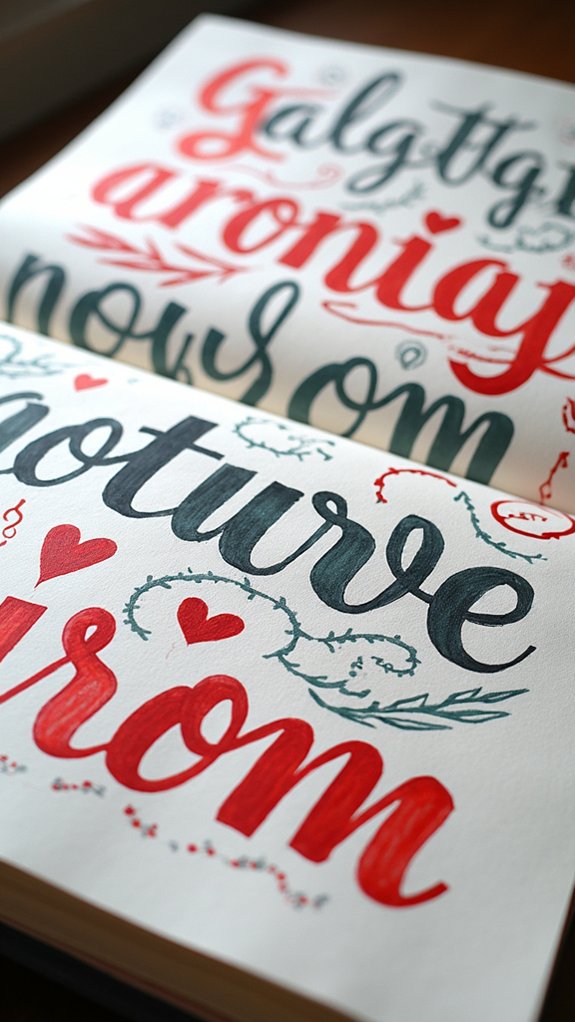
Playful typography is all about using funky letterform styles and amping up expression—think giant bubble letters next to skinny, spiky handwriting, each bouncing with personality.
Artists like to mix in bold contrast by layering thick marker strokes with tiny, scratchy lines or surprising pops of color, making every word feel like it’s shouting, whispering, or maybe even doing a little dance across the page.
If letters could wear costumes and tell jokes, this is where they’d show off their style!
Letterform Styles and Expression
Even though letterforms might look simple at first glance, jumping into different styles can be like opening a box of art supplies—suddenly, there are colorful possibilities everywhere.
Letterform styles range from bold block letters to bouncy scripts, each one packing its own vibe. Some people might like tidy, classic serif fonts, while others want wild, hand lettering that dances across the page.
Exploring hand lettering gives artists so much freedom—it’s like giving each word its own outfit, mood, and personality. Adding playful touches, like swirly tails or little doodles tucked into the loops, makes every letter feel unique.
And when artists blend colors, patterns, or even a splashy watercolor background, their letterforms stop being just words—they burst into life!
Techniques for Bold Contrast
A bunch of eye-popping tricks can turn plain words into real showstoppers on any sketchbook page. To amp up bold contrast, mix playful typography styles—maybe classic hand lettering merged with cool digital fonts. Try swapping font sizes and weights within a single saying; it’s a quick way to shine a spotlight on the most important words. Play with color blocking, too, by placing bright, clashing colors around your typography—it’s like giving your words a party hat. Don’t be afraid to mash up script fonts with chunky sans-serifs for major attitude. Finally, remember negative space is your friend. Give those letters some elbow room! Here’s a cheat sheet for boosting contrast:
| Technique | Why It Pops |
|---|---|
| Big & Bold Words | Instant focal point |
| Color Blocking | Makes text jump out |
| Font Mash-Ups | Unexpected & exciting vibe |
Urban Sketching on the Go

Ever wondered what it’s like to turn a bustling city sidewalk into your very own outdoor studio? Urban sketching pushes artists out of their comfort zones, right into the heart of city life.
With a trusty A5 sketchbook page in hand, every passing bus, quirky storefront, or skateboarding kid becomes part of the creative journey. Quick sketching techniques—fast lines, bold shapes, a little organized messiness—let creators capture the city’s wild energy almost before it zips by.
It’s not about perfect drawings; it’s about freezing a moment before it’s gone. Throw in some splashes of watercolor or bold ink, and suddenly that park bench scene pops with color and texture.
Best of all, sharing work with other sketchers keeps the journey fun, fresh, and full of ideas.
Monochrome Daydream Doodles
Monochrome daydream doodles are all about using just one color—or even just shades of gray—to see how much fun you can have with lines and shadows.
With only a pen or pencil, artists get creative using shading tricks and bold outlines, making something simple look really cool and sometimes even mysterious.
There’s something almost magical about how a few lines and the right amount of shadow can set the mood, turning a blank page into a world that feels both chill and full of energy at the same time.
Shades and Line Play
Even if color seems like the main star in most art, there’s something totally magical about black, white, and gray coming together on a single page.
Monochrome daydream doodles use different shades to pull your eyes into the sketch and keep you exploring. The real trick? Playing with lines!
Artists mess around with line weights—thick, thin, wild zigzags or calm, straight marks—to make the art dance. It’s like a secret language made out of pen and pencil, and it never gets boring.
Here are three ways these shades and line play bring a sketchbook page to life:
- Varying line weights add texture and movement.
- Shading with grayscale creates striking contrast.
- Clever use of negative space balances the whole piece.
Minimalist Mood Exploration
Artists playing with line and shade sometimes decide to cut things down to just the basics—minimalist mood exploration is where things get interesting. With only a single color and its shades, monochrome daydream doodles make a page feel neat but not boring. By focusing on line quality—thick, thin, scratchy, or super smooth—and the emptiness of negative space, these sketches explore mood more than detail. It’s creative, but also chill, like getting into a quiet zone where every mark matters. Plus, trying minimalist mood exploration is awesome for overcoming “white page syndrome.” The lack of big decisions makes starting easier. For many, simply doodling in one color turns into mindful reflection, like a meditative creative break.
| Technique | Benefit |
|---|---|
| Monochrome Doodles | Depth with one color |
| Negative Space | Simple, calming composition |
| Texture Play | Adds interest without clutter |
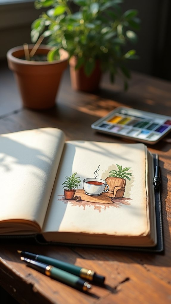
Coffee-Stained Vintage Collage

When you splash a bit of brewed coffee onto a page, something totally magical can happen—it’s like the sketchbook starts to tell its own old-timey story.
Coffee stains turn plain paper into a treasure map of memories, with every drip and swirl showing off wild and unpredictable patterns.
Layering vintage elements, such as faded photos or scraps from yellowed newspapers, lets you mash up the past with your own ideas, making your art both old-school and totally fresh.
Want to take it even further? Try throwing in washi tape or scraps of worn fabric for extra charm.
- Drip or brush coffee stains for unique backgrounds—each one’s a surprise.
- Layer vintage images to add depth and personality.
- Use a matching palette for that cozy, timeless vibe.
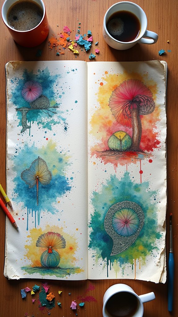
Galaxy Watercolor Washes
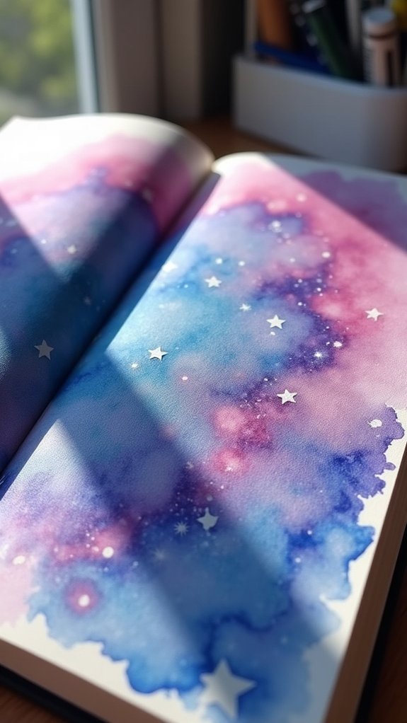
Just as a coffee-stained page can whisper stories of the past, a galaxy watercolor wash feels like stepping right into the middle of a starry dream.
With galaxy watercolor washes, anyone’s sketchbook can become a portal to the universe. The secret? Start with a wet-on-wet technique—dampen your paper, then swirl together deep blues, purples, and blacks.
Splash in some pinks and whites for star dust and nebulae. For real cosmic magic, sprinkle on a pinch of salt or flick on a bit of alcohol; watch it create tiny, star-like bursts.
Want something extra? Add metallic touches that shimmer like real stars—because why not, right?
Galaxy watercolor washes are pure creative inspiration, where every page feels like infinity in your hands.
Minimalist Line Art Page
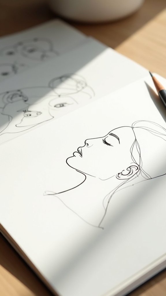
Even though big, splashy art can be exciting, there’s something quietly powerful about a minimalist line art page. With just a few carefully placed lines, an artist can capture a whole mood or idea.
Minimalist line art celebrates simplicity, letting clean lines and negative space do all the talking. Sometimes, the best part isn’t what’s drawn, but what’s left empty—like a dramatic cliffhanger for your eyes!
This style doesn’t need fancy supplies or complicated techniques, making it perfect for anyone to try. Here are three ways to make a minimalist line art page pop:
- Play with negative space—leave some areas completely blank.
- Use a limited palette, like only black or one bold color.
- Experiment with line thickness for extra dimension.
Mixed Media Melange
Plunge into a world where glue sticks become magic wands and sketchbooks turn into treasure maps—welcome to the mixed media melange!
This is where creative inspiration explodes into action. Picture layers of watercolor washes mixing with bold strokes of ink, plus cool surprise guests like vintage tickets, scraps of magazine, or a tiny button snagged from a shirt.
Artists immerse themselves in mixed media to try wild combos: acrylic paint with fabric, or funky paper with doodled graphics. Some pages even jump off the page—literally—with stitched patches or chunky bits glued down for that amazing 3D touch.
Sure, it can get messy, but isn’t that the best part? Every page feels like an experiment gone right, breaking art rules and inventing brand-new ones.
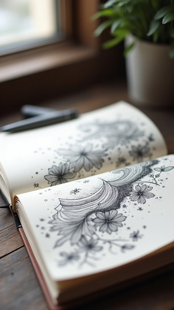
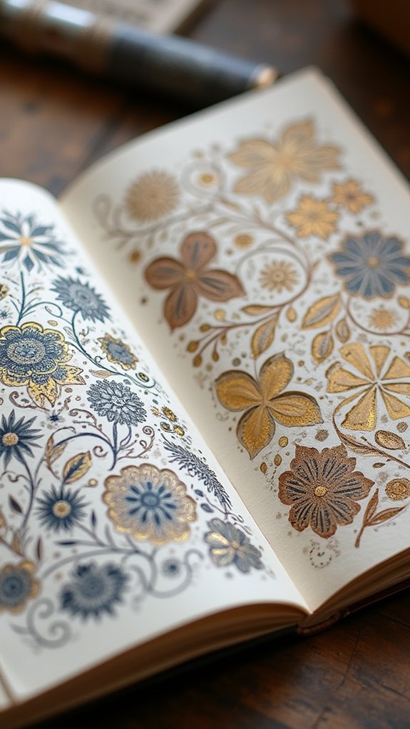
Nature Pattern Repetition
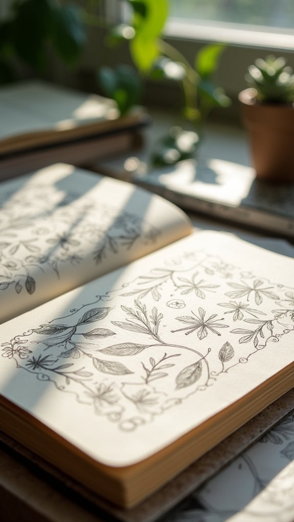
After the wild mix-and-match energy of mixed media, sketchbook artists often find themselves enchanted by patterns straight out of the natural world.
That’s where nature pattern repetition steps in, bringing creative inspiration from the shapes of leaves, flowers, and even the way certain bugs line up.
These repeating forms aren’t just pretty; they guide the viewer’s eyes like a dance and make any page look instantly more put-together.
Artists use different techniques to jazz up their patterns, and nobody can say they’re boring!
To get the most out of nature pattern repetition, artists often:
- Vary the size and direction of repeated motifs.
- Play with color and texture to keep things unexpected.
- Practice mindful sketching, letting patterns spark both art and relaxation.
Personalized Map Illustration
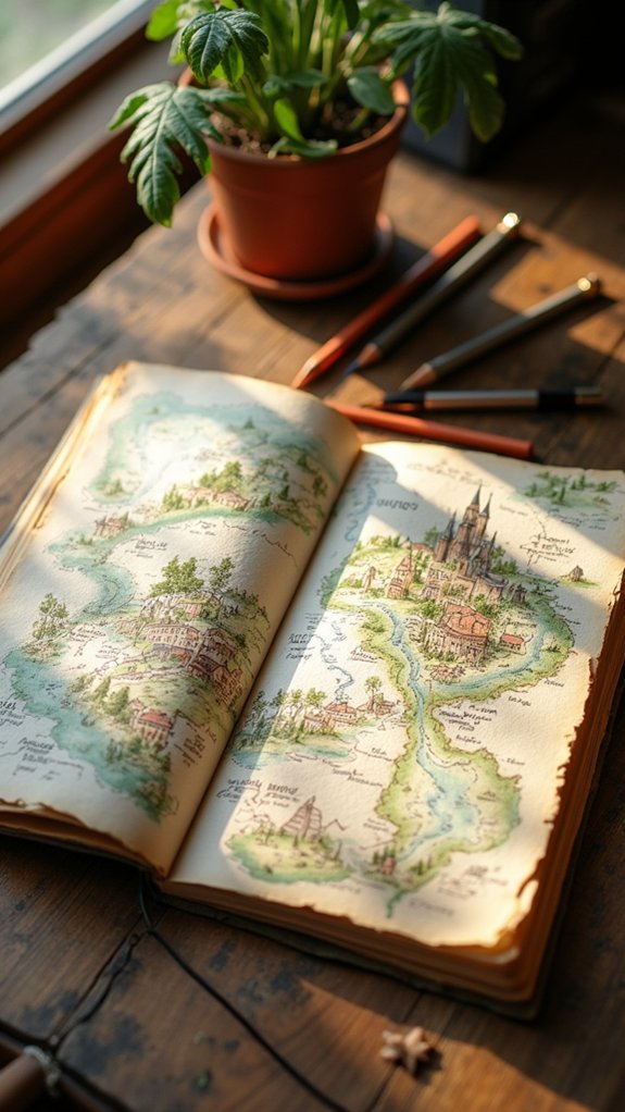
While some sketchbook pages capture quick doodles or bursts of color, personalized map illustration turns a plain piece of paper into an epic adventure map, starring the artist’s own life.
It’s like making your own treasure map, except the “X” marks your favorite pizza place—or maybe that time you got totally lost downtown! By adding landmarks, routes, and funny personal notes, these maps become totally one-of-a-kind visual diaries.
Creative inspiration can strike anywhere: maybe you use watercolor to show a river, or collage some ticket stubs from a cool concert. Sticking to a certain color palette or style helps keep everything looking awesome and pulled together.
Tiny doodles or symbols for your wildest memories? Yes, absolutely—this is your adventure, after all.
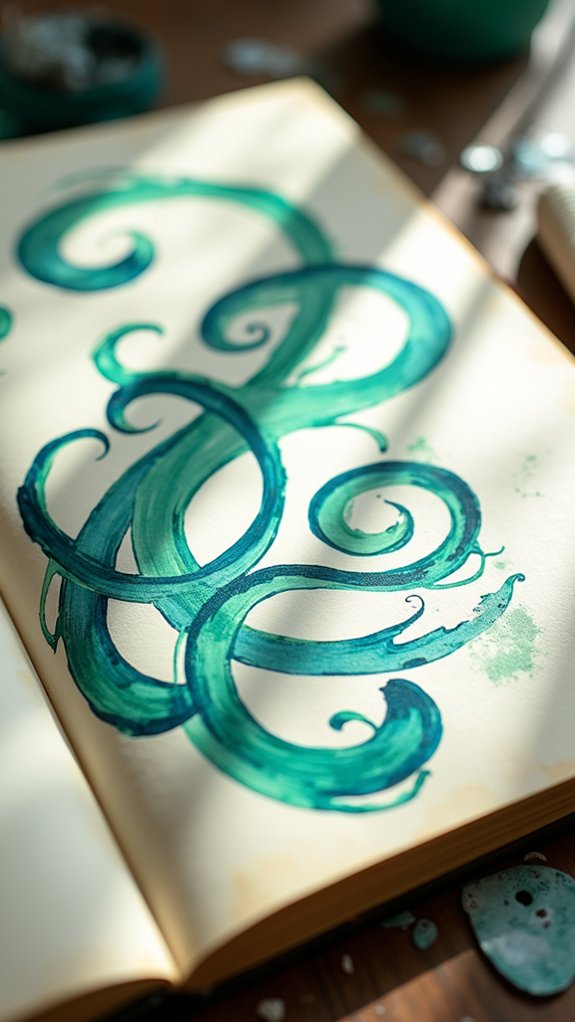
Abstract Geometry Practice
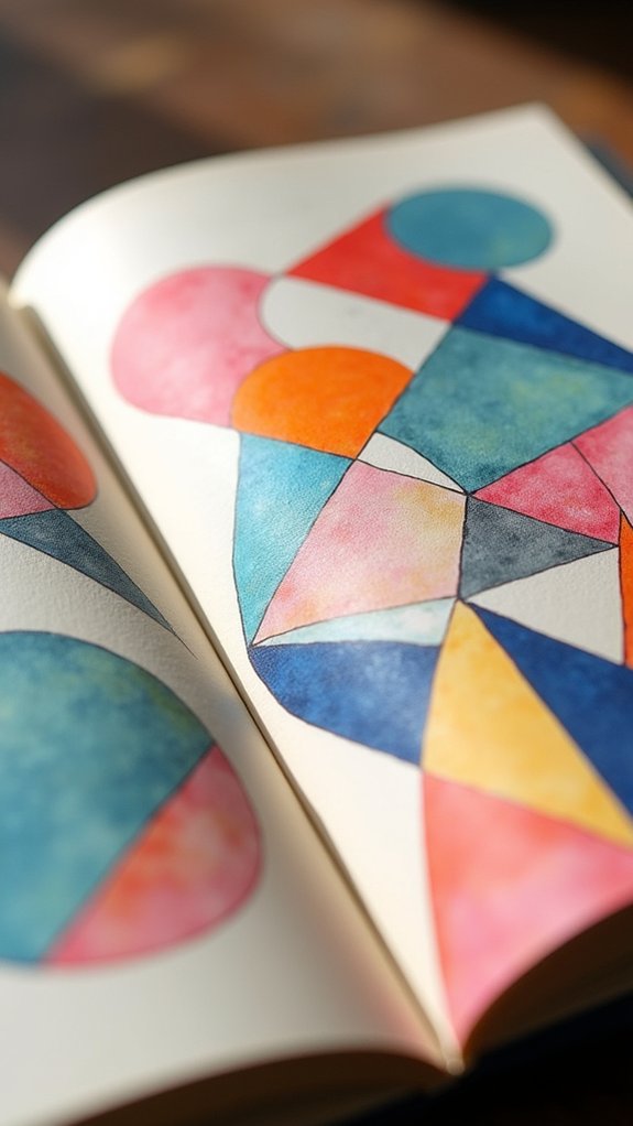
Abstract geometry practice is where things get wild—with triangles, circles, and unexpected shapes taking the spotlight, artists can play around and see how all those forms bounce off each other.
Mixing and matching colors becomes a mini science experiment in balance (nobody wants a neon headache, after all), and it’s all about finding a combo that feels just right.
With every squiggle and shade, the page turns into a puzzle, packed with action and full of surprises.
Exploring Dynamic Shapes
What happens when someone lets their pencil wander across a page, chasing after wild triangles, wandering circles, and odd-looking polygons? They end up exploring dynamic shapes that jump off the paper, giving their sketchbook a mega dose of visual impact.
In abstract geometry practice, there’s no need to keep things boring or straight-laced. It’s about letting loose and just seeing where those shapes lead. Some people even combine pen, marker, or watercolor, which can make the shapes really pop with cool textures.
Here are three ways to level up those abstract pages:
- Mix up shapes—a rectangle sitting next to a twisty line? Why not!
- Play with symmetry for balance that grabs the eye.
- Layer shapes for a sense of space, depth, and fun chaos.
Color Harmony Strategies
Since every awesome sketchbook spread deserves colors that totally vibe together, figuring out color harmony can turn even the wildest abstract geometry into something beyond cool.
For starters, rocking a limited palette of analogous colors (those sneaky neighbors on the color wheel) instantly makes abstract geometric designs look more put together than your best planner page.
Want a power move? Try the 60-30-10 rule—let one color be the superstar, give another the sidekick role, and save a zinger as the accent.
If you’re feeling bold, go for complementary colors; they’re like the rival teams in a sports movie, bringing energetic contrast.
Mixing in shades and tints adds that tasty depth, and remember: colors have feelings. Blue’s chill, red’s wild—choose your mood!
Daily Routine Visual Diary
Curiosity about the little things in life can turn even the most boring day into something worth remembering, and that’s exactly what a daily routine visual diary is all about. Instead of letting moments blur together, artists sketch, glue, and scribble bits from their daily routine, squeezing creative inspiration out of everything—from spilled coffee to a funny doodle on a school notebook.
This approach is about more than just pretty pages. It’s about finding meaning and letting creativity spill over the edges. Consistency is key, but so is experimentation—don’t be afraid to mix it up!
Here are three simple ways to make your daily routine visual diary pop:
- Mix photos, clippings, and notes.
- Sketch using a different color palette each week.
- Set a daily theme and stick to it.
Collaborative Art Jam
Sometimes, the best art happens when a bunch of creative minds team up, toss their ideas into the mix, and just see what weirdly wonderful things appear. That’s exactly the vibe you get at a collaborative art jam.
Everyone brings something different—markers, paint, maybe even old ticket stubs or glitter that somehow ended up everywhere. Artists swap tips and mash up styles until the sketchbook pages look like explosions of creative inspiration, part chaos, part master plan.
Prompts or themes help guide the madness, but rules are pretty loose—just enough to keep everyone headed in the same wild direction. People snap photos or make quick sketches of the jam, capturing not just the art, but the feeling of making something awesome together.
Child’s Markings and Memories
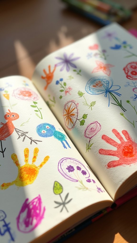
One quick way to turn any sketchbook into a time machine? Add a scribble or doodle straight from a kid’s hand!
Child’s markings have a way of zapping everyone right back to the moment—a tiny hand clenching a fat crayon, serious concentration, maybe even a tongue peeking out of the corner of a mouth.
These imperfect lines and bursts of color aren’t just cute, they’re full of memories. Each page becomes a story, like a secret code written in wobbly lines and wild swirls.
Want to make sure the memories stick around?
- Date each doodle to track artistic growth over time.
- Mix your own art with their creations for a cool collaboration.
- Choose forgiving supplies, allowing fearless, joyful creativity—no worries about “ruining” anything!
Found Objects Embedded
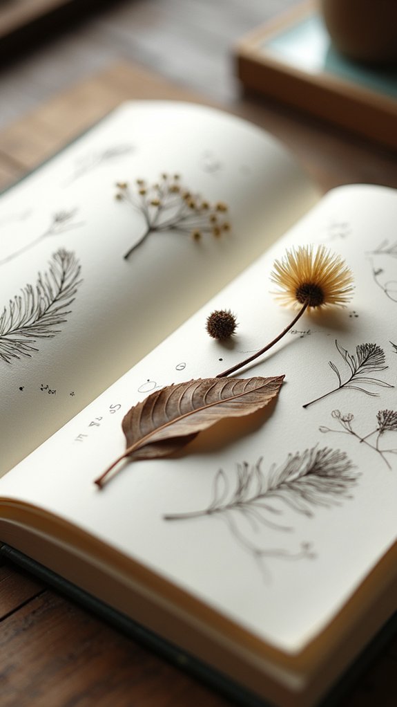
After flipping through pages buzzing with wild kid energy, it’s kind of cool to see how a sketchbook can collect memories in other ways too. When artists embed found objects—like leaves, ticket stubs, or even a lost button—they turn the page into a time capsule. The textures pop, the colors shift, and suddenly, every spread tells a fuller story. Mixed media magic happens when these found objects chill beside watercolor splashes and ink doodles. It’s all about layering moments and memories, right on paper. Plus, jotting down details about each treasure adds extra personal meaning. It’s creative inspiration you can actually touch!
Here’s some fun found object ideas:
| Object Type | Possible Meaning |
|---|---|
| Leaf | Favorite park visit |
| Ticket Stub | Unforgettable movie night |
| Fabric Scrap | Special old shirt |
| Postcard Piece | Dreamy vacation memory |
| Candy Wrapper | Sweetest day with friends |
Brush Pen Calligraphy Trials
Trying brush pen calligraphy can really test your patience—sometimes letters end up wobbly, lines go rogue, and it feels like the pen is out to get you.
But mistakes are just part of the adventure, and experimenting with different brush strokes can actually make the process more fun (and sometimes pretty hilarious).
As people push through the frustration, they start to notice their control and style growing, stroke by experimental stroke.
Overcoming Calligraphy Frustrations
Even though brush pen calligraphy looks totally magical on social media, those first attempts can feel like wrestling a slippery octopus with a paintbrush.
Calligraphy frustrations are real—the letters wobble, lines get wonky, and sometimes your “inspirational quote” looks more like a ransom note.
But behind every jaw-dropping calligraphy piece, there’s a heap of not-so-glamorous practice pages. The secret? Embracing mistakes as creative inspiration, not failures.
Here are a few tricks to keep frustration in check:
- Start with basic shapes: Practice lines and circles before diving into full letters.
- Use the right tools: Flexible brush pens and grid paper make a world of difference.
- Embrace the learning curve: Progress happens page by page—imperfections included!
Each try brings you closer to your own style.
Experimenting With Brush Strokes
Crashing into the world of brush pen calligraphy feels a little like learning to ride a bike—with a paintbrush instead of handlebars and paper instead of pavement.
Every attempt brings wobbly lines and the hope that, just maybe, the next set of brush strokes will look cool enough for your sketchbook. Testing different brush pens—some bendy, some springy—lets each page become an adventure.
There’s real magic in pressing hard for thick lines, then lifting for those skinny swoops. Loops, swirls, and wild flourishes bring extra zing, while colored inks and layering tricks can make letters practically jump off the page.
Keeping a practice sheet handy helps track progress, making every new attempt smoother and more confident. Messy? Sure. But totally worth a spot in your sketchbook.
Expressive Self-Portrait Page
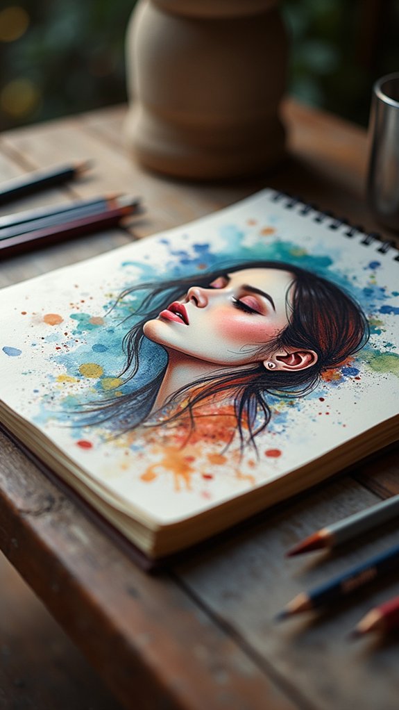
While some might think a self-portrait is just about drawing a face, an expressive self-portrait page in a sketchbook is actually more like an emotional rollercoaster in art form.
It’s less about getting the hair perfectly right and more about capturing the moods, weird thoughts, and secret dreams tangled up in a person’s mind. Artists turn these pages into explosive, expressive battlegrounds using splashy watercolor washes or scribbly brush pen calligraphy—no boring faces allowed!
Mixing bold colors and unexpected shapes helps the whole page jump out at you, sort of like a pop song for your eyeballs. Sometimes, they even sneak in hidden symbols or favorite quotes for extra punch.
Here are three expressive self-portrait page ideas:
- Layer bright mixed media textures.
- Add powerful personal symbols.
- Experiment with abstract styles.
Stamp and Stencil Play
Stamp and Stencil Play is where things can get wild—think bold patterns clashing, colors overlapping, and designs mixing like a big, happy art party.
By layering stamps and stencils, artists can mix patterns that almost pop off the page, letting one design peek out from behind another for extra wow.
It’s kind of like building an art sandwich—each layer adds more texture and excitement, and sometimes the messier it gets, the cooler it looks.
Mixing Stamps and Stencils
How do artists take a simple sketchbook page and turn it into a feast for the eyes? By mixing stamps and stencils, they reveal endless ways to make pages pop with personality and fun textures.
This combo isn’t just about making things look pretty—it’s about telling a creative story with every spread. With the right tools and a little imagination, artists can whip up some seriously cool effects.
Here’s how mixing stamps and stencils amps up any sketchbook:
- Create Dynamic Patterns: Layer stencils with stamps (think floral stencils and botanical stamps) for patterns that feel alive and fresh.
- Experiment with Materials: Try foam, rubber, or even a potato as a stamp for surprising results!
- Switch Up Inks: Use pigment and dye-based inks for either vibrant splashes or subtle shadows.
Layering Patterns Creatively
Every sketchbook has that one wild page—the one where patterns overlap, colors clash (in a good way), and it’s hard to tell where one layer ends and the next begins. Layering patterns with stamps and stencils releases creative inspiration, and you don’t even need to be a master artist! Try using ink, watercolor, or even acrylics; each one reacts differently, and surprises are half the fun. Experimenting with found objects—like leaves or weird fabric scraps—adds texture and character nobody else can copy. Don’t rush: let each layer dry, then add another for depth. Pro tip: contrasting colors and different opacities really make designs pop off the page. Check out this quick table for creative combinations:
| Stamp Type | Stencil Shape | Layering Medium |
|---|---|---|
| Rubber heart | Starburst | Watercolor wash |
| Foam flower | Geometric | Ink splatter |
| Leaf print | Chevron | Acrylic streaks |
Architectural Impressions
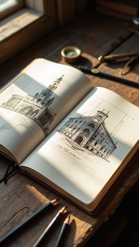
A sketchbook becomes a secret portal when it’s filled with architectural impressions—suddenly, those blank pages come alive with dramatic rooftops, crooked windows, and winding staircases.
It’s almost like the paper becomes a mini city, waiting to be explored. By experimenting with line work, shading, and perspective, artists can transform even the simplest roofline into something epic.
Adding splashes of color with watercolor or colored pencil, or jotting down quick notes in the margins, makes each sketchbook page feel like a tiny adventure.
And who says you have to draw only perfect buildings? The little quirks give tons of personality!
- Try mixing pencil sketches with watercolor washes for extra depth.
- Use real buildings or cool photo references to inspire your architectural impressions.
- Annotate sketches with fun facts or quick diagrams for more impact.
Moodboard With Clippings
Magazines, ticket stubs, scraps of wrapping paper—these random little treasures can totally transform a plain sketchbook page. Turning these finds into a moodboard with clippings is like making a collage of everything you vibe with.
People hunt down magazine cutouts, old photos, or quirky bits from their day, snipping them out and sticking them down to match a color scheme, mood, or even a wild idea. Clippings from vintage magazines or newspapers? Total time-travel bonus.
Organizing by color or subject makes the page look intentional, not like you tripped and spilled glitter. Add some quick doodles or scribbled notes, and suddenly, your moodboard feels personal and super unique.
Every sketchbook page starts to tell its own mini story—no two alike!
Layered Texture Experiments
After piecing together moodboards out of wild clippings and bits of daily life, things can get really interesting by adding some legit texture to those sketchbook pages.
Layered texture experiments are all about mixing stuff up—a splash of watercolor here, some inky lines there, with maybe a chunk of newspaper or two snuck in for that mysterious vibe.
There’s no rulebook, just a wild ride of creative inspiration. Want to make your pages pop and feel extra special? Try some of these:
- Mix materials like coffee stains, fabric scraps, or acrylic for out-of-nowhere finishes.
- Layer transparent papers, so colors and patterns peek through from below.
- Add three-dimensional elements, like stitched threads or buttons, for an artsy, touchable effect.
It’s hands-on creativity—let imagination lead!
Frequently Asked Questions
How to Make a Sketchbook More Aesthetic?
To make a sketchbook more aesthetic, one should utilize colorful materials and respond to creative prompts. Incorporating mixed media, cohesive color schemes, and varied textures can further enhance visual appeal, while embracing imperfections fosters character and authenticity.
Do Sketchbooks Have to Be Perfect?
Sketchbooks do not have to be perfect. Embracing flaws and sketchbook imperfections encourages creative growth and self-expression. Artists benefit from accepting mistakes, allowing them to explore ideas freely without the pressure of achieving flawless results in every entry.
How Do You Make a Good Sketchbook Spread?
Creating a good sketchbook spread involves selecting a cohesive color palette, planning an intentional layout design, balancing negative space with detailed areas, and combining textures or mixed media. Documenting process notes can further enhance narrative and visual appeal.
What Size Sketchbook Should I Get as a Beginner?
Choosing sketchbook dimensions as a beginner depends on personal preference and workflow. Beginner tips suggest starting with an A5 size for portability and comfort, while experimenting with A4, square, and panoramic formats expands creative possibilities.
Conclusion
With so many fresh ideas, anyone can turn their sketchbook into a work of art worth sharing. It’s not about being perfect, it’s about letting loose and having fun on the page—maybe even making a mess or two. Every squiggle, splash, or snipped paper piece tells a story, so why not get started? Who knows, the next brilliant, wild, or even slightly weird sketchbook page could totally be yours! Go for it!
Leave a Reply