
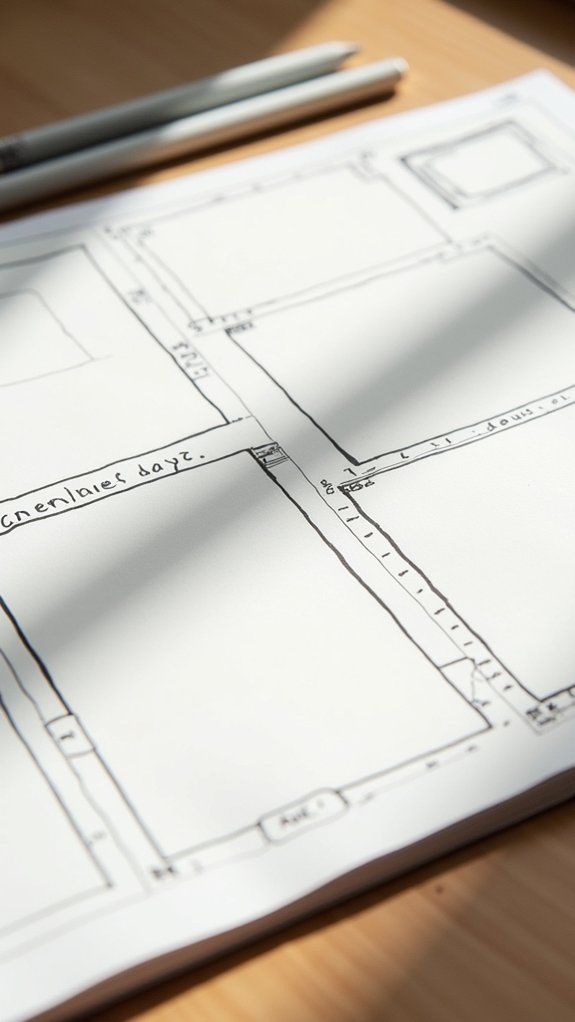
Sketchbook page layouts can make planning a breeze and spark lots of new ideas. Popular templates include rectangles inside rectangles, bold color accents, timelines, and central maps surrounded by sketches. Some pages mix drawings with notes, use themed boxes, or feature a single subject with charts. Circles, arrows, and fun labels really amp up the excitement. Each layout helps keep things organized—and makes sure you never get bored. Curious? There are even more creative layouts just ahead!
Key Takeaways
- Use rectangle within rectangle layouts to break ideas into manageable, clearly defined sections for organized sketchbook pages.
- Try a central map with surrounding sketches to visually explore a main theme and its related concepts.
- Arrange sketches sequentially with timeline storyboard layouts to easily plan stories or processes step-by-step.
- Employ themed boxed groupings or colored accents to highlight, group, and organize different subjects on a single page.
- Combine sketches with adjacent notes, arrows, and charts to integrate text and visuals for enhanced clarity and context.
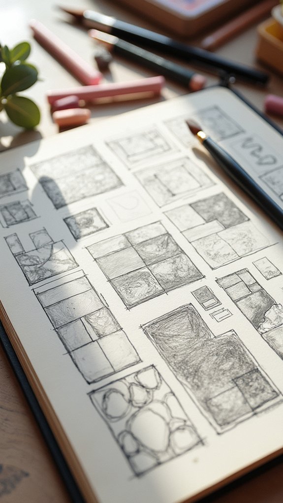
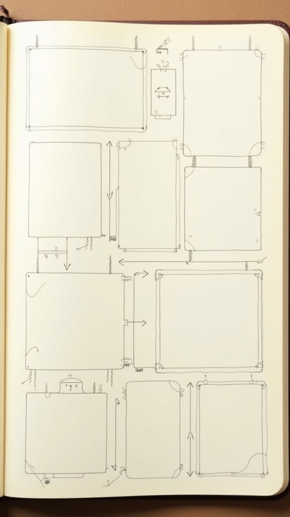
Rectangle Within Rectangle Layout

Rectangle magic—it’s not just for math class anymore! In the rectangle within rectangle layout, artists get to stack, layer, and nest rectangles right on their sketchbook page, turning it into a playground for creativity.
Instead of one big empty space, the page transforms into boxes within boxes—a perfect way to break big ideas into smaller, manageable bits. Want to draw a scenery in one rectangle and doodle your cat in another? No problem!
Adding notes or titles around or inside these rectangles not only keeps everything balanced, but also helps tell the story behind each sketch. Plus, experimenting with sizes and arrangements means there’s always a way to make things pop.
Best part? It takes away the stress of perfection—every rectangle counts!
Central Map With Surrounding Sketches
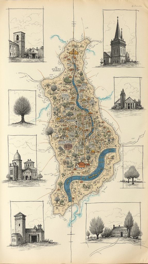
Even if maps usually remind people of geography class, on a sketchbook page, a central map becomes an epicenter of creativity—the kind of layout that pulls everything together like a magnet.
To start, pick a main place or theme for the map to claim the spotlight. Next, sprinkle sketches around it, each one exploring something connected to the map. Want to show a path or a funny connection? Use arrows or lines—they’re like visual breadcrumbs.
Play around with the sizes and directions of those outer sketches, too, so the page has energy, not just plain old orderliness. Add a pop of color here and there—it can glue the page together and guide the eye.
Little notes or quirky labels around the central map can turn your sketchbook page into a story worth reading!
Bold Color Accent Page

Nothing snaps a sketchbook page to life quite like a blast of bold color. It’s like flipping on a spotlight—suddenly, everything wakes up!
With a bold color accent page, artists can really make their sketchbook pages pop. The trick is to choose just a few sketches or words to highlight with those eye-catching hues, while letting the rest of the page chill in black-and-white. This contrast keeps things organized and points the viewer right where you want them to look.
Some people even arrange their sketches in a circle around a bold color center, turning the page into a visual carnival ride. Matching colored headers or quick notes don’t just look cool, they help ideas stick together. Now, that’s powerful planning!
Integrated Image and Notes Spread
Color can totally steal the show, but sometimes the real magic happens when sketches and notes team up on the page. With an integrated image and notes spread, sketches on a page aren’t just floating alone—they’ve got stories and facts right beside them. A great trick is to put sketches in the center, letting words frame the scene like a spotlight. Use arrows or lines to be the matchmakers between each sketch and its story, so no one gets lost. Pick fun fonts (never comic sans, trust us!) and bold a word or two for flair. Add pops of color, but don’t splash the whole page—too much and it’s chaos! Check out this simple table for layout ideas:
| Center Sketch | Left Note | Right Note |
|---|---|---|
| Tree | Leaf types | Bark texture |
| Bird | Song facts | Nest sketch |
| Shoe design | Materials | Designer tip |
| Eye drawing | Shading tip | Reference |
| Robot | Tools used | Inspiration |
Timeline Storyboard Layout

A sense of adventure comes alive with a timeline storyboard layout—think of it as a comic strip for real-life moments or wild ideas.
Imagine page layouts where sketches line up in neat rows, each box telling what happens next, like a secret code flipping through time. Arrows zigzag between scenes, guiding your eye so you don’t miss the best parts.
This layout isn’t just for memorizing history lessons—it’s cool for tracking an experiment, showing your pet’s goofy antics, or visualizing your own epic journey through middle school.
Artists love the timeline style because it holds everything together, while letting you go wild with different drawing sizes and wild styles.
Every page becomes a living, breathing adventure, ready for the next chapter.
Diagonal Feature and Text Balance
There’s something super cool about tilting a sketchbook page on the diagonal—it just screams, “Look at me!”
Isn’t it wild how a simple angle can turn a regular page of sketches into a serious attention-grabber? Diagonal layouts pull your eye across the page, almost like a dance floor for both doodles and ideas.
The secret sauce? Balancing your notes and sketches so nobody is hogging the spotlight.
Using rectangles along the diagonal for both text and drawings keeps things organized without making it look like a tornado hit your supplies.
Play with bold fonts or mix up hand-lettered styles; toss in a slash of color around your favorite sketches or text boxes.
Suddenly, it’s not chaos—it’s a masterpiece with awesome flow.
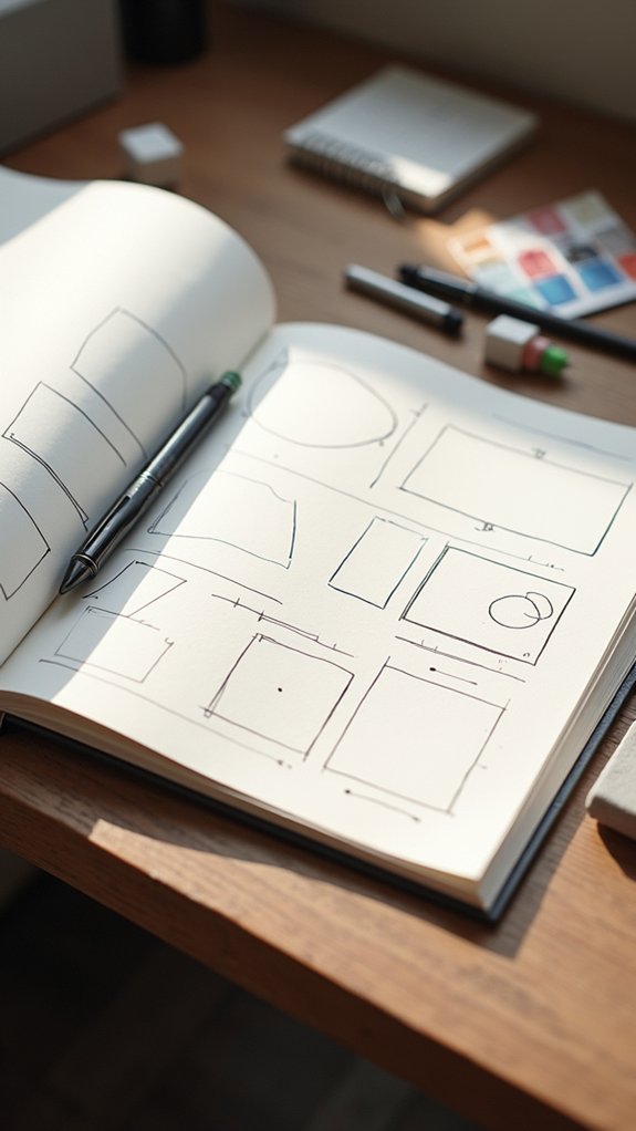
Grid of Mini Sketches and Details
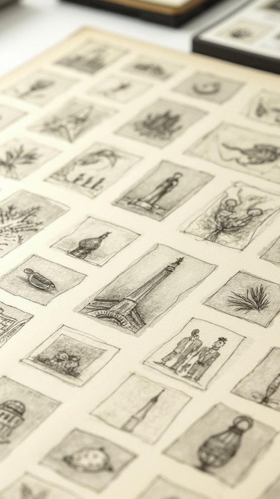
Give a sketchbook page a grid makeover, and suddenly it’s like trading in a cluttered closet for a super-organized shelf—with every mini sketch and note getting its own cozy spot. Using a grid of mini sketches helps every idea shine. Planning out a three-column, five-row layout? That’s smart. It keeps the page tidy and boosts your art confidence, making it way easier to focus on each subject. Each box on the grid lets you doodle a detail, add notes, or test shading tricks, so you can experiment freely without messing up the whole page! Odd-numbered layouts keep it lively. Switch up box sizes for some extra style and fun. Here’s what a 3×5 grid could look like:
| Mini Sketch 1 | Mini Sketch 2 | Mini Sketch 3 |
|---|---|---|
| Detail/Note | Quick Study | Texture Test |
| Idea Draft | Tiny Character | Shadow Play |
| Thumbnails | Color Swatch | Error Practice |
Collage and Mixed Media Arrangement
Collage and mixed media pages are where sketchbooks really start to feel magical, mixing layers of paper, photos, and even random ticket stubs to tell a wild visual story.
Putting text right on top of images or tucking words between scraps adds a voice to the page, making it feel almost like a secret message for anyone who looks closer.
With every layer and carefully chosen word, artists can create pages that pop with energy and practically leap out of the sketchbook yelling, “Look at me!”
Layering Visual Elements
Creativity comes alive when artists start piling up different things on a sketchbook page—suddenly, a simple drawing can turn into a wild mashup of paper scraps, fabric bits, and even old photos.
When it comes to page layout, layering visual elements makes artwork pop with energy and depth. Artists often use collage techniques to mix materials, which gives the page interesting textures and a sense of surprise.
Want even more drama? Try blending watercolor with ink or pastel for awesome contrast. Using a grid layout helps keep everything from turning into a chaotic jumble.
Transparent materials—like tracing paper or vellum—layer on top rather than cover things up, making the page even cooler.
- Collage with paper, fabric, or photos
- Grid page layouts for neatness
- Mix watercolor, ink, and pastels
- Layer transparent elements like vellum
Integrating Text and Images
Although filling a sketchbook with art is a blast, things get even more exciting when text jumps into the mix. Integrating text and images can totally change the way a sketchbook page feels, making everything link together like a comic strip or a super cool magazine spread.
When artists blend notes or captions around sketches, it fills up awkward blank spots and pulls all the ideas together. Plus, bold titles, squiggly descriptions, and even silly personal comments—written in different sizes or fonts—give each page extra personality and help tell a richer story.
For something even more wild, adding washi tape, scraps of colored paper, or other mixed media elements brings extra depth and makes everything pop. The trick is experimenting with placement until the balance just feels right.
Minimalist Composition With White Space
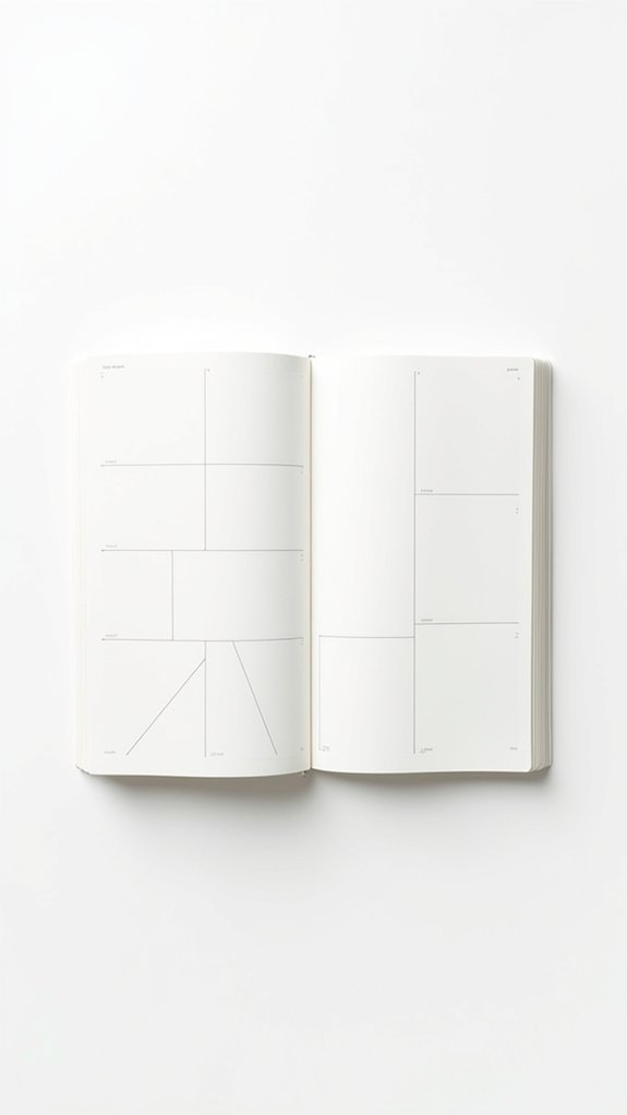
Once you step into the world of minimalist composition with white space, everything starts to feel a little lighter—like your sketchbook just took a big, relaxing breath.
This style is all about letting your page breathe, giving each element room to shine. Instead of filling every inch, you leave plenty of empty space, which actually makes your sketches stand out even more.
It feels a bit like magic—sometimes, what you leave out is just as important as what you put in! A minimalist sketchbook page invites viewers to really look, to pause, and to enjoy the simple beauty of your work—without feeling overwhelmed.
- Let empty space highlight important sketches
- Place drawings and text with intention for clarity
- Prevent page overcrowding by editing your layout
- Try different amounts of white space for unique vibes
Circular Flow Design
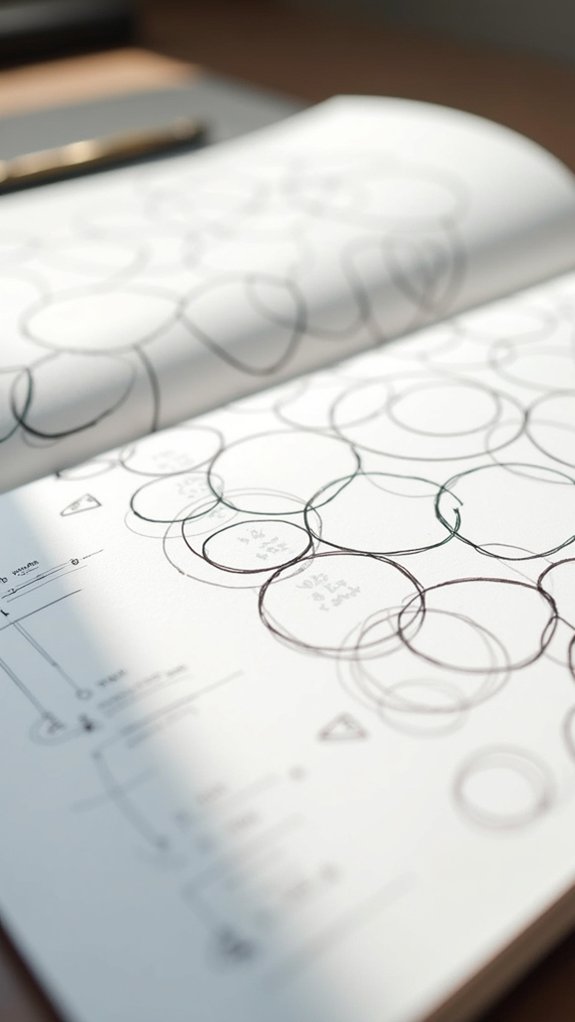
When a page swaps straight lines for a swirling path, things suddenly get a whole lot more interesting—enter the circular flow design. This layout feels like an exciting roller coaster for your eyes, sending you looping around the page instead of just from left to right. The circular flow design organizes sketches in a round pattern, making each stop along the way feel equally important. Using a pop of color here and there draws attention to certain spots, while leaving other areas uncolored keeps things calm—not like a page full of highlighters gone wild. Mixing big and small sketches in the circle adds energy and variety.
| Element | Placement | Color Technique |
|---|---|---|
| Central sketch | Center | Uncolored |
| Highlight detail | Top left | Bold accent color |
| Mini sketch | Bottom | Light shadowing |
| Movement arrow | Right edge | No color |
| Focal image | Left edge | Full vibrant color |
Object-Focused Page With Context Elements
When putting together an object-focused page, it’s all about making that main subject shine while still giving a sense of its story with smartly placed context elements.
There’s a bit of an art to balancing how much detail you give the central star and how much you let the background and other bits support it—too much, and you get clutter, too little, and things look empty.
Artists can play around with size, arrow lines, and even a splash of color to keep everything clear and interesting, making the page not just a picture but a whole experience.
Highlighting Objects With Surroundings
Spotlights and stage lights—every object craves a little attention, right?
In sketchbook page layout templates, highlighting objects with surroundings means making one thing, like St Pauls, the star of the show, while still giving a nod to its supporting cast—the context around it.
Urban sketchers use this trick to make an interesting page that tells a story, not just shows a scene. They often play with placement, color, and tiny details to keep your eyes moving across the spread, soaking in both the main subject and its environment.
Think of it like creating a cool movie poster for a building or a street!
- Central object sketched big and bold, surrounded by related small sketches
- Monochrome for surroundings, color pop for the main subject
- Arrows and lines guiding attention through the composition
- Fun, quick captions linking objects to their context
Balancing Detail and Background
Jump right in, and suddenly the main object jumps off the page—it’s the showstopper, but it doesn’t hog all the space.
Smart layout ideas keep things balanced by adding just enough background to give context, but not so much you lose the star of the show.
One cool trick? Use rectangles within rectangles. Frame your centerpiece, then fill the outer space with related sketches, textures, or soft washes of color.
Keep those extra bits lighter or even uncolored, so all eyes land on your main drawing. Scatter small notes or arrows around the object to highlight details or show how things connect—it makes the page both fun and easy to follow.
Add personal reflections or facts nearby to fill gaps without stealing the spotlight.
Narrative Sequence With Arrows
Although making a sketchbook page can feel like arranging a secret code, a narrative sequence with arrows turns that code into a story anyone can follow. This layout is like a comic strip, except you get to decide what happens next.
Placing sketches in a row, or snaking them around the page with arrows, helps guide eyes from start to finish. The arrows are the magic guides—they show movement, changes, and even surprise jumps in time. Captions and quick notes spill the secret thoughts or details behind each scene.
Want extra energy? Flip the direction or even loop an arrow to add suspense or a twist. With a narrative sequence, a drawing isn’t just a picture—it becomes an epic journey.
- Linear arrangement of sketches or scenes
- Arrows indicate movement, flow, or time
- Captions offer extra context and insight
- Experiment with arrow directions for dramatic effect
Themed Boxed Groupings

Themed boxed groupings make organizing visual story themes way more fun and easy to follow, kind of like giving each idea its own little room on the page.
Using cohesive motif boxed layouts, an artist can tie a bunch of sketches together so everything looks connected and makes sense as one big picture.
Plus, it’s pretty satisfying to see a page where everything belongs right where it should—almost like a comic strip, but cooler!
Organizing Visual Story Themes
Once a sketchbook page starts to fill up with ideas, things can get a bit wild—like a party where every doodle wants to be the star.
That’s where organizing visual story themes really comes in handy for a clean, interesting layout. By boxing groups of sketches around a theme, artists can keep everything from getting lost in the chaos.
Want to show a hero’s journey or a wild day at the park? Separate those stories into their own little worlds using rectangles, nested shapes, or even circles. It’s a layout secret that lets viewers follow the action without getting lost at doodle-palooza!
Some smart ways to make themed groupings pop include:
- Rectangles within rectangles
- Circular arrangements around a main idea
- Selective color for different themes
- Careful use of negative space
Cohesive Motif Boxed Layouts
Grouping sketches by theme keeps the sketchbook chaos under control, but what really takes things up a notch is boxing those themes in like mini comic panels.
Cohesive motif boxed layouts let artists corral small sketches or images into neat rectangles. It’s like giving each idea its own display case at a museum—fancy, right? Inside these boxes, all the little drawings relate to one central theme or narrative, tying the page together visually.
Rectangles inside rectangles might sound a little math class, but it actually makes everything look tidy and interesting. Try mixing it up—odd-numbered groupings, changing up box sizes, or adding a splash of color in each box keep the vibe exciting.
This method keeps everything connected and makes flipping through sketchbook pages way more fun.
Single Subject With Chart or Graph

Spotlighting a single subject on a sketchbook page can feel a bit like putting a superhero in the middle of the action—everyone’s eyes go straight there!
With a single subject layout, you get to give your star (maybe a detailed animal or science diagram) center stage.
But, what if your superhero is trying to explain something complex—like their strengths or secret powers? That’s where a chart or graph steps in!
Add a small, clearly-labeled chart to show off data or comparisons next to your main sketch. Use bold, contrasting colors so the action hero (okay, your drawing) and the chart don’t blend together in a comic-worthy explosion of confusion.
- Place the chart beside or below the subject
- Use color contrast for clarity
- Label charts crisply
- Keep layout balanced
Frequently Asked Questions
What Should I Put on the First Page of My Sketchbook?
When considering what to include on the first page of a sketchbook, individuals might feature their name, date, a personal motto, or a drawing that embodies their creative inspiration, effectively setting the tone for their artistic journey.
How to Plan a Sketchbook Spread?
When planning a sketchbook spread, one should first focus on theme development, unifying sketches and annotations around a central idea. Organizing visuals and text thoughtfully guarantees clarity, balanced composition, and better narrative flow throughout the spread.
What Should I Draw on My First Page?
When considering what to draw on the first page, one might feature personal themes, a self-portrait, milestones, or Inspiration Sources. This approach sets an intentional tone and documents aspirations for the creative journey ahead.
How to Make Your Sketchbook Cool?
Making a sketchbook cool involves integrating creative inspiration, experimenting with inventive layouts, strategic color accents, and meaningful text. Personal touches, like quotes or mixed media, showcase the artist’s individuality and transform the sketchbook into an engaging, expressive artifact.
Conclusion
So, that’s a bunch of awesome sketchbook page layouts ready for action! Whether you want to tell a story, track progress, or just play with shapes, these templates have your back. Remember, there’s no single “right way”—it’s all about experimenting and making each page yours. Try a timeline one day, jump to themed boxes the next. The best part? Messy is allowed! Grab your pen, immerse yourself, and watch your sketchbook come to life, one page at a time.
Leave a Reply