
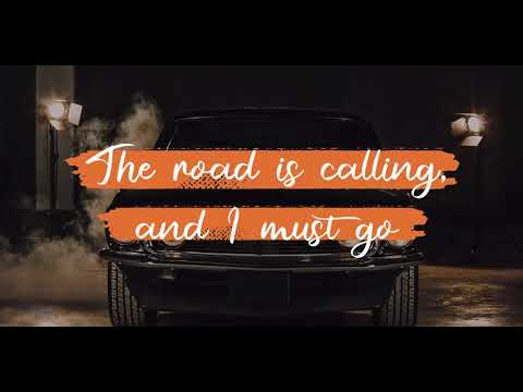
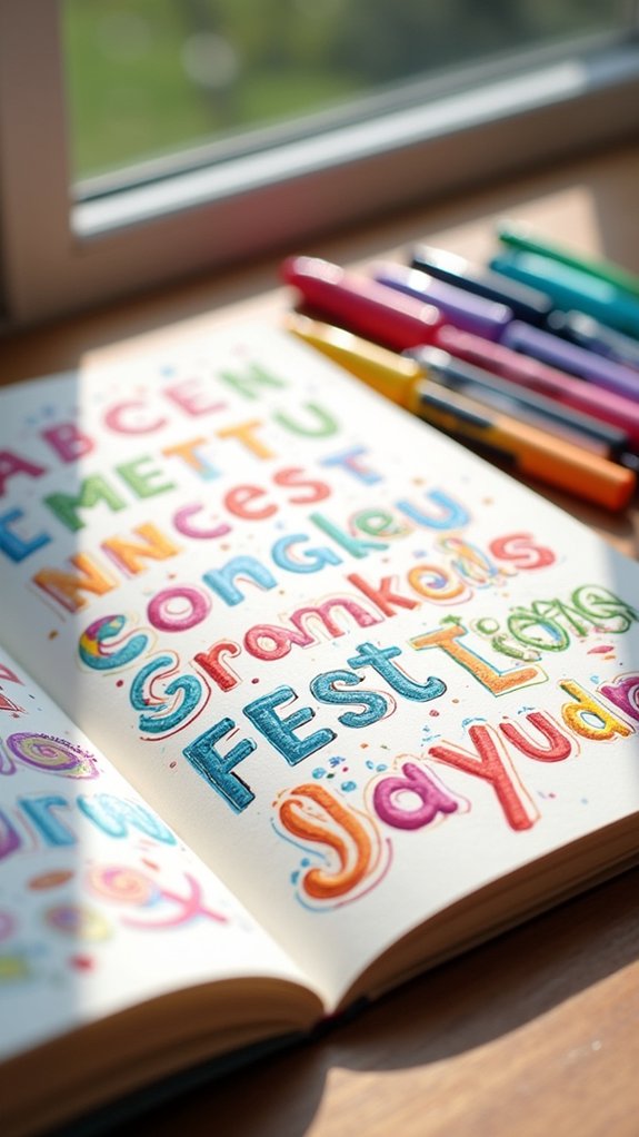
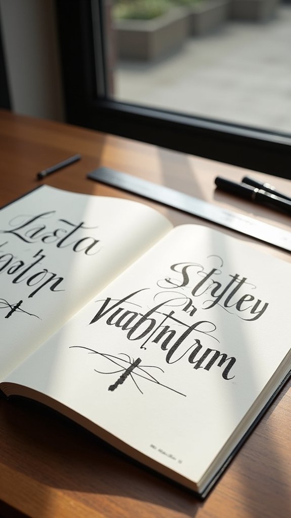
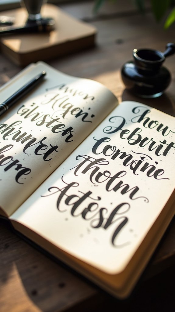
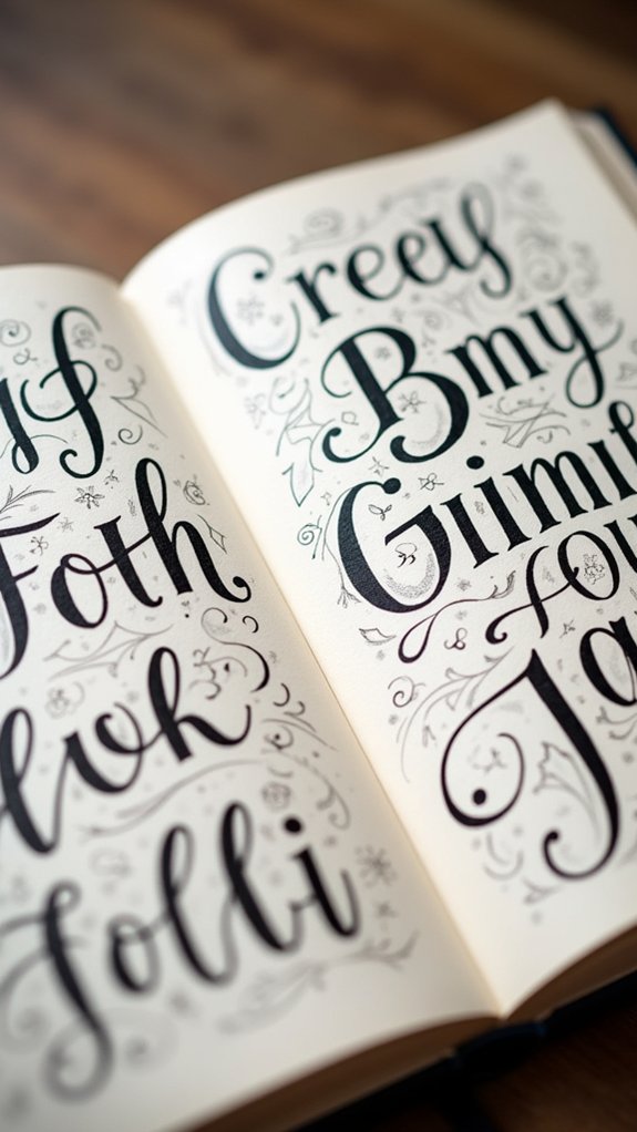
Sketchbooks become way cooler with creative lettering styles—think bouncy retro bubble letters, super-clean architect handwriting, or bold block alphabets. Some folks love classic serif fonts that look fancy, while others go for edgy brush script or neat faux calligraphy with regular pens. There are playful cursive titles, shiny 3D effects, and even goofy letters with faces. Mixing these styles adds instant personality to titles, and the right tools or little tricks really make them pop—stick around to discover how!
Key Takeaways
- Explore classic and elegant options like Serif Lettering and Old English Capitals for sophisticated, eye-catching sketchbook titles.
- Use modern styles such as Sans Serif and Monoline Lettering to achieve a clean, minimalist look in your sketchbook.
- Incorporate playful styles like Brush Script, Bubble Letters, and Goofy Extras to add personality and energy to your pages.
- Apply structured, professional techniques like Bold Block Alphabets and Architect’s Handwriting for neat and impactful title headings.
- Enhance your lettering with faux calligraphy, 3D shadows, and organic handwritten notes for added depth, texture, and unique character.
Classic Serif Lettering
Classic serif lettering is like the fancy suit of the lettering world—always looking sharp, a little bit old-school, and totally ready to impress.
When someone opens a sketchbook and spots a title in classic serif lettering, they instantly sense elegance and a dash of tradition. The secret? Those tiny “serifs,” or decorative ledges at the ends of each stroke.
Fonts like Times New Roman and Georgia rock these details, instantly making any page look more formal. It’s not just for old newspapers; these styles can take a sketchbook from blah to brilliant.
For the best look, artists focus on keeping the serifs crisp and the baseline even. With classic serif lettering, every title demands a second look—seriously, it’s practically wearing a tie.
Modern Sans Serif Styles
Modern Sans Serif styles bring sketchbook lettering into the future with blocky, minimalist letters and lines so straight they act like rulers in disguise.
These clean, digital-inspired lines look super sleek, and when you write in bold all-caps, it pretty much shouts “look at me!” without a single extra swirl or curl.
Anyone who wants their titles to jump off the page while staying neat and modern will have a blast experimenting with these sharp, attention-grabbing styles.
Minimalist Block Letter Forms
Envision this: letters so crisp and clean they look like they just rolled out of a fancy, futuristic printer. Minimalist block letter forms are all about that sharp, modern vibe—think fonts like Helvetica or Futura, the kinds you’d see on a cool tech company’s website. Goodbye frills, hello calm, simple lines that nearly glow with confidence! These forms focus on perfect shapes, steady spacing, and absolute clarity. Every letter stands proud—no decorations, just style and structure. To master this, imagine you’re a robot aligning groceries—everything must line up! Pro tip: grid paper is your best buddy for keeping heights and widths even.
| Feeling | What It Inspires |
|---|---|
| Calm | Confidence |
| Focused | Modernity |
| Sleek | Professionalism |
| Satisfied | Simplicity |
Clean Digital-Inspired Lines
After nailing those minimalist block letters, things are about to get even slicker with clean, digital-inspired lines.
Modern sans serif styles basically scream “futuristic notebook pro,” thanks to their sleek, no-frills look. Instead of funky loops or swirly flair, these styles stick with crisp lines and even, steady strokes.
It’s the kind of look you’d expect on your favorite app or a really stylish website—think fonts like Roboto and Montserrat!
When creating titles in your sketchbook, consistent letter spacing and perfect alignment make all the difference. Grab some grid-lined paper to help nail that geometric vibe.
It might feel a little intense at first, but soon your pages will look so fresh, your titles might just go viral—at least among your friends!
Bold All-Caps Styles
Few lettering styles grab attention quite like bold all-caps in a modern sans serif look.
With their crisp edges and clean shapes, bold all-caps styles instantly make any sketchbook title pop off the page. This style is super modern and highly readable, perfect if you want your titles to be seen—no squinting needed!
The simple, geometric vibe fits almost any theme, making it super versatile and stylish.
Want a quick guide to making your titles stand out? Try this:
- Pick a strong sans serif font—think Roboto, Montserrat, or Futura.
- Play with letter spacing and change up the alignment for extra drama.
- Vary the size or the weight of letters to create awesome visual hierarchies.
Get creative—let your sketchbook scream style!
Expressive Brush Script
Expressive Brush Script packs a punch with its wild, energetic strokes that almost jump off the page—imagine a dance party, but with letters instead of people.
This lettering style is all about flow and attitude; the letters seem to swoosh, sway, and even twirl with every stroke. The secret? Using different pressure as you draw so some lines are thick and bold, while others are thin and breezy.
Tools like brush pens, watercolor brushes, or paintbrushes create textures that make each word look totally unique. Practicing both uppercase and lowercase is key, making sure letters connect and keep that lively rhythm going.
Add in some playful swirls or fancy flourishes, and suddenly your sketchbook titles have serious star power.
Faux Calligraphy Techniques
Faux calligraphy looks fancy, but it’s actually super easy once you learn the basic steps, and all you need is a regular pen—no magic wands or feather quills required.
Here’s what’s up: first, writers sketch out their letters, then thicken the downstrokes for that bold, calligraphic style, though it can get wonky if you rush or forget where those thicker lines should go.
From picking the right tool (spoiler: almost anything works!) to spotting common slip-ups, these tricks help anyone master faux calligraphy without breaking a sweat—or the bank.
Step-by-Step Faux Calligraphy
Even though real calligraphy might seem fancy or difficult, anyone can get that wow-factor look with faux calligraphy—and all you need is a regular pen or marker, seriously!
Here’s the scoop: faux calligraphy is all about tricking the eyes with some clever strokes. First, write your chosen word in your normal handwriting. Next, spot the parts of each letter where your pen would naturally be moving downward—yep, those are your “downstrokes.” Simply thicken those by drawing a parallel line and filling in the space!
Want to make your faux calligraphy stand out even more? Try this:
- Use a pencil for sketching and erasing mistakes.
- Keep your letters on a straight baseline for balance.
- Add swirls, dots, or little flourishes for flair!
Tools and Common Mistakes
Once the magic of faux calligraphy gets going, there’s a big secret behind those smooth, show-offy letters—choosing the right tools can make all the difference.
Most people start with a pencil to sketch their designs, so mistakes are no big deal—just erase and try again! Markers and pens work best for inking, and experimenting with different types, like brush pens or fineliners, can totally level up your vibe.
Want to keep those letters straight? Grid paper is a true lifesaver.
Still, don’t be surprised if you make mistakes. Forgetting to lift your pen or not thickening just the downstrokes are super common mix-ups. If things look flat or wobbly, it’s just a sign you’re learning—keep practicing with the right tools!
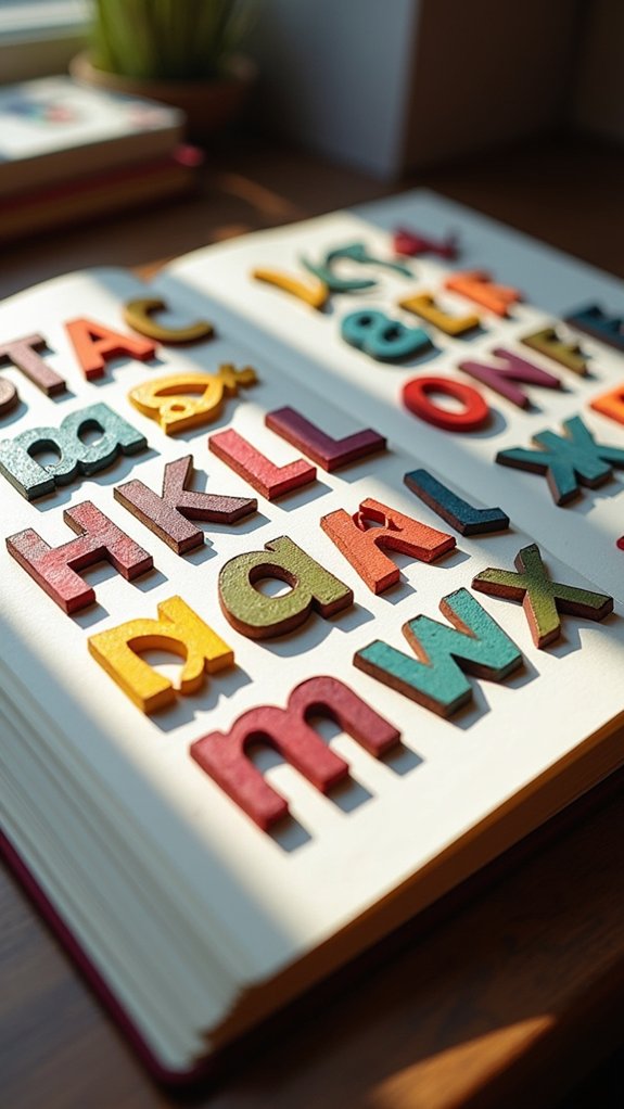
Retro Bubble Letters
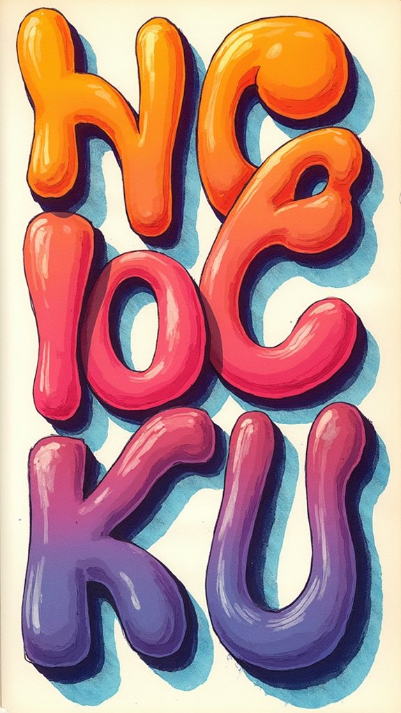
Nothing says “fun” quite like retro bubble letters—they’re the life of the lettering party, puffed up and colorful, looking like they might float off the page at any second.
Drawing the letters in this style is like inflating each one with its own personality. These letters are bold, bouncy, and packed with a nostalgic punch straight from your parents’ school notebooks.
Here’s how to make them totally pop:
- Outline with Gusto: Thick, exaggerated outlines give these balloon-like forms their signature vibe.
- Layer Vibrant Colors: Go wild with markers or gel pens, stacking shades to achieve that three-dimensional, “touch me if you dare” depth.
- Add Shiny Highlights: A quick swipe of white turns each letter into a glossy, eye-catching masterpiece!
Playful Doodle Fonts
Playful doodle fonts are where imagination takes a wild detour—think letters that look like they’ve had one too many cups of soda and are now bouncing around the page.
Doodle fonts stand out with irregular shapes, silly curves, and goofy extras like cartoon faces, stars, or even squiggly lines poking out where you least expect them. Each letter can rock its own personality, from bubbly “O”s to stretched-out “A”s, making titles look lively and full of energy.
Elegant Old English Capitals
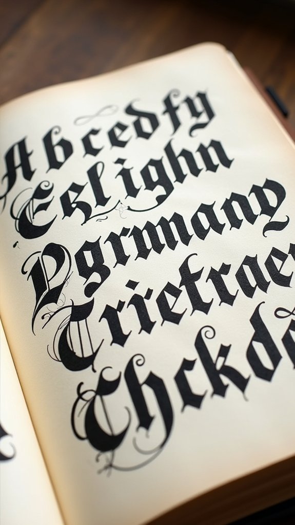
Drama practically bursts out of every stroke when it comes to Elegant Old English Capitals. This hand lettering technique is all about grand entrances—think bold, sharp angles and fancy flourishes that demand attention.
Inspired by Gothic script from way back in the Middle Ages, these capitals are perfect if you want your sketchbook titles to look both royal and a tiny bit mysterious. Beginners might feel a little dramatic themselves as they master the tools and curves, but the impact is so worth it!
Here’s how to really shine:
- Start with simple block letterforms, then layer on embellishments like curls.
- Use brush pens or calligraphy markers for more control over thick and thin strokes.
- Add decorative borders or illuminated initials for that wow factor.
Minimalist Monoline Lettering
After soaking in all that royal energy from Old English capitals, it’s time to switch things up with a style that feels fresh as a clean sheet of paper—minimalist monoline lettering. This style keeps things clear and simple, using just one steady line to make each letter. No fancy flourishes or thick-and-thin drama here—just consistent, smooth strokes that scream modern cool. Whether you grab a trusty fineliner or a brush pen, the key is to keep the line weight even for a polished, stylish look. Want extra jazz? Try adding sharp angles or simple shapes for a perfectly balanced vibe. Versatile and easy to read, minimalist monoline lettering looks amazing on anything from sketchbook titles to posters. Check out this comparison table:
| Tool | Application | Key Feature |
|---|---|---|
| Fineliner | Sketchbook Titles | Consistent Line |
| Brush Pen | Signage | Fluid Motion |
| Ruler | Branding | Sharp Angles |
| Pencil | Drafting | Easy Adjustments |
| Digital Stylus | Digital Designs | Precision |
Bold Block Alphabets
There’s just something about bold block alphabets that makes a title pop right off the page, like it’s jumping up and waving for attention.
These chunky, eye-catching letters are perfect when a sketchbook title needs to make a real impression. With bold block alphabets, it all comes down to thick, solid lines and shapes that scream for a viewer’s focus.
Artists love how flexible these are too. You can make them huge, tiny, or somewhere in-between; they’ll always stand out.
To really level up bold block alphabets, try these three things:
- Master the basic geometric shapes for clean, uniform letters.
- Experiment with rounded edges or sharp angles for different moods.
- Add pops of color or texture for even more drama.
Loopy Cursive Titles
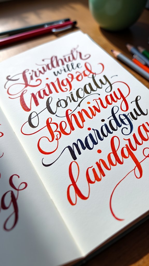
Loopy cursive titles are all about making funky, connected letters that swirl across the page, so it’s important to start with smooth, curved shapes and pay attention to how each letter links to the next.
The real magic happens with pen pressure—press down for juicy thick lines and lighten up for skinny twists, letting each stroke come alive with personality.
For a final touch, playful flourishes like twirls and swoops can make every title in a sketchbook look like it’s ready to jump off the paper and do a happy dance.
Creating Loopy Letterforms
A sketchbook’s titles can instantly pop with the playful energy of loopy letterforms, turning even an ordinary label into something that looks like it’s ready to dance right off the page.
Loopy letterforms are all about that swoopy, whimsical vibe! To get started, warming up with some basic cursive can help your hands get used to connecting letters in a smooth and natural way.
When you’re itching to try more, follow these tips:
- Start with pencil – Sketch your loopy cursive titles lightly so you can erase and tweak until you’re happy.
- Add embellishments – Go ahead and doodle on extra loops or swirls wherever you want some bounce.
- Play with loop size – Tall, tiny, or super-swervy—mixing up loop sizes makes your titles pop!
Choosing Proper Pen Pressure
Mastering pen pressure feels almost like revealing a secret superpower in the world of loopy cursive titles. Suddenly, every twist and turn of a letter comes alive!
By applying gentle pen pressure on the upstrokes, artists create airy, elegant lines, while pressing harder on the downstrokes transforms curves into thick, bold pops of color and style. It’s almost like the difference between whispering and yelling—both have their place, and both make lettering stand out.
Practicing with pen pressure doesn’t just train hands, it actually helps build muscle memory, making those swooping loops way smoother.
Brush pens are basically magic wands here, as they respond to every little movement. Plus, experimenting with super-smooth paper makes pens glide like skaters on ice—total game changer!
Adding Playful Flourishes
Sometimes, all it takes is a bit of extra twist and flair to turn plain handwriting into something totally eye-catching. When it comes to loopy cursive titles, playful flourishes are your secret weapon. These twists and swirls add serious personality, making every page look lively and fun.
Getting started isn’t as tricky as it seems—just follow these steps:
- Start by practicing individual letters, focusing on smooth loops and keeping the size even.
- Add playful flourishes like big swooping tails or dramatic swirls to your favorite letters for that whimsical look.
- Try out different brush pens and colors to make those flourishes pop and match your sketchbook’s vibe.
Don’t be afraid to get creative—your sketchbook titles will shine!
Liquid Typography Effects
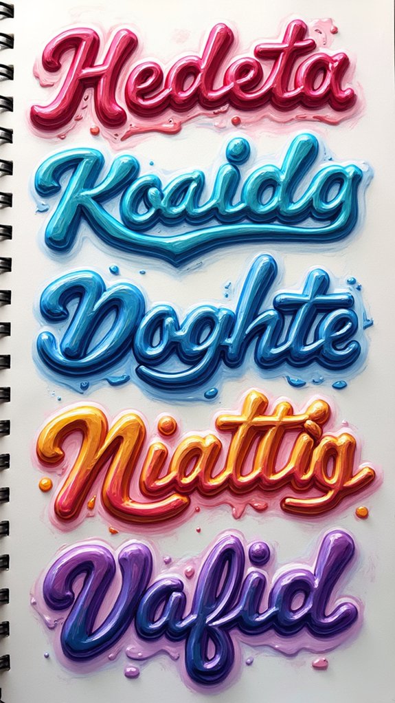
Energy practically bursts from the page when letters start to flow like water—welcome to the world of liquid typography.
This style is all about bending the rules and letting letters wiggle, wobble, and drip, like someone just splashed a bucket of paint across your page.
Imagine writing your name, but the letters twist and turn into silky streams, curved like waves or stretched like melted chocolate.
Using techniques like color blending, smooth gradients, or adding playful droplets and swirls, artists make words look like they’re made of actual liquid.
You can try this with markers, watercolor, or even doodle it with digital tools.
Liquid typography turns any boring title into a lively, swirling, attention-grabbing masterpiece—so jump in and get splashy!
Graffiti-Inspired Lettering
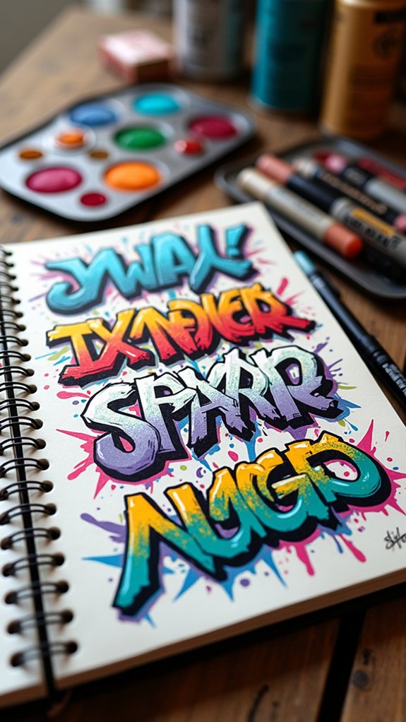
Bursting off brick walls and sketchbooks alike, graffiti-inspired lettering brings a wild, rebellious energy that grabs all eyes in the room—and refuses to let go. This style, pulsing with neon vibrance and jaw-dropping shapes, is honestly hard to ignore.
Artists twist and warp their letters, inspired by the colorful chaos of urban art culture, making each piece feel like a shout across a busy street. Ready to get started? Here’s how graffiti-inspired lettering cranks creativity up to eleven:
- Bold, exaggerated lines and vibrant colors make titles instantly stand out.
- Wildstyle connections and overlapping block letters add mind-bending energy and depth.
- Sketching and planning let artists capture that explosive style without losing control.
It’s all about bending the rules—and breaking them with style!
Architect’s Handwriting Style
Now, let’s check out the architect’s handwriting style—it’s all about being neat, balanced, and super clear, almost like the letters stepped out of a blueprint with rulers in hand.
This style has some cool origins in the world of architects, who use sharp pencils and fine liners to keep their lines crisp and their sketches easy to read (no chicken scratch allowed).
If you want your notes to look sharp and impressive, learning this technique could make your sketchbook look like it was designed by a pro—just don’t blame the pencil when your Rs look suspiciously like tiny ladders at first!
Key Features and Origins
Ever wondered why architect’s handwriting looks so sharp and clean, almost like it was designed by robots with really good style?
This hand lettering technique didn’t happen by accident. It was born out of a need for crystal clear writing on architectural plans, where messy scribbles just wouldn’t cut it.
The architect’s handwriting style is like the graphic novel superhero of sketchbook lettering, thanks to its sharp lines, geometric vibes, and major legibility factor.
Here’s why people love it:
- Clean, precise lines that scream order—no chaos allowed.
- Mix of uppercase and lowercase letters with perfect spacing and straight alignment to keep things totally readable.
- Geometric shapes in every letter, echoing the symmetry you see in cool building designs.
Now that’s what you call style with purpose!
Tools and Techniques Used
Sharp pencils, trusty rulers, and snazzy pens are the secret weapons behind the architect’s handwriting style. To get that cool, crisp look, artists rely on basic hand lettering techniques—think steady hands, sharp lines, and letters that don’t slouch or wobble.
Using a ruler is like having a superhero sidekick that keeps every stroke super straight and every angle on point. Fans of architect’s handwriting will mix pens like fineliners and brush pens to explore different line thicknesses.
Practicing shapes and keeping the spacing equal helps the style feel really neat, while little imperfections and tiny spacing quirks give it some personality. It’s all about balancing discipline and flair—like a pro who can both follow a rulebook and doodle outside the lines!
Applying Style to Sketches
Bringing the architect’s handwriting style into your sketches is a total game-changer—it’s like giving your ideas a snazzy suit and saying, “Look at me, I mean business… but I can still have fun!”
This style stands out with its super neat, laser-straight letters, so every note or label looks crisp and easy to read. For hand letterers wishing to level up, mastering this look means balancing clean lines with some personal flair.
Here’s what to focus on:
- Pay attention to the baseline and cap line—it keeps all your letters at the same height, which looks super pro.
- Use the right tools: fine-tipped pens or mechanical pencils make those sharp strokes easy.
- Add a bit of “you”—space your letters or switch up a curve for extra style!
Organic Handwritten Notes
Messy scribbles and lopsided letters—believe it or not—can be total game changers in a sketchbook.
With organic handwritten notes, a page immediately feels more personal, like a secret message between the artist and the world. Unlike stiff, computer-made fonts, these letters wiggle and wobble, showing off real human imperfection—like a proud crooked grin.
Lettering in this style isn’t about making things perfect; it’s about letting your hand flow naturally, adding your own unique flavor. Artists such as Santi Salles use this organic touch, mixing up line thickness or letting letters lean and dance across the page.
Whether you’re jotting down the location, a quick date, or your honest thoughts, these notes sprinkle your sketches with authenticity and warmth.
Shadowed and 3D Letterforms

After scribbling out notes that look like they danced right off the edge of the page, sometimes an artist wants a heading that pops—even leaps—off the paper.
Enter shadowed and 3D letterforms. They don’t just stand there; these letters bring a whole new level of attitude and energy. Adding shadowed effects or going full-on 3D can seriously pump up the wow factor in sketchbook titles.
Here’s how to make those letters look extra bold and bouncy:
- Outline the main shape, then add a darker color or shade to one side for a classic shadowed look.
- Layer colors and try light gradients for convincing 3D letterforms—think comic book captions!
- Use isometric grids to nail angles and channel those perfect blocky vibes.
Decorative Embellished Fonts
Whimsy takes center stage when decorative embellished fonts enter the sketchbook scene. These styles are like a fun party for your letters—full of swirls, curls, and flourishes that really make titles pop. Experimenting with different styles, like mixing thick and thin lines, instantly adds depth and keeps things exciting. Want even more flair? Try adding shadows or highlights for a little drama, or toss in extra patterns so your work is never boring. But, pro tip: keep your embellishments consistent so everything feels like it belongs together.
Here’s a quick comparison to spark some ideas:
| Embellishment | Effect on Title |
|---|---|
| Swirls & Curls | Extra personality |
| Mixed Line Weights | Eye-catching depth |
| Patterns & Shadows | More visual excitement |
Let your creativity run wild!
Frequently Asked Questions
How Do You Write Pretty Lettering?
To write pretty lettering, one can practice Lettering Techniques such as sketching with pencil first, experimenting with styles, using grid paper for consistency, adding embellishments, and seeking inspiration from online resources to refine creativity and skill.
How to Write a Sketchbook in Different Fonts?
Exploring how to write a sketchbook in different fonts involves experimenting with font variations such as serif, sans serif, and script. Utilizing online resources and practicing hand lettering allows individuals to creatively personalize their sketchbook titles.
How to Make Your Sketchbook Unique?
To make a sketchbook unique, one can focus on creative personalization by integrating mixed media elements, inventive date formats, moodboards, and varied hand lettering. This approach transforms pages, reflecting individual style and enhancing artistic visual storytelling.
What Should I Put on the First Page of My Sketchbook?
When considering what to put on the first page of a sketchbook, one might include their name, contact details, a relevant date, a theme, an Inspiration Source, and leave room for an organized table of contents.
Conclusion
So, with these 16 sketchbook lettering styles, anyone can level up their titles and make pages pop. Trying out classic serifs or wiggly bubble letters is a blast, and even if a letter goes wonky, that just adds personality. Mixing things up keeps sketchbooks exciting, and who knows—maybe those awkward doodles will spark your best ideas. The main thing? Have fun, get messy, and let your unique style shine, sketch after sketch.
Leave a Reply