
Art journals can burst with energy by mixing bright painted backgrounds, wild color swatches, and collage bits found in magazines. Mindmaps bring ideas to life, while bold pop art portraits make faces totally unforgettable. Try altering old book pages, layering stencils, and stamping textures for unexpected surprises. Sketching cultural icons or scribbling expressive faces shows big feelings. Clever typography and even progress photos tell your story. Curious about how to turn those wild ideas into reality? Here’s where it gets really exciting.
Key Takeaways
- Experiment with bold, layered backgrounds using contrasting colors, collage materials, and mixed media for high-energy visual impact.
- Use expressive pop art portraits with bright colors and sharp outlines to infuse journal pages with personality and dynamism.
- Organize inspirations with colorful mindmaps, connecting ideas visually and sparking fresh, unpredictable themes to explore.
- Transform old books into altered art journals by painting, collaging, and embedding textures for unique, tactile pages.
- Incorporate playful typography and sketched cultural icons, using dynamic compositions to guide viewers and amplify storytelling.
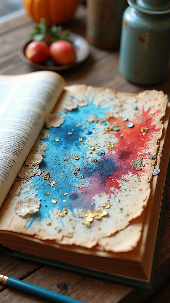
Vibrant Backgrounds With Collage and Paint

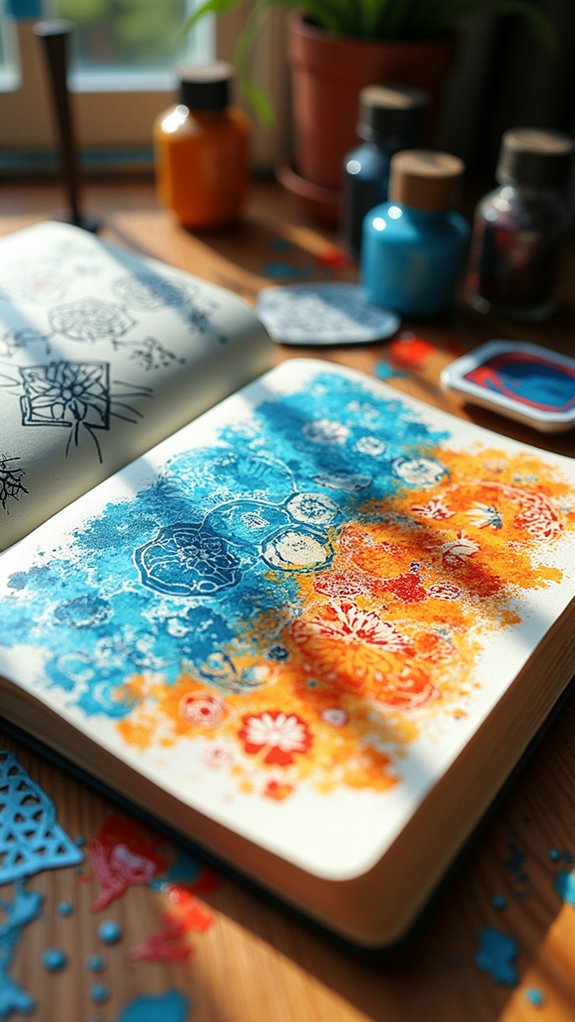
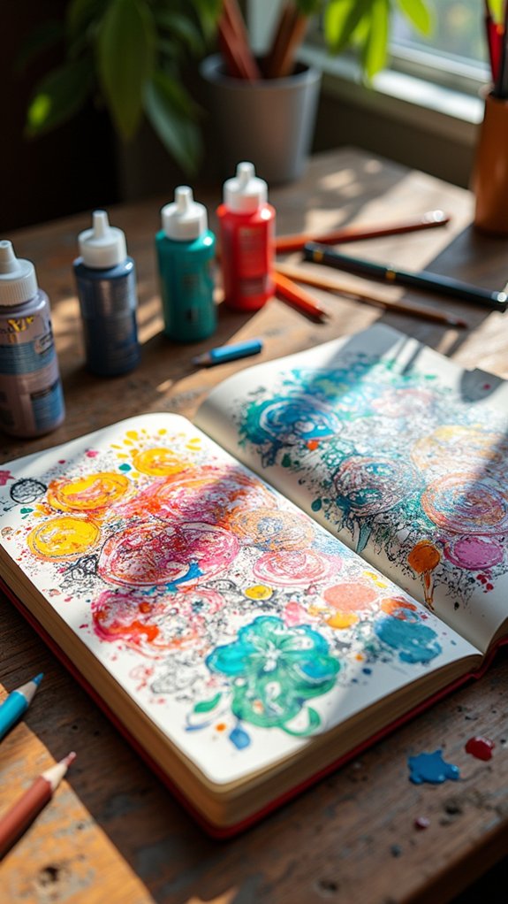
Art journals are like magical playgrounds where backgrounds get to be loud, bold, and totally awesome. To make vibrant backgrounds, artists love to layer paint—like smearing acrylics or using splashy sponge painting.
But here’s where things get wild: collage materials! Think snipping out magazine cutouts, gluing down funky textured paper, or even grabbing ticket stubs and old maps to add some serious personality.
Experimenting with contrasting colors cranks up the wow factor, making every page almost jump right out at you. Mixing stuff like watercolors with ink or sneaking in a pastel or two can totally change the vibe, adding unexpected pop and texture.
Pop Art Portraits Using Bold Colours
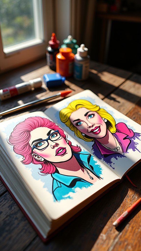
Pop art portraits practically shout from the page with their wild, eye-catching color palettes—think electric pinks and sunny yellows battling for attention.
By layering colors and playing with sharp outlines, artists can make their subjects, like movie stars or superheroes, almost leap out of the sketchbook.
Picking an iconic figure to paint only makes things more exciting, especially when their face pops against all that bold, crazy color.
Choosing Eye-Catching Palettes
Trendy or culturally inspired palettes keep things fresh. No need to stick to the standard—wild works! Here’s a quick look at pop art palette moves:
| Technique | Pop Art Effect |
|---|---|
| Complementary Colors | Strong, punchy contrast |
| Analogous Colors | Smooth, funky flow |
| Flat, Bright Hues | Bold, graphic look |
| Unexpected Combos | Surprising, emotional reactions |
| Trend-Inspired Palettes | Fresh, modern connection |
Layering for Dynamic Effects
Now that the colors are popping right off the page, it’s time to supercharge those sketchbook portraits with some awesome layering tricks.
Layering isn’t just about putting one color on top of another—it’s the secret weapon for getting bold, dynamic effects that practically jump out and say, “Look at me!” By combining colours in transparent or semi-transparent ways, artists can create depth, energy, and tons of visual excitement.
Pop art portraits use techniques like glazing or even thick impasto, and mixed media takes things to a whole new level.
- Layer transparent paints or markers, letting combined colours mix for totally wild effects
- Try using collage pieces or textured surfaces to make your art feel alive
- Experiment with bold contrasts and highlights to make the portraits stand out even more
Layering rules!
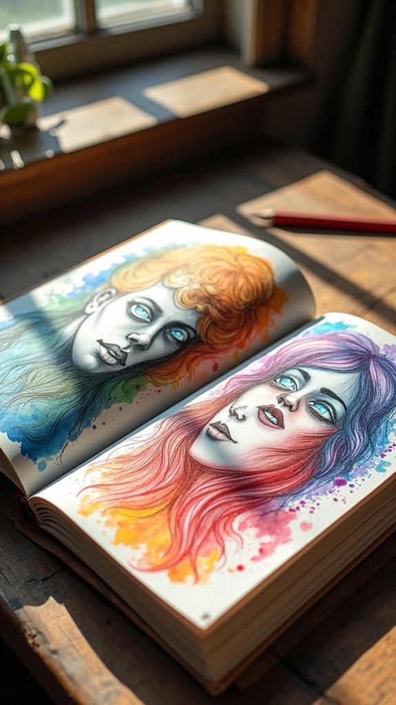
Iconic Figures as Subjects
Even if someone’s never heard of pop art, they’d probably recognize a bold, colorful portrait of someone like Marilyn Monroe in a heartbeat.
That’s the awesome thing about pop art—it grabs your attention with its vibrant colors, like neon yellows and deep blacks, and turns famous faces into something you can’t look away from.
Artists such as Andy Warhol loved using mixed media, combining painting, collage, and even text, making each portrait feel totally fresh and super edgy.
Repeating those iconic faces in different colors just amps up the energy, kind of like hitting the “shuffle” button on someone’s style.
When you add mixed media touches, these sketches practically shout from the page—they don’t just pop, they explode with personality!
Mindmaps for Creative Exploration
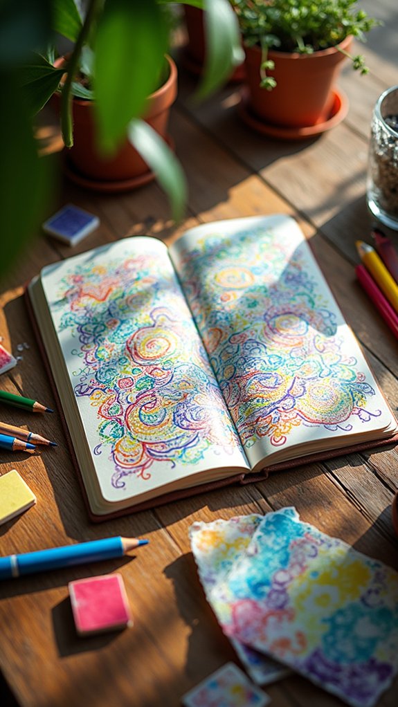
A mindmap might look like a wild tangle of ideas exploding across a page, but for many artists, it’s an amazing way to organize creative thoughts before they get lost in the shuffle.
In an art journal, mindmaps can feel like building the coolest web, connecting your wildest inspirations with sneaky lines, arrows, and bursts of color. They let artists spot hidden links between different styles or techniques—sometimes turning “random” into “genius.”
Plus, who doesn’t love doodling little symbols or splashing wild colors as ideas bubble up?
- Using mindmaps helps brainstorm and organize art journal themes before the real drawing begins.
- Connections between art styles or techniques are easier to spot with a colorful mindmap.
- Regular updates keep art journaling fresh, fun, and unpredictable!
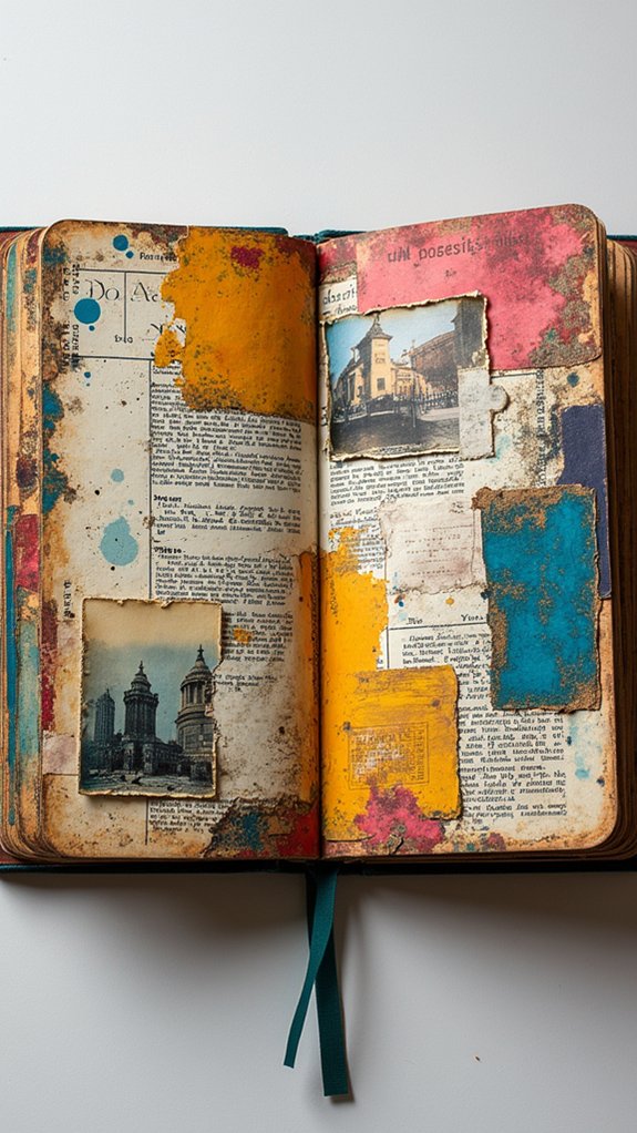
Altered Book Pages as Artistic Canvas
Old books don’t always have to gather dust on a shelf—they can become a playground for art experiments and wild ideas.
With altered books, artists turn forgotten novels into wild canvases, mixing words, pictures, and memories! Using fun art techniques to compose, like painting over pages, doodling between lines, and collaging pictures, each book becomes totally one-of-a-kind.
Some artists cut, fold, or even glue extra stuff into pages for awesome textures and secret hideouts. Toss in a few ticket stubs or an old postcard, and suddenly the altered book is telling a story, too!
There are no rules or perfect outcomes, just epic possibilities. Altered books are all about exploring, so go ahead—break a few “book rules” and let the creativity run wild!
Mixed Media Layers With Found Papers
When artists immerse themselves in mixed media layers with found papers, things can get downright electrifying—like an art supply explosion in the best possible way.
Each page becomes a playground for wild creativity, where layering scraps of maps, old tickets, or funny postcards totally transforms plain paper into an adventure. Found papers don’t just look cool; they pack each page with memories and hidden stories.
This isn’t just cutting and pasting—artists glue, tape, or even stitch these treasures down, adding major texture and depth. Placement? That’s where the magic (and happy accidents) happen!
- Mixing found papers sparks unexpected textures, so nothing looks flat or boring.
- Layering different adhesives—glue, tape, stitching—gives unique tactile feel.
- Arranging pieces at wild angles makes bold, eye-catching layouts burst with energy.
Experimenting With Stencils and Stamps
After getting wild with mixed media and piling on those layers of found paper, artists might find themselves itching to try something a bit more controlled—but just as fun. That’s where experimenting with stencils and stamps comes into play! Stencils let creators trace out perfect shapes and super cool patterns that would be tricky to freehand. Stamps, on the other hand, help add poppin’ textures and even more personality to each page. Mixing these tools means layering up color and designs for a look that seriously stands out. Feeling adventurous? Try using ink, paint, or even embossing powder to see what wild effects you can get! Check out this fun table on how these two tools compare:
| Uses With Stencils | Uses With Stamps |
|---|---|
| Create crisp shapes | Add raised textures |
| Layer with colors | Print repeating images |
| Use with fabric or paper | Try with ink or paint |
| Build backgrounds | Accent focal points |
Combining Typography and Visual Narrative
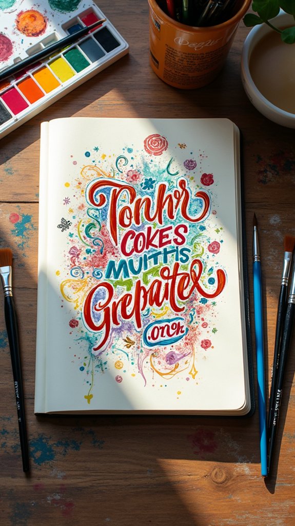
Storytelling gets a major upgrade when artists start mixing funky typography with eye-catching visuals in their art journals. Merging words and images isn’t just stylish—it supercharges the story.
Typography can shout with bold chunky letters, whisper in curly cursive, or dance across the page in wild patterns. When artists hand-letter next to printed fonts, their unique voices jump off the page, adding loads of personality.
The placement and scale of the text matter, too—giant shouting words or trailing whispers lead the viewer’s eye everywhere. In art, this makes the journey through each page totally unforgettable.
- Hand-lettered and printed typography create lively, personal contrast.
- Playing with font size and style sets the mood of the whole page.
- Smart placement of typography guides the viewer and boosts storytelling.
Colour Swatching and Palette Discovery
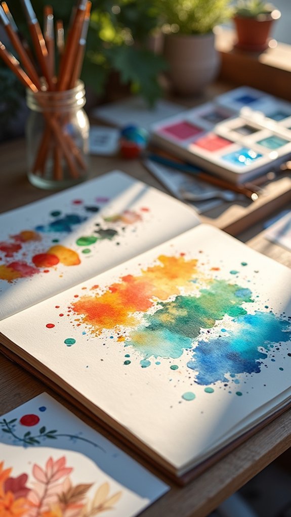
Colour swatching is like running your own secret lab, where every test leads to wild new mixes and surprising shades.
By organizing those swoops and streaks into neat sections—no, your messy blobs totally count—artists can spot patterns and discover combos nobody else has tried.
Finding a personalized palette this way turns an ordinary art journal into a playground of unique colors, each ready for its big moment.
Exploring Unique Colour Combos
Ever wondered what happens when you just throw a bunch of wild colors together and hope for the best? Sometimes, magic!
Exploring unique color combinations on sketchbook pages is like a science experiment—minus the explosions (hopefully). Artists get to see how colors mix, layer, and react, sparking unexpected surprises. Swatching isn’t just for showing off cool colors; it’s about figuring out which combos pop and which are, well, less awesome.
Trying out strange pairings can end up as the best part of the page, and documenting those finds in a sketchbook means they’re never lost.
- Layer colors to see which combos create new, exciting shades
- Mix primaries to discover unexpected palette options
- Mark down favorite mixes directly on sketchbook pages for future reference
Who knew color chaos could lead to genius?
Swatch Organization Techniques
Organization becomes a secret weapon when it comes to swatching colors in a sketchbook. Instead of smearing paint randomly, artists break up their pages into neat sections for markers, watercolors, or pencils. This way, every swatch has its place—no more mysterious smudges or color chaos!
Swatch organization techniques, like using grids, turn color mixing into a science experiment, making discovering new, wild combined colours way easier. Watercolor charts show off all the shades you can make when you layer or blend, while a trusty color wheel lives nearby, reminding everyone which hues play nice together.
Layering swatches, especially to check for opacity, saves loads of heartbreak later. Plus, it’s pretty satisfying when everything lines up just right, like color-coded magic.
Creating Personalised Palettes
After all that careful swatch organization, it’s where the real magic kicks in—putting together a personalized palette.
Imagine mixing and matching your favorite shades, discovering surprising combined colours, and figuring out what feels totally *you*.
Artists plunge into swatching different mediums—from juicy watercolors to bold acrylics—on all kinds of oddball papers.
It’s not just about seeing how the colors look, but how they vibe together and what stories they can tell on a page.
And hey, little mistakes? Totally part of the process! Embracing those happy accidents can lead to some wild new discoveries.
To keep things fun and organized, try:
- Dividing pages into sections for neat swatch zones
- Mixing colours on charts to spot epic combos
- Using color wheels to group warm, cool, and primary shades
Journaling Emotions Through Expressive Faces
When big feelings come crashing in like a surprise thunderstorm, drawing expressive faces in an art journal can turn that chaos into something you can actually see and work with.
Expressive face illustrations let artists put their emotions right on the page, whether that’s anger, joy, sadness, or confusion. By doodling with graphite or experimenting with mixed media, each face shows another side of a feeling.
Using color theory—like splashing oranges and reds for fiery moods or cool blues when feeling down—can make those emotions jump off the page louder than a shout in a quiet room.
Playing with different styles, even wacky abstract ones, offers infinite ways to say, “This is how I feel.” Art Journaling suddenly becomes a secret emotional language, all your own.
Incorporating Cultural Icons in Sketches
Feeling emotions on the page is powerful, but sometimes it’s just as exciting to capture the bigger stories swirling around in the world. That’s where sketching cultural icons comes in! Bringing someone like Marilyn Monroe or a superhero into an art journal isn’t just for fun—they’re symbols packed with meaning.
Using traditional pop art techniques—bold lines, bright colors, and repetition—can instantly make sketches feel dynamic and adventurous.
- Sketching cultural icons lets artists talk about big themes, like identity or fame, without saying a single word.
- Traditional pop art techniques, like Andy Warhol’s wild color-blocks, boost the wow factor in any journal.
- Analyzing pop art legends like Keith Haring inspires smart composition choices—think bold outlines and super-cool patterns.
Big stories, bold style!
Documenting Artistic Progress With Process Photos
Snap a picture, and suddenly every messy brushstroke and wild pencil line becomes part of the story. With process photos, artists can turn their sketchbooks into visual diaries, catching every step from wild idea to finished masterpiece.
These snapshots don’t just show the end result—they reveal the wild ride along the way, with all the splotches, experiments, and “oops” moments included. It’s a cool way to see real artistic progress, not just the perfect stuff.
Frequently Asked Questions
Are Sketchbooks Good for Journaling?
Sketchbooks offer significant benefits for journaling, providing a versatile space to explore various journaling techniques. Artists can freely integrate drawing, writing, and mixed media, fostering creativity and experimentation while reducing the pressure usually associated with traditional journals.
What Do You Put in an Art Journal?
An art journal typically contains drawings, paintings, collages, and written reflections. Artists often include creative prompts, experiment with mixed media, and use visual storytelling through found objects, color swatches, and process notes to capture inspiration and growth.
What Is the Best Art Journal?
The best art journal combines heavyweight, acid-free paper with lay-flat binding for ideal use of mixed media. Journal recommendations include Moleskine, Leuchtturm1917, and Strathmore, as they consistently feature the best materials for diverse artistic practices.
How to Fill up a Sketchbook Quickly?
To fill up a sketchbook quickly, one should set daily page goals, employ quick sketching techniques, use creative prompts, and experiment with mixed media. Incorporating doodles and patterns helps efficiently complete pages while maintaining visual interest.
Conclusion
With all these sketchbook ideas, anyone’s art journal can transform from “just okay” to “wow, who made that?” Seriously, there are a million ways to mix collage, paint, doodles, or whatever weird paper you’ve got lying around. Nobody needs to stick with boring pages or basic sketches! Whether someone’s just getting started or already has paint on their hands, these prompts give everyone a spark, a laugh, and plenty of room to make creations totally their own.
Leave a Reply