
If you love filling your sketchbook with flowers, try classic roses, dainty daisies, and graceful tulips—each one brings its own charm. Sunflowers burst with bold centers, while wild violets demand careful, gentle strokes. Sketch cherry blossoms for soft pink clouds or magnolia blooms for giant, waxy drama. Irises and peonies offer layered petals, and the lady’s slipper orchid is just plain weird, in the fanciest way. Each flower offers new shapes and textures, and there are plenty more surprises ahead.
Key Takeaways
- Choose flowers with soft shapes and gentle curves like cherry blossoms, daisies, and peonies for a delicate sketchbook effect.
- Experiment with light sketching techniques and subtle shading to capture translucency and dimension in petals.
- Use varied line thickness and gentle hatching to enhance detail without overpowering the delicate nature of each bloom.
- Select seasonal and textured flowers, such as coltsfoot or irises, to add visual interest while maintaining an airy, gentle appearance.
- Incorporate fine details and light color washes to emphasize the fragile beauty and subtlety of classic and wild flowers.
Drawing a Classic Rose: Shaping Petals and Adding Shadows

There’s just something magical about drawing a classic rose—it feels like stepping into a secret club for artists, where every swirl and curve matters.
Imagine opening your sketchbook during travel sketching and capturing a rose with just a pencil. It all starts with a gentle outline, mapping out the circular core and the bloom’s proportions.
Shaping petals is a big deal—each one curves and overlaps, creating a kind of spiral that’s both tricky and satisfying. Don’t forget those fine veins on each petal; they’re like tiny maps showing where light and shadow play.
Shading is where the magic happens, using soft pencils for those cool, shadowy twists. Add highlights along the outer edges, and suddenly, your rose pops with dreamy, three-dimensional life.
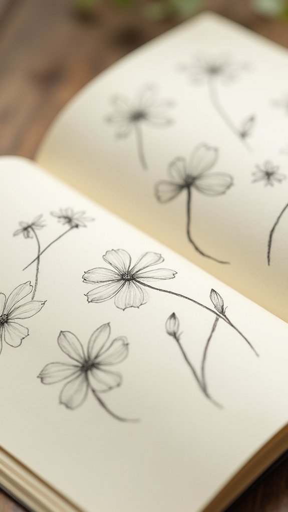
Sketching Dainty Daisies: Overlapping Petals for a Natural Look
A daisy might seem simple at first, but sketching one that really feels alive is a whole different challenge—like taming a tiny, cheerful sunburst on paper.
Getting that natural look means paying close attention to the overlapping petals, which never grow in a perfect circle. Start with a small, central circle and lightly sketch elongated petals, letting them overlap and vary in size for an organic vibe.
Daisies show off their delicate nature with subtle curves and soft, pointed edges, so light pencil strokes help capture that before any serious shading or color. Don’t forget, shading between overlapping petals brings out dimension and helps the flower pop.
To really nail it, try these tricks:
- Vary petal size and angle
- Use gentle shading for depth
- Experiment with soft watercolor washes
Illustrating a Tulip: Capturing Elegance With Simple Lines
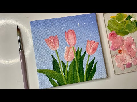
When sketching a tulip, linework can make all the difference in showing off the flower’s fancy curves and gentle style.
Artists start with light, simple lines, then mix in heavier ones to give the petals shape and a touch of drama—sort of like outlining a superhero’s cape, but for flowers.
Paying attention to these lines helps the tulip pop off the page, making it look graceful and just a little bit magical.
Linework Techniques for Tulips
With just a few well-placed lines, a tulip can spring to life on the page, full of elegance and personality. Start by sketching the tulip’s outline with light, smooth lines, almost like you’ve made one swift motion and—ta-da!—there’s a flower.
Vary your line thickness, using bold edges for outer petals and super gentle, whisper-thin lines for the delicate insides. Don’t forget, if your browser for the next technique, you’ll notice every petal has its own unique bend, so add gentle curves and subtle angles for realism.
For the stem and leaves, keep your lines flowing to enhance the tulip’s graceful feel.
- Layer thin lines for subtle shading and texture
- Use different pressures for line variety
- Never miss outlining those elegant petal shapes
Expressing Form and Grace
Elegance practically leaps off the page when someone starts sketching a tulip—it’s like capturing a ballerina mid-twirl, all poise and motion.
Tulips have such an elongated, graceful shape that even with just a few simple lines, anyone can bring out their natural beauty. The trick is in following those smooth curves, keeping the petals’ thickness and those soft bends in mind.
Don’t forget the stem! It should look slender but strong, kind of like a superhero holding up their sidekick, the flower. Add light shading to show off the folds and creases—nothing too heavy, just enough to tease the eye.
Next time you grab your sketchbook, think of this. I’d love to see your masterpieces posted to your favorite website in this browser!
Creating Sunflowers: Emphasizing Bold Centers and Radiant Petals
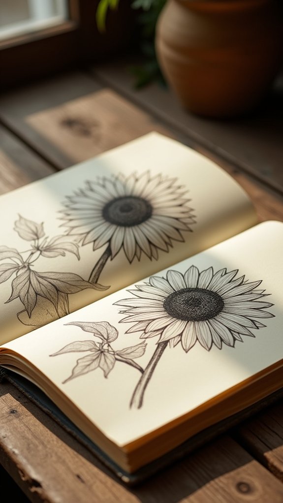
A bunch of sunflowers can easily steal the spotlight in any sketchbook—those bold, dark centers practically shout for attention while the bright petals explode out in all directions like sunshine caught on paper.
To make a sunflower pop, an artist really has to dig into the wild petal dynamics and the eye-catching color contrasts that make these flowers unforgettable. Want to get that sunflower texture just right? Sketchers can use stippling or cross-hatching on the center’s rough, seed-packed disk for a touch of realism (and a little graphic drama).
Observing the tall stems tilting toward imaginary sunlight adds personality, almost like the flowers are stretching just to show off.
- Give petals pleasantly wavy edges for extra drama
- Blend deep greens and yellows for brilliant color contrasts
- Layer textures in the bold, seeded center
Rendering Wild Violets: Capturing Tiny Shape Variations
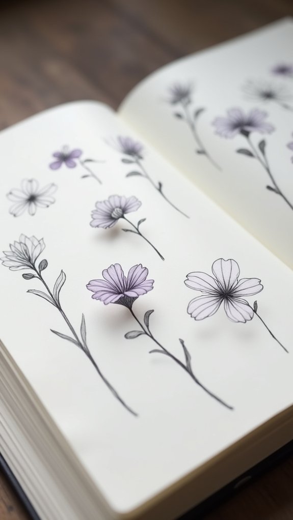
Wild violets may look tiny and calm, but each one hides a secret of its own in the way its petals curve or bend at the tips—so paying close attention really counts.
Sketchers should watch for slight wiggles in the edges and see how the colors seem to shift if you move just a little, almost like the flower is changing its mind about what purple means.
It’s kind of like mother nature is showing off her tiny art tricks, and your pencil gets to catch every trick in action.
Observing Petal Structure Closely
Petal power takes center stage when it’s time to sketch wild violets. Every violet hides a surprise—the way each petal curls, dips, or displays fine hairs and veining, wild violets are like tiny origami masters.
Sketching wild violet petals calls for detective-level observation. Look carefully at the distinct petal color variations that appear even on the same plant. Wild violet habitats—sun-dappled woods, shaded lawns—also shape their petal forms, so take note of the setting.
Try these sketching techniques to really capture their character:
- Study the notches and subtle lobes on each petal for true shape.
- Use feather-light strokes to reflect their soft, delicate nature.
- Notice how petals overlap—sometimes they look like they’re sharing secrets!
Expressing Subtle Color Shifts
Even the shyest garden artists can get a little star-struck when they see how many colors violets can show off.
Wild violets aren’t just plain purple; look closer and you’ll find deep purples sliding into soft lavenders, with hints of blue and white sneaking in like little surprises.
With color blending techniques and watercolor layering, artists can let each delicate shift show up on the page.
Try layering thin washes, adding more color or water to highlight subtle petal contrast.
And—don’t forget—violets love to show off their greens against their purples, making the flowers pop.
Sketching their heart-shaped or rounded petals using a fine pen and gently adding in veining details really helps catch those tiny shape variations.
Drawing Lavender Sprigs: Tall Stems and Textured Blossoms
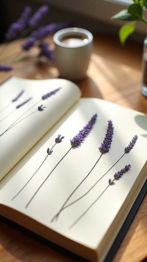
One of the coolest flowers to sketch has to be lavender—those tall, graceful sprigs with their pops of purple crowding together at the tips. When you grab a pencil and start drawing, notice how the stem height makes the lavender reach for the sky—up to a meter tall!
The lavender color isn’t just one shade, either. It’s a whole range, from bold, deep purples to softer, almost silvery hues. But what makes lavender extra fun to draw? That awesome flower texture. Each blossom cluster is packed with tiny petals, giving it a fluffy, almost fuzzy look.
- Vary the stem heights so each sprig looks unique and lively.
- Mix up the lavender color for a dreamy, natural effect.
- Use quick, tiny lines to capture that soft flower texture!
Sketching Buttercups: Round Petals and Subtle Reflections
After sketching those wild, textured lavender sprigs, it’s time for something a little brighter—say hello to the buttercup.
These cheerful flowers practically glow, thanks to their round, cup-shaped petals and the way light reflections dance across their glossy surfaces.
Buttercup textures are smoother than you’d expect—unlike crinkled petals, these feel almost like satin, just begging you to reach out and poke them.
When sketching, notice how seasonal blooms of buttercups in spring and early summer add pop and warmth to any page.
Don’t forget the dramatic contrast between soft petals and their sharp, detailed leaves and stems.
Even a gentle wash of yellow can make petals look almost see-through—like sunlight trapped in a flower.
Buttercups really know how to steal the show!
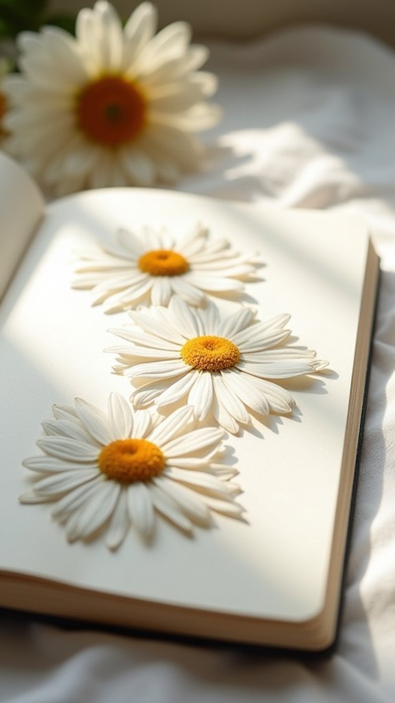
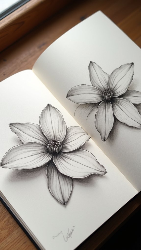
Illustrating Cherry Blossoms: Layering Petals for Softness
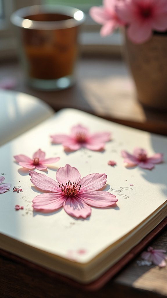
A cluster of cherry blossoms looks like a pink cloud—soft, dreamy, and almost too perfect to be real. When drawing these delicate flowers, start with a loose sketch to block out the rounded petals and central burst.
To get that gentle effect, use petal translucency techniques: paint in thin, soft layers of pink and white, letting colors blend like cotton candy shadows. This layering brings out depth and beauty, almost as if the petals themselves are glowing.
In Japanese culture, cherry blossom symbolism is huge—they mean hope and the fleeting nature of life. Each flower whispers stories of spring and new beginnings, which is great for capturing seasonal beauty.
- Blend watercolor layers for a dreamy effect
- Define petal edges with darker pinks
- Add details with a fine pen for realism
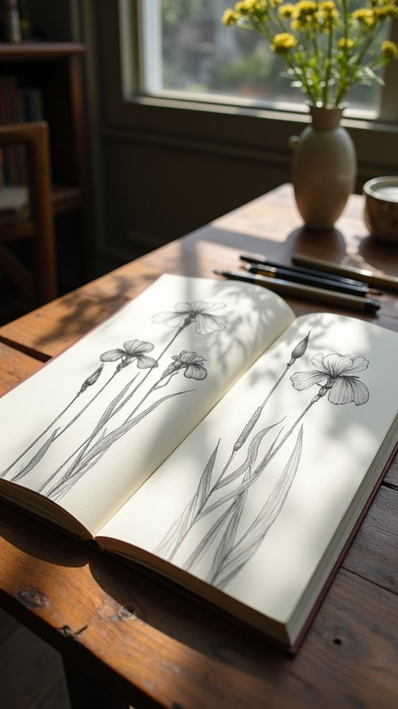
Capturing Iris Forms: Guiding Curves and Gentle Gradients
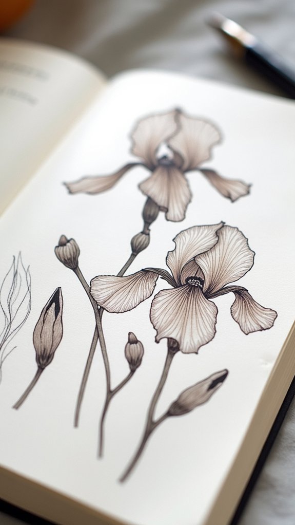
Irises are like the drama queens of the flower world—bold, elegant, and totally unafraid to show off. Sketching an iris means tracking its guiding curves, those swooping, almost theatrical lines that make its petals look like dancers mid-twirl.
Their petal textures are another level—some crinkled, some smooth, all begging for an artist’s attention. To really nail an iris, it’s best to start with a light pencil outline, barely there, so the delicate shapes shine later under a wash of color.
When it comes to color blending, go wild! Irises shift from deep, moody purples to the softest whites. Using different brush sizes helps capture both the tiniest veins and the gentle gradients that make these flowers such showstoppers.
Depicting Peonies: Building Volume With Layered Petal Edges

Drawing peonies is a little like building a fluffy mountain out of marshmallows—lots of layers, lots of softness, and a whole bunch of gentle curves.
To really make those petals pop, artists play with shading, using lighter and darker areas to show which petals are in the spotlight and which are hiding in the shadows.
With just a few careful lines and some smarty-pants color choices, anyone can trick the eye into seeing real, touchable peony petals stacking on the page.
Capturing Soft Petal Layers
Peony petals are like tiny clouds crammed together, each one soft, puffy, and just begging to be sketched. To capture the magic of these overlapped petals, artists turn to clever petal layering techniques—think of it like stacking fluffy pancakes, but way prettier.
Gentle, light strokes shape each petal’s edge, and the arrangement starts with inner petals, building outward. Combining color blending methods (hello, watercolor washes!) with sketching keeps everything delicate. Press lightly for airy spots and harder for shape, letting the peony pop off the page.
The real fun? Texture variation exploration—try mixing up your lines and shading for realistic petal vibes.
- Focus on soft, overlapping petal shapes
- Play with pencil pressure for light and depth
- Use soft watercolors to blend colors at edges
Suggesting Depth Through Shading
Once those soft, stacked petals are sketched out, getting them to look lifelike takes more than just careful outlines—it’s all about the magic of shading.
Shading techniques are like a secret tool for making peonies pop right off the page. Think about how light hits the petal curvature—where petals overlap, layer darker shades to really boost that three-dimensional look.
Smooth, gentle brush strokes show off the velvety petal texture, while sharper ones can outline the crisp edges. Color blending is key at the petal bases, smoothly fading pinks or soft yellows into shadows for real flower vibes.
Don’t be afraid to go bold and mix colors! When done right, those fluffy peonies suddenly look so touchable, you’ll want to smell them.
Rendering Grape Hyacinth: Clusters of Miniature Bells
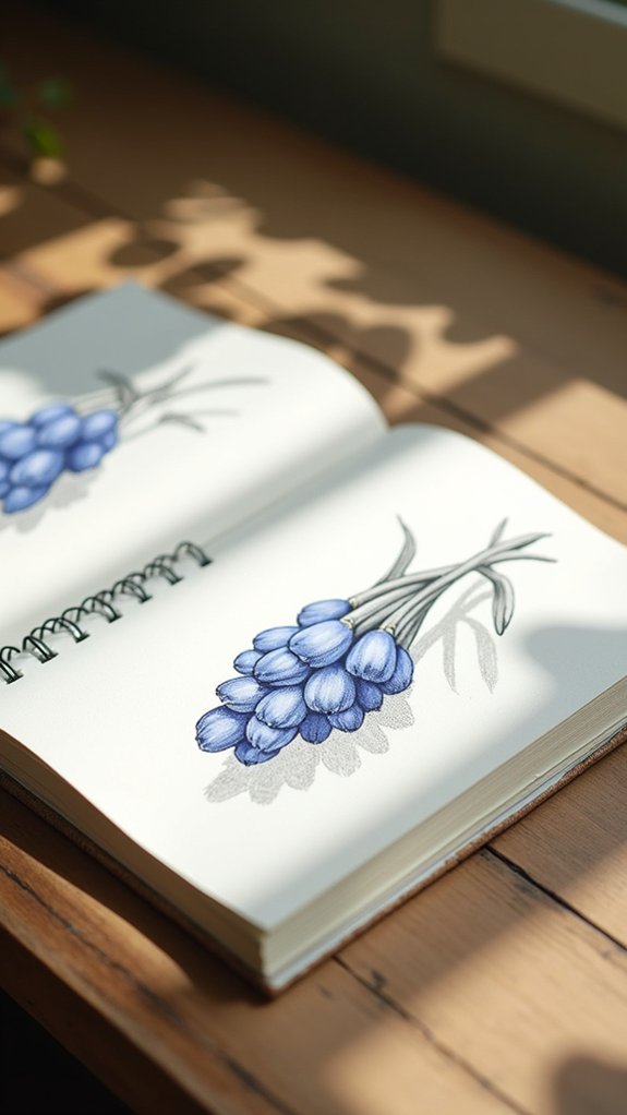
Clusters of grape hyacinth look a bit like a tiny festival of blue and purple bells, all packed tightly together and showing off their fancy colors.
Some even sneak in whites or delicate pinks, which can make sketching them extra fun if you love color variations.
These little blooms aren’t just pretty faces either—they’re like open invitations for bees and butterflies, with their sweet scents calling pollinators from all around.
In real gardens, grape hyacinths work their magic in borders, under shrubs, or in rocky patches, boosting any garden placement with a pop of cheerful hues.
- Try blending blues and purples for believable color variations.
- Show multiple clusters together for a festival effect.
- Add tiny pollinators for a touch of lively, buzzing humor.
Drawing Cuckoo Flowers: Four Petal Symmetry and Light Hatching
Cuckoo flowers look like they’ve been made with a ruler, with four perfect petals spread out like tiny wings, so getting that symmetry on paper is a fun challenge.
Artists can use gentle hatching—those quick, feather-light lines—to make the petals stand out, giving them a soft look without making them seem heavy.
Getting the curves and shadows just right feels almost like solving a secret puzzle, and even a small sketch can end up looking pretty awesome.
Capturing Petal Symmetry
There’s a special kind of magic in the way some flowers arrange their petals, and cuckoo flowers are like the wizards of the bunch with their perfect four-petal symmetry. This makes them an awesome pick for anyone wanting to practice petal arrangement techniques in their sketchbook.
First, pay close attention to how each petal connects around the central stigma—it’s a total floral anatomy insight booster! Use a fine-tipped pencil to get each curve right. Then, try using different hatching density effects to show how the petals catch the light.
Here’s how to make them shine on your page:
- Outline first to nail the four-petal balance
- Observe real cuckoo flowers for natural arrangement ideas
- Use light, even hatching for that airy, magical vibe
Subtle Hatching Techniques
Many artists find that mastering subtle hatching can take a simple flower sketch and turn it into something that almost jumps off the page—like a cuckoo flower ready to whisper secrets. When drawing Cardamine pratensis, also called cuckoo flowers, artists use hatching techniques to honor their four-petal symmetry and delicate charm. Light hatching—using thin, close lines—adds just enough shadow to give the petals depth, while still keeping them soft. Changing the direction and spacing of lines is like giving the petals a gentle twist, showing how they curve and catch the light. Practicing shading variations and texture enhancement can make sketches look more lifelike and magical. Try mixing things up as shown in the table:
| Technique | Result |
|---|---|
| Light, fine hatching | Soft, delicate shading |
| Varied line direction | Realistic petal curvature |
| Adjusted line spacing | Enhanced texture and contrast |
Illustrating Wild Irises: Tall Stems and Detailed Centers
A wild iris isn’t just another flower to draw—it’s basically the diva of the meadow, strutting around on tall, skinny stems that can tower up to three feet high.
These blossoms put on a show with their bold petals and intricate centers, packed with wild iris textures and color variations sure to grab anyone’s attention—especially pollinators, who can’t resist the vibrant yellows, purples, and whites.
Their sword-like leaves slice through the page for contrast, while the petals themselves flirt with light, looking almost see-through.
When sketching, artists should keep an eye out for those ruffled or sleek petals and mix up line weights for extra realism.
- Notice wild iris textures and petal shapes
- Highlight color variations in the center
- Sketch tall stems for dramatic effect
Sketching Coltsfoot: Radiating Petals and Fuzzy Textures
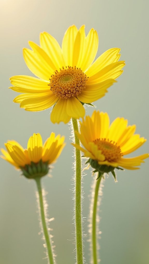
Now that the wild iris has strutted its stuff across the sketchbook, it’s time to meet coltsfoot—the flower that shows up early to the party, long before most others even think about blooming.
Coltsfoot (Tussilago farfara) bursts onto the scene in early spring, making it a prime subject for anyone keen to capture a seasonal bloom. Its flower anatomy is something to admire: a bright yellow disc packed with tiny florets, surrounded by thin petals that shoot outward like sunbeams.
Sketch artists get treated to real texture variation here—not just the smooth, dandelion-like petals but the fuzzy, heart-shaped leaves that appear later, soft as a rabbit’s ear.
Whether found by a damp roadside or an open field, spotting one feels like discovering gold.
Articulating Magnolia Blooms: Broad Petals and Central Details
Magnolia blooms practically demand attention, throwing out those giant, velvety petals so wide they look like they’re trying to outdo each other for the spotlight.
With each petal stretching and curving in a showy arrangement, sketching them almost feels like trying to capture a drama in slow motion. Artists find magnolia’s petal arrangement especially fun—no two look exactly the same, and their broad surfaces catch light in surprising ways.
The reflection bounces off their waxy petals, creating subtle gradients you won’t want to miss with your pencil. Don’t forget the wild centerpiece—this flower’s reproductive structure features a bunch of stamens and pistils, each begging for just a dash of extra detail.
- Notice petal arrangement variety
- Capture shiny light reflection
- Highlight the detailed reproductive structure
Sketching Pansies: Heart-Shaped Petals With Contrasting Veins
Even though pansies might be small, they definitely know how to make a statement in any sketchbook. Their heart-shaped petals and bold, contrasting veins look almost hand-painted, giving every pansy its own flashy personality.
When artists pay attention to petal symmetry, sketching pansies becomes a fun puzzle—each petal mirroring the next, but just not quite perfectly.
And then comes the real thrill: playing with pansy color. Purples, yellows, whites, and even oranges mean there’s no end to mixing and layering different shades.
For those looking to up their sketching techniques, focusing on delicate shading and capturing those dramatic veins turns a simple drawing into a show-stopper.
Seriously, these little blooms might just steal your whole page!
Depicting Lady’s Slipper Orchid: Intricate Folds and Unique Profiles
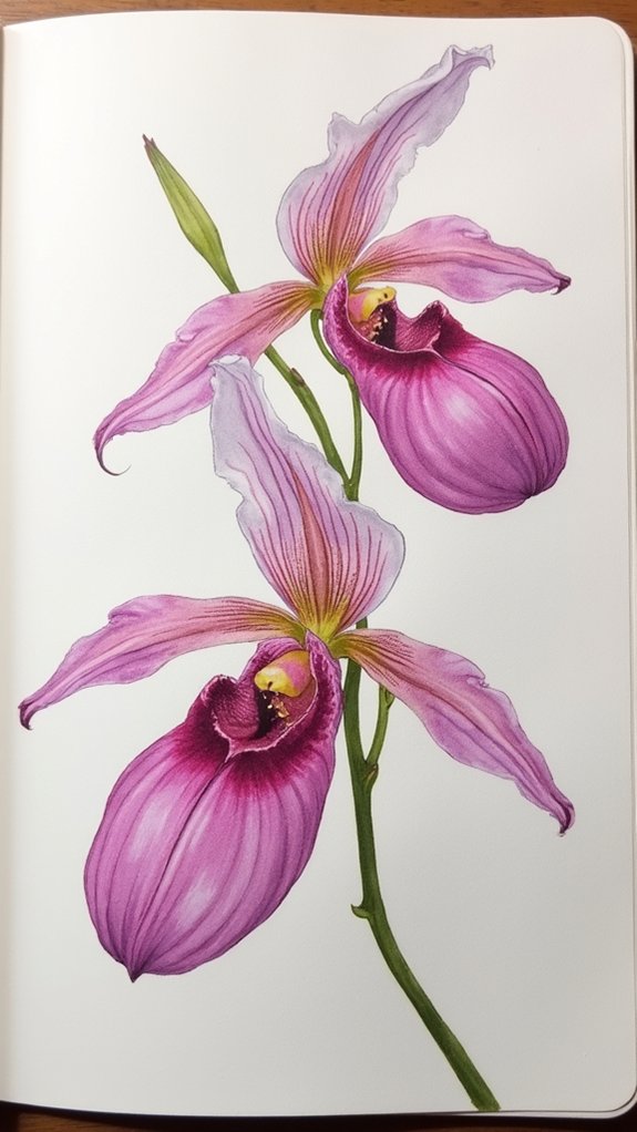
Pansies bring their own burst of color and charm, but nothing quite catches the eye like the Lady’s Slipper Orchid with its weird and wonderful flower shape.
This wild bloom has a pouch-like flower that almost looks like a fairy’s shoe—seriously, who designed this thing? Sketching a Lady’s Slipper means paying close attention to those intricate folds in the petals and the unique, shoe-like profile.
Using color techniques, like gentle shading and layering, helps bring out the deep pinks, sunny yellows, and snowy whites of these orchids. Don’t forget those fine lines and subtle color fades for the cool orchid textures.
- Examine the flower’s pouch shape from different angles
- Layer colors for a natural shaded look
- Use light, fine lines for delicate petal details
Frequently Asked Questions
What Are the Easiest Flowers to Draw?
When considering the easiest flowers to draw, artists often select simple blossoms like daisies, bluebells, or wildflowers. Sunflower sketches and easy petal designs, such as tulips and buttercups, help beginners learn floral forms with minimal complexity.
What Should I Draw on My First Sketchbook Page?
When facing the first sketchbook page, one might include inspirational flower quotes, sketches of favorite drawing tools, and examples of personal drawing styles. This approach creates a welcoming, motivational introduction and celebrates individual artistic expression from the start.
What Is the Difference Between a Sketch Pad and a Sketchbook?
A sketch pad generally features loose sheets and lighter sketch pad materials, ideal for practice pages. A sketchbook, often in standard sketchbook sizes, contains bound pages, favoring artists who prefer durability when choosing sketch tools for varied media.
How to Make a Cheap Sketchbook?
To make a cheap sketchbook, one can gather DIY sketchbook materials like recycled paper and cardboard, use budget friendly art supplies for decoration, and employ homemade sketchbook binding methods such as stapling or stitching to assemble the pages.
Conclusion
So, diving into these 17 flowers turns any sketchbook into a mini garden, right? Each one brings its own challenge—twisty petals, wild shadows, the works. But messing up a line? That’s just part of the fun. Every petal, each little detail, helps artists level up and get creative. Even if these flowers droop or end up looking a bit silly, they still brighten a page. The best part? There’s always another flower to try next.
Leave a Reply