
Looking to make your sketchbook way cooler? Try raw umber and blue acrylic washes for depth, layer in bold brush strokes, or mess around with color palettes—clash blue and orange for fun! Dab with funky brushes or do a coffee wash if you want that “old map” vibe. Fragment backgrounds, smudge charcoal powder, or add flashy gold leaf for a pop of luxury. Mixing these ideas will help any sketch leap off the page, and there’s plenty more creativity ahead!
Key Takeaways
- Layer raw umber and blue acrylic washes for instantly atmospheric backgrounds with depth.
- Use dabbing and fragmented brush strokes to create textured, multi-dimensional surfaces.
- Apply coffee washes for sepia tones, then enhance with pastel pencils or salt for added visual interest.
- Incorporate negative space and bold, patchy brush strokes to achieve dynamic and balanced compositions.
- Add metallic gold leaf accents or charcoal blends to introduce texture and luxurious highlights.
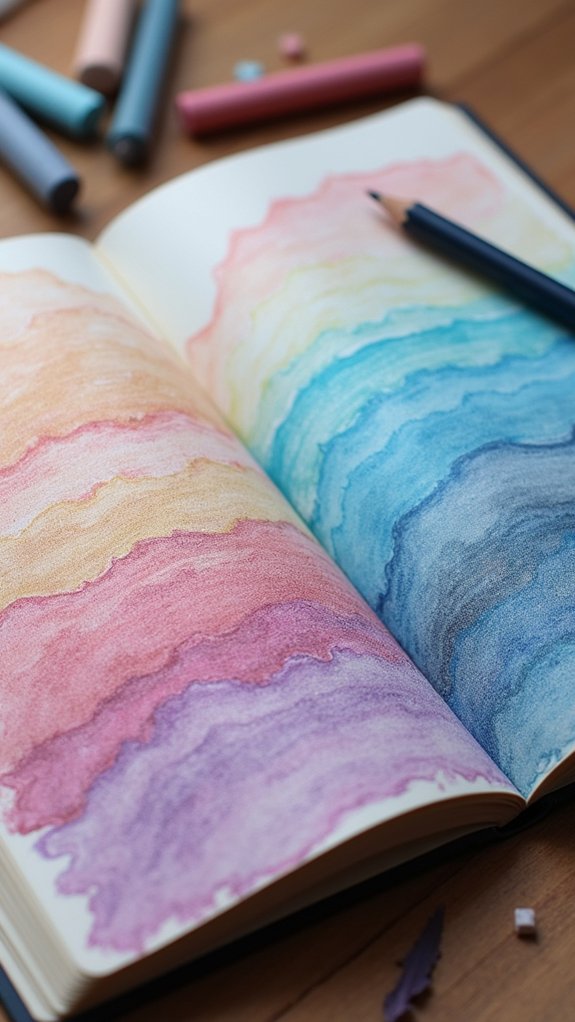
Raw Umber and Blue Acrylic Washes

Sometimes, the coolest sketchbook backgrounds start with just two colors—raw umber and blue.
These two shades, when mixed as washes with blue acrylic, can make your page look really good without much effort. It’s kind of like magic!
Try playing with how much raw umber you use versus the blue—maybe you like things moody and deep, or maybe you want something more chill and neutral. Either way, you’re in control.
Water down the paints a bit, swipe them on your paper, and don’t forget to use a plastic palette knife for scraping or blending. It adds just the right touch of texture.
Also, layering the washes makes the final background look super deep, especially on paper that handles water well.
Bold Brush Strokes for Expressive Backgrounds
After messing around with those raw umber and blue washes, it’s time to really let loose—bold brush strokes are where things start to get wild.
Grabbing a big brush and swooshing it across the page? Instant boost of energy. The mix of strong, sweeping moves plus interesting color combinations makes any background pop.
Don’t be shy—layer strokes on top of each other, and watch as the background starts to show complex texture and depth.
Try dabbing with the brush for a different look; blobs and dabs break up space so things don’t look flat or boring.
It might get a little messy, but sometimes that chaos is exactly what sketches need. Who said backgrounds had to be neat anyway? Things are way more fun this way.
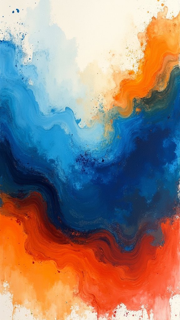
Experimenting With Color Palettes

Color can totally change the mood of your sketchbook, so why not have some fun with it?
Playing around with bold contrasts—think blue against orange, or any color wheel opposites—can make your backgrounds pop, while using just one hue in different shades turns everything calm and mysterious, almost like your page is hiding secrets.
Whether someone sticks to one color or lets bright opposites battle it out, experimenting with palettes keeps every background fresh and exciting.
Contrasting Hues Exploration
A bold splash of opposing colors can totally shake up the background of a sketchbook page—think electric blue chasing after a fiery ochre, like superheroes locked in battle.
When someone experiments with contrasting hues, things get pretty interesting fast. Pairing warm and cool tones doesn’t just jazz up a page; it can really put the spotlight on your sketch without you having to spend much time layering details.
Using the color wheel is like having a secret sidekick—it helps you match up shades that were born to clash, in a good way. Dabbing bright colors together not only adds energy but also creates textures that are super fun to look at.
Don’t be scared to mix odd combos—sometimes those turn into masterpieces.
Monochromatic Palette Play
Switching things up from loud color clashes, some artists go all-in on just one color—yep, it sounds wild, but it’s called monochromatic palette play.
The idea here is simple: stick to one color, but tweak its shades and tints by mixing in a little white or black. Suddenly, your background really pops with depth and mood, while avoiding chaos.
Next time you grab your sketchbook, try it out! You might be a little surprised by how easy it is to lead eyes exactly where you want them. No fighting over which color gets the limelight—just one, ruling the page.
Dabbing, smudging, or layering can turn boring flatness into something textured and totally cool. Monochromatic? More like majorly awesome!
Dabbing Techniques for Added Texture
Picking the right brush is kind of like picking the right tool for a top-secret mission—flat brushes, round ones, or even sponges can all change the look of your dabbing patterns.
Layering your dabs with different colors and levels of paint makes your background start to pop, adding those cool dimensional effects that make people stop and stare.
Want your sketchbook to stand out? This is your moment to go wild with textures!
Choosing the Right Brush
When it comes to making textured backgrounds pop off the page, the brush in hand matters way more than most people think. The whole vibe changes depending on your brush size selection, bristle stiffness impact, and even a little thing called dabbing pressure variation. For big, bold splashes, grab a larger brush; for tiny speckles, stick with something small and precise. A brush with stiff bristles will leave awesome textures, while softer bristles keep things subtle. Don’t forget, heavy pressure makes a mark you can’t miss, but light touches build dreamy layers. The table below breaks it down:
| Feature | Effect on Background |
|---|---|
| Large brush | Covers wide areas quickly |
| Small brush | Adds detailed texture |
| Stiff bristles | Creates bold, bumpy marks |
| Light dabbing pressure | Soft, gentle patterns |
Layering for Dimensional Effects
On a quest to give sketchbook backgrounds some serious wow-factor, layering different colors and textures turns a flat page into a wild playground for the eyes.
Dabbing with a brush isn’t just fun—it’s a superpower for creating textural contrast. Try color blending techniques with acrylic and water for cool, see-through layers, or slap on thick paint using a plastic palette knife for a chunky, fragmented look.
Got salt? Toss it on a wet watercolor background and watch as it soaks up pigment, making random light spots that look kind of like magic.
Want your art to scream “fancy”? Press on some gold leaf over dried dabs, and you’ve instantly got next-level layering mediums.
Basically, every swipe and dab piles on excitement.
Coffee Wash for Aged Effects
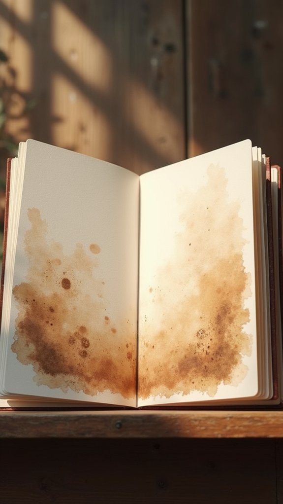
A mug of coffee isn’t just for drinking—it’s actually a secret weapon for making sketchbook backgrounds look old and mysterious.
With some cooled coffee and a watercolor brush, artists can create soft, faded tones that seem to whisper stories from long ago. This process is super easy and fun, but it’s also pretty rewarding when you see those cool coffee texture effects.
Here’s how anyone can get started:
- Apply a light coffee wash across your page, using a brush for even coverage and that signature antique vibe.
- Try layering techniques exploration by adding more washes once the first layer dries, building extra depth or creating unique patterns.
- Grab pastel pencil highlights to outline shapes and details, making the muted background pop with bold, colorful energy.
Watercolor Brush Techniques With Coffee
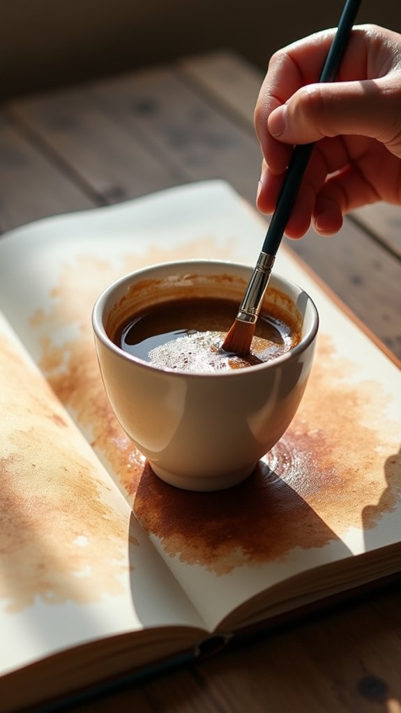
Even though most people think of coffee as a morning pick-me-up, some artists know it makes for a seriously awesome tool in the sketchbook. With watercolor brush techniques, coffee can be transformed into magical backgrounds. Dipping a brush into different coffee washes lets artists experiment with coffee color variations, layering from pale tan to deep brown. And get this—coffee texture exploration is super fun! If you sprinkle a pinch of salt onto the wet coffee wash, it soaks up liquid and leaves wild white marks once it dries. You can tweak your coffee concentration, swipe broad strokes, or even go for dots and dabs. Let’s check out some techniques:
| Coffee Technique | Resulting Effect |
|---|---|
| Light Wash | Soft, aged look |
| Heavy Wash | Rich, darker tones |
| Salt Texture | Speckled white marks |
| Layering | More depth and drama |
Outlining With Pastel Pencils
Outlining with pastel pencils is like giving your sketches a superhero cape—it boosts the edges and makes the shapes stand out better, especially against a soft coffee wash.
Layering these bright outlines right over your painted background lets you add pops of color and really make your artwork sing.
Plus, it’s pretty fun to see how a splash of bold or surprising color can totally change the mood of your drawing!
Enhancing Edges and Shapes
Nothing grabs attention in a sketchbook quite like bold outlines zipping around the edges of shapes, especially when pastel pencils come into play.
These pastel techniques don’t just look cool—they give your drawings superhero-level color contrast and make your shapes leap off the page. When adding outline styles, timing matters; let that background dry first to dodge any smudgy disasters.
For the most punch, experiment with different outline thicknesses and color choices. Sometimes, blending the outline gently with your finger can soften the look and help your shapes blend into the background just enough to stay interesting.
Here’s how to boost your edges and shapes:
- Choose bold pastel pencil colors that contrast with your background.
- Vary line thickness for added energy.
- Lightly blend outlines for a smoother, unified look.
Layering Over Coffee Wash
Some sketchbook artists swear by the magic of coffee—no, not just to stay awake, but to whip up gorgeous backgrounds for their drawings.
With coffee wash techniques, all it takes is a watered-down brew and a watercolor brush to add an old-school, sepia-toned vibe to any page.
Once the coffee wash is dry (and it’s super important not to rush this part!), pastel pencil colors really start to shine. Outlining shapes or sketching details with bright or earthy colors makes them practically pop against the mellow, brownish background.
The contrast is eye-catching, but here’s a secret: blending methods matter, too. Use a fingertip or a blending tool to lightly smudge the edges of the pastel pencil marks, tying everything together for serious depth and style.
Adding Colorful Accents
A splash of color can turn an ordinary sketch into something totally electric, and that’s where pastel pencils come in handy.
Outlining with pastel pencils is like giving your artwork an energy boost—those vibrant accents create bold contrast and pull everything together.
Pastel pencil techniques let artists switch up texture and thickness just by changing pressure, while color harmony strategies can make sure outlines actually fit the rest of the page (not clash like a wrong puzzle piece).
Here’s how to make those outlines pop:
- Pick colors that vibe with your background, using color harmony strategies for unity.
- Wait until your paint dries, then use outline application tips for crisp, smudge-proof lines.
- Vary your pressure and layer outlines over textured areas for amazing depth and style!
Scraping With a Plastic Palette Knife

Dive right in and start exploring the wild side of art with scraping, a technique that uses a plastic palette knife to create backgrounds that are anything but boring.
Palette knife techniques are like the secret sauce for getting those eye-catching textured surfaces in your sketchbook. Just grab some watered-down acrylic paint and use the knife to scrape paint both on and off the page. Adventure awaits!
Try combining colors like yellow ochre, burnt umber, and cadmium red for a background that looks way more interesting than a flat wash. The plastic palette knife is super flexible, so you can play around with pressure to switch up your patterns.
This method shines in mixed media projects and works best on sketchbook paper ready for water—no shredded pages, promise!
Mixed Acrylic Color Layering
Ready to step up the background game even more? Mixed acrylic color layering is the secret weapon for turning flat sketchbook pages into vibrant masterpieces.
By blending colors like yellow ochre, burnt umber, and cadmium red, artists achieve deep color harmony and a sense of lively chaos. The real excitement kicks in when layering methods come into play—each layer dries before the next leap of creativity begins, preserving both color and texture contrast.
Here’s how this magic can boost anyone’s sketchbook:
- Create unexpected effects with watered-down raw umber and scrape it with a palette knife for those cool fragmented backgrounds.
- Mix up your brush choices to stamp playful marks or jagged patterns.
- Always let layers dry, so every texture and color shines through, no muddy mess.
Salt Sprinkling on Wet Watercolor
Sprinkle a little magic—literally—by tossing salt onto wet watercolor and watch as science and art collide in the coolest way.
This trick instantly spices up any sketchbook background. When you try a salt types comparison, you’ll notice that chunky, rock salt leaves big, wild bursts, while table salt creates tinier, snowflake-like patterns.
The fun part? It’s all about texture variation techniques—move the salt around, drop it in clusters, or sprinkle it evenly for different looks.
For maximum wow-factor, start experimenting placements, like adding salt just to the edges or swirling it across the page.
After the paint dries, brush off the salt and check out the wild patterns left behind. It’s like a secret code in your artwork—totally cool!
Creating Patterns With Ink Rollers
Roll out some excitement—literally—with ink rollers, and watch your sketchbook backgrounds level up fast.
Ink roller techniques make it easy to cover pages with watered-down acrylics, smoothing out big, even spaces in no time. Things get really cool when you start experimenting!
Try color blending strategies by layering blues over yellows for wild greens or soft blending between shades. Add some unexpected flair with texture variation methods—swap roller types or push with different amounts of pressure.
Here are three ways to keep things interesting:
- Overlap different colors with the roller for funky multi-layered effects.
- Use patterned rollers or wrap them with string to change the look.
- Blend colors on the roller itself before printing for a surprise every time.
Your backgrounds will never look boring again!
Fragmented Backgrounds With Minimal Coverage
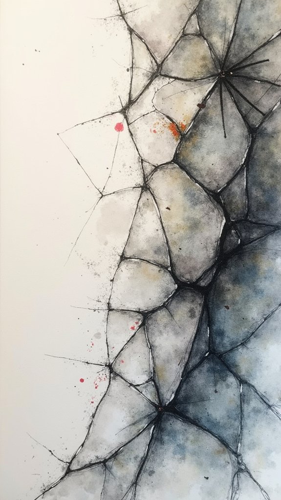
Fragmented backgrounds with minimal coverage are like a refreshing change for any page—broad, messy brush strokes layered on top of each other, but never close to filling it all in.
Letting lots of negative space peek through gives each mark room to shine, and those empty gaps? They actually help the whole background feel balanced instead of busy, making your sketchbook look cool and just a little mysterious.
Layering Fragmented Brush Strokes
Even though it might sound a little wild, layering fragmented brush strokes is like building a secret world in the background of your sketchbook—one swipe of color at a time.
This method isn’t just about being messy, though; it controls how fragmented textures and color dynamics play together, hinting at hidden depth without stealing the spotlight from your main subject. Using wild brush variations makes each fragment stand out.
Try this roadmap for a fun, energetic background:
- Pick two or three bold colors and use big, dramatic brush strokes, leaving spaces in between for that fragmented vibe.
- Layer on more dabs and slashes, switching up brush sizes to enhance texture and create surprise.
- Wait for each layer to dry—trust the process—so your sketches stay sharp, crisp, and totally unique!
Embracing Negative Space
Just when it seems like the background is about to steal the show with wild bursts of brushwork, pulling back and leaving parts of the page blank can be just as dramatic—maybe more!
Negative space exploration isn’t just for fancy artists; it’s a clever way to help your focal point leap off the page. By using minimalist design principles, like leaving big, open areas around the main subject, the important details stay front and center.
Try adding bold marks with acrylic or even coffee washes, then scrape or dab away spots so some paper peeks through. Toss in bits of charcoal or sprinkle salt for cool, fragmented patterns.
The magic of embracing negative space? It guides your viewer’s eyes—no flashy circus background required!
Visual Balance With Gaps
Envision this: a background that isn’t totally filled in, but instead leaves unexpected gaps, almost like the artwork is taking big, creative breaths.
These gaps hold real significance—they invite viewers to explore the page and wonder about what’s left unsaid. That’s where visual balance with gaps comes in. It’s all about using fragmented backgrounds and minimal coverage to create cool visual dynamics without crowding things out.
Want to try? Here are three simple balance techniques:
- Paint bold, patchy brush strokes using watered-down acrylics so the paper peeks through.
- Sprinkle salt onto wet paint for unpredictable, chalky white marks that shake things up.
- Place gold leaf highlights only in certain areas to catch the light—and everyone’s attention—while keeping the composition balanced.
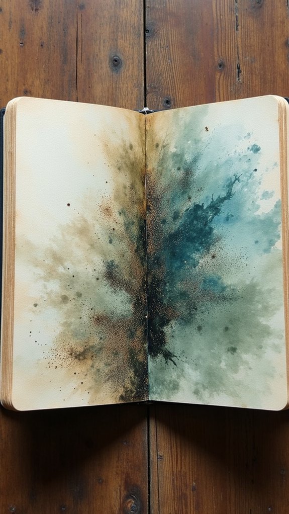
Dynamic Charcoal Powder Effects
Bring some serious drama to your sketchbook backgrounds with dynamic charcoal powder effects—it’s like giving your art an energy boost! Charcoal blending techniques let you swoosh, smudge, and layer shades for awesome shadows and highlights. But here’s where things get wild: try acetone splash effects by spritzing or flicking acetone onto the charcoal-covered page. You’ll get cool, unpredictable patterns that look almost otherworldly. And if you’re into mixed media, texture layering methods let you stack charcoal with watercolor or acrylic splashes. Now, for a burst of sketchbook inspiration, check out this table of game-changing methods:
| Technique | Result | Pro Tip |
|---|---|---|
| Charcoal Blending | Smooth Gradients | Blend with a brush or finger |
| Acetone Splashes | Unique Splatters | Use a spray bottle for control |
| Smudging & Dabbing | Soft, Cloudy Effects | Vary pressure for texture |
| Fragmented Application | Dynamic White Spaces | Mask edges with scrap paper |
| Mixed Media Layering | Extra Depth | Try watercolor under the charcoal |
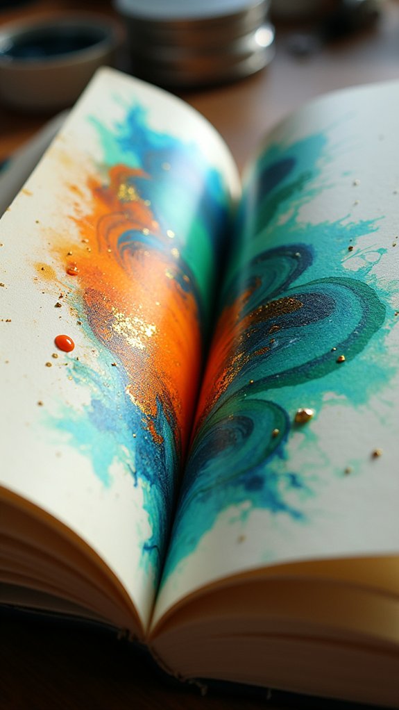
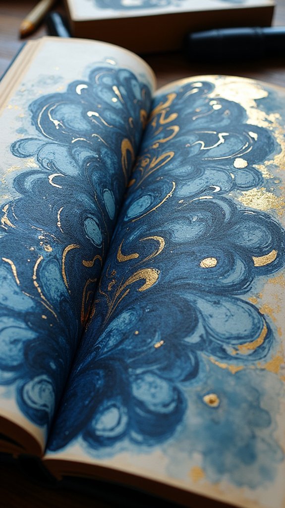
Gold Leaf Application for Luxurious Texture
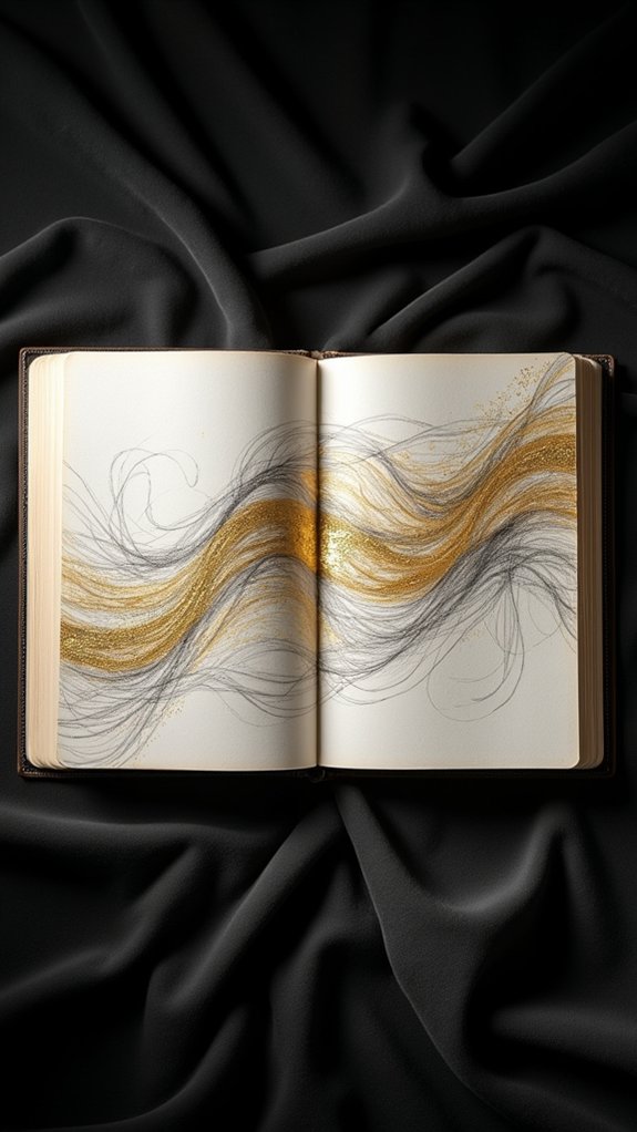
Transform any sketchbook page from drab to downright dazzling by adding gold leaf for a blast of luxury and texture.
Gold leaf application turns backgrounds into shimmering wonders, adding both glitz and depth with its reflective surface effects. No one’s ever accused a gold-flecked page of being boring!
With simple texture enhancement techniques, even beginners can get impressive results. Here’s how to make your art shine like a treasure chest:
- Prep with Gold Leaf Glue: Brush on gold leaf glue, let it get tacky (about 15 minutes), then gently lay on the leaf.
- Rip, Layer, and Overlap: Playing with fragmented bits and layering pieces creates wild, eye-catching patterns!
- Try Alternatives: If real gold busts your budget, imitation gold or silver leaf mimics the look without breaking the bank.
Layering and Combining Multiple Techniques
Dive right in—there’s nothing quite as exciting as mixing up different art techniques to see what magic happens! Try starting with a bold wash of raw umber and blue, letting the colors swirl together for some wild color interaction. As it dries, sprinkle salt over your watercolor—watch as it absorbs pigment, creating cool texture exploration right before your eyes. Once dry, dab in coffee for a vintage effect, then layer on acrylics or charcoal for contrast and more depth. Don’t be afraid to use brushes, ink rollers, or even your fingers! For an extra-special touch, add swatches of gold leaf for a touch of glam. Here’s how layering techniques can mix and match:
| Technique | Effect Achieved |
|---|---|
| Salt & Watercolor | Crystallized textures |
| Coffee base | Aged, vintage look |
| Gold leaf | Luxurious highlights |
| Acrylic layering | Bold, sharp contrasts |
Frequently Asked Questions
What Paper Types Work Best for Textured Background Techniques?
When selecting paper for textured background techniques, artists often choose watercolor paper for its durability and absorbency. Mixed media paper also accommodates various materials, while papers with pronounced textured surfaces can enhance the tactile and visual depth of artworks.
How Do You Protect Finished Sketchbook Backgrounds From Smudging?
To prevent smudging of finished backgrounds, one should apply fixative sprays designed for art, ensuring they are archival quality. Sealing methods like protective sprays or interleaving with glassine sheets further safeguard artwork while maintaining color integrity.
Can Digital Sketchbooks Replicate Traditional Background Effects?
The effectiveness of digital sketchbooks in replicating traditional background effects depends on digital brushes, layering techniques, and texture simulation. Artists can mimic analog nuances, but achieving the same tactile authenticity may require experimentation and careful adjustment of digital tools.
How Do You Fix Mistakes in a Background Without Ruining the Page?
When addressing mistakes in a background, artists often utilize background repair techniques such as gentle erasing, layering solutions to conceal flaws, and color blending methods to seamlessly integrate corrections, thereby preserving the overall integrity of the page.
Are There Eco-Friendly Alternatives for Common Background Materials?
The topic of eco-friendly alternatives for common background materials often includes recycled paper options, natural dye sources, and plant based adhesives. These materials reduce environmental impact while maintaining quality, making them suitable substitutes for traditional sketchbook supplies.
Conclusion
With these sketchbook background ideas, imagination gets a major upgrade. Whether it’s messy brush strokes, shiny gold leaf, or a splash of coffee (yup, art and breakfast unite), artists have endless choices to create depth and drama. Don’t worry if the first try looks more “abstract experiment” than masterpiece—sketchbooks are all about having fun and taking risks. So grab those art supplies and go wild. Who knows? The next page might just be your most epic yet.
Leave a Reply