
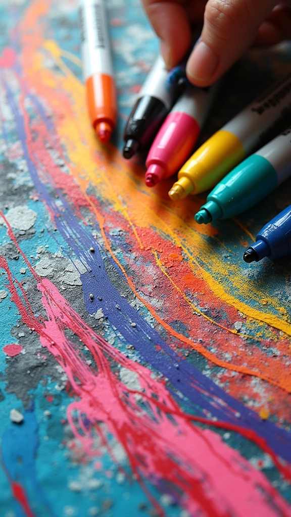
Posca markers are awesome for bold lines and wild creativity—think squiggly abstract art, chunky letter quotes, and super-bright pop art faces. Try geometric patterns, comic-book panels, or cactus doodles with thick outlines. Mix things up with freeform backgrounds, eye-popping color blocks, and mixed media textures. Don’t forget fun food characters or textured flower petals! Each idea lets you layer colors, play with different line widths, and express your style in big, in-your-face ways. Stick around for even more bold ideas!
Key Takeaways
- Experiment with geometric patterns and color blocks, using thick Posca markers for crisp, bold outlines and high-contrast visual impact.
- Create abstract squiggly line art or freeform backgrounds, layering vibrant marker strokes to emphasize bold, expressive lines.
- Illustrate playful food characters or pop art portraits, accentuating features with exaggerated, strong outlines for comic-book flair.
- Draw minimalist cactus or spring leaf designs, using thick outlines and limited palettes to make shapes pop against clean backgrounds.
- Combine Posca markers with acrylic paint or textured surfaces, using varied marker sizes to enhance boldness and visual drama.
Abstract Squiggly Line Art

Even though it might look a little wild at first, abstract squiggly line art with Posca markers is all about letting loose and having fun.
Imagine grabbing a bunch of colorful paint pens and just letting your hand wander across a canvas or sturdy paper—no rules, just bold, curvy lines everywhere!
To create art that pops, start by brushing on an acrylic background, adding cool texture and depth.
Brush on an acrylic background first to add cool texture and depth before layering your vibrant squiggles.
Then, layer on squiggles in all sorts of colors and thicknesses by switching marker sizes and pressing harder or softer.
Want to make your art stand out even more? Sneak in tiny doodles or symbols, or pick a theme—maybe spooky bats for Halloween!
This style is perfect for home decor, since every piece turns out unique and playful.
Geometric Shape Patterns
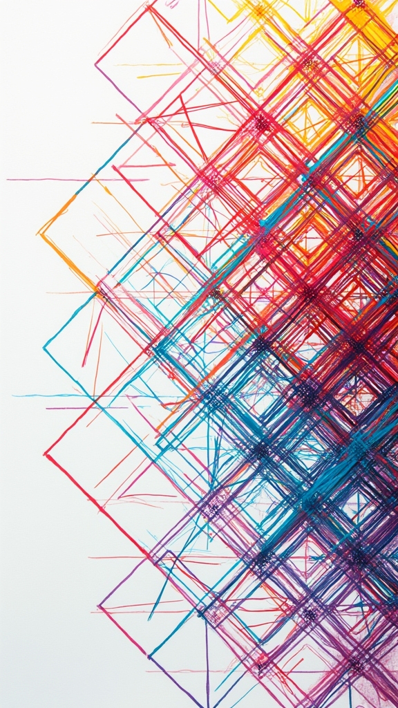
Abstract squiggly lines might let creativity run wild, but sometimes it’s cool to see what happens when things get a little more structured. That’s where geometric shape patterns come in!
Using Posca markers, artists can start with basic shapes—think triangles, circles, and squares—and fill them with bold, contrasting colors. Layering those colors and lines makes the artwork pop and gives it real depth, almost like it’s jumping off the page.
Mix things up by changing line thickness—a thick line here for drama, a thin line there for detail. Leaving some spaces empty or lighter adds balance and keeps things from looking too busy.
People love posting these crisp, colorful patterns on social media, and it’s easy to see why—they’re eye-catching, satisfying, and totally fun to make!
Bold Lettering and Hand Lettered Quotes

There’s something super satisfying about seeing a bold, colorful quote jump off the page—almost like it’s shouting “look at me!” with every letter.
Posca markers make this magic happen, thanks to their vibrant colors and smooth, easy-flowing ink. When it comes to inspirational quote designs, experimenting with unique lettering styles—like chunky block letters or playful brush script—can totally change the vibe.
Posca markers bring quotes to life with bold color and smooth ink—switch up your lettering style to transform the whole mood!
Try color blending techniques by layering different shades for a cool ombré effect, or add outlines and shadows with a contrasting color for extra pop. Mixing up marker thickness adds drama and helps certain words stand out, so each quote feels alive and full of energy.
With some practice, anyone can develop their own signature style and wow their friends!
Pop Art Portraits
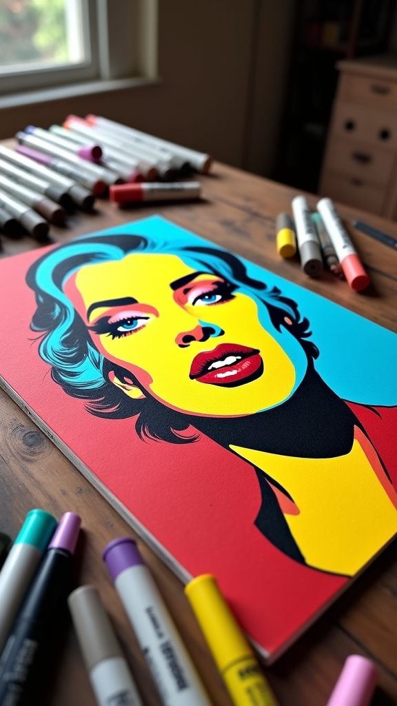
Switching gears from bold lettering, pop art portraits take things to the next level with a serious splash of attitude.
These portraits are all about celebrity caricatures, vibrant color contrasts, and playful iconography that practically jumps off the page. Using Posca markers, artists can turn basic faces into electric, comic-inspired masterpieces.
Here’s how to keep the vibe fun and fresh:
- Start with thick outlines to capture exaggerated features—think big eyes, wild hair, or a goofy smile.
- Layer bold, vibrant colors for maximum pop, making sure each hue stands out.
- Add playful iconography, like speech bubbles or comic-style backgrounds, for extra personality.
- Experiment with line weights and textures to add depth, making each portrait unique and bursting with energy.
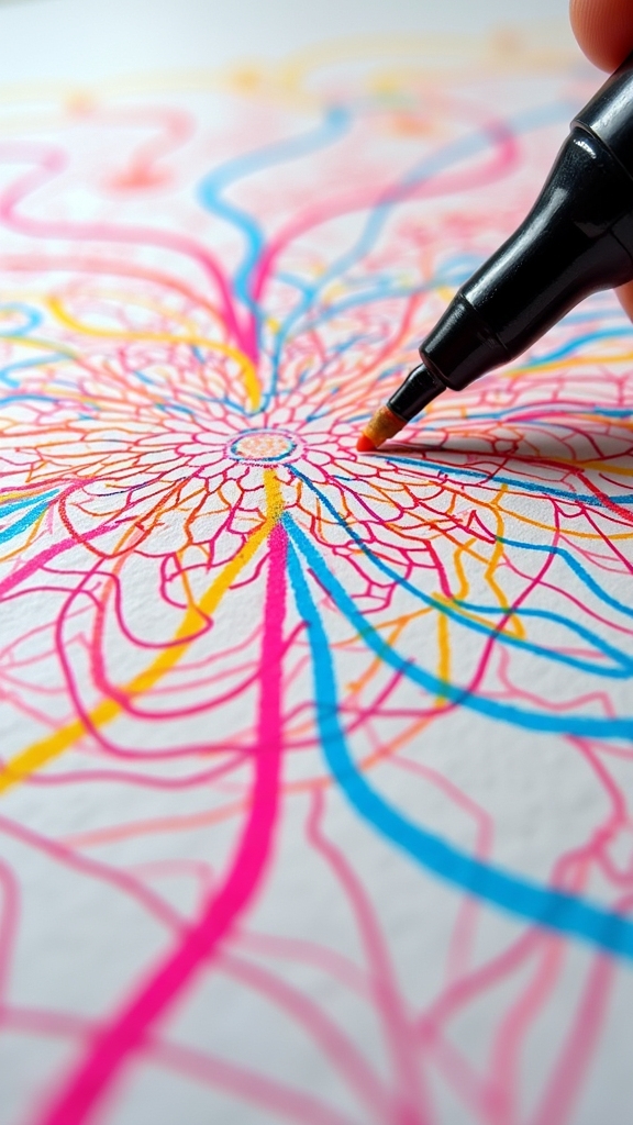
Mandala Designs With Thick Outlines

When making mandala designs with thick outlines, picking the right color palette can totally change the vibe—think cool blues for calm or fiery reds for energy.
Layering those bold outlines with Posca markers isn’t just fun, it also adds serious depth, making each section pop like it’s on a 3D art show.
Don’t be afraid to mix light and dark shades in your outlines, because that contrast is where the magic really happens.
Choosing Mandala Color Palettes
Ever wondered how to make your mandala designs really pop, especially when you’re working with those thick, bold outlines?
Picking the right colors can make all the difference! Using color harmony techniques, artists can balance their palette, making sure the colors don’t clash like socks and sandals.
Plus, understanding color psychology effects helps set the perfect mood—calm blues for chill vibes or fiery reds for energy.
Want your art to feel fresh? Try color trends exploration to see what’s hot right now! Here’s how to get started:
- Choose complementary colors to make those outlines stand out.
- Stick with two to four colors for harmony and focus.
- Use vibrant shades inside, darker ones for outlines.
- Test combos first—no surprises, just bold beauty!
Layering Outlines for Depth
Although a mandala already looks pretty awesome with its wild patterns, layering thick outlines can take it to a whole new level—almost like the design is jumping right off the page!
To get started, artists sketch the basic mandala in pencil, making sure the symmetry is on point. Then, they grab some Posca markers and start layering color contrasts—try thick outlines on the edges and finer ones near the center. This trick makes the whole mandala pop!
Mandala symmetry techniques really shine as artists blend marker colors, letting them overlap just a bit for a cool effect. Adding dots or tiny shapes in between the outlines brings even more intricate pattern variations.
Just make sure each marker layer dries, or the colors might get muddy instead of magical!
Graphic Animal Illustrations
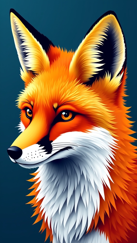
A bunch of animal drawings can go from cool to absolutely epic with just a few swipes of Posca markers. These markers are perfect for graphic animal illustrations, where bold lines and explosive color make each creature stand out.
Artists can use animal symbolism to send secret messages or show respect for wildlife conservation—imagine a roaring tiger symbolizing bravery or a wise owl representing knowledge. Color psychology also brings meaning, like calming blues for dolphins or fiery reds for foxes.
To really make those animals pop, try this:
- Outline animals with a thick black Posca marker for instant drama.
- Use different tip sizes to add fur, feathers, or scales.
- Layer vibrant Posca colors for wild effects.
- Add playful or abstract backgrounds for extra whimsy.
Layered Doodle Collages
From sketching wild tigers to crafting swirling patterns, there’s another way Posca markers totally rock: layered doodle collages.
These are all about mixing doodle inspiration techniques with collage layering strategies to make your art jump off the page. Start with a wild background—try some acrylic paint for a burst of color, then go wild with bold Posca lines on top.
Use thick and thin markers to create crazy squiggles, zig-zags, or shapes, stacking them up for a super cool effect. Don’t stress about rules—just let your doodles flow!
Want your collage to feel like a sunny spring day? Pick emotional color choices that match your mood.
The best part? Each layer brings a new surprise, making your artwork totally unique.
Botanical Line Drawings
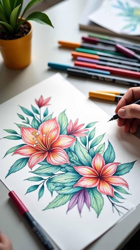
Botanical line drawings with Posca markers open up a world of creativity, whether someone is sketching a cool minimalist cactus or filling a page with wild, spring-inspired leaf patterns.
Adding textured flower petals can make the artwork look extra lively—almost like the flowers might just jump off the page and demand sunlight.
With bold colors and plenty of room for imagination, these ideas turn a simple piece of paper into a tiny, vibrant garden (no watering required).
Minimalist Cactus Illustrations
Imagine this: just a few bold lines, a splash of color, and suddenly, there’s a cactus that looks super cool and modern—almost like it’s ready for its own art show.
Minimalist cactus illustrations with Posca markers are all about celebrating the cool shapes of different cactus varieties, but without going overboard on details. The trick is to use a minimalist design—clean, simple, and bold.
Here’s how artists make it pop:
- Sketch the cactus shape with thick, steady lines to capture its unique style.
- Play with line thickness—thin lines for spines, thick for the outline—to add depth.
- Stick to a limited palette, maybe just greens and a fun accent color.
- Use negative space so the cactus really stands out, no clutter in sight!
Spring-Inspired Leaf Patterns
Even though winter might feel like it drags on forever, spring bursts in with all that fresh, leafy energy—and that’s exactly what artists love to capture with Posca markers.
Spring-inspired leaf patterns are all about natural motifs, layered textures, and vibrant colors. To start, artists lay down a soft green or pastel base, then swoop in with darker shades to outline leaf shapes and highlight those delicate veins.
Switching up marker tips, they play with line thickness to add depth and a touch of drama. Want to make things even more fun? Toss in some squiggly lines or doodle-like shapes around the leaves for a whimsical vibe.
The result? Art that basically shouts “spring is here!”—even if your socks say otherwise.
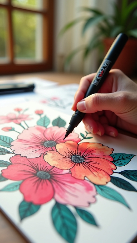
Textured Flower Petals
Flower petals, with all their wild shapes and textures, are basically nature’s way of showing off—and Posca markers make it super easy to capture that drama.
By layering vibrant colors and using dynamic lines, artists can bring those petals to life. The trick is to play around with different techniques to build up layered textures and make each petal pop.
Here are some cool steps for drawing textured flower petals with Posca markers:
- Start with bold outlines to shape your petal—don’t be shy, make them stand out.
- Use dynamic lines of different thicknesses to add dimension and excitement.
- Layer vibrant colors, mixing and blending to create depth and natural variation.
- Add extra texture with cross-hatching, stippling, or even highlights using a white marker.
Comic Book Style Panels
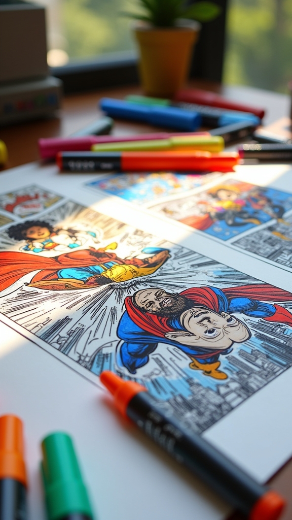
When it comes to comic book style panels, there’s a real sense of excitement in planning out each scene. Artists start by sketching a grid layout, thinking like movie directors as they set up shots for maximum drama or comedy.
Using Posca markers, they bring bold lines to life, making characters pop and backgrounds fade just enough—perfect for those character development techniques everyone talks about. Panel composition strategies can be wild, mixing small close-ups with big, dramatic action shots. That’s where action sequence dynamics really shine—imagine a superhero leaping from one panel to the next!
Speech bubbles and thought clouds, drawn with Posca markers, help characters share secrets or crack jokes. A limited color palette keeps everything looking sharp and cool, tying the whole story together.
Repeating Motif Borders
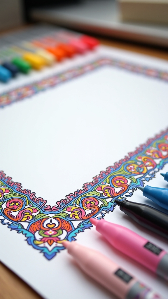
Repeating motif borders are all about picking a cool shape, like a zigzag or a row of tiny lightning bolts, and using it again and again around your page.
Choosing the right motif is just the beginning—layering colors with your Posca markers takes it up a notch, making each little shape pop like it’s at a marker party.
It’s kind of amazing how a simple border can totally transform your artwork, especially when you mix bold shapes with bright, unexpected colors.
Selecting Motif Shapes
Geometric shapes like triangles, circles, or even hexagons can totally steal the show when picking out motifs for repeating borders with Posca markers. They’re sharp, bold, and let you create patterns that pop—almost like they’re daring you to look away!
But the real magic happens when you mix these with smart choices:
- Play with motif color schemes—try wild contrasts or cool monochrome for different moods.
- Switch up motif size variation; big, small, or in-between shapes add serious excitement.
- Use clever motif placement strategies—keep things lined up, alternate, or stagger shapes for extra energy.
- Make sure to leave enough space between each motif, so your awesome designs don’t squish together and lose their punch.
That’s how borders go from basic to brilliant!
Layering Colors Effectively
Layering colors with Posca markers can totally turn a simple border into a jaw-dropping masterpiece—no magic wand required. The trick is in smart marker layering strategies.
Start by picking a base color and lay it down evenly, then give it a moment to dry (seriously, patience pays off here). Next, try out color blending techniques by stacking other shades on top, making sure each layer dries before adding another. This prevents smudgy disasters and keeps your lines bold.
Want your repeating motif borders to really pop? Go for contrasting color combinations—think yellow on purple or blue on orange. Don’t forget to play with different nib sizes for added texture. Each layer should complement the last, building up a dynamic, eye-catching edge.
Contrasting Color Block Experiments
Even though it might sound a little wild at first, diving into contrasting color block experiments with Posca markers is basically like giving your artwork a megaphone and telling it to shout.
It’s about taking color contrast techniques and running with them—think bright yellows right next to deep blues, or even neon pinks paired with jet blacks.
Artists can boost block color harmonies and sharpness with some clever moves:
- Fill geometric shapes with solid, punchy color blocks and keep those edges crisp.
- Layer colors using different marker widths—some thick, some thin—for extra drama.
- Try layering color strategies by blending two clashing colors into a gradient for a wild, dynamic look.
- Outline color blocks in black for that bold, comic-book vibe that makes everything pop.
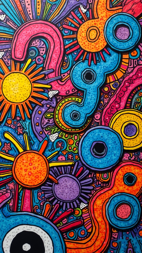
Optical Illusion Art
When artists want to make eyes play tricks, optical illusion art with Posca markers is where the real magic happens. With just a few bold lines and wild color contrasts, a flat sheet of paper can suddenly look like it’s popping out or swirling.
Artists love using geometric repetition and perspective shifts—think zigzag tunnels, impossible cubes, or wavy checkerboards—to confuse the brain and make it wonder, “Is that really moving?”
Posca markers are perfect for this; their vibrant, opaque colors make every detail stand out, and you can layer or blend them for even cooler effects.
Playing with line thickness adds a punchy, 3D vibe, while shadows and highlights make the whole illusion look even more real—and totally mind-bending!
Urban Graffiti-Inspired Pieces
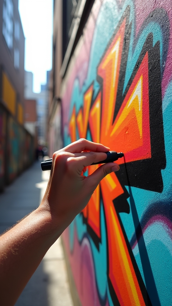
Although some people think graffiti belongs only on city walls, it can look just as bold and exciting on paper with Posca markers. These markers are perfect for exploring street art techniques, especially when you want to use those bright, urban color palettes that pop.
With graffiti layering methods, anyone can create eye-catching art that feels straight out of the city. Here’s how to get started:
- Lay down a solid base color, then add bold outlines and shapes for depth.
- Experiment with drips and splatters to mimic the free spirit of street art—messy can be cool!
- Try stenciling or adding your own tag for that real graffiti vibe.
- Use plenty of contrasting colors to make your art jump right off the page!
Monochrome Silhouette Scenes
If there’s one way to make Posca marker art look instantly dramatic, it’s by diving into monochrome silhouette scenes. These drawings use bold black lines layered over bright or textured backgrounds, creating an awesome splash of contrast that jumps right off the page.
By experimenting with different marker widths, artists can add cool details while sticking to a simple color scheme. Silhouette storytelling is all about using shapes—like trees, city skylines, or wild animals—to make viewers feel something, even without showing any details.
Creative negative space takes things up a notch, leaving parts of the page blank so the shapes pop even more. For a twist, some artists doodle or add abstract shapes, turning contrasting scenery into playful, eye-catching masterpieces.
Modern Floral Arrangements
Modern floral arrangements with Posca markers are all about layering wild, vibrant color palettes—think neon pinks, cool blues, and electric greens stacked together like a flower party on paper.
Abstract petal doodle techniques come into play, where petals twist into funky shapes or squiggle across the background, making the whole piece feel alive and bursting with energy.
It’s a chance to let creativity run a little wild, mixing bold lines and playful colors to create floral art that practically shouts “look at me!”
Layering Vibrant Color Palettes
There’s something seriously exciting about grabbing a handful of Posca markers and diving into a floral drawing—especially when it comes to layering vibrant colors.
Modern floral arrangements get their lively look by using vibrant color blending and understanding a bit of floral color theory. To make your petals pop and your leaves leap off the page, try these steps:
- Start with a light base color, then layer darker shades for depth, highlights, and shadows.
- Use different marker widths—fine tips for tiny floral centers, thicker ones for bold leaves and stems.
- Experiment by blending colors while the ink’s still wet for smooth gradients and wild color effects.
- Add texture with cross-hatching or stippling, making your flowers look full and touchable.
Who knew flowers could be this much fun?
Abstract Petal Doodle Techniques
While some artists stick to traditional flower doodles, diving into abstract petal designs with Posca markers turns the whole process into a wild creative adventure.
Imagine starting with a splashy, vibrant acrylic paint background—already the page is buzzing with energy. Then, it’s all about organic shape exploration: drawing bold, squiggly lines that twist and curl like petals, but with a funky, modern twist.
Contemporary floral techniques shine when you layer different Posca marker colors on top, letting each one dry for that awesome, multi-dimensional effect. The real magic? Vibrant color blending and letting those bright lines pop against the softer background.
Try out wacky petal shapes and wild arrangements—there are no rules here! Suddenly, your flowers look super modern, fresh, and totally unique.
Whimsical Food Illustrations
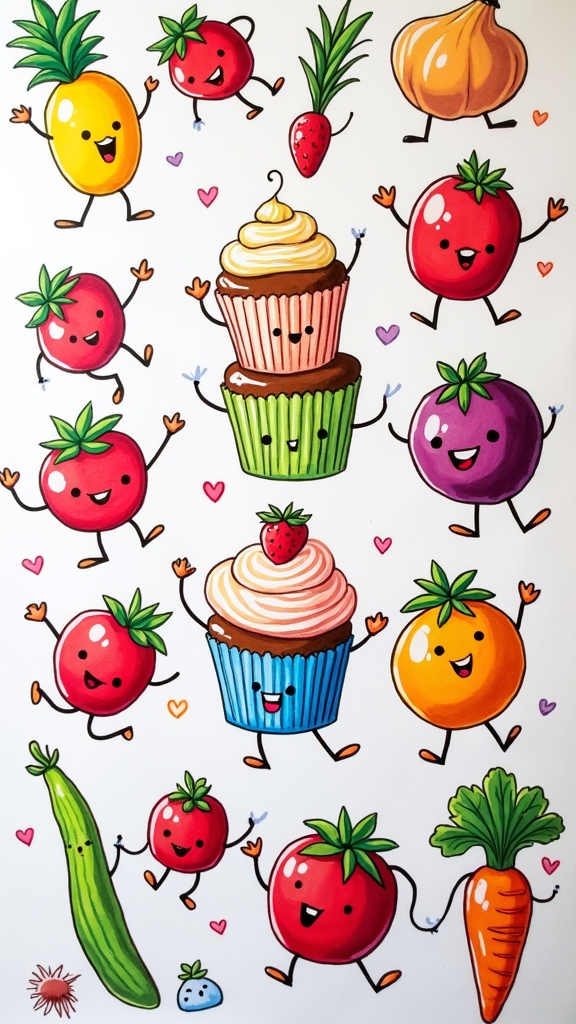
Even the most ordinary snack can turn into a wild character with a little imagination and a set of Posca markers. Whimsical food illustrations aren’t just about drawing what you see—they’re about making food come alive with personality and fun!
With bold lines and bright colors, artists can transform a basic cupcake into a grinning superstar or an apple into a dancing diva. Here’s how to get started:
- Use food character expressions to give your snacks silly faces, big eyes, or cheeky grins.
- Try layering and blending to create textured ice cream with swirly, dreamy scoops.
- Experiment with playful fruit designs—add sunglasses to a banana or sneakers to a strawberry.
- Mix fine and bold outlines for quirky details, like sprinkles, wild hair, or wacky hats.
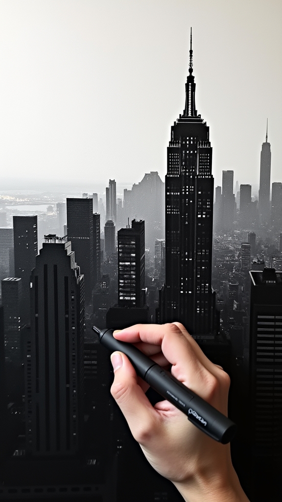
Architectural Line Studies
Skyscrapers, cozy houses, mysterious castles—buildings can be just as exciting to draw as any wild creature or cartoon snack.
With Posca markers, architectural line studies become an adventure in boldness. Artists can play with line weight variations, using thick lines to make foreground walls pop and thinner lines for background or window frames. It’s like giving your drawing a 3D boost!
Architectural details—like roof shingles, tiny bricks, or swirling iron gates—really stand out when you layer colors and add sharp outlines.
Perspective techniques help make streets curve or buildings reach for the sky, adding drama and realism. Shadows and reflections, made with darker shades, bring depth.
Grab photos, study real buildings, and let those lines tell a story!
Decorative Cactus and Succulent Drawings
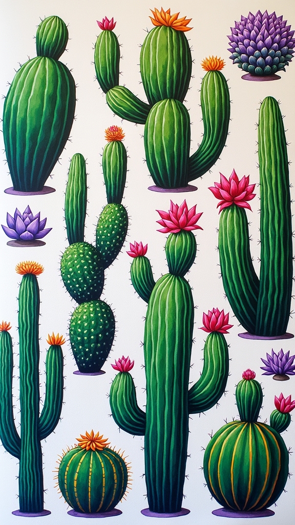
Who says plants have to stay in pots? With Posca markers, artists can turn ordinary cacti and succulents into wild, bold masterpieces. These markers pop against a light acrylic background, making every leaf and spike stand out.
For those looking to level up their plant art, here’s how to make your drawings truly eye-catching:
- Try unexpected cactus color combinations—mix hot pinks and electric greens for a quirky twist.
- Use different marker tips to practice succulent texture techniques, giving your plants a bumpy or fuzzy look.
- Play around with playful plant placements—stack them, float them, or let them spill off the page!
- Add squiggly lines and little doodles for an extra burst of personality and fun.
No green thumb required—just imagination!
Music-Inspired Visual Art
Music has a way of sparking wild ideas, and with Posca markers, artists can turn favorite song lyrics into bold, colorful art that practically sings off the page.
Reimagining album covers or channeling the wild styles of the 70s and 80s can be a blast—think funky patterns, neon colors, and big, dramatic shapes.
Whether it’s drawing out the beat in thick lines or sneaking in a lyric or two, music-inspired art lets creativity run loud and free.
Visualizing Song Lyrics
Ever wondered what your favorite song might look like if you could actually see it?
Visualizing song lyrics with Posca markers brings a whole new twist to music. It’s like giving rhythm and emotion a face!
Lyric emotion visualization lets artists translate the feeling of a song into bold, colorful lines, building an auditory art connection that goes beyond just listening.
Music themed doodling is perfect for this—no rules, just pure creative flow.
Try this:
- Pick a lyric that stands out and write it in a cool font.
- Use different line widths to match the mood—thick for powerful words, thin for softer moments.
- Add symbolic colors—like fiery reds for excitement or calm blues for chill vibes.
- Mix in swirls, shapes, or patterns to show the song’s rhythm.
Album Cover Interpretations
After jamming out with lyric-inspired doodles, there’s a whole new world of creativity waiting with album cover interpretations.
Grab some Posca markers and immerse yourself in album art analysis—look at what makes each cover cool. Is it the wild color choice, bold shapes, or the way it makes you feel?
Try starting with a base color, then layer on contrasting shades to add depth, just like the mood shifts in your favorite songs. Remember, your emotional response matters—pick an album that rocks your world, and let those feelings guide your lines.
Use thick, bold outlines to highlight the important features, Andy Warhol-style. And if you want a real challenge, mash up pop art and abstract vibes for a totally fresh twist!
Iconic Music Era Aesthetics
How did the 70s and 80s get so cool, anyway? Maybe it’s the explosion of bold colors, or those wild geometric shapes you see in old album covers.
When artists want to channel iconic music era aesthetics, they tap into music visualizations and nostalgic themes with Posca markers. Here’s how they do it:
- Use bright, punchy colors and sharp lines to capture the energy of the era—think neon and checkerboard patterns.
- Mix in lyrics or themes from classic songs, like “Sweet Dreams (Are Made of This),” for instant retro vibes.
- Layer acrylic paint with Posca markers to add depth and make details pop.
- Reference memorable cultural moments—famous music videos or TV characters—for extra fun and connection.
It’s like a time machine, but way more colorful!
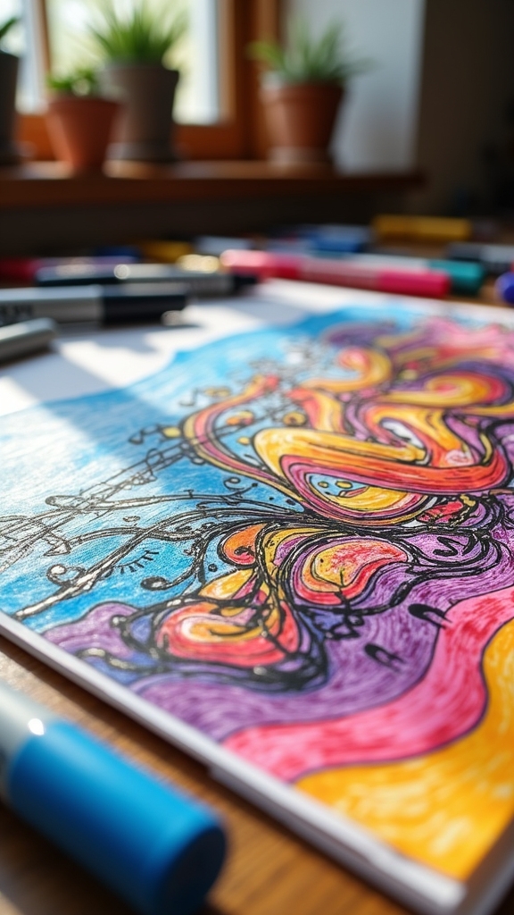
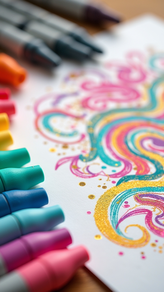
Mixed Media Texture Play
When it comes to making art that really pops, mixed media texture play is where the magic happens. Artists can immerse themselves in texture exploration techniques by combining Posca markers with acrylic paint, letting those bold marker colors leap off painted backgrounds.
Mixing surfaces, like using bumpy canvas or gritty textured paper, adds an extra kick—every line behaves just a bit differently! Mixed media layering gets even wilder when you throw in scraps of fabric or paper, making those dimensional marker effects stand out.
Playing with different marker tip sizes, from chunky to super skinny, brings both drama and delicate details. Want a cool twist? Add a little water to your marker lines for soft gradients—just don’t get too carried away with the splash zone!
Freeform Patterned Backgrounds
Building on all that wild texture fun, things get even more exciting with freeform patterned backgrounds.
This is where Posca marker fans really let loose! Imagine this: no rules, no plan, just you, a splashy base of acrylic, and a bunch of wild ideas ready to break free.
Want to know how to make your own? Check out this simple plan:
- Slap on a layer of acrylic paint so your background pops and helps with layered textures.
- Grab Posca markers with different tip sizes to add thick, thin, and even wobbly lines for cool variety.
- Try color blending techniques and spontaneous doodling—anything from zany squiggles to oddball shapes works.
- Mix tons of colors, overlapping lines and shapes to create a lively, multi-dimensional masterpiece!
Frequently Asked Questions
What Is the Best Thing to Draw on With Posca Markers?
When considering the best surface for Posca markers, canvas projects are highly recommended. Proper surface preparation guarantees ideal adhesion. Canvas allows for smooth application, supports color blending, and showcases the vibrant, opaque qualities Posca markers are known for.
Is POSCA Ok on Skin?
Regarding posca skin safety, Posca markers are water-based and non-toxic, but posca ink ingredients are not formulated for skin. While some use them for posca temporary tattoos, prolonged contact may cause irritation, so safer alternatives are recommended.
Why Is POSCA so Expensive?
Posca marker pricing reflects the balance between quality versus cost, as these markers offer professional-grade pigments, durable nibs, and consistent performance. Artists often view such art supply investments as worthwhile for achieving vibrant, long-lasting results across various surfaces.
What Not to Do With Posca Markers?
When considering Posca marker mistakes, users should avoid common application errors such as applying excessive pressure, layering wet ink too quickly, choosing improper surface choices, leaving caps off, or exposing markers to extreme temperatures, which compromise performance.
Conclusion
Posca markers open up a whole universe of bold, colorful drawing ideas—way more than just doodles on your notebook. Whether you’re into wild squiggles, funky patterns, or creating your own pop art masterpieces, there’s something here for everyone. So, grab your markers, let your imagination run wild, and don’t worry about making mistakes. The best part? Even the weirdest ideas can turn out super cool. Who knows, your next drawing might just blow everyone’s mind!
Leave a Reply