
Mastering Posca lettering is all about picking the right markers, grabbing cool paper (try black for serious wow-factor), and sketching your design lightly before going bold. Keep your hand steady, let each color layer dry, and don’t freak if a line gets streaky—just add another stroke. Practice shapes and letters to build skills (even squiggles count!), and experiment until you find your own style. If you want juicy tricks for popping color and wild effects, there’s even more to uncover next.
Key Takeaways
- Choose high-quality Posca markers and experiment with different paper colors to enhance color vibrancy and design visibility.
- Lightly sketch your design for balanced letter spacing, then outline with a light-colored marker for guidance.
- Use slow, steady strokes and consistent pressure for clean, crisp lettering, allowing each color layer to dry before adding more.
- Correct mistakes by layering additional color after drying and always test markers on scrap paper before starting your main piece.
- Regularly practice basic shapes and strokes, experiment with styles, and keep a sketchbook to track progress and develop your unique lettering style.
Essential Materials for Posca Lettering

Markers are kind of like magic wands for anyone getting into Posca lettering, but it’s not just about grabbing the first pen you see.
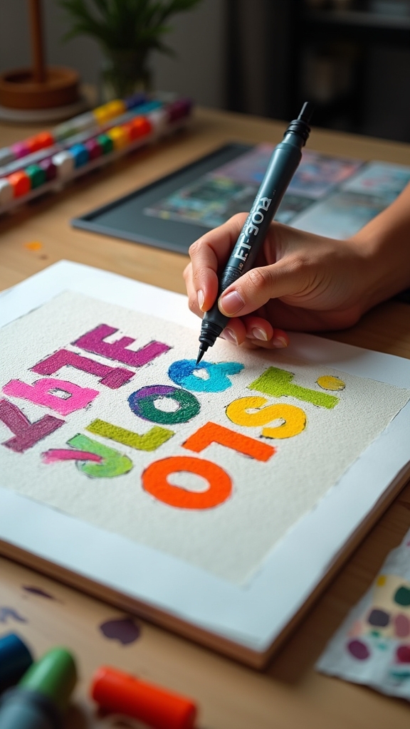
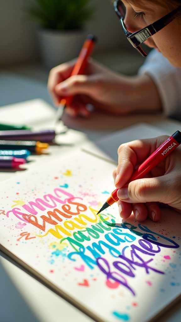
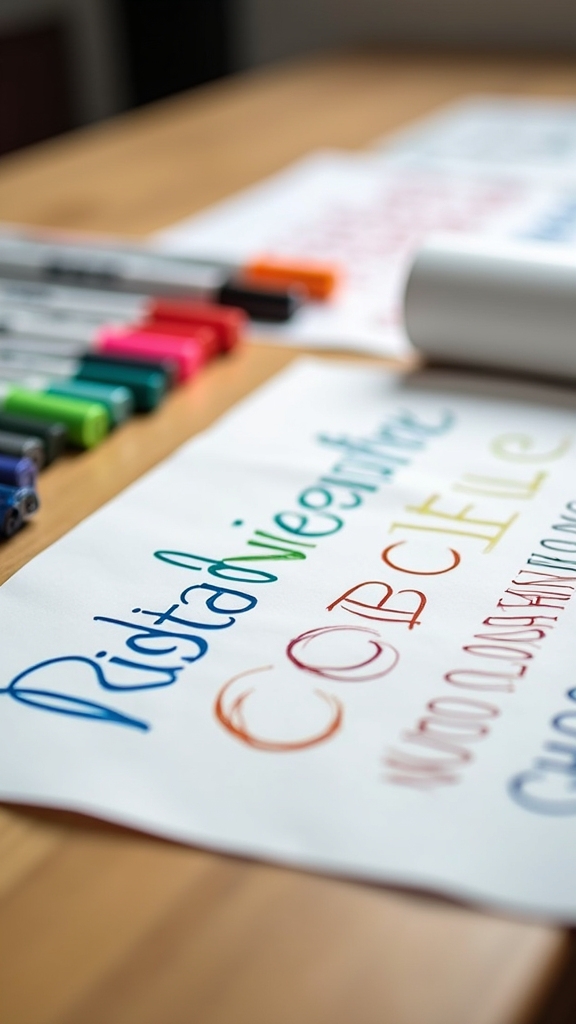
To start off strong, you’ll need some essential materials for Posca lettering. The most important? Posca markers, of course! These water-based, opaque paint markers come in a bunch of nib sizes—fine, medium, and broad—so you can nail every detail, from bold titles to tiny flourishes.
Posca markers are your go-to for lettering—water-based, opaque, and available in all the nib sizes you’ll ever need.
A pretty good trick is to use black or dark-colored paper, which makes the colors pop like fireworks. Don’t forget to prep your paper—wipe it clean and make sure it’s dry.
For blending magic, lay down lighter shades first, then layer on the darks. Simple, but super effective!
Choosing the Right Surface for Your Artwork
When picking paper for Posca lettering, the background color can totally change the look of your art—black or dark paper makes colors pop like neon lights at midnight, while white paper gives a softer, lighter vibe.
Tonal backgrounds, like gray or navy, add a cool twist and help your letters stand out without being blinding. It’s almost like choosing the perfect stage for your markers to put on their best show.
Black vs. White Paper
The eternal showdown between black and white paper can make any artist feel like they’re picking sides in a superhero movie. Black paper, with its mysterious vibe, instantly makes Posca marker colors pop—seriously, every shade looks pretty electric! It’s like each letter is wearing a neon cape. But there’s a catch: sketching on black can be tough, since pencil lines almost vanish. White paper, on the other hand, is the classic hero. Colors may need more layers to shine, but it’s easy to see every pencil mark. Here’s a quick breakdown:
| Feature | Black Paper | White Paper |
|---|---|---|
| Color Vibrancy | Super vibrant | Needs extra layers |
| Sketching | Hard to see | Easy to see |
| First Impression | Looks pretty bold | Looks pretty classic |
Benefits of Tonal Backgrounds
Even though picking a background might sound like a boring step, it’s actually where the magic starts for Posca lettering. Using a tonal background—like black or gray paper—makes every color look a *lot better*. It’s almost like turning up the volume on your favorite song!
When artists use a midtone surface, they can layer colors for extra depth and cool effects, because the paper helps everything stand out. Tonal backgrounds boost vibrancy, making those neon pinks and electric blues pop like crazy.
Sure, sketching on dark paper can be tricky, since pencil lines barely show up, but a little light reflection can help. And remember, that first paint layer acts like a primer, so the final design ends up bold and super eye-catching.
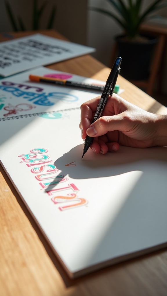
Sketching Your Lettering Design

Sometimes, all it takes is a blank sheet and a bit of courage to start sketching out a killer lettering design. It might feel like a big leap, but with the right steps, anyone can be good to go.
Picking a background color, like black paper, makes a big difference—your sketch pops way more than on plain white. When sketching your lettering design, use a light touch with your pencil; that way, if you mess up, no big deal!
Want to make sure your lines show? Tilt the paper and check the reflection.
- Try black paper for extra pop
- Sketch lightly for easy fixes
- Use reflections to see your lines
- Keep letter spacing balanced
- Outline with a light-colored marker when satisfied
Techniques for Clean and Consistent Strokes
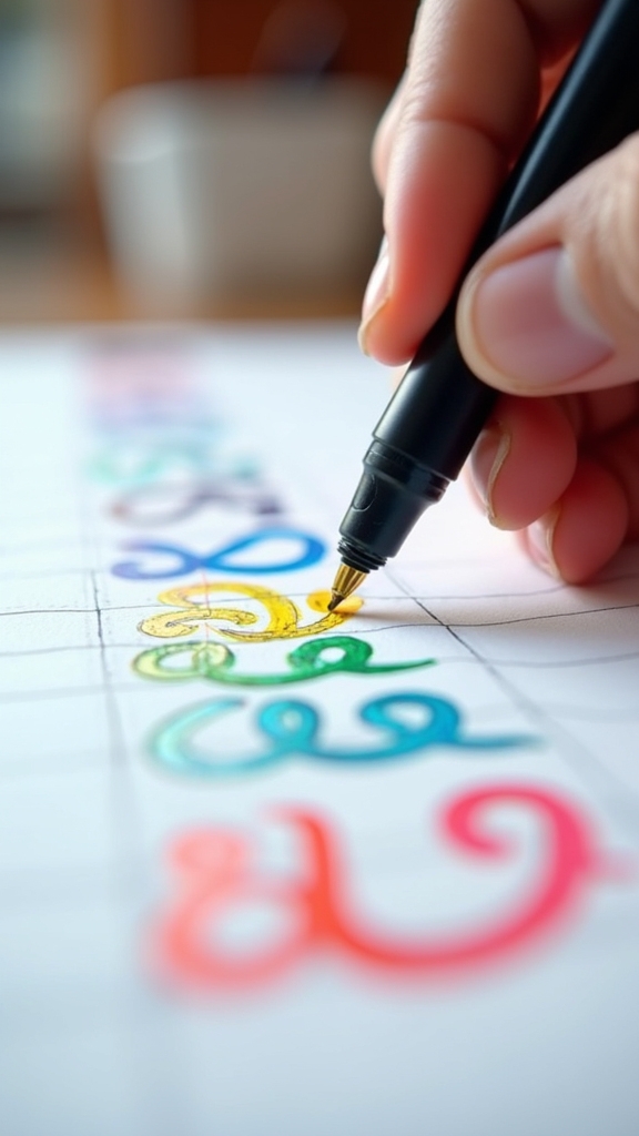
Getting those Posca strokes looking crisp isn’t just luck—it’s all about steady hand pressure and sticking to the same direction with each line.
If the pressure wobbles or the marker starts zigzagging, things can get messy fast, like a spaghetti dinner gone wrong!
Maintaining Steady Hand Pressure
Take a deep breath—steady hand pressure is the secret sauce behind those crisp, eye-catching Posca lettering strokes. Without it, lines can get wobbly or blotchy, and nobody wants their masterpiece turning into a marker mess!
Steady hand pressure means controlling how hard you press the marker, so the paint flows just right. Sure, it sounds tricky, but with a few handy tricks, even total beginners can master this skill.
Try these tips to keep your hand as calm as a ninja in a library:
- Practice slow, deliberate strokes to train your control.
- Use your wrist as a pivot point for stability.
- Experiment with different grip techniques for comfort.
- Start and finish each stroke lightly for cleaner edges.
- Regularly practice lines and curves on scrap paper.
Consistent Stroke Direction
Even if someone has the steadiest hand in the world, their Posca lettering can still look messy if they don’t pay attention to stroke direction.
Consistent stroke direction is like the secret sauce for neat, polished letters. It keeps everything looking uniform—no random wobbly lines or weird zigzags.
Practicing slow, deliberate movements helps a ton, letting you control the pressure and keep each stroke smooth. Trying different angles and hand positions might feel silly at first, but it’s the best way to figure out what works for you.
Starting with light, guiding strokes before going in with full pressure makes your lines clean and sharp.
Seriously, spend time practicing the same letters, paying attention to consistent stroke direction, and watch your lettering transform!
Adding Color and Layering for Vibrancy
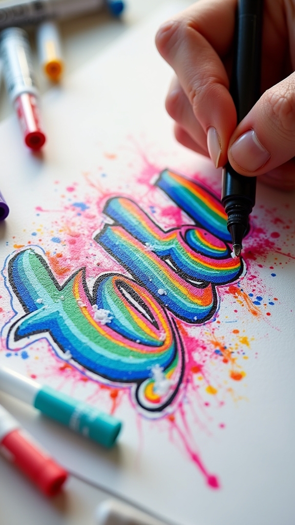
While some people just scribble with their markers and hope for the best, anyone who wants their Posca lettering to really pop needs to think about how color and layering work together.
Adding color isn’t just about picking your favorite shade and filling it in—there’s a bit of science (and magic) behind layering for vibrancy! If you want your letters to shine on the page, check out these tips:
- Start with a transparent base layer, especially on dark paper, to set the tone without drowning your surface.
- Add a second layer to boost vibrancy and make those colors really stand out.
- Let each layer dry before adding the next for awesome depth and complexity.
- Try using midtone paper for more visible sketches and colorful pops.
- Always test your colors on scrap paper first—surprises are fun, but not here!
Creating Unique Effects With Posca Pens
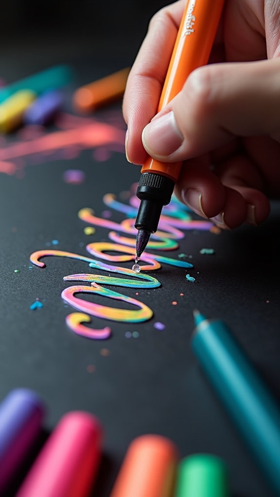
A splash of creativity can turn ordinary Posca lettering into something totally unforgettable. Let’s see what happens when you use a black background—the colors basically jump off the page, making your artwork bold and eye-catching.
Try layering your favorite colors; the first coat works like a primer, and the second layer makes everything look richer and more intense. If you’re feeling adventurous, blend colors for cool effects like a drip or melting look, but remember to let each layer dry first or things could get messy fast!
Play around with Posca’s different nib sizes to add tiny details or rough textures for extra flair. Using midtone paper helps you see your sketch better, making it easier to plan out your next masterpiece.
Troubleshooting Common Beginner Mistakes
Mistakes—everyone makes them, especially when starting out with Posca lettering! It’s totally normal to mess up when you’re learning, but don’t let it stop your creative flow.
Maybe you’re thinking, “I’m going to ruin this page!” Don’t worry—those little hiccups are just part of the process. Here are some super common beginner mistakes (and quick fixes) that can save your sanity:
- Always test your Posca markers on scrap paper first. Surprises aren’t always fun!
- If your lines look streaky, let them dry, then add a second layer for “wow” factor.
- Smudging? Wait for each layer to dry—even if you’re super impatient!
- Having trouble seeing your pencil sketch on dark paper? Use a light-colored pencil or tilt for better light reflection.
- Store markers capped and horizontal to keep them juicy and ready.
Practicing With Drills and Lettering Exercises
Getting past those beginner blunders feels awesome—now it’s time to really build some skills! Practicing with drills is where the magic happens.
Beginners can start by repeating simple shapes and strokes, helping their hands get used to the way Posca markers move. It’s like training for a sport—muscle memory is key. Breaking down letters into basic shapes makes learning a lot less scary (and way less likely to end in marker meltdowns).
Experimenting with pressure or speed during drills shows how lines can go from super skinny to bold and chunky. Using a sketchbook for regular lettering exercises lets artists try out different styles and effects.
Setting a goal for each practice session—like nailing that tricky “S”—keeps things focused and fun.
Developing Your Personal Lettering Style
Style isn’t just something people are born with—it’s built, one experiment at a time.
True style grows from playful experiments, not just natural talent—each creative try adds to your signature look.
When diving into Posca lettering, discovering your unique flair is like revealing a secret level in a game. It takes a bit of courage and a whole lot of curiosity. Hope you guys are ready to try new things!
Here are some fun ways to develop your personal lettering style:
- Try out different letterforms and fonts until something just clicks.
- Mix up your tools—brush pens, markers, even digital apps—to see what feels best.
- Peek at famous lettering artists for inspiration, but always add your own twist.
- Challenge yourself with new techniques, like wild textures or bold colors.
- Keep a sketchbook handy to capture all your experiments and progress.
Frequently Asked Questions
How to Use Posca Pens for Beginners?
When exploring Posca techniques, beginners should shake pens well, apply multiple layers for vibrant color, and start with light shades. Quick application prevents smudging, while regular tip cleaning and horizontal storage help maintain peak performance and longevity.
Why Are Posca Pens so Expensive?
A cost analysis of Posca pens reveals their expense stems from high-quality, water-based paint, versatile surface compatibility, durable and refillable design, precision tips, and strong professional endorsement, all contributing to their premium pricing compared to standard markers.
What Not to Do With Posca Markers?
When considering Marker Mistakes, users should avoid applying Posca markers to non-porous or wet surfaces, pressing too hard, neglecting to shake them, or improper storage. These errors can cause poor adhesion, smudging, leakage, and inconsistent paint flow.
What’s the Best Paper to Use With Posca Pens?
When considering the best paper types for Posca pens, smooth surfaces like marker paper or glossy cardstock are preferred, as they allow ideal ink flow. Black or tonal paper enhances vibrancy, while textured paper may damage pen tips.
Conclusion
Mastering Posca lettering isn’t magic—it’s practice, patience, and a dash of bold creativity. Anyone can turn plain words into colorful art with the right tools and a bit of guts. Mistakes? Totally normal, and honestly, sometimes hilarious. With every stroke and splash of color, skills improve, confidence grows, and personal style shines brighter. So, grab those pens, let the imagination run wild, and remember: the only real rule is to have a blast while lettering!
Leave a Reply