
Painting Posca flowers is super fun and totally doable—just gather some clean, nonporous surfaces, a handful of Posca pens, and a few reference photos for inspiration. Start with a light pencil sketch, then use vibrant Posca colors to fill in petals and leaves, blending while the paint is wet for extra wow. Layer on highlights, shadows, and some sneaky details for a 3D effect. Protect your masterpiece with varnish, and boom—artwork complete! Next up: revealing even more awesome techniques.
Key Takeaways
- Choose vibrant Posca pen colors, prepare a clean nonporous surface, and gather reference images for inspiration.
- Lightly sketch flower shapes with pencil, planning composition and color placement.
- Apply base petal colors with flat Posca pens, blending while wet for depth and natural gradients.
- Layer additional colors for shadows and highlights, using white for shine and black for definition.
- Protect the finished artwork with spray varnish for longevity and enhanced color vibrancy.
Choosing Your Materials and Preparing Your Surface

Before jumping right into painting, getting the right materials and prepping the surface is kind of like setting up your own creative laboratory—it’s seriously important!
Choosing your materials can make or break your whole Posca flower masterpiece. Start by picking a good mix of Posca pens with different nib sizes—you’ll want bold strokes for petals and tiny details for stems or flower centers.
The secret to stunning Posca flowers? A solid mix of nib sizes for bold petals and those tiny, intricate details.
Next, snag a wooden palette for mixing colors; it’s smooth, easy to clean, and honestly just feels cool to use.
Make sure your painting surface is squeaky clean and nonporous, because Posca pens love to blend and layer on those types.
Don’t forget to shake your pens and press the nibs to get that ink flowing—no dry pens allowed at this party!
Sketching Your Flower Design
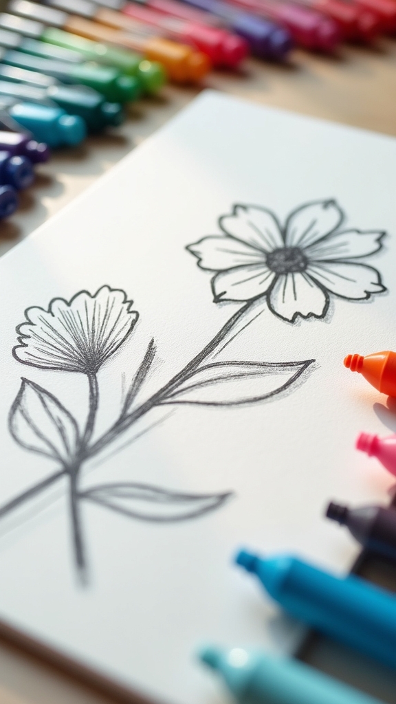
Sketching your flower design starts with picking out some awesome reference photos, like Gerberas or Chrysanthemums, so you know what shapes and colors to aim for—no wild guesses here!
Using a regular pencil, sketch the main shapes gently, paying attention to how big the petals are and where everything sits, kind of like planning out seats for a flower party.
Don’t stress about every tiny detail; keep things loose and simple so your flowers look lively and the painting part stays fun.
Choosing Reference Images
Ever wonder how artists make their flower paintings look so real and lively? The secret is in choosing the right reference images. Picking high-quality photos of flowers, like Gerberas or Chrysanthemums, helps capture accurate shapes, stunning colors, and true-to-life proportions.
But don’t just grab the first picture you see—try using several reference images! When you look at flowers from different angles, you’ll notice cool details and get ideas for a more dynamic composition.
Pay close attention to the color palette in your references; blending those hues will make your artwork pop! And hey, don’t be afraid to mix things up. Change the shape, combine colors, or add your own twist.
Reference images are just the starting point for your creative adventure!
Pencil Layout Techniques
Once a bunch of awesome reference photos are picked out, it’s time to grab a pencil and start bringing those flowers to life on paper—no green thumb required. The sketching process kicks off with gentle pencil layout techniques: keep those lines light and easy to erase. Look at your flower design reference—maybe a Gerbera or a wild, fluffy Chrysanthemum—and start outlining the basic shapes. Focus on where the petals and leaves go, and don’t sweat if it’s not perfect at first. The magic of pencil is, you can tweak and fix as you go! Here’s a quick rundown to help:
| Step | Tip |
|---|---|
| Choose reference photo | Pick clear, detailed flowers |
| Lightly sketch outline | Soft pencil lines make erasing easy |
| Draw main petals | Focus on shape and direction |
| Add leaf shapes | Balance their placement |
| Refine petal details | Adjust lines for natural look |
Proportions and Composition
Even before a single Posca pen touches the paper, getting the proportions and composition right can make all the difference between “Whoa, cool flower!” and “Wait, is that a pizza?”
To start off strong, it helps to pick a reference image and really look at how the petals and leaves are arranged—think of it like putting together a flower puzzle. Grab a pencil and lightly sketch the basic shapes, like circles for the flower’s center or ovals for the petals.
Don’t stress about details yet—focus on the overall size and where everything sits. Try using the rule of thirds to place your flower in a more eye-catching spot.
Step back often to see if your sketch makes sense, since every layer of color will build on this foundation.
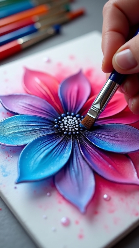
Selecting and Blending Colors With Posca Pens
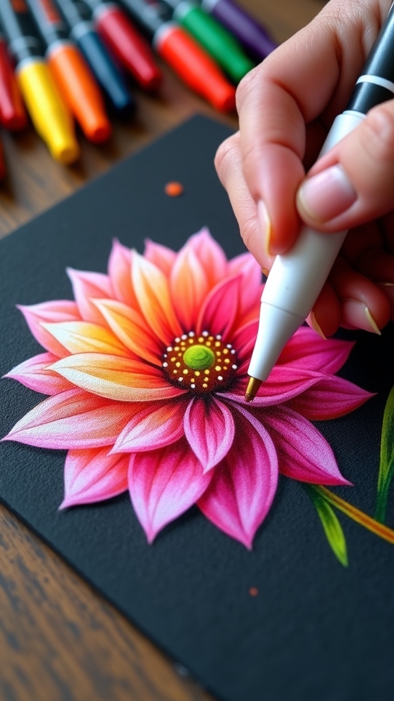
Picking out colors for Posca flowers is where the fun really starts, because mixing bright, bold colors with soft pastels can make your flowers pop right off the page.
Blending those colors smoothly is like magic—layering them just right gives petals a super cool, realistic look, especially when you start with lighter shades and build up to darker ones.
With the right combos and a little patience, anyone can create flower art that looks pretty much amazing.
Choosing Vibrant Color Palettes
While staring at a pile of Posca pens, it’s easy to feel like a kid in a candy store—so many colors just waiting to jump onto the page!
Choosing a vibrant color palette for flower painting means picking shades that pop and play nicely together. Start by grabbing some primary colors, then toss in their secondary color buddies for a lively mix.
On nonporous surfaces, colors stay wet a bit longer, giving more time to blend—kind of like mixing paint on a smooth plate. Using a flat pen helps lay down color evenly, and adding a touch of white can make those petals look super bright and full of depth.
Don’t be afraid to mix shades right on your palette for extra creativity!
Layering for Smooth Blends
After picking out those eye-popping colors, it’s finally time to get hands-on with blending and layering—this is where Posca flower art really starts to bloom.
First, pick your base color and lay it down smoothly using a flat nib; this is like prepping your flower’s “skin” for a makeover. While that base is still wet, add a little bit of a second color right on top. Watch as they blend into a sweet gradient—almost like magic!
For serious depth, layer darker shades in the flower’s shadowy spots, but make sure each coat is totally dry before adding new colors. This keeps things crisp and vibrant.
Want petals to pop? Layer white or pale colors for highlights. Layering for smooth blends is totally worth the effort!
Painting Petals and Creating Realistic Shapes
Before diving into the colorful chaos of painting, sketching petal shapes lightly with a pencil can save a lot of frustration later on—no one wants a lopsided daisy, right?
Once the basic shapes are mapped out, it’s time to grab those paint pens and bring your flower to life. Using a flat Posca pen lets you lay down smooth, even color, which makes petals look soft and vibrant.
Don’t rush—blend different colors while the ink is still wet to create awesome depth and shadows. It’s better to suggest petal shapes and textures instead of outlining every single one, so the flower looks natural, not stiff.
Adding highlights with white Posca ink gives petals a shiny, realistic curve—almost like they could pop right off the page!
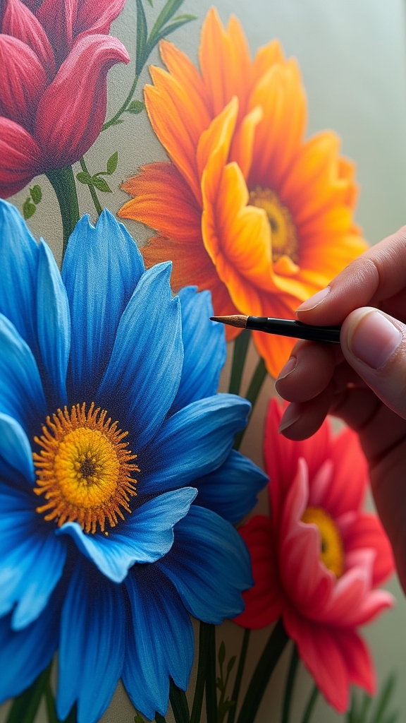
Adding Leaves and Background Elements

Even though the flowers are the stars of the show, adding leaves and cool background details can totally level up the whole painting.
Leaves aren’t just green blobs—they need personality! Mix up some artificial greens to get the right shade, and don’t be afraid to let the edges look a little ragged. That’s what makes them real, not like robot leaves.
Use a flat Posca pen to lay down smooth color, blending a few different greens while the ink is still wet. It’s kind of like making a mini jungle on your paper.
For the background, pick lighter or complementary colors to make those flowers pop. Add color in gentle layers, and once things dry, a touch of white can make everything stand out brilliantly.
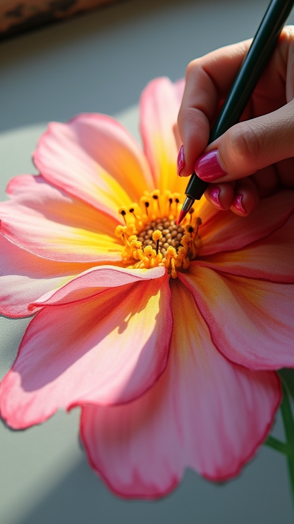
Building Depth With Layers and Highlights
When it comes to painting flowers with Posca pens, building depth is like bringing them to life right on the page. It’s all about layering colors and using highlights to make those petals and leaves pop.
By stacking different tones, artists can make their flowers look almost three-dimensional—like you could pluck them right off the paper! Here’s how to boost visual appeal and enhance structure:
- Layer colors slowly, letting each dry before adding the next for rich, dynamic petals.
- Use darker shades in shadowed spots to add dimension and realism.
- Mix a bit of gray with white for soft shadows that don’t overpower the original colors.
- Add bright highlights with opaque white to make flowers stand out.
- Keep tweaking and adjusting, building depth until the composition really shines.
Finishing Touches and Protecting Your Artwork
Now that the flowers burst with color and depth, it’s time for those final touches that really make the artwork sing.
Grab a white Posca pen and add little highlights—think of them as magic sparkles that make petals pop!
For clean outlines and a grounded look, use a black Posca pen to define the edges.
If things look a bit wild, balance out the color and check your shadows and highlights.
Want texture? Try blending with a brush or adding tiny details for some wow factor.
Once you’re happy, let that dry (seriously, don’t rush it—smudges are heart-breakers).
Finally, spray on a varnish to protect your masterpiece. It keeps colors vibrant and shields your flowers from accidental coffee spills!
Frequently Asked Questions
How to Use Posca Markers for Beginners?
Using Posca markers for beginners involves shaking and priming the marker, selecting appropriate nib sizes, and practicing color blending while ink is wet. Gradual layering, clean tools, and a protective spray varnish help achieve vibrant, lasting results.
How Do I Get My POSCA Pen to Work?
When addressing pen maintenance, one should vigorously shake the POSCA pen, then repeatedly press the nib on scrap paper to initiate ink flow. If ink stalls, gently clean the nib with water and always store the pen horizontally.
Why Are Posca Pens so Expensive?
A cost analysis reveals Posca pens are expensive due to their high-quality, non-toxic ink, advanced valve system, and versatility across surfaces. Durability, brand reputation, and the option for refills and replaceable nibs further justify their premium pricing.
What Not to Do With Posca Markers?
Common Marker Mistakes with Posca markers include using them on porous surfaces, applying excessive pressure, attempting color blending on unsuitable surfaces, diluting ink with water inside the pen, and neglecting to shake and prime the marker before use.
Conclusion
Painting flowers with Posca pens isn’t just fun—it’s a creative adventure! Anyone can turn a blank page into a burst of color, from sketch to final highlight. Sure, maybe the first flower looks like a wild daisy with a caffeine addiction, but that’s part of the process. With a little patience and a lot of imagination, every artist can grow their own vibrant Posca garden. So grab those pens and get blooming—your masterpiece is just a petal away!
Leave a Reply