
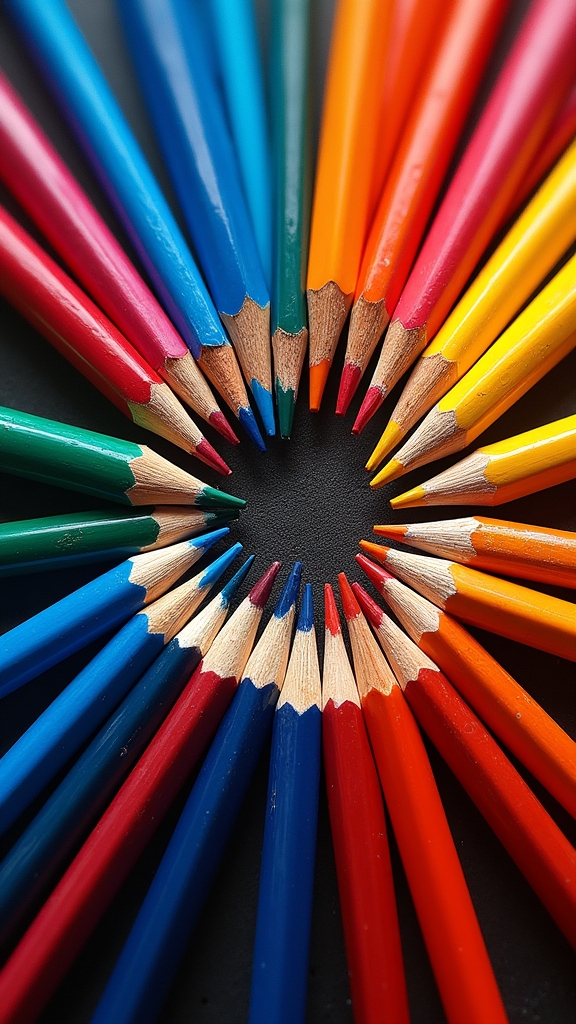
Want colored pencil art that totally pops off the page? Try drawing glowing underwater scenes on grey paper, candy still lifes with crazy-bright shells, or animal portraits using wild neon shades. Mix and blend your colors like a mad scientist—layer, cross-hatch, even scribble! Draw fantasy creatures with wild palettes or moody self-portraits on dark paper. Urban skylines in all one color? Why not! Abstract art is a color explosion. There’s a zillion ways to make your art scream “look at me,” and the next ideas are even cooler.
Key Takeaways
- Layer vibrant Prismacolor pencils on toned paper for bold, glowing effects in nature, underwater, and portrait art.
- Use unexpected and wild color combinations to create striking fantasy creatures and imaginative scenes.
- Employ blending, cross-hatching, and stippling techniques to add texture and depth to your colored pencil artwork.
- Create dramatic urban landscapes using monochromatic color schemes with varied tints and shades for visual impact.
- Highlight candies and marbles in still life by layering bright hues and adding sharp, contrasting highlights for a 3D look.
Realistic Nature Scenes With Layered Colors
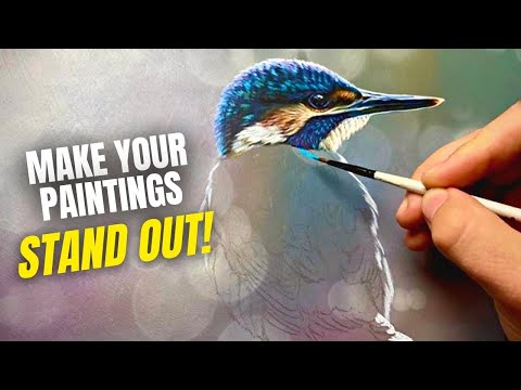
How do artists make colored pencil drawings of nature scenes look almost like photographs? It all comes down to smart techniques and a splash of patience.
In colored pencil art, artists start by sketching out the basic shapes—picture the outline of a leaf or the wavy surface of a pond. They pick 1-2 main colors, then choose supporting colors that either blend harmoniously or pop as opposites.
Using Prismacolor Premier pencils for vivid pigment, they layer and blend, building up shades for super-realistic effects. Techniques like burnishing get things smooth, while tricks like cross-hatching or stippling make shadows leap off the page.
Sharing step-by-step pics or WIP shots on social media gives fans a peek into the magic behind these stunning creations.
Expressive Animal Portraits Using Color Harmony
Expressive animal portraits really shine when artists pick bold color palettes that make each creature’s personality pop off the page.
Mixing in thoughtful shading not only builds mood, but also gives those furry or feathered friends some serious attitude.
Choosing Vibrant Color Palettes
Even though a tiger in the wild isn’t purple, nobody said you can’t give it funky colors in your drawing! Picking a vibrant color scheme is how animal portraits go from “cute” to “whoa, that pops!”
The trick is choosing shades that make the animal stand out and tell a little story about its mood or world. Complementary colors, like blue and orange, add serious drama. Artist-grade colored pencils—think Prismacolor—give you rich, smooth layers and bold shifts.
- Choose a dominant color to set the tone for your animal’s attitude.
- Add analogous colors (those next to each other on the wheel) for harmony and flow.
- Don’t be afraid to experiment with shades and tints for neat fur or feather details.
- Warm colors can shout for attention, while cool ones bring chill vibes.
Enhancing Mood Through Shading
When bold lions start brooding or bright foxes look mischievous, it’s not just the shapes or lines—it’s the way color and shading work together that really tell the story. In colored pencil drawings, artists focus on a dominant color vibe to set the mood, guiding the whole look. Harmonious shades, especially those that sit near each other on the color wheel, bring out heat, depth, and drama. Want that fox to really stand out? Use subtle hues for fur and a bold, opposite color in the background! Check out how these choices affect your artwork:
| Shading Technique | Mood Created |
|---|---|
| Analogous colors | Warmth, calm |
| Strong contrast shading | Intensity, focus |
| Complementary background | Energy, pop |
Every pencil stroke counts toward the animal’s personality!
Balancing Warm and Cool
Colors aren’t just for filling in shapes—they’re for telling stories, too. In expressive animal portraits, balancing warm colors (like reds and oranges) with cool colors (think blues and greens) isn’t just about looking good—it brings emotion and excitement to the page!
Using color harmony, artists set the mood with a dominant color temperature, then use complementary shades to jazz up shadows and highlights. With Prismacolor pencils, layers can blend into smooth shifts, making even a tiger’s fur look magical or a chameleon truly pop.
- Sketch lightly first to map out the animal’s basic shape and features.
- Choose a main warm or cool color to set the overall mood.
- Layer complementary colors for realistic shading and unexpected energy.
- Experiment with textures, blending, and contrasts for extra “wow!”
Vibrant Flower Drawings on Toned Paper
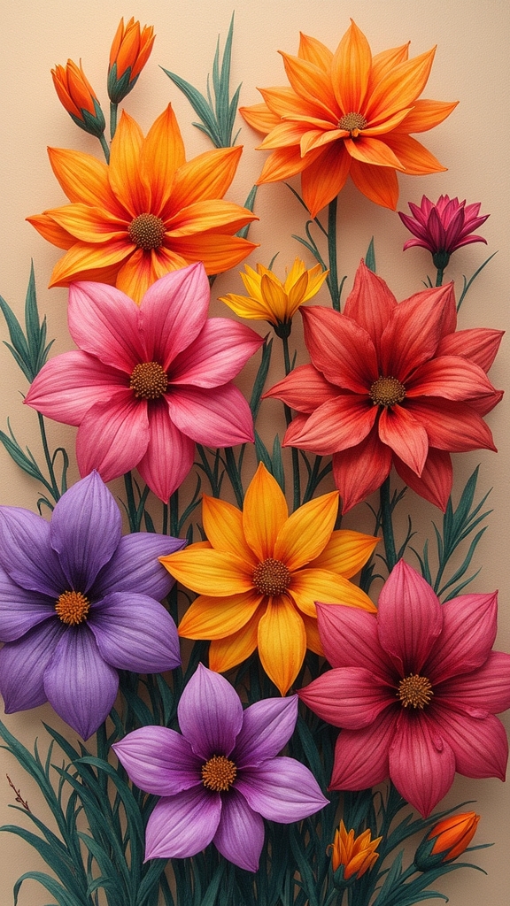
When it comes to drawing bold flowers with colored pencils, using toned paper makes everything look brighter and more dramatic, like your garden just got a serious upgrade.
Paying attention to color harmony helps set the mood—warm shades can make your blooms look happy and full of energy, while cooler colors turn petals calming and soft.
Color Harmony Essentials
Flowers on toned paper aren’t just pretty—they’re a total showstopper when color harmony gets involved. Picking a dominant color is like giving your artwork a personality, making the whole piece feel united and intentional.
When artists pair the flower shades with a background’s complement, those colors practically leap off the page! Color harmony helps every bloom look more lively, not just… floating in space.
Prismacolor pencils make blending a breeze, letting shifts stay smooth and punchy. Here’s how artists tackle color harmony magic in their flower drawings:
- Choose a consistent dominant color to tie every petal together.
- Use complementary hues to the toned paper for extra zing and contrast.
- Think about analogous color schemes for a smooth, unified look.
- Build up shadows with deeper tones to emphasize color drama.
Layering Techniques Explained
Even though it might look tricky at first, layering with colored pencils is where the real magic starts in drawing vibrant flowers on toned paper.
Layering techniques mean you don’t just color in one spot and call it done—no way! You start with a super light base layer, sketching out the basic flower shape.
Then, like building a crazy-tall sandwich, you add more layers with slightly darker, richer colors. Using Prismacolor pencils really helps since their pigments blend so smoothly you almost forget you’re using pencils at all.
Softer pencils fill in big petals, while harder ones set the tiny details. Mixing a main color with some complementary colored shades? Now that’s where bold, eye-catching pops happen on toned paper.
Try it—it’s like flower magic!
Enhancing Contrast Effectively
Layering’s awesome, but here’s the real secret weapon for drawing flowers that jump right off toned paper: bold, eye-popping contrast. Suddenly, those colored petals aren’t just pretty—they’re dazzling!
Using Strathmore’s tan or grey toned paper instantly gives every colored pencil stroke a boost. The trick is to play with light and shadow until the flowers seem almost three-dimensional. Artists find that contrast isn’t just about coloring hard or soft—there’s a science to it, and a bit of magic.
For real flower power, try these tips:
- Start with light colored base layers, then add darks to boost depth.
- Layer complementary colors to make petals recognizable from far away.
- Use strong shading, adjusting pencil pressure for more realism.
- Add pops of white or light to make details shine!
Creating Eye-Catching Self-Portraits With Color Blocking
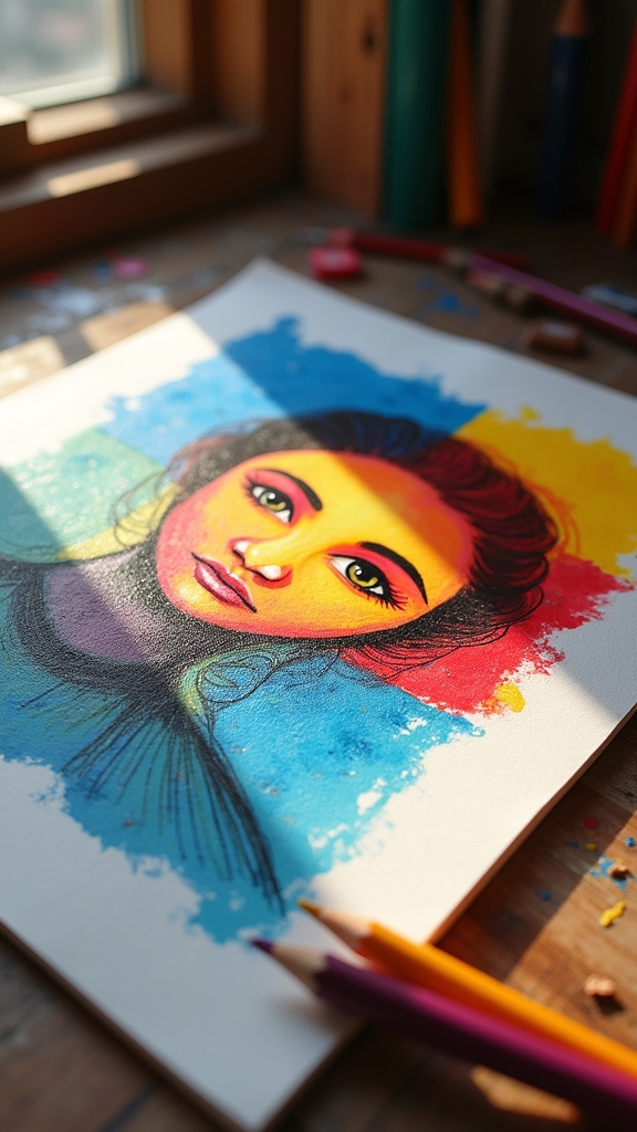
A splash of bold color can totally transform a regular self-portrait into something that stops people in their tracks. With color blocking, artists break a face or background into big shapes and fill each section with striking, contrasting shades.
Prismacolor pencils work wonders for this—they blend smoothly, so you can layer intense hues that really bring out your features. Choosing just a few colors, including some warm and some cool, keeps things balanced but exciting.
Throw in a bit of color theory: place complementary colors next to each other to make areas pop with energy. Drawing on Strathmore toned tan or grey paper acts like a secret weapon—it boosts those colors even further and creates a stunning, high-impact effect that practically jumps off the page.
Exploring Abstract Art With Bold Color Combinations
After going bold with self-portraits, it’s fun to take things in a wilder direction—abstract art is like the “choose your own adventure” of the art world.
There are no rules, just vibrant color explosions and brave ideas. For artists wanting to make their colored pencil art really pop, Prismacolor Colored Pencils are the secret weapon.
They’re perfect for blending reds with blues, smashing yellows against greens, and letting imagination run wild. A smart color wheel and creative paper choices only kick things into a higher gear.
Want to crank up the intensity and show off some unique flair? Try mixing these simple techniques:
- Layering colors to build bold contrasts
- Using toned paper for an instant “wow” background
- Trying cross-hatching or stippling for texture
- Picking wild, unexpected color combos
Underwater Worlds With Smooth Color Gradients
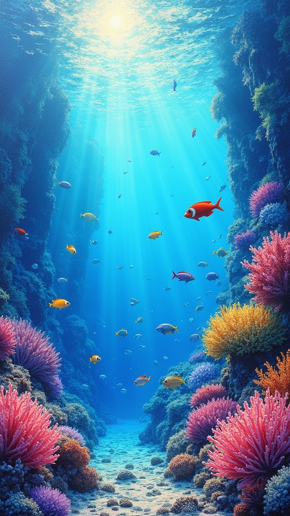
Underwater scenes are like secret worlds waiting to be discovered, and colored pencils can bring that magic right onto the page. In colored pencil art, blending smooth color gradients is key to capturing how light diffuses underwater. Dark blues and rich greens form the base, while pops of coral orange or fiery fish add bursts of excitement. Using tools like Prismacolor pencils and layering colors gently, artists can blur hard lines, creating that awesome sense of moving water. Picking a toned paper—like grey or tan—makes your colors glow brighter and really sets off those underwater details. Play with pencil pressure to get anything from super soft water gradients to bold, crisp seaweed lines. Here’s a handy guide:
| Color Tips | Blending Trick | Paper Choice |
|---|---|---|
| Blues & Greens | Light Pressure | Grey or Tan Strathmore |
| Coral Accents | Layer Gradually | Enhances Vibrancy |
| Mix cool & warm | Circular Motion | Contrast with Detail |
Close-Up Botanical Studies Using Detailed Shading
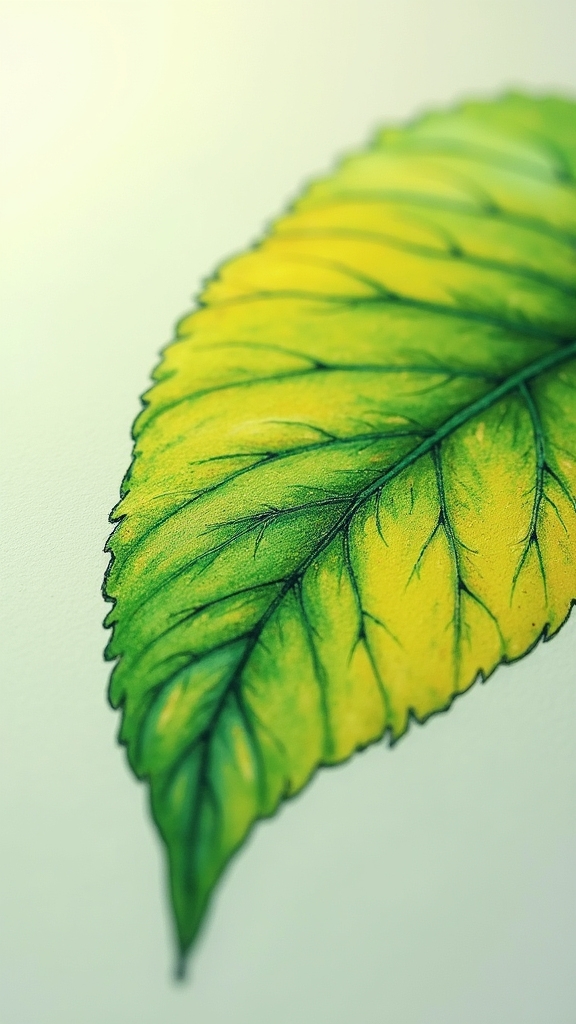
Botanical study isn’t just about drawing flowers—it’s like going on a tiny safari right up close, where every petal, curl, and speck of dust can feel as big as a mountain.
When artists crack open their Prismacolor Premier pencils, they can draw a photorealistic rose or leaf that’ll make someone stop and blink. To nail those realistic vibes, technique is everything: start with shadows, build up layers, and use both soft and hard pencils for super smooth blends or crisp lines.
- Use Strathmore toned tan or grey paper for depth and extra color pop
- Pick one or two main colors, then spice them up with complementary shades
- Focus on rich color saturation to make details stand out
- Practice often—your “tiny safari” skills get sharper every time
Whimsical Candy Still Lifes With Luminous Highlights
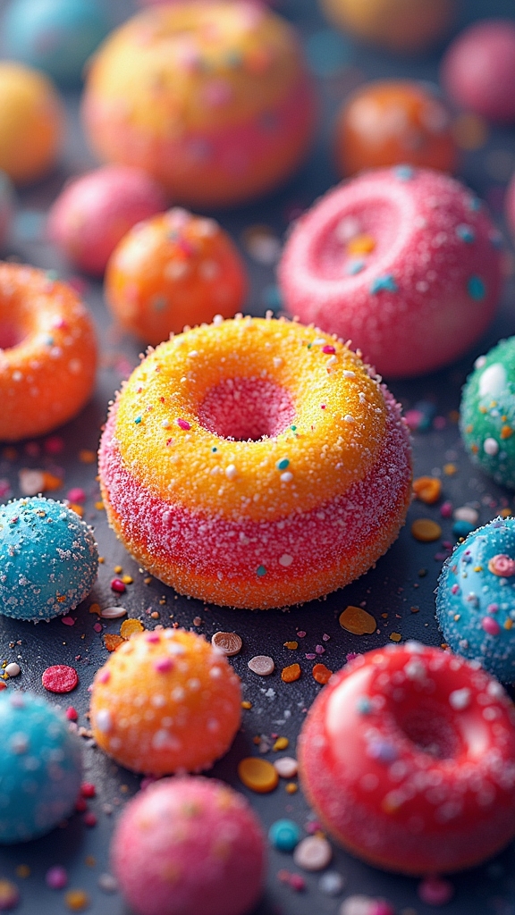
Whimsical candy still lifes are all about making those jelly beans and lollipops look so shiny you’ll want to grab them right off the page (but, sorry, they’re not snackable).
Artists focus on building up glossy candy shells by layering bright colors, adding those must-have highlights, and capturing the way light bounces off each sugary treat.
Getting the reflections just right takes some patience, but when done well, these drawings totally pop—almost like a real bowl of candy showing off under a lamp.
Crafting Glossy Candy Shells
A rainbow of glossy candy shells can turn any colored pencil drawing into an explosion of fun, and honestly, who doesn’t love a little shine?
To make candy art truly mouthwatering, artists lean into vibrant color layering, capturing those bright, reflective highlights candies are known for. It’s all about tricking the eye—getting that sugar-coated sparkle just right.
Here’s how they pull off sweet, shiny masterpieces:
- Layer vibrant Prismacolor pencils to build smooth, rich hues for glossy candy shells.
- Use complementary colors for shadows and highlights, giving each shell a lively 3D vibe.
- Add the brightest highlights with a white pencil, remembering where the light hits.
- Try burnishing with a lighter pencil to blend colors seamlessly, making candies look extra real.
The result? Art that almost tastes sweet!
Vibrant Color Layering Techniques
Even before a single candy gets outlined, it’s the vibrant color layering that gives a still life that irresistible, almost electric energy—like the candy might just hop off the page and roll across your desk.
Artists reach for their trusty Prismacolor premier pencils to lay down a light base layer, easing into the magic. They start soft, then gradually build up the color, sneaking in complementary shades—maybe a cool blue shadow under a warm red jellybean—for extra pop.
For that classic candy shine, they leave tiny areas blank or press in a lighter color right on top of darker layers. Blending with a colorless blender pencil or even a soft tissue makes the surface extra smooth and dreamy, just like real candy—no sugar rush required.
Capturing Reflective Candy Surfaces
Once those layers of wild color are built up, it’s time for artists to do some real candy magic—making every gumdrop and chocolate shine like it’s just been unwrapped.
Using colored pencil, especially vibrant Prismacolors, adds a burst of glossy excitement to whisk viewers straight into a candy shop. Artists zero in on the shine: solid color bases, then highlight and shade, thinking hard about where the skittles really glisten under the spotlight.
Play with cool and warm tones—maybe an orange glint on a blue jellybean, or a dash of purple shadow hugging a lemon drop’s edge.
Here’s how to make those sweet treats glow:
- Build up solid color layers
- Layer in luminous highlights and deep shadows
- Use light pressure for subtle shines
- Toss in lots of playful candy shapes
Photorealistic Fruit Using Prismacolor Layering
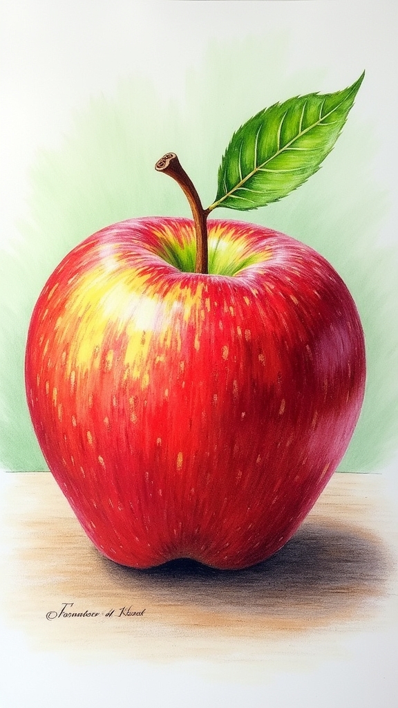
Color explosions happen when Prismacolor pencils meet a juicy apple or a bunch of shiny grapes.
Creating a photorealistic colored pencil drawing starts by picking a jaw-dropping reference photo—think apples that look good enough to eat or grapes so shiny they could be marbles.
Artists build a soft, light base layer first, blending colors bit by bit, just like stacking up pancakes for breakfast—each layer adds yumminess!
Real magic happens by burnishing, either with a lighter Prismacolor pencil or a colorless blender, to get those juicy highlights and smooth shadows.
Paying attention to color harmony is key; analogous shades keep it looking super realistic.
And don’t forget: stepping back now and then keeps your eye sharp and your fruit popping off the page!
Dramatic Night Skies Through Soft Blending Techniques
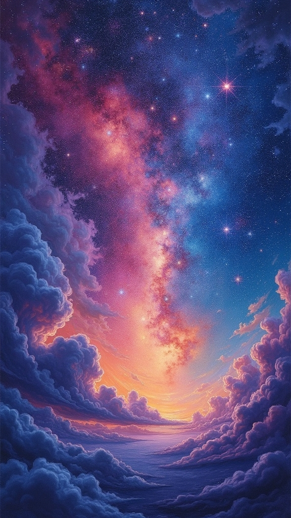
Now it’s time for some sky-high drama—creating night scenes that look so deep, you could almost fall in.
Layering shades of blue and purple into a midnight background gives the sky tons of depth, and mastering those smooth gradient shifts with soft blending can make each color melt right into the next.
It’s a bit like magic—or maybe a magic trick you can actually explain!
Layering for Depth
Immerse yourself in the world of dramatic night skies, where layering colored pencils turns a blank page into a cosmic masterpiece.
With layering, artists can seriously amp up the depth in their art—think glorious dark skies dotted with glowing stars. The secret? Building color slowly and blending gently, like you’re painting with colored stardust.
Start with a deep blue or black base, then add purples and mellow whites for that night magic. Blending in slow circles or gentle back-and-forth motions makes the colors melt together for an ultra-smooth look.
Don’t forget, pressure matters too! Press hard and you’ll get rich color, go lighter and it’s soft as moonlight.
- Start with a dark base layer
- Build up color gradually
- Use circular motion for even blending
- Highlight with white for distant stars
Gradient Transitions Mastery
Grab a handful of colored pencils and prepare for some real magic—the secret spell here is gradient shifts. Gradient alterations mastery means getting that sky to move from dark, moody blues into soft pinks and purples so smoothly, it almost feels like pastel painting in colored pencil form. Want your night sky to look deep and realistic? Use toned paper to cozy up those colors and follow color theory for maximum punch. Start dark at the top, use lighter pressure near the horizon, and layer, layer, layer! Soft pencils, a colorless blender, or even a bit of tissue to smooth out the lines gives you that wow-worthy blend.
Here’s a quick cheat sheet:
| Step | Tip for Night Sky Success |
|---|---|
| Dark tones on top | Use realistic colored pencil blues |
| Blend into purples | Light pressure for smooth mixing |
| Add pink hues | Layer multiple shades carefully |
| Use toned paper base | Enhances depth and color vibrancy |
Colorful Fish Rendered With Reflective Pencil Strokes
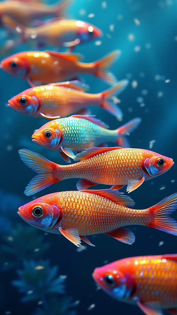
A handful of artists will tell you that drawing colorful fish with reflective pencil strokes feels a bit like capturing underwater magic on paper.
Even the most talented can’t resist the urge to try and draw anything from neon guppies to shimmering koi! The trick is in the details—those shiny scales, rippling shadows, and bursts of color that look almost unreal.
Starting with a limited color palette—warm reds, cool blues, maybe a zesty yellow—helps everything pop without turning fishy artwork into a color chaos.
- Use Prismacolor Premier pencils for amazing color blending and juicy saturation.
- Layer lighter colors gently over darker ones to catch that sparkling scale effect.
- Add background shades that make your fish leap off the page.
- Try cross-hatching or stippling for realistic, eye-catching texture.
Urban Landscapes With Monochromatic Color Schemes
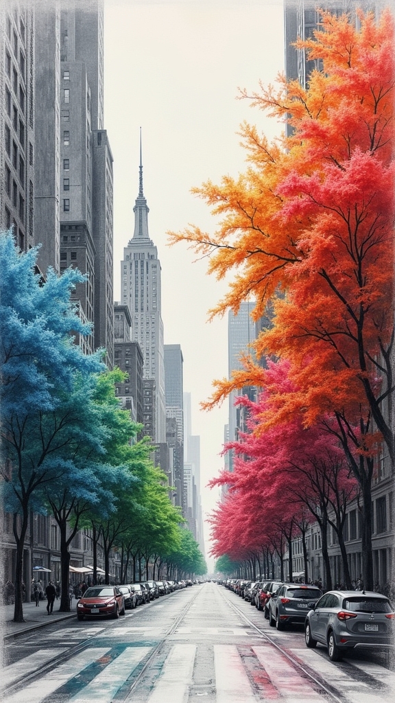
Even if you’ve never paid much attention to city skylines, there’s something seriously cool about creating urban environments with just one main color running the show.
Think of it like picking a team captain—maybe blue, red, or even spooky green—and letting them call the shots for the whole drawing. With colored pencils and the right art supplies, artists can play with lighter tints and super-dark shades of their chosen color, making buildings pop and shadows stretch across sidewalks.
Adding a hint of similar colors keeps things from getting too predictable. Want to amp things up? Try drawing on grey or tan toned paper, which makes colors glow more than a neon sign.
Shading techniques add awesome depth, turning a city scene into something epic.
Dynamic Splatter Art for Playful Color Exploration
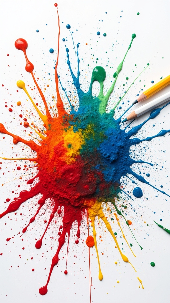
Splatter art isn’t just messy fun—it’s a great way to test out cool techniques, like making wild color blends and layering bold shades for serious vibrance.
With colored pencils, even beginners can flick, tap, and create eye-popping effects that look like a firework show on paper.
Some artists mix soft, blurry splatters with sharp, bright dots, and the results can totally steal the spotlight—almost as if your drawing threw its own party.
Splatter Techniques Explained
Countless art lovers would agree—sometimes, the boldest masterpieces come from letting loose and making a mess. Splatter techniques in colored pencil art are all about being playful and fearless. Instead of carefully staying inside the lines, artists can flick, tap, or even shake color onto the page. This creates energetic explosions of color that look totally alive.
Using toned paper like Strathmore tan or grey makes these splatters stand out even more, almost like fireworks against a night sky. Trying different pencil pressures leads to cool effects, from soft sprays to strong bursts. Even basic Crayola pencils work, if you’re just starting out.
Here’s how to boost your splatter game:
- Try different paper backgrounds
- Experiment with pencil pressure
- Observe color layering results
- Practice with affordable pencils
Color Blending Mastery
Any artist who loves getting a little wild with their materials will instantly connect with dynamic splatter art, especially when it comes to mastering color blending.
Dynamic splatter art is all about letting loose—think flicks, dots, and wild bursts of colored pencil across the paper. When artists use Prismacolor pencils on toned Strathmore paper, the colors practically leap off the page.
Color blending mastery comes alive with spontaneous mixes—try laying down blues and greens in overlapping splatters, or go bold with red and yellow explosions. It feels like controlled chaos!
Plus, thinking about color theory (analogous and complementary color combos) helps artists create either smooth harmony or electrifying contrast.
Best of all, this colorful mess isn’t just fun—it sharpens skills for blending and shading like a pro.
Layering for Vibrance
Dive right in and get messy—layering is where dynamic splatter art really starts to pop!
Think about using every colored pencil you own, from Crayola to Prismacolor, as your color arsenal for playful experiments. The real trick is layering techniques: stack colors, blend edges, and watch new shades magically appear.
Toned paper, like Strathmore’s tan or grey, makes those colors scream with contrast and energy. Whether you’re a total newbie or have serious pencil skills, this method invites everyone to go wild and loosen up.
Want some quick tips for maximum vibrance?
- Try layering light colors first, then add darker splatters on top.
- Use toned paper for extra boldness.
- Mix complementary or analogous colors for excitement.
- Pile on multiple layers for texture and serious depth!
Delicate Lip Drawings With Rich, Blended Tones
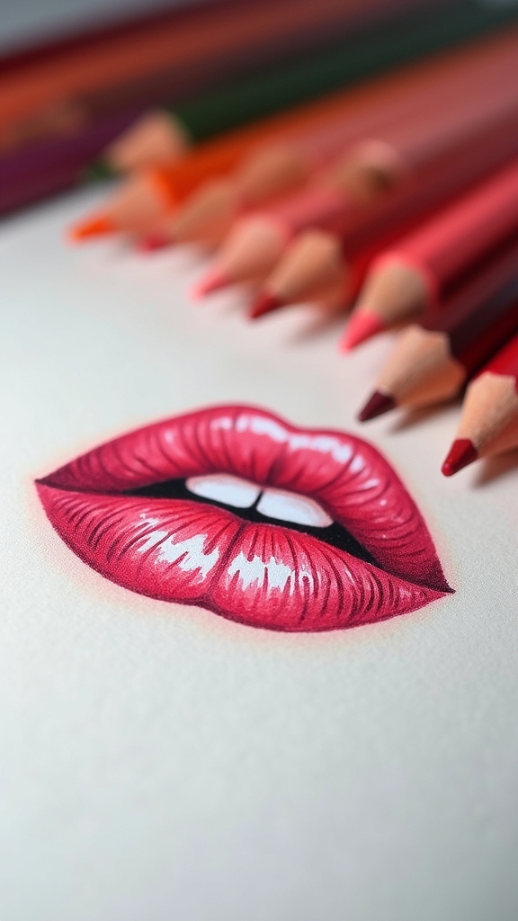
Even though lips might seem tricky to draw, colored pencils can turn them into mini masterpieces bursting with color and life. Using Prismacolor Premier colored pencils, anyone can blend tones smoothly, layering reds, pinks, and purples to make lips look real enough to talk back!
Adding different shades helps create serious depth and dimension, while gentle pressure lets artists build up soft, subtle texture without harsh lines. By paying extra attention to shiny highlights and tiny shadows, lips practically shimmer and pop off the page.
Some artists even use toned paper like Strathmore’s tan or grey, which makes those vibrant colored hues stand out like candy. Capturing each stage in step-by-step photos turns the process into a story—and who doesn’t love a good art journey?
Sunflower Fields Featuring Warm and Cool Contrasts
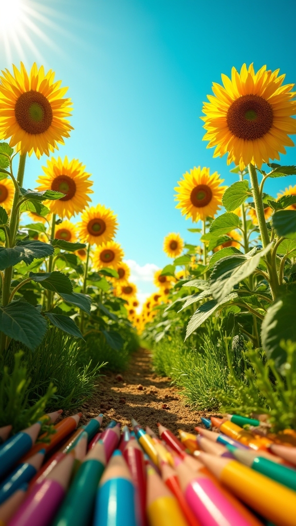
Contrast steals the show in colored pencil drawings of sunflower fields, making each petal and patch of sky buzz with energy. To really make those sunflowers burst off the page, artists pay attention to warm and cool color combinations.
Imagine glowing yellows and oranges in the flowers, then cool greens or deep blues in the background—instant drama! Odd tip? Use tan or grey paper to make those sunflower heads practically glow.
The real trick is to pay attention to layering and shading, using different pressures and stroke directions for realistic texture.
- Pick a dominant yellow for the sunflowers, then add blues or purples in the sky for pop.
- Layer Prismacolor pencils for a lifelike petal texture.
- Use toned paper to boost luminosity.
- Play with shading for light effects.
Succulent Arrangements With Textural Detailing
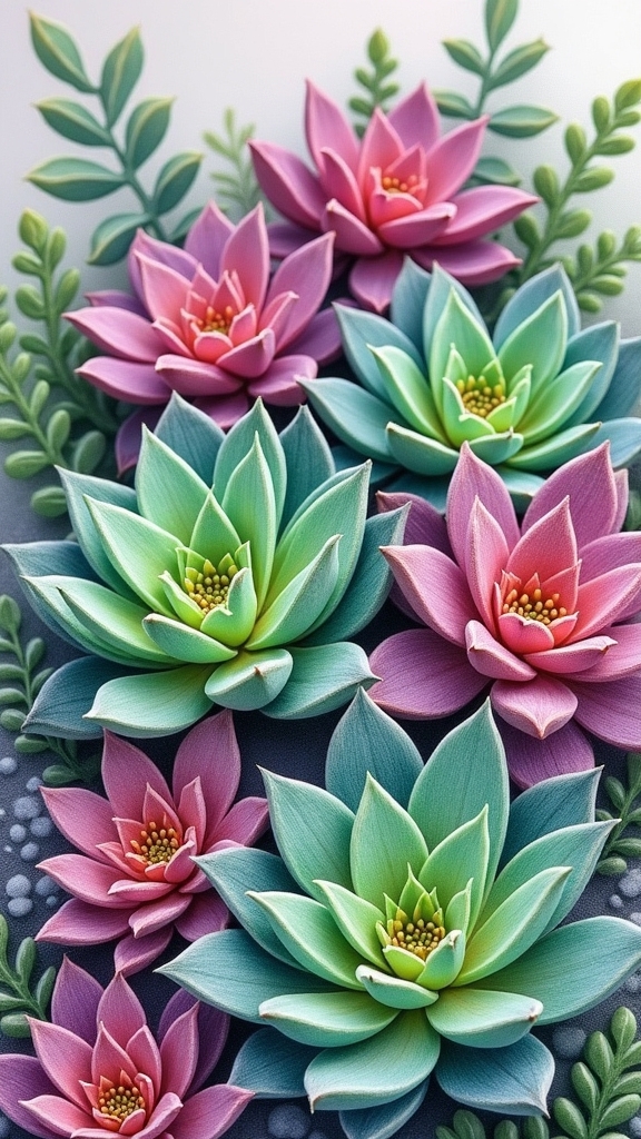
Succulents are like nature’s little sculptures, each one showing off wild shapes and patterns that beg to be captured with colored pencils. When drawing succulent arrangements, artists grab their favorite art materials—Prismacolor pencils for smooth blending, and maybe some toned Strathmore paper to really make the colors explode. Using light and shade is key, so the textures look almost touchable, like you could poke a spiky aloe and get a surprise sting! Mix up your pencil pressure for even more dynamic feels. With complementary colors, those luscious greens and purples create drama on the page. Layering colored pencils brings every ruffle, bump, and twist to life. Here’s a table to imagine what could fill the paper:
| Rosette Layers | Fuzzy Leaves | Bumpy Edges |
|---|---|---|
| Spiky Agave | Powdery Kalanchoe | Wavy Echeveria |
| Curvy Jade | Velvet Panda | Red-tipped Tips |
| Blueish Tones | Silver Glitter | Shadow Contrast |
Ocean Starfish Studies in Complementary Hues
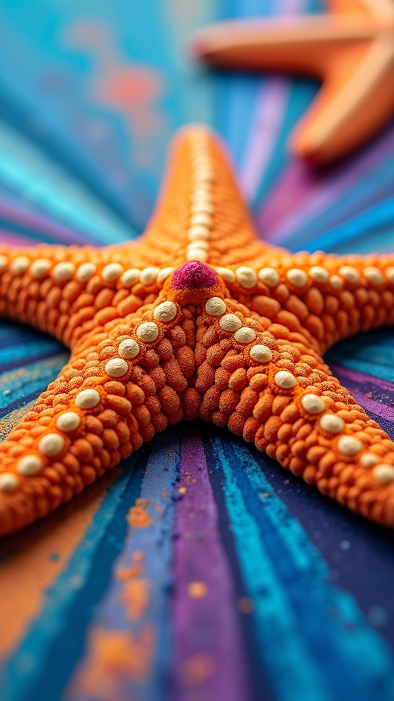
Plenty of ocean lovers know that starfish aren’t just cute—they’re packed with wild colors and patterns begging to be drawn. That’s why ocean starfish studies in complementary hues can make any colored pencil artwork pop like crazy!
Picture a bright orange starfish chilling on a blue background; bam, instant eye magnet. Using Prismacolor colored pencils, artists can blend like butter, smoothing bold colors together to mimic those underwater vibes. Mixing up different tones and shades within the orange-and-blue combo adds serious depth, making the starfish look like they’re ready to wobble right off the page.
- Choose toned tan or grey paper for extra “pop”
- Experiment with realistic or abstract styles for unique effects
- Focus on the starfish’s funky patterns and textures
- Layer complementary hues for standout contrasts
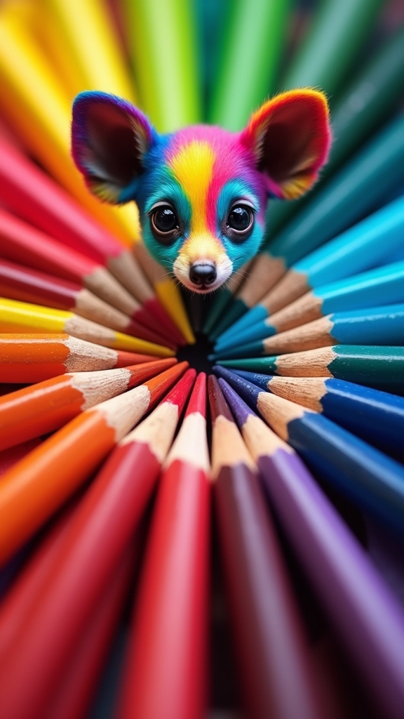
Fantasy Creatures With Imaginative Color Palettes
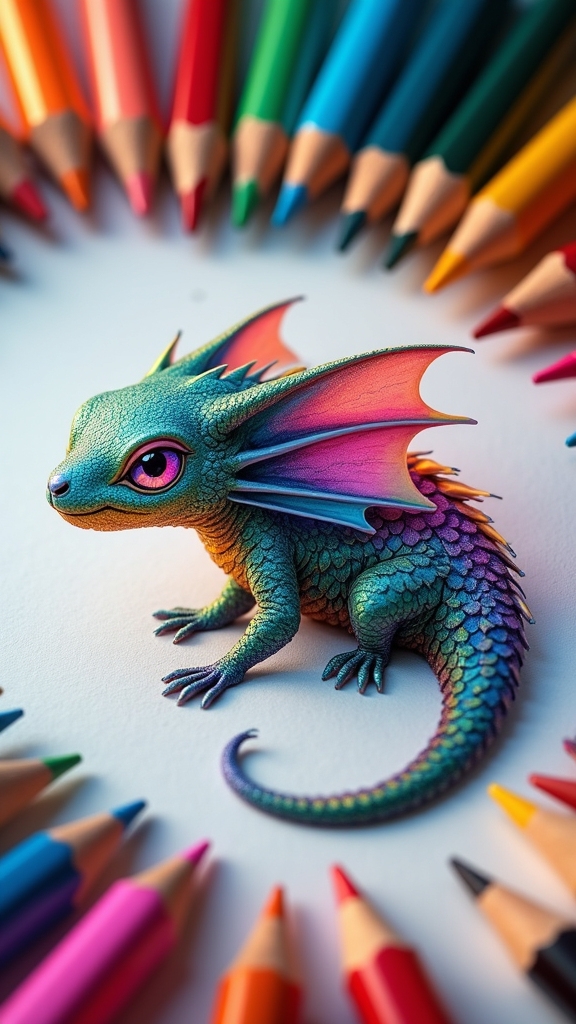
Ever wonder what a flying dragon would look like if you colored it neon pink with electric blue wings? Drawing fantasy creatures is so much fun, especially when using colored pencils and letting your imagination run wild.
Why not give a unicorn shimmering teal fur, or a griffin feathers mixed in purples and yellows for some real wow factor? Artists often use complementary colors like blue and orange for crazy contrast, making their magical beasts really pop.
Layering and blending with Prismacolors helps create scales, glittery wings, or even fluffy monster bodies that practically leap off toned paper. Try playing with shadows and highlights to make your fantasy creatures look three-dimensional and full of life.
No rules—just creative possibilities waiting for your wildest ideas!
Painterly Marbles Using Soft and Hard Pencil Tips

Even though marbles might seem small and simple, drawing them with colored pencils can turn into an epic quest for shiny, glassy perfection.
To make marbles look painterly and real, artists rely on both soft and hard pencil tips—it’s like having two superpowers. Soft tips make blending colors as smooth as melted chocolate, while hard tips slice in razor-sharp highlights for that unbeatable glassy zing. The trick is all in the layers!
Master marble magic by blending with soft pencil tips and etching sharp highlights with hard ones—the secret to glassy, painterly perfection.
Here’s how artists get those marbles to practically bounce off the page:
- Lay down bold color bases with soft pencil tips for depth
- Switch to hard pencil tips to carve out dazzling reflections
- Play with pencil pressure for gradients—from ghostly light to inky dark
- Test different colored pencil brands for the richest colors
Moody Portraits on Grey Paper for Subtle Color Effects
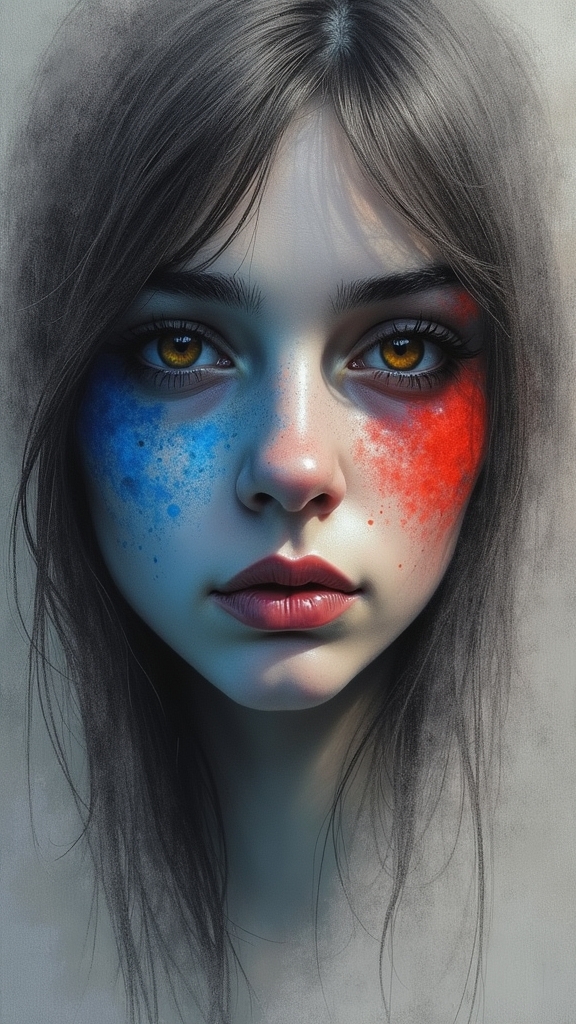
When someone wants to give their portraits a mysterious, dramatic vibe, grey paper is like having a secret weapon up their sleeve. Creating moody portraits on this neutral background helps colored pencils shine in a whole new way.
Colors seem richer, and the shadows in skin and hair gain a softer, more believable look. It’s perfect for showing off subtle emotions—think quiet sadness, or a thoughtful stare.
Prismacolor colored pencils blend smoothly on grey, making it easy to layer dark and light shades for cool contrasts and unforgettable features. Artists love using burnishing tricks here, too, pushing the colors just enough to pop without ruining that dramatic, moody atmosphere.
Moody portraits on grey paper? Totally next level for colored pencil work.
Birds in Motion Captured With Vibrant Streaks and Layers
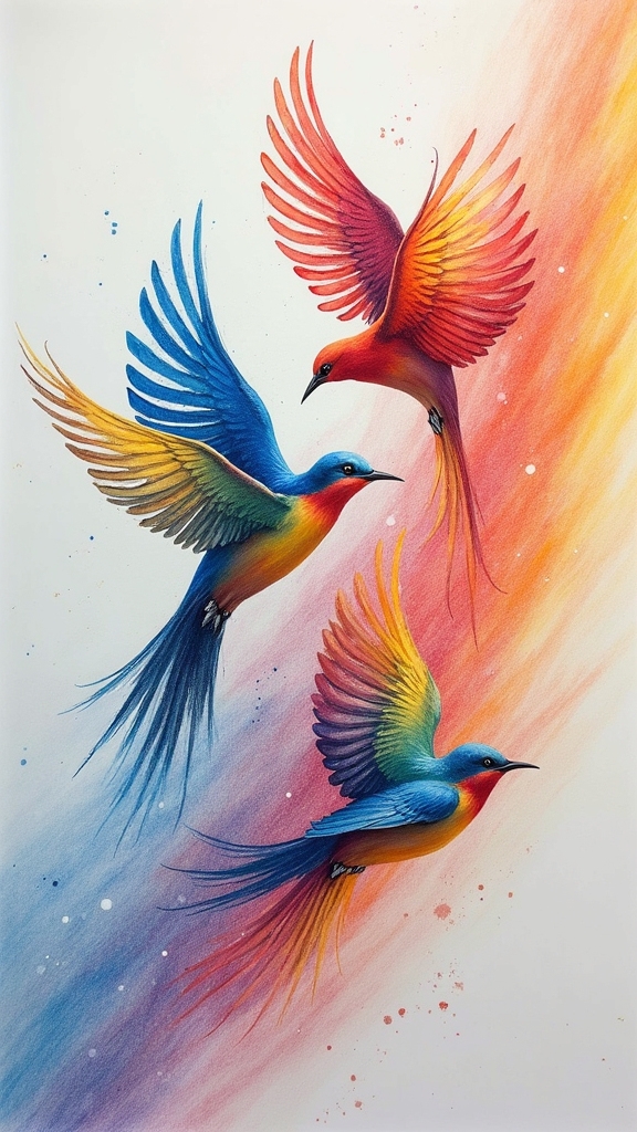
Although drawing birds can be tricky, making them look like they’re actually flying or darting through the air is where the real magic happens.
Using colored pencils like Prismacolor, artists can draw birds in motion with streaks of vibrant color, layering shades to capture energy and life. Juggling a mix of complementary colors helps make those feathers pop, while careful blending and pressure tricks add extra detail.
Toned paper, like Strathmore’s tan or grey, kicks up the wow factor, letting colors leap right off the background. Want your artwork to look like it’s about to take flight? Try these tips:
- Draw streaks for motion blur and dynamism
- Layer shades to show light and shadow
- Blend bright, complementary colors
- Use varying pencil pressure for feather texture
Frequently Asked Questions
How Do You Make Colored Pencils Pop?
To make colored pencils pop, one should apply vibrant techniques, such as choosing complementary paper colors, using artist-grade materials, layering and blending, controlling pencil pressure, and exploring color harmony to achieve bold contrasts, rich saturation, and visual impact.
How to Color Nicely With Colored Pencils?
When learning how to color nicely with colored pencils, artists should focus on mastering blending techniques, experimenting with color layering, controlled pencil pressure, and shading methods to achieve smooth shifts, depth, and a refined, polished finish in their artwork.
Which Color Is the Best Color for Drawing?
The best color for drawing varies based on color theory, subject, and emotional intent. Artists may select warm or cool colors, dominant hues, or complementary pairs to achieve specific effects, creating harmony and visual impact within their artwork.
What Is Color Pencil Art Called?
The creative practice of using colored pencils is commonly referred to as colored pencil drawing or colored pencil painting. Artists employ various Colored Pencil Techniques to achieve different effects, such as blending, layering, and burnishing, within their compositions.
Conclusion
Colored pencils aren’t just for doodles or homework—these ideas prove they can create serious wow-factor art. From wild animal portraits bursting with color, to moody faces on gray paper, there’s a style for every vibe. You don’t need fancy supplies—just some pencils, paper, and a mind ready to experiment. So, grab your colors, let your creativity run wild, and remember: if you mess up, that’s just a new idea waiting to happen. Let’s get drawing!
Leave a Reply