
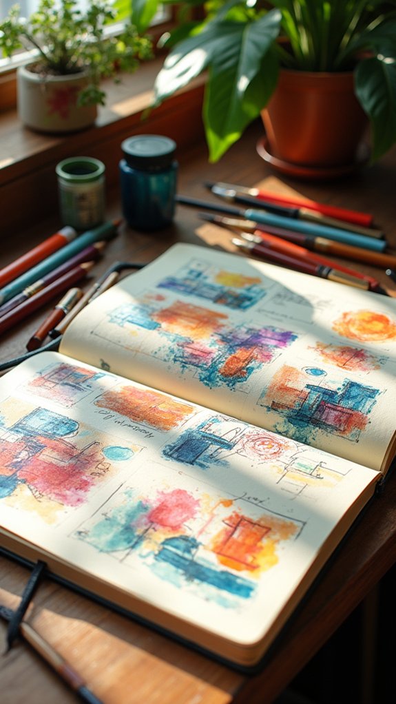
Sketchbook layouts can make planning feel like a superpower, turning chaos into cool, eye-catching order. Try grid layouts for neat sections, or use rectangular boxes to keep ideas from bouncing everywhere. Centerpiece arrangements grab attention, and leaving some white space helps everything stand out—even your colorful doodles! Timeline spreads are perfect for telling stories, and project trackers keep you on schedule. Mix symmetry with wild shapes for variety. There’s even more creativity hiding in the next set of layout ideas.
Key Takeaways
- Use grid layouts or rectangular boxes to keep sketchbook pages organized by theme, project, or sequence.
- Incorporate horizontal timeline spreads and arrows to visually plan and narrate events or creative progress.
- Highlight main ideas with bold centerpieces surrounded by supporting sketches and notes for clear focus.
- Balance white space intentionally around drawings and notes to prevent clutter and maintain visual clarity.
- Combine quick handwritten notes and sketches with labels or annotations for effortless idea tracking and future reference.
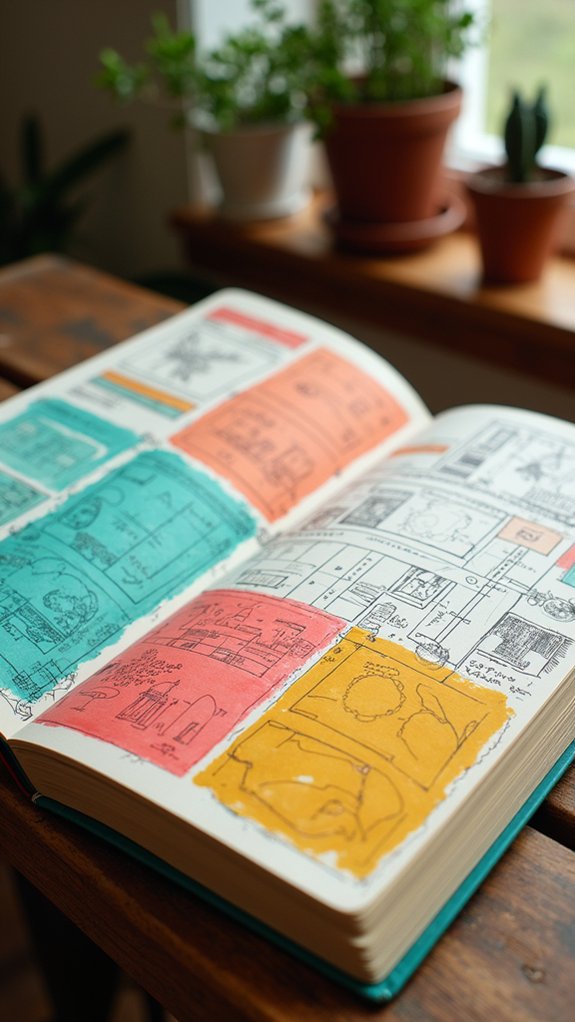
Grid Layouts for Structured Sketching

Grid layouts are like secret superpowers hiding in a sketchbook. Picture a page split into perfect sections—it’s like the page is suddenly tamed!
With grid layouts, sketchbook design becomes a breeze. Artists get to place their ideas in a way that feels totally organized, not like a wild tornado of doodles. Each box or row gently guides where things go, helping keep everything balanced.
The coolest thing? These grids can be any size or shape, so everyone can find one that fits their style.
When artists stick with grids, their pages look super cohesive, kind of like a comic book that tells a smooth visual narrative. Plus, working with grids boosts compositional skills, letting creativity shine without turning into chaotic scribbles.
Rectangular Boxes for Categorizing Ideas
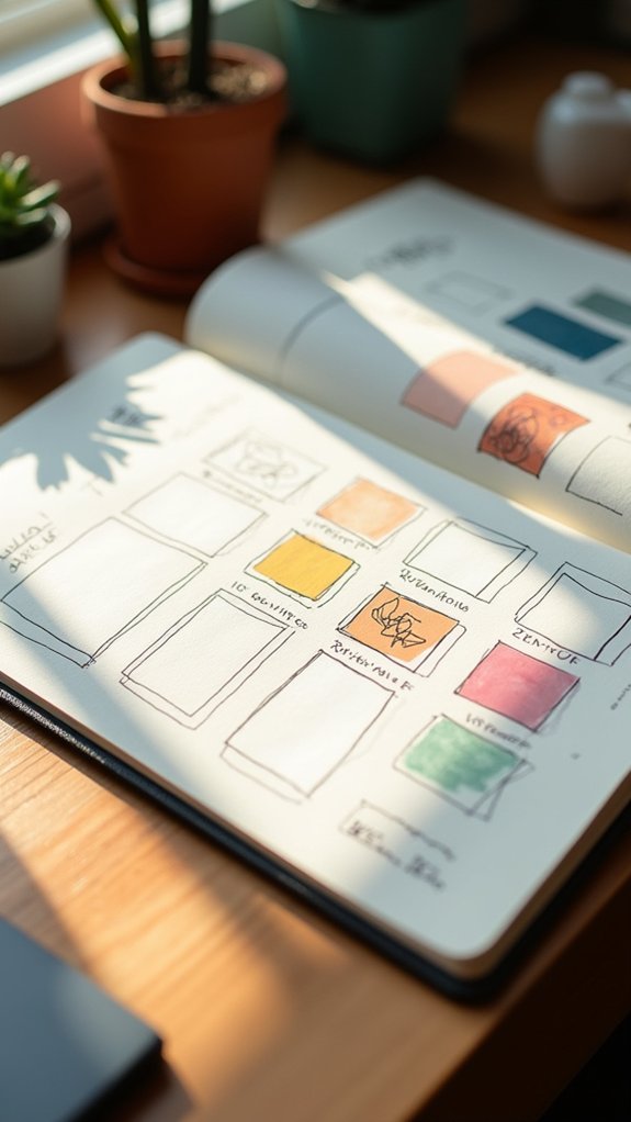
Rectangular boxes are like magic frames that help organize sketchbook pages, making sure each idea gets its own special spot.
By splitting the page into sections, artists can group themes or story parts, so nothing gets lost in the mess (goodbye, chaos!).
It’s a bit like making a comic strip—boxes add order, but there’s plenty of room for fun and surprises, too.
Structuring Pages With Rectangles
Even though organizing a sketchbook page can feel like wrestling with a wild octopus, using rectangles to structure ideas makes things a lot less slippery.
By building a layout with rectangles, sketches and notes stay corralled and easy to find later. It’s almost like setting up invisible fences—each box holds its own bit of design or thought, making the whole composition feel neat and balanced.
Want to show a bunch of sketches from your museum trip? Divide the page with scenic rectangles and boom, everything is orderly.
Adding rectangle-shaped spaces for text between drawings strengthens the overall layout, adding helpful explanations or funny captions.
Experimenting with the size and placement of rectangles keeps things fresh—no two pages have to look the same.
Organizing Themes by Sections
When a sketchbook starts bursting with ideas that feel like they’re having their own chaotic party, splitting the page into sections can be a game-changer. By organizing themes into neat rectangular boxes, artists instantly turn chaos into order.
Each section acts like a mini stage, giving every concept its own spotlight, making themes super easy to locate later—no frantic flipping required. Some artists even stack rectangles inside larger rectangles for a next-level layout. It’s like building an idea skyscraper, with space for annotations and doodles between floors!
Plus, experimenting with different shapes and sizes keeps things exciting and personal. If you want your sketchbook to tell a story, try lining up sections by timeline or theme, guiding the eye, and capturing your creativity with style.
Centerpiece Arrangements for Visual Impact

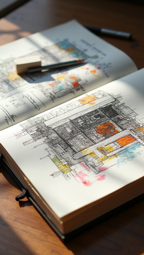
Sometimes a sketchbook page really grabs attention when it has a bold centerpiece, like a map right in the middle, acting as an anchor for everything else.
By making this central element pop and then surrounding it with smaller sketches or notes, it’s easy to highlight what matters most and tie in extra details.
Arranging these pieces just right keeps the page looking sharp, not messy—plus, it’s kind of like giving the spotlight to your main star while the supporting cast adds extra excitement.
Central Map as Anchor
Maps have a kind of magic—not just for finding your way, but in the way they can totally transform a sketchbook page. When a central map takes over as the anchor in a sketchbook layout, it becomes more than just a drawing; it’s the heart of a whole visual narrative.
Suddenly, you can arrange accompanying sketches—maybe that cool bakery you visited or a mysterious alley—around the map, connecting them with arrows like a detective tracking down clues. This layout lets you use selective focus, spotlighting special spots you loved on your journey.
It not only organizes memories from your travel experience, but it also makes flipping through your pages feel like exploring a tiny world, all mapped out and bursting with stories.
Highlighting Focal Elements
Spotlights make everything cooler—whether it’s on a stage or smack in the middle of a sketchbook page.
When building a knockout layout, slapping a bold centerpiece right in the middle can turn plain old sketches into a showstopper. The idea is to choose a focal element—a map, a doodle, or a quirky block of text—and let it anchor the whole spread.
Clever use of negative space gives that centerpiece room to shine, while little creative touches can bring everything together for visual unity. To keep eyeballs glued to what matters most, try some of these moves:
- Draw arrows or lines between the centerpiece and nearby sketches.
- Add splashes of color to frame the focal element.
- Experiment with different shapes or sizes.
- Maintain plenty of open space around the centerpiece.
Surrounding Details Arrangement
Even though a killer centerpiece steals the show, the magic really happens in the way all the surrounding details come together. With a bold sketch nailed right at the center, the rest of the sketches join in like backup dancers—filling the page, supporting the star, and keeping your eyes moving. It’s not just about slapping random stuff around, though. A smart arrangement, guided by arrows or bursts of color, can build a super clear visual narrative. Surrounding sketches can show different moments, highlight details, and with clever use of color, tie everything into a cohesive story. Mixing horizontal with vertical sketches or tiny doodles next to big ones adds energy and keeps it all from looking flat as a pancake.
| Centerpiece Trick | Why It Works |
|---|---|
| Use arrows | Guides eye movement |
| Vary sketch sizes | Adds interest |
| Color highlights | Boosts focus |
| Balanced arrangement | Keeps it cohesive |
| Themed details | Strengthens narrative |
Balanced Use of White Space

A handful of the coolest sketchbook pages out there don’t actually fill every inch with doodles or notes—there’s some real magic in leaving parts blank.
Think about it: a balanced use of white space keeps your page from getting overloaded and turning into total visual clutter. The white or “negative space” lets your main sketches pop, and it gives your ideas room to breathe.
When you create that harmonic balance, your drawings feel more important—like they’re getting their own little spotlight.
- Use negative space to frame your favorite sketches; it’s like an invisible picture frame.
- Leave room around busy areas to highlight focal points and keep things organized.
- Try a minimalist aesthetic for bold, clear statements.
- Letting empty spots inspire creative directions—sometimes the blank parts are just as fun!
Horizontal Timeline Spreads
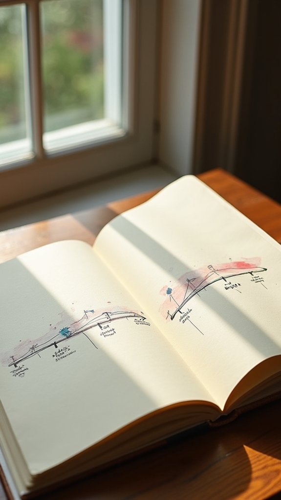
Horizontal timeline spreads are like comic strips for your sketchbook, letting moments line up in order for an easy-to-follow story. Each sketch grabs a key moment, and arrows can zip from one to the next to show how everything connects—no time travel required.
It’s a fun way to share how things change over time, keep your story flowing, and maybe even sneak in a secret joke or two along the way.
Visual Storytelling Across Time
When someone wants to tell a story that stretches over time, sketchbook timelines can make that tale pop right off the page. A horizontal timeline is like a comic strip for real life, letting artists show one event after another as if viewers are eye-walking through time.
It’s not just cool to look at; this creative layout lets people track changes in nature, city scenes, or even a teacher’s mood across the school year. Annotations, those little notes next to sketches, give each moment context and personality, boosting storytelling power to a new level.
Even using arrows feels dramatic, guiding the eye with style. Here’s some inspiration for these visual representation champs:
- Document daily plant growth
- Chart weather changes
- Capture evolving city scenes
- Show animal behaviors
Sequencing Key Moments
Even if someone’s never thought about turning their life into a comic strip, sequencing key moments with a horizontal timeline spread can seriously level up any sketchbook.
It’s like lining up a story parade right across the sketchbook pages—each drawing capturing a slice of the journey. This style is especially epic for travel sketching because it lays out the adventure in illustrated highlights, letting every little moment shine without getting lost.
Artists can toss in visual cues, like mini icons or quick doodles, to connect events and bring out a more vivid narrative. Mixing in maps or personal notes adds context, making the whole experience way more memorable.
Playing with sketch styles and sizes along the timeline keeps things fresh and your audience guessing what comes next.
Using Arrows for Flow
Although a timeline spread is already cool for showing a story, arrows are like the secret sauce that pulls everything together. When someone uses a horizontal timeline layout in their sketchbook, tossing in arrows makes the flow of events so much clearer.
Now, it’s not just sketches hanging out side by side—it’s an organized, full-on narrative with a clear direction. Arrows show how ideas and moments connect, so even if someone’s feeling a little lost, those little pointers keep them right on track.
Creative sketches, different sizes, even fun doodles in the margins—arrows help organize it all. Here’s how arrows boost the timeline game:
- Point between sketches for smoother flow
- Highlight event sequences with organization
- Add clarity to the narrative’s path
- Make the story pop visually
Storytelling With Rows and Arrows
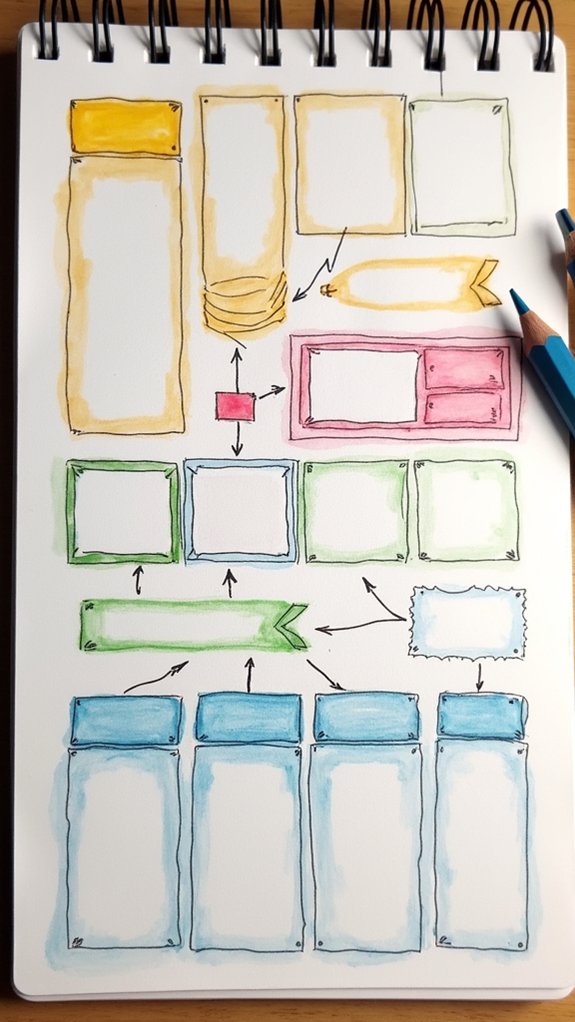
If you’ve ever tried to tell a story using just pictures, the idea of organizing sketches in neat rows might sound a bit like arranging dominoes—each one leading to the next. Rows give your sketches structure, helping to create a visual timeline or a narrative, while arrows add that extra punch by linking actions and ideas, pulling viewers along for the ride. It brings visual interest to your page and lets your story flow with style and clarity. Artists love that rows and arrows encourage flexibility—if a wild idea pops up, there’s still room to squeeze it in.
Here’s a sample layout:
| Row 1: Sketch | Row 2: Sketch | Row 3: Sketch |
|---|---|---|
| Event Begins | Arrow → | Action Unfolds |
| Scene Change | Arrow → | Next Event |
| Plot Twist | Arrow → | Surprise Face |
| Build Tension | Arrow → | Big Reveal |
| Resolution | Arrow → | Happy Ending |
Combining Images and Handwritten Notes
Rows and arrows are great for mapping out a story, but sometimes sketches need a little extra spark to really come alive.
Combining images and handwritten notes is a fantastic way to make sketchbook pages pop while keeping things super organized. Placing notes near drawings helps everything connect, and the use of negative space keeps the page from feeling squished or chaotic.
Plus, experimenting with fonts means each note can have its own personality—think quirky headlines or neat facts under each doodle. It all ties together for a cohesive design that’s full of visual harmony.
Try these ideas:
- Surround sketches with handwritten notes for instant context
- Use negative space to let both text and images breathe
- Add variety by experimenting with fonts and handwriting styles
- Fill layout gaps with quick notes for a balanced, cohesive design
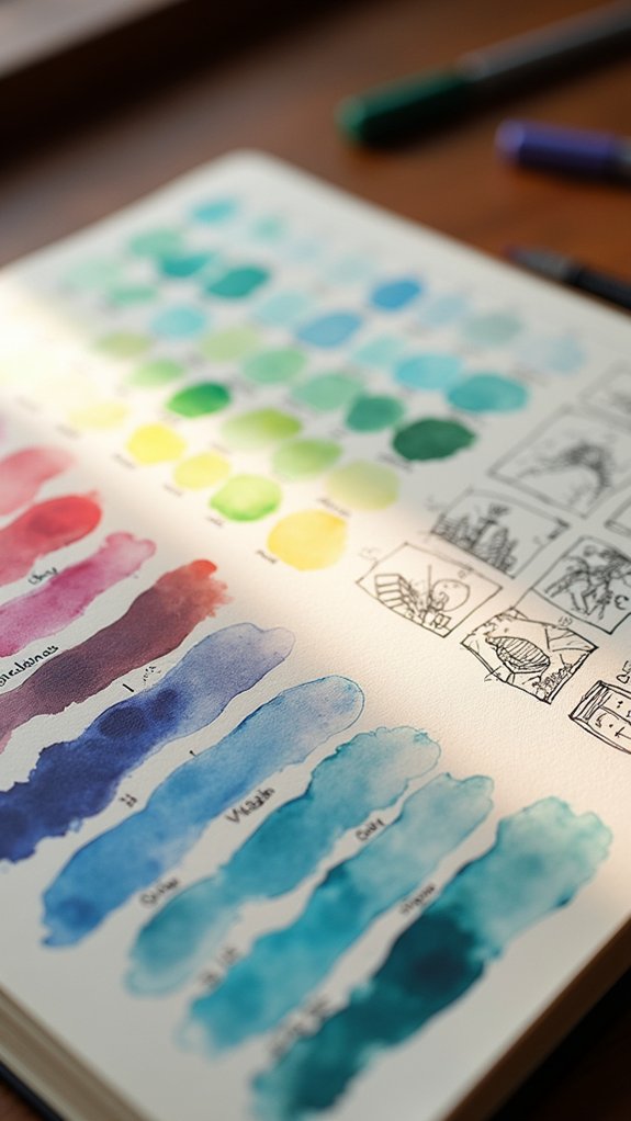
Color Blocking for Visual Unity
A splash of color can work wonders in a sketchbook spread, turning a boring group of doodles into something that really grabs attention.
Color blocking is like giving your layout a secret weapon—it helps create visual unity and keeps everything feeling organized. By adding big, solid areas of color around or behind sketches, the page instantly feels more put together.
Arranging these colored shapes in circles or grids holds the viewer’s interest and brings balance to the composition, kind of like a team working in perfect harmony.
Want a little drama? Contrasting colors can make certain areas pop with energy, while complementary tones invite everything to gel.
Dropping in color after sketching also lets artists fine-tune their layout, spotlighting the most important ideas or stories.
Collage Pages Mixing Different Media
Rip, snip, and glue—the world of collage pages throws open the door to endless creativity in a sketchbook. Mixing different media, like paint, magazine clippings, and even scraps of fabric, makes every page feel like a new adventure.
It’s not just about layering stuff; it’s about using texture and depth to pull viewers in. Artists can color strategically to tie together totally random bits, or let one bright piece pop from the page.
Plus, incorporating text is awesome for adding a secret message or a dramatic title. No two collage pages are the same—each one is unique and reflective of the artist’s style.
- Combine watercolors, ink, photos, and found objects
- Add handwritten notes or magazine clippings as text
- Play with overlapping layers for texture and depth
- Use color strategically to guide the viewer’s eye
Thematic Collections Across Spreads
After experimenting with wild collage pages, some artists find themselves itching for a sketchbook that tells a bigger, more connected story.
That’s where thematic collections across spreads swoop in—think pages filled with sketches that all link to a single theme, like favorite places or a series of silly cats.
Using color to unify a collection, artists can set a mood or vibe that stretches from one page to the next, pulling the eye along a visual narrative.
Layout matters, too: arranging sketches in neat rows or playful clusters can create a sense of timeline or story.
Adding text for context makes things even better, filling in gaps where a picture alone might leave you guessing.
It’s all about a sketchbook with personality!
Visual Indexes for Easy Navigation
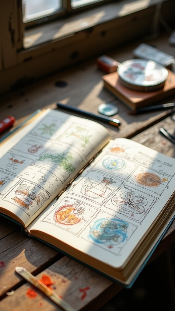
Ever find yourself flipping through a sketchbook, desperately hunting for an old drawing but coming up empty? That’s where a visual index swoops in to save the day.
By organizing your pages with clever navigation tricks, you can say goodbye to chaotic searches. A visual index works like your sketchbook’s table of contents, but way more fun. Think tiny thumbnail sketches to give you a preview, color coding so you know which themes live where, and categories for every subject or style. It’s like a secret map to your own art!
- Add thumbnail sketches with page numbers for quick reference
- Use color coding to highlight different themes or styles
- Organize sketches by date, subject, or technique
- Update your visual index regularly as you create new artwork
Deconstruction Sketches With Annotations
Deconstruction sketches with annotations are like giving your brain x-ray vision, letting artists break tough subjects into basic shapes and puzzle pieces.
By adding handwritten notes and labels to each part, the sketch doesn’t just show what’s there—it tells a story about why each feature matters.
Suddenly, even the most complicated scenes turn into step-by-step adventures, kind of like having a conversation with your drawing as you untangle its secrets.
Breaking Down Complex Subjects
Messy pages full of doodles, arrows, and handwritten notes—sometimes that’s where the real magic happens. Breaking down complex subjects in a sketchbook is all about using deconstruction sketches to really analyze every part.
By tearing apart a dragon, bike, or even that weird plant in your backyard, artists get to know the structure behind the chaos. Annotations add secret codes for future “you” to crack—notes about shape, color, maybe even how prickly something feels.
It’s a bit like detective work, uncovering how everything fits together. Check out these steps:
- Sketch main shapes to see how the parts relate
- Use arrows and labels for structural points
- Jot down notes about proportions and perspectives
- Try viewing from different angles for a full-picture understanding
Annotating Key Features
While some artists jump right in with swirling lines and splashes of color, the ones who stop to write notes beside their sketches are onto something special. Annotating deconstruction sketches turns a regular sketchbook layout into a treasure map of ideas and discoveries. Instead of just drawing what they see, artists jot down thoughts, like, “Whoa, that shadow curves just like a banana!” or “This texture feels rough—need to try thicker pencil.” These small notes make a huge difference. They help the artist’s thought process stand out, boost observational skills, and capture their artistic journey in detail. Deconstruction sketches with annotations turn doodles into science, art, and storytelling—sometimes all at once!
| Element | Benefit |
|---|---|
| Annotations | Enhance understanding and detail recall |
| Observational Skills | Sharpened by analytical note-taking |
| Artistic Journey | Clear map of progress and ideas |
Visual Storytelling Through Labels
Curiosity practically jumps off the page when artists start using labels and annotations in their sketchbooks. It’s like giving their deconstruction sketches a secret code—and viewers get the decoder ring!
By breaking down an object into parts, then adding labels and annotations, artists kick their observation skills into high gear. The layout design becomes more than pretty—suddenly, it’s a guide leading viewers through each piece of the puzzle.
Visual storytelling comes alive, blending images with clever notes that connect idea to idea.
- Deconstruction sketches break objects into bite-size pieces for closer study
- Annotations explain what each part does, adding insight and context
- Labels steer the viewer’s eyes, making sure nothing gets lost
- Clever layout design mixes visuals and text, inviting viewers on a story adventure
Layering Text With Illustrations
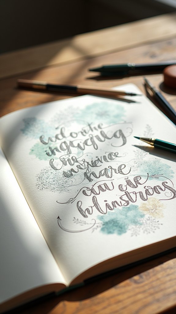
Every awesome sketchbook page seems to come alive when text and drawings work together, almost like they’re teaming up in the world’s coolest comic strip.
Layering text with illustrations isn’t just about slapping words on a page—it’s about weaving together visual elements and written bits so every inch looks intentional. Placing captions, thoughts, or facts around sketches can fill awkward gaps and create a seriously cohesive layout.
Negative space becomes a secret weapon, making sure the page never looks crammed. Trying out wild font styles or changing up colors and sizes can spark instant visual interest and keep things from getting boring.
Adding arrows or lines? That’s like sending viewers on a choose-your-own-adventure through your ideas, where every detail has its moment to shine.
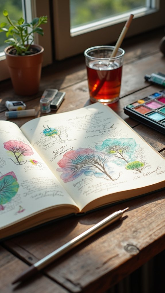
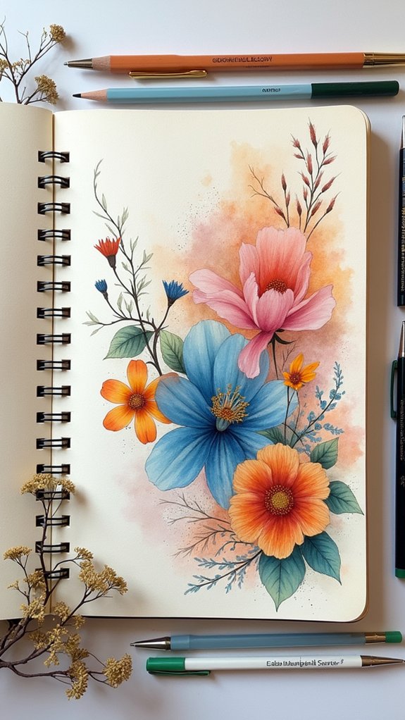
Seasonal Theme Pages
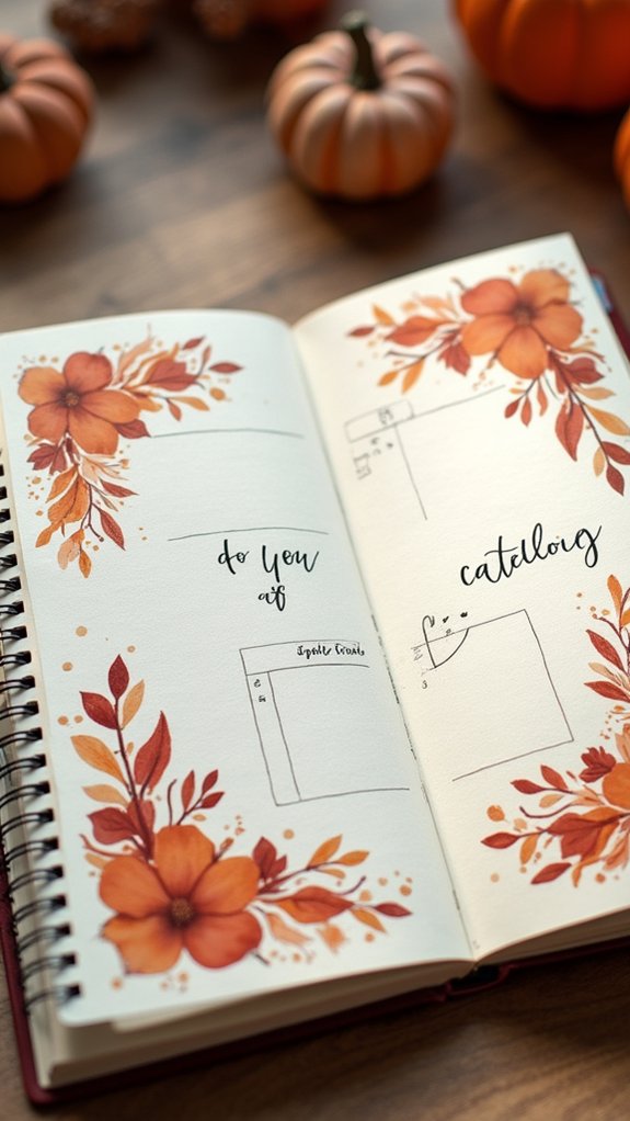
Seasonal pages in a sketchbook are like a personal time machine, zipping from crunchy autumn leaves to sun-soaked summer scenes and even to snowflakes that make noses tingle.
Artists get to capture these moments using different color palettes and sketching techniques, making each season burst with life on paper. Nature journaling fits perfectly, whether you’re scribbling about blooming flowers or the silly ways squirrels hoard food for winter.
Trying new artistic styles, like loose watercolors for spring or bold markers for fall, adds fun twists. Plus, community sketching events can get everyone involved, bringing more creativity into the mix.
- Explore rich seasonal color palettes for each theme
- Practice nature journaling with sketches and notes
- Use diverse sketching techniques for varying effects
- Join community sketching events for inspiration
Project Tracker Layouts

When it comes to tackling big ideas and turning dreams into reality, project tracker layouts in a sketchbook can be a real game changer—kind of like having a GPS for creativity.
These layouts help keep everything on track by using grids or tables to show tasks, deadlines, and important milestones. Color coding is like adding highlighters to a roadmap, making it super easy to spot what needs attention or what’s already done.
Visual workflows, like arrows or lines, connect tasks to show the order things need to happen—that’s where task dependencies sneak in!
Every good project tracker layout has a notes space, so random thoughts and reminders don’t escape. In the end, this setup becomes an all-encompassing tool, helping anyone manage even the wildest projects.
Dynamic Symmetry and Asymmetry
After sorting out big plans and projects, it’s time to shake things up a bit and talk about how layouts can grab attention—sometimes by being perfectly balanced, and other times by breaking all the “rules.”
Dynamic symmetry is like using an invisible grid, such as the rule of thirds, to decide where things go. This kind of layout feels organized, giving the page visual harmony.
But let’s not forget about asymmetry! Sometimes, crooked, off-center, or oversized features can make an engaging sketchbook look even more creative. Asymmetry adds surprise—like when you see a giant doodle next to a bunch of tiny notes.
Together, these ideas create a cohesive presentation that feels alive.
- Rule of thirds for dynamic symmetry
- Asymmetrical designs for excitement
- Creative arrangements with scale and color
- Balancing harmony and playful tension
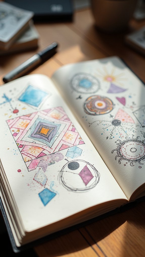
Mix-and-Match Spontaneous Layouts
Some sketchbook pages just don’t want to follow the rules—and honestly, that’s where the real fun begins.
With mix and match spontaneous layouts, artists can ditch the idea of one strict design and let creativity take the wheel. Maybe there’s a bold map in the center, surrounded by quirky doodles and random rectangles dancing around it. This setup gives a super cohesive design, even if everything feels wild at first glance.
Smart use of color weaves all these elements together, creating visual harmony that guides the eye, like a treasure map for imagination. Layering sketches or letting them overlap keeps viewers curious while white space acts as breathing room.
The result? It looks laid-back, but it’s thoughtfully designed—almost like organized chaos that totally works.
Frequently Asked Questions
What Tools or Pens Prevent Ink Bleed-Through on Sketchbook Paper?
Selecting tools to prevent ink bleed-through involves considering ink types, reputable pen brands like Sakura or Micron, adequate paper thickness, and layering techniques. Bleed proof markers and adapting sketching styles also contribute to successful, clean sketchbook results.
How Do I Choose the Right Sketchbook Size for My Workflow?
When selecting sketchbook dimensions, one should weigh workflow efficiency, portability considerations, and creative comfort. Finding the ideal sketchbook involves matching personal preferences for size and format to daily routines, ultimately enhancing productivity and artistic satisfaction during creative sessions.
What Are the Pros and Cons of Spiral-Bound vs. Hardcover Sketchbooks?
Comparing spiral-bound and hardcover sketchbooks involves evaluating spiral benefits like binding flexibility and enhanced page accessibility, against hardcover durability and better portability factors. Price comparison often shows spirals as more affordable, whereas hardcovers usually provide longer-lasting protection.
How Can I Fix or Cover up Mistakes in My Sketchbook Layouts?
Addressing layout errors requires mistake correction techniques such as creative cover ups, washi tape solutions, collage embellishments, white out options, and layering methods. These approaches help conceal imperfections while enhancing overall sketchbook aesthetics and maintaining artistic flexibility.
How Should I Protect Finished Sketchbook Pages From Smudging or Fading?
Protecting finished sketchbook pages from smudging or fading involves using page protectors, gentle handling, archival spray, or fixative options. Consider UV protection and appropriate storage solutions to further preserve artwork integrity and longevity over time.
Conclusion
So, there you have it—seventeen sketchbook layout ideas that can totally level up anyone’s art game. Whether it’s grids, boxes, wild mixes, or clever white space, there’s something in here for every style. The best part? There are no wrong answers, just endless possibilities! Grab a fresh page and get creative. Who knows, your next awesome idea could be one doodle or messy brainstorm away. Honestly, isn’t that what sketchbooks are all about?
Leave a Reply