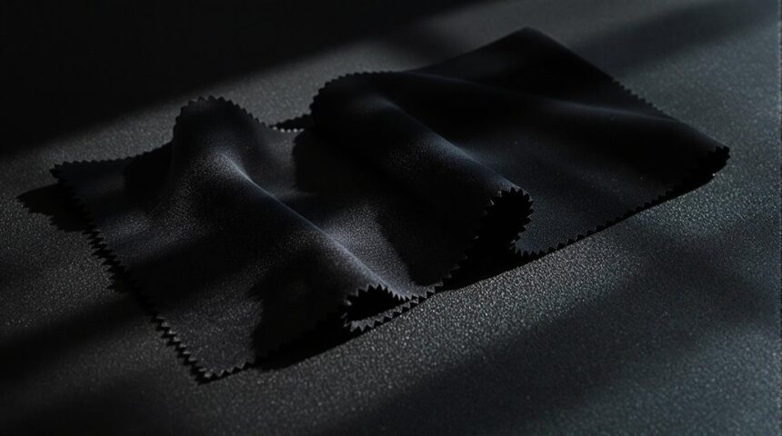
Anthracite and black may look like twins at first, but they’re not fooling anyone up close. Black is pure, bold darkness—no shades, no surprises. Anthracite, though, has cool undertones and a subtle sheen, showing hints of gray or blue depending on the light. Anthracite feels chill and welcoming, while black gives off mega-serious vibes. Pair anthracite with soft colors for a fresh look, or keep things dramatic with black—one brings comfort, the other pure power. There’s more to discover about these deep shades!
Key Takeaways
- Anthracite is a deep grey-black with cool undertones, while black is a pure, solid color with no undertones.
- Anthracite often appears softer and more versatile in design, whereas black delivers a bolder, more formal presence.
- In different lighting, anthracite reveals subtle grey or bluish tones; black remains consistently dark and intense.
- Anthracite creates a calming, inviting atmosphere, while black can feel heavier and more dramatic in interiors.
- Anthracite pairs well with soft or warm colors for sophistication, while black is typically used for high-contrast or authoritative effects.
Defining Anthracite and Black: Origins and Characteristics
Color can be a pretty wild thing when you start to look closely, especially with shades like anthracite and black. Anthracite sits right on the edge between deep grey and black, with cool undertones of blue or purple sneaking in if you really pay attention.
It actually gets its name from anthracite coal, which is famous for being super tough and shiny. Black, on the other hand, is the total absence of color—no undertones, no frills, just pure darkness.
Because anthracite isn’t quite as intense, it’s a popular choice for anyone wanting a modern look that still feels calm and stable. People love its soft, sophisticated vibe, while black tends to shout “serious business” instead.
Both are deep shades, but their characteristics and origins set them apart.
Visual Distinctions: Tone, Undertone, and Luster
Even though anthracite and black might look almost the same at first glance, their differences start popping out the longer you stare.
Anthracite isn’t just another dark grey—it’s got a secret: subtle cool undertones, sometimes bluish or even a bit purplish, sneaking through. Black, on the other hand, is just black—no undertone, no surprises, just the ultimate dark.
When it comes to luster, anthracite often shows off a tiny sheen, like it’s winking in the light, while black usually sticks with a matte finish unless someone’s shined it up on purpose.
And under different lights? Anthracite likes to shift and reveal its soft grayish personality, but black stays stubborn, always holding onto its deep, bold tone.
Psychological Effects and Mood Setting
Staring at the subtle shifts between anthracite and black is more than just a game for the eyes—it actually messes with the way a room *feels* too.
Anthracite grey, with its deep and cool undertones, has some serious psychological effects. It’s like a secret ingredient for calmness and concentration, perfect for when you need to get in the zone.
Its darker tones wrap around you, giving off comfort and intimacy, almost like a cozy blanket for your mind. There’s even a hint of warmth that makes a space feel extra inviting.
On the flip side, pure black can seem heavy and a bit too formal—sometimes even a little cold.
Anthracite finds that sweet spot, balancing sophistication with a more approachable emotional response.
Design Applications: When to Use Anthracite Versus Black
So, when does it actually make sense to pick anthracite over black, or vice versa? Imagine this: anthracite, with its cool undertones, is perfect for interior design where you want a calming effect—think bedrooms or chill-out zones. Black, on the other hand, is all about dramatic impact and making a focal point. In working spaces, anthracite offers stylish elegance without feeling harsh, while black can sometimes feel a bit too intense, especially if natural light is limited.
Here’s a quick comparison to help decide:
| Use Case | Anthracite | Black |
|---|---|---|
| Bedrooms | Calming effect | Bold, dramatic impact |
| Colour combinations | Softens with pastels and creams | Strong contrast, absorbs light |
| Window treatments | Understated, stylish elegance | Stark, dominant focal point |
| Working spaces | Relaxed focus, subtle | Powerful, can feel heavy |
| Branding | Sophisticated, versatile | Authority, high-end luxury |
Pairing and Complementary Colours in Interior Spaces
When it comes to decorating with anthracite or black, color pairings can totally make or break the look.
Anthracite, with its deep grey tones, creates a sophisticated vibe, but it’s the complementary colours that really make it pop. Imagine pairing anthracite with soft blues, creamy whites, or even dusky pinks. Suddenly, the space feels calm and inviting, not gloomy at all.
Warm hues like pale yellows can add just the right amount of energy, while metallic accessories give everything a cool sparkle and visual interest.
For anyone planning a room makeover, here are three ideas:
- Pair anthracite with mint, teal, or cream for a fresh, calming atmosphere.
- Use metallic accessories for a touch of glamour.
- Balance with warm hues to soften the look.
Frequently Asked Questions
What Is the Difference Between Anthracite and Black?
The difference lies in shade variations and lighting influences; anthracite’s cool undertones affect color symbolism and psychological effects. Black dominates fashion trends and material applications, while anthracite’s versatility in color mixing offers broader design implications and aesthetic preferences, reflecting historical significance.
Is Anthracite Darker Than Black?
When comparing anthracite characteristics to black properties, black appears darker due to its total light absorption. Color perception and light reflection influence design choices, fashion trends, interior design, paint options, and material applications, with each shade symbolizing distinct aesthetics.
What Color Is Anthracite Close To?
When comparing color combinations or paint swatches, anthracite is close to deep charcoal shades and slate textures. In interior design, fashion styles, and textile choices, lighting effects and material variations influence its perception, aligning with color psychology principles.
Which Is Darker, Anthracite or Dark Grey?
When comparing dark shades, anthracite is generally darker than dark grey, influencing color psychology and paint choices. Its depth enhances material textures, lighting effects, and complements interior decor, fashion trends, color mixing, and various design applications with sophistication.
Conclusion
So, anthracite and black might look pretty similar at first glance, but they each bring their own personality to a room. Anthracite has that cool, smoky vibe with a bit of mystery, while black is bold, classic, and never goes out of style. Picking between them isn’t rocket science, but it can totally change the mood. Whether you want cozy or dramatic, knowing the difference means you’re one step closer to creating a space you totally love.


Leave a Reply